Pivot Table Toolbar
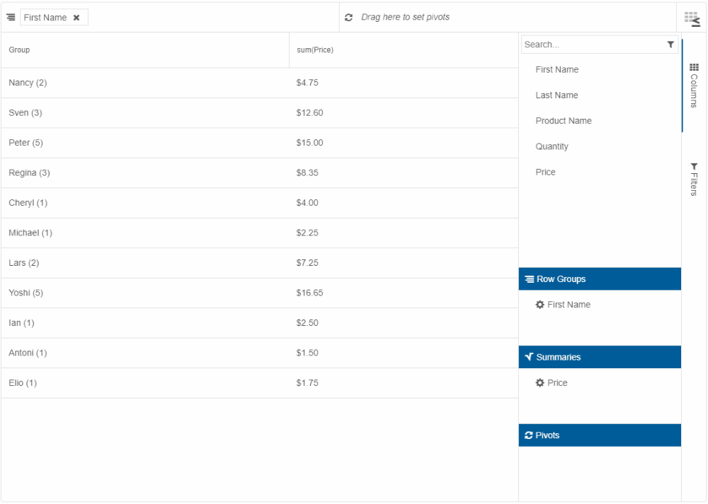
In Smart.PivotTable, a toolbar can be displayed at the top of the element. It provides several tools that allow for Pivot Table column customization, conditional formatting, and filtering. The toolbar is enabled by setting the property toolbar to true.
The toolbar contains the following:
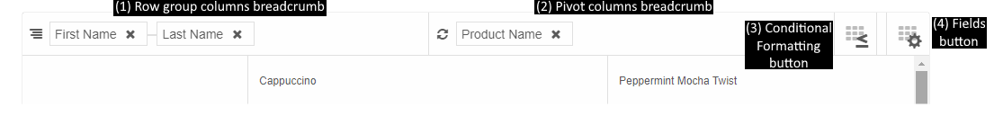
(1) Row group columns breadcrumb
Allows for removing and reordering the currently applied Row group columns by dragging the breadcrumb items. Items can also be dragged into (2) Pivot columns breadcrumb if their corresponding columns have allowPivot enabled. Learn more about column roles in the Smart.PivotTable Overview help topic, section Pivot Table Concepts, Columns, and Column Roles.
(2) Pivot columns breadcrumb
Allows for removing and reordering the currently applied Pivot columns by dragging the breadcrumb items. Items can also be dragged into (1) Row group columns breadcrumb if their corresponding columns have allowRowGroup enabled.
(3) Conditional Formatting button
When clicked, opens a dialog with a formatting panel inside.
The formatting panel allows the configuration of background and text color of certain cells under certain conditions.
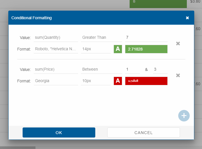
Available settings in the formatting panel are:
- Column to apply formatting to (applicable to all dyncamic summary columns);
- Condition to apply formatting on - Less Than, Greater Than, Equal To, Not Equal To, Between;
- Value based on which to evaluate condition; if condition is Between, a second, "to", value is configurable;
- Font family to apply when condition is met;
- Font size to apply when condition is met;
- Background and text color to apply when condition is met - both configurable via additional pop-up opened from the formatting panel.
All of these settings can be configured on initialization in the Pivot Table by setting the property conditionalFormatting the value of which is always in sync with the Conditional Formatting panel in the dialog.
(4) Fields button
When clicked, opens a dialog with the Pivot Table designer. Full description of the designer is available in the next section of this help topic, Pivot Table Designer. When the property designer is enabled, thus showing the designer to the side of the table, the Fields button is not available (see section Pivot Table Designer and Toolbar Interaction).
Pivot Table Designer
A Pivot Table designer can be displayed by setting the property designer to true. By default, the designer appears on the right of the Pivot Table. Its position is controlled by the property designerPosition with two possible values:
- 'near' - designer appears on the side nearest to the group column.
- 'far' (default) - designer appears on the side farthest from the group column.
Alternatively, the designer can be opened in a dialog from a button in Smart.PivotTable's toolbar (see the previous section, Pivot Table Toolbar).
The Pivot Table's designer is essentially a tabs with two views - Columns and Filters.
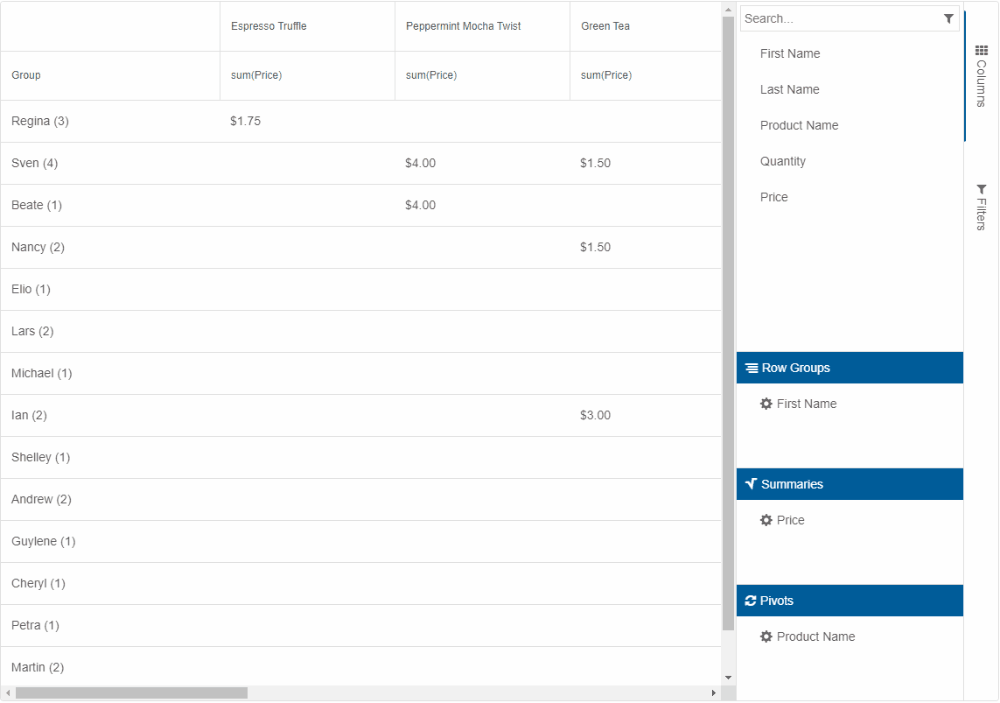
Designer "Columns" View
In the "Columns" view, there are four lists of columns, dragging between which is possible, as follows:
- Columns - all columns, as set up in the columns property. Dragging to this list from another list removes the role associated with the source list.
- Row Groups - all columns with rowGroup enabled. Only columns with allowRowGroup can be dragged here.
- Summaries - all columns with a summary function. Any column can be dragged here. If a column is dragged here, the summary function applied is either the one returned by the callback function getDefaultSummaryFunction (if implemented) or 'count'. There must always be at least one column in this list.
- Pivots - all columns with pivot enabled. Only columns with allowPivot can be dragged here.
Further configuration of columns is available by clicking the cog icon next to a column label. This opens a Column settings dialog with the following options:
Available to all columns
- Move to - changes the role of a column;
- Text alignement - changes the text alignement of the headers of the dynamic columns corresponding to this column. Corresponds and is in sync with the column property align.
Available to Summaries columns only
- Calculation - changes the summary function. Corresponds and is in sync with the column property summary;
- Number alignment - changes the text alignment in summary column cells. Corresponds and is in sync with the column property summarySettings.align;
- Number prefix - changes the text prefix in summary column cells. Useful for adding currency symbols. Corresponds and is in sync with the column property summarySettings.prefix;
- Decimal places - changes the decimal places in summary column cells. Corresponds and is in sync with the column property summarySettings.decimalPlaces;
- Thousands separator - changes the thousands separator character in summary column cells. Corresponds and is in sync with the column property summarySettings.thousandsSeparator;
- Decimal separator - changes the decimal separator character in summary column cells. Corresponds and is in sync with the column property summarySettings.decimalSeparator;
- Negatives in brackets - if enabled, negative values appear in brackets instead of with the minus sign. Corresponds and is in sync with the column property summarySettings.negativesInBrackets.
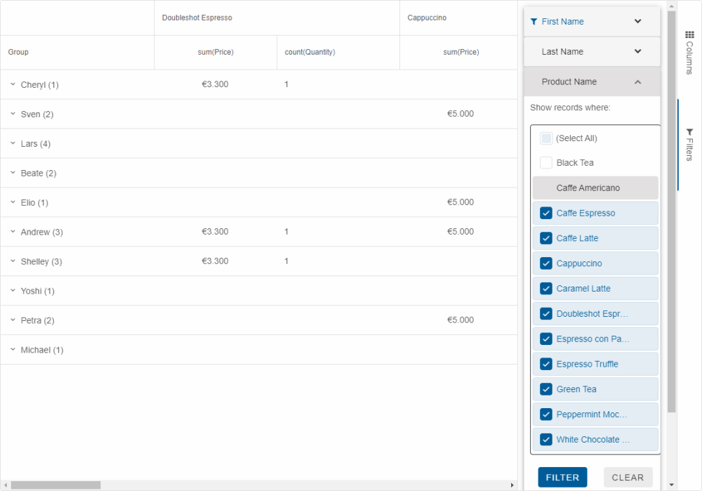
Designer "Filters" View
In the designer's "Filters" view, Excel-like filters with all unique values from the original data source (and not aggregated ones) are available for each column. These filter panels are displayed in an accordion for ease of access.
Filters applied via the Pivot Table Designer discard any filters applied programmatically with the method addFilter and vice versa.
Pivot Table Designer and Toolbar Interaction
Both the Pivot Table's toolbar and a standalone designer can be shown at the same time, allowing columns to be dragged from the designer to the toolbar's breadcrumbs and vice versa and change the column roles dynamically.