 JavaScript
 Angular
 Vue
Vue React
ReactSmart UI Web Components work with current evergreen browsers and Node 18+ for local tooling; pin package versions to match your project policy.
Smart UI is distributed as the smart-webcomponents NPM package. You can also use the full download from the Download page.
npm install smart-webcomponents
<script type="module" src="node_modules/smart-webcomponents/source/modules/smart.pivottable.js"></script>
<link rel="stylesheet" type="text/css" href="node_modules/smart-webcomponents/source/styles/smart.default.css" />
div (you mount programmatically with appendTo):Semantic element (id matches the selector in Smart()):
<smart-pivot-table id="pivottable"></smart-pivot-table>
Host container (id matches appendTo on Smart.PivotTable):
<div id="pivottableContainer"></div>
div:
<script type="module">
	import 'node_modules/smart-webcomponents/source/modules/smart.pivottable.js';

	const pivottableOptions = {};

	// Option A - semantic <smart-pivot-table> with id="pivottable"
	Smart('#pivottable', class {
		get properties() {
			return pivottableOptions;
		}
	});

	// Option B - host div id="pivottableContainer"
	// const pivottableInstance = new Smart.PivotTable({
	// 	...pivottableOptions,
	// 	appendTo: '#pivottableContainer'
	// });

	// Option C - constructor(selector, options), then append the returned element yourself
	// const myPivotTable = new Smart.PivotTable('#pivottable', pivottableOptions);
	// document.body.appendChild(myPivotTable);
</script>
Uncomment Option B when you use the host div; use Option A when you use the semantic element. The Runtime cookbook also documents new Smart.PivotTable('#pivottable', pivottableOptions) with appendChild, and document.createElement('smart-pivot-table') with .props or Object.assign (all are valid patterns; do not combine overlapping patterns for the same instance unless you intend multiple components).
Alternative creation patterns and imperative APIs. These are all valid ways to create Smart UI components: semantic markup + Smart(); new Smart.PivotTable({ ...options, appendTo: '#...' }); new Smart.PivotTable('#pivottable', pivottableOptions) plus appendChild on the returned element; and document.createElement('smart-pivot-table') then assigning options via .props or Object.assign on the element.
Constructor with a selector string and options, then append the returned element (for example const myPivotTable = new Smart.PivotTable('#pivottable', pivottableOptions)):
	const pivottableOptions = {};
	const myPivotTable = new Smart.PivotTable('#pivottable', pivottableOptions);
	document.body.appendChild(myPivotTable);
Create with document.createElement('smart-pivot-table'), assign properties (same as any custom element), then append:
	const pivottableOptions = {};
	const pivottable = document.createElement('smart-pivot-table');
	Object.assign(pivottable, pivottableOptions);
	document.body.appendChild(pivottable);
Host on a div with appendTo (import the module, then instantiate when the document is ready; the container id must match appendTo):
	import "../../source/modules/smart.pivottable.js";

	document.readyState === 'complete' ? init() : window.addEventListener('load', init);

	function init() {
		const pivottableOptions = {};
		const pivottable = new Smart.PivotTable({
			...pivottableOptions,
			appendTo: '#pivottableContainer'
		});
	}
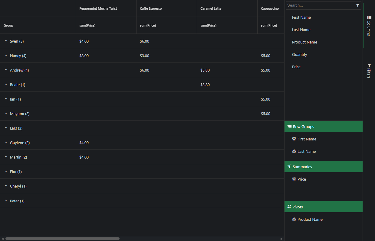
Smart.PivotTable is a table of statistics that summarizes the data of a more extensive table (such as from a database, spreadsheet, or business intelligence program). This summary might include sums, averages, or other statistics, which the pivot table groups together in a meaningful way. The PivotTable arranges and rearranges (or "pivots") statistics in order to draw attention to useful information.
PivotTable has two types of columns - the original columns, that correspond to the ones from the grid/table/database the data is retrieved from, and the dynamic columns which are the columns visible in the PivotTable after the data has been processed.
The original columns are defined in the PivotTable's settings by setting the columns property. Here is a sample configuration:
columns: [
    { label: 'Last Name', dataField: 'lastName', dataType: 'string', allowRowGroup: true, rowGroup: true },
    { label: 'First Name', dataField: 'firstName', dataType: 'string', allowRowGroup: true, rowGroup: true },
    { label: 'Product Name', dataField: 'productName', dataType: 'string', allowPivot: true, pivot: true },
    { label: 'Quantity', dataField: 'quantity', dataType: 'number', summary: 'sum' },
    { label: 'Price', dataField: 'price', dataType: 'number', summary: 'sum', summarySettings: { prefix: '$', decimalPlaces: 2 } }
]
To be visualized in the PivotTable, a column has to have at least one role, configured by setting one of the properties:
Once the PivotTable's data source and original columns array are processed, dynamic columns with summarized data are produced and populated. Here is an image that shows a Smart.PivotTable with dynamic columns based on the columns array from above:
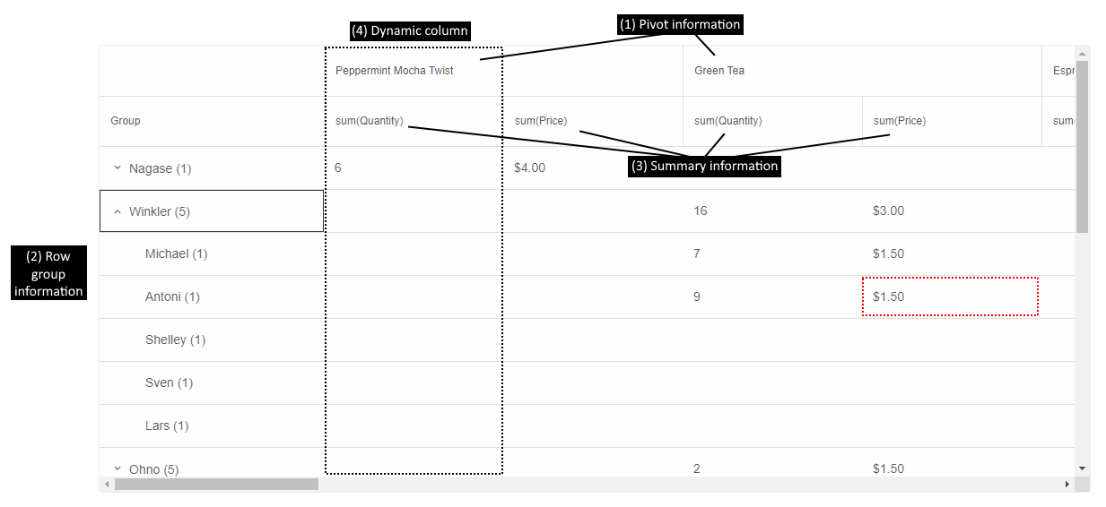
The cell highlighted in red in the image shows the sum of the prices (summary (3)) of all products Green Tea (pivot (1)), purchased by everyone named Antony Winkler (rowGroup (2)).
There can be multiple pivot, row group, and summary columns. The order in which they appear in the PivotTable depends on the order in which they are configured in the columns array. That is why, in this case, rows are first grouped by Last Name, then by First Name and sum(Quantity) is before sum(Price).
Information about all currently displayed dynamic columns can be retrieved by calling the method getDynamicColumns.
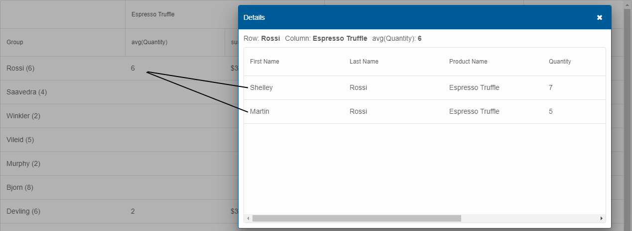
Each cell in PivotTable may summarize one or more original data points. If the property drillDown is enabled, the user can double-click a cell to show a Smart.Table in a dialog with all records aggregated in the clicked PivotTable cell.
A variety of operations can be performed on Smart.PivotTable's aggregated data or dynamic columns. Here is an overview:
Dynamic columns can be reordered by clicking a summary header and dragging with the mouse. Reorder is enabled by setting the columnReorder property to true.
The PivotTable's data can be exported to a wide variety of file formats:
by calling the element's method exportData, e.g.:
const pivotTable = document.getElementById('pivotTable');
pivotTable.exportData('html', 'pivotTable');
This sample code exports the PivotTable to the file pivotTable.html.
The original data bound to Smart.PivotTable can be filtered in order to summarize a more focused set of data points. Filtering can be applied in two ways:
Checkbox row selection can be enabled in Smart.PivotTable by setting the property selection to true. There are two selection modes available:
The PivotTable can be sorted by its dynamic columns (including the Group column). The sorting behavior is controlled by the property sortMode with the following values:
Users can apply sorting by clicking on a column's summary header. Clicking multiple times toggles between ascending direction, descending direction, and no sorting.
Alternatively, sorting can be modified with the methods sortBy and clearSort.
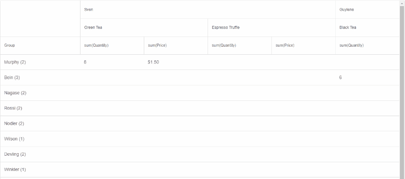
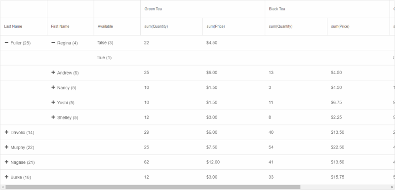
When there are row group columns in the PivotTable, an alternative layout, inspired by classic, OLAP, pivot tables can be enabled. In this layout, there is a separate column for each level of nesting (row group applied) as opposed to the default, tree grid-like, style with a separate row for each record in the hierarchy. Moreover, in classic layout, the data shown in a table row depends on whether the row is collapsed ("parent" data) or expanded (first "child" data).
The classic, OLAP, layout can be enabled by setting the property groupLayout to 'classic':
Additional, advanced, features of Smart.PivotTable are described in the following help topics:
Smart.PivotTable has the following methods:
Append to the DOM:
const container = document.getElementById('pivottable-container');
container.appendChild(pivottable);
Remove from the DOM:
pivottable.remove();
Set a property:
pivottable.disabled = true;
pivottable.theme = 'dark';
Get a property value:
const isDisabled = pivottable.disabled;
const currentTheme = pivottable.theme;
Invoke a method:
pivottable.refresh();
pivottable.focus();
Add event listener:
pivottable.addEventListener('change', (event) => {
    console.log('change triggered:', event.detail.type);
});
Remove event listener:
const handlePivotTableEvent = (event) => {
    console.log('change triggered:', event.detail.type);
};

pivottable.addEventListener('change', handlePivotTableEvent);
pivottable.removeEventListener('change', handlePivotTableEvent);
The PivotTable component follows WAI-ARIA best practices:
For custom labeling, set aria-label or aria-labelledby attributes on the component.
Supported stacks: Smart UI targets Angular 17+, React 18+, Vue 3+, Node 18 LTS, and evergreen browsers; pin exact package versions to your org policy.