Build your web apps using Smart Custom Elements
Smart.GanttChart - Task Table
Task Table
Smart.GanttChart's uses a Table component to display the tasks of the element. There are two types of items determined by their hierarchy that the element is using:
- Table Row - represent a Task/Milestone. As such it doesn't allow nested items.
- Table Tree Row - represent a Project. Allows nested items - subTasks of a Project. When the user clicks on the arrow infront of an Table Tree Row, if it has subTasks, the group will expand in order to view all the tasks that belong to the project or collapse to hide them. Collapsing/Expanding reflects on the Timeline as well.
Expanding/Collapsing the project affects the Timeline as well.
The columns of the Task Table are determined by the taskColumns property. This property represents an Array of objects. Each object defines a column with the follkowing properties:
-
label - determines the text that will appear as the header of the column. The
label property can be used in conjunction with messages in order to provide quick
localization. Here's an example:
const ganttChart = document.querySelector('jqx-gantt-chart');

gantt.taskColumns = [
        {
            label: 'columnLabel',
            value: 'label',
            size: '60%'
        }
        ...
];

gantt.messages = {
        'en': {
            ...
            'columnLabel': 'Task Name'
            ...
        },
        'de': {
            ...
            'columnLabel': 'Aufgabennname',
            ...
        },
Note: The demo used in this section is available on the website: Link
- value - Determines the content of the Table items that will be created for each task. The value should match a task property, e.g. dateStart, dateEnd, label, duration, etc. If it doesn't the column will still be created but the Table rows will not be populated with content. This can be used to create a column with custom content using the formatFunction.
- size - determines the size of the column. The size can be in percentages or pixels.
- min - determines the minimal size of the column. The size can be in percentages or pixels.
- max - determines the maximal size of the column. The size can be in percentages or pixels.
-
formatFunction - a callback that determines the content of the Table rows that will be
created for each task. Can be used to completely customize the content. The function has two
paramenters - the value of the property determined by the value attribute defined
earlier for
each Task and item - the item object if any.
... ganttChart.taskColumns = [ { ... //Custom format function formatFunction: function (label) { if (label === 'Learn') { return ' <i class="material-icons"></i>' + label; } else if (label === 'Work') { return ' <i class="material-icons"></i>' + label; } else if (label === 'Travel') { return ' <i class="material-icons"></i>' + label; } else if (label === 'Eat') { return ' <i class="material-icons"></i>' + label; } else if (label === 'Shop') { return ' <i class="material-icons"></i>' + label; } else if (label === 'Train') { return ' <i class="material-icons"></i>' + label; } else { return label; } } } ... ];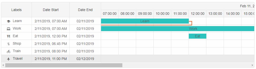
Note: The demo used in this section is available on the website: Link
Task Table Size
By default the GanttChart is devided in two components - Task Tree and Timeline. So it's necessary to control the size of the Task Tree. The following properties are available:- treeMin - Sets the minimal size of the Task Table. The size can be in percentages or pixels.
- treeSize - Sets the size of the Task Table. By default it's set to '20%'.
...
ganttChart.treeMin = '10%';
ganttChart.treeSize = '20%';
...
By setting the size of the Task table to '20%' what's left of the width of the GanttChart will be used to render the Timeline.
Task Panel size
The GanttChart component contains two panels - task and resource panels. By default the Resource panel is not visible unless there are resources defined. The Task panel is always visible.
The following properties allow to control the size of the Panels:
- taskPanelSize - determines the size of the Task Panel when both Task and Resource panels are visible.
- taskPanelMin - determines the min size of the Task Panel when both Task and Resource panels are visible.
- resourcePanelSize - determines the size of the Resource panel when visible
- resourcePanelMin - determines the min size of the Resource panel when visible.
Keyboard Navigation
Keyboard navigation inside the Task Table is enabled by default when the element is focused.| Key | Action |
|---|---|
| ArrowUp/ArrowDown | Pressing the 'ArrowUp/ArrowDown' keys focuses the previous/next task in the table. |
| ArrowLeft/ArrowRight | Pressing the 'ArrowLeft/ArrowRight' keys focuses the previous/next table cell. |
| Space | Pressing 'Space' key will select/unselect the focused task. |
| Enter | Pressing 'Enter' key will open the window editor to edit the task if possible. |
| Delete | Pressing 'Delete' key will delete the task. |