Using with React
1. Installation
The easiest way to start with React is to use NextJS.
npx create-next-app@latest
cd my-app
npm start
2. Preparation
Open src/page.js
3. Setup
Smart UI for React is distributed as smart-webcomponents-react NPM package
- Download and install the package.
npm install smart-webcomponents-react
2. Add the React Component in src/page.js
import { Accordion, AccordionItem } from 'smart-webcomponents-react/accordion';
import 'smart-webcomponents-react/source/styles/smart.default.css';
3. Add the HTML for the Accordion in src/page.js
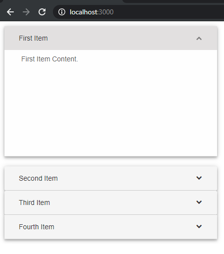
page.js<Accordion> <AccordionItem label="First Item">First Item Content.</AccordionItem> <AccordionItem label="Second Item">Second Item Content.</AccordionItem> <AccordionItem label="Third Item">Third Item Content.</AccordionItem> <AccordionItem label="Fourth Item">Fourth Item Content.</AccordionItem> </Accordion>
Start the app with
npm run devand open localhost:3000 in your favorite web browser to see the output below:
 The full source code:
import React from 'react';
import styles from './page.module.css';
import { Accordion, AccordionItem } from 'smart-webcomponents-react/accordion';
import 'smart-webcomponents-react/source/styles/smart.default.css';
export default function Home() {
return (
 <Accordion>
   <AccordionItem label="First Item">First Item Content.</AccordionItem>
   <AccordionItem label="Second Item">Second Item Content.</AccordionItem>
   <AccordionItem label="Third Item">Third Item Content.</AccordionItem>
   <AccordionItem label="Fourth Item">Fourth Item Content.</AccordionItem>
 </Accordion>
);
}
Adding Grid
Now, let's build a more advanced example with our Grid component. The Smart.Grid for React is the industry's best data grid component, covering features such as paging, sorting, filtering, editing, grouping, localization. excel and pdf export, import from excel, printing, charting, etc.
Let's add a Smart.Grid component and enable columns hierarchy, sorting, paging, multiple cells selection, column resize and editing.
Add the code below to create a Grid bound to a list of people.
<Grid
	dataSource={this.dataSource}
	columns={this.columns}
	appearance={this.appearance}
	behavior={this.behavior}
	selection={this.selection}
	paging={this.paging}
	pager={this.pager}
	sorting={this.sorting}
	editing={this.editing}
</Grid>
The Grid is databound to a dataAdapter instance which acts as a bridge between the Data and the Smart.Grid for React.
dataSource = [{ "firstName": "Beate", "lastName": "Wilson", "productName": "Caramel Latte"},
	{ "firstName": "Ian", "lastName": "Nodier", "productName": "Caramel Latte"},
	{ "firstName": "Petra", "lastName": "Vileid", "productName": "Green Tea"},
	{ "firstName": "Mayumi", "lastName": "Ohno", "productName": "Caramel Latte"},
	{ "firstName": "Mayumi", "lastName": "Saylor", "productName": "Espresso con Panna"},
	{ "firstName": "Regina", "lastName": "Fuller", "productName": "Caffe Americano" },
	{ "firstName": "Regina", "lastName": "Burke", "productName": "Caramel Latte"},
	{ "firstName": "Andrew", "lastName": "Petersen", "productName": "Caffe Americano"},
	{ "firstName": "Martin", "lastName": "Ohno", "productName": "Espresso con Panna"},
	{ "firstName": "Beate", "lastName": "Devling", "productName": "Green Tea"},
	{ "firstName": "Sven", "lastName": "Devling", "productName": "Espresso Truffle"},
	{ "firstName": "Petra", "lastName": "Burke", "productName": "Peppermint Mocha Twist"},
	{ "firstName": "Marco", "lastName": "Johnes", "productName": "Caffe Mocha"}]
Below is the columns initialization code. Each column should have "label" and "dataField" props. "label" defines the header text, "dataField" defines the databinding in the data source.
columns = [{
	label: 'First Name',
	dataField: 'firstName'
},
{
	label: 'Last Name',
	dataField: 'lastName'
},
{
	label: 'Product',
	dataField: 'productName'
}
]
Now lets enable resizing, selection, editing and paging in our React Grid.
behavior = {
	columnResizeMode: 'growAndShrink'
}

appearance = {
	alternationCount: 2,
	showRowHeader: true,
	showRowHeaderSelectIcon: true,
	showRowHeaderFocusIcon: true
}

paging = {
	enabled: true
}

pager = {
	visible: true
}

sorting = {
	enabled: true
}

editing = {
	enabled: true
}

selection = {
	enabled: true,
	allowCellSelection: true,
	allowRowHeaderSelection: true,
	allowColumnHeaderSelection: true,
	mode: 'extended'
}
To enable sorting, editing and paging we define objects and set the Grid's "enabled" property to true. The appearance object defines alternating rows appearance. showRowHeader displays the row header cells and the showRowHeaderSelectIcon and showRowHeaderFocusIcon define the row header cells style when the row is selected or focused. The selection object defines a cells selection and enables the row and column headers selection.
 The full code for the example:
import 'smart-webcomponents-react/source/styles/smart.default.css';
import { Grid } from 'smart-webcomponents-react/grid';
export default function Home() {
const behavior = {
columnResizeMode: 'growAndShrink'
}
const appearance = {
alternationCount: 2,
showRowHeader: true,
showRowHeaderSelectIcon: true,
showRowHeaderFocusIcon: true
}
const paging = {
enabled: true
}
const pager = {
visible: true
}
const sorting = {
enabled: true
}
const editing = {
enabled: true
}
const selection = {
enabled: true,
allowCellSelection: true,
allowRowHeaderSelection: true,
allowColumnHeaderSelection: true,
mode: 'extended'
}
const dataSource = [
{ "firstName": "Beate", "lastName": "Wilson", "productName": "Caramel Latte"},
{ "firstName": "Ian", "lastName": "Nodier", "productName": "Caramel Latte"},
{ "firstName": "Petra", "lastName": "Vileid", "productName": "Green Tea"},
{ "firstName": "Mayumi", "lastName": "Ohno", "productName": "Caramel Latte"},
{ "firstName": "Mayumi", "lastName": "Saylor", "productName": "Espresso con Panna"},
{ "firstName": "Regina", "lastName": "Fuller", "productName": "Caffe Americano" },
{ "firstName": "Regina", "lastName": "Burke", "productName": "Caramel Latte"},
{ "firstName": "Andrew", "lastName": "Petersen", "productName": "Caffe Americano"},
{ "firstName": "Martin", "lastName": "Ohno", "productName": "Espresso con Panna"},
{ "firstName": "Beate", "lastName": "Devling", "productName": "Green Tea"},
{ "firstName": "Sven", "lastName": "Devling", "productName": "Espresso Truffle"},
{ "firstName": "Petra", "lastName": "Burke", "productName": "Peppermint Mocha Twist"},
{ "firstName": "Marco", "lastName": "Johnes", "productName": "Caffe Mocha"}
]
const columns = [{
label: 'First Name',
dataField: 'firstName'
},
{
label: 'Last Name',
dataField: 'lastName'
},
{
label: 'Product',
dataField: 'productName'
}
]
return (
<div>
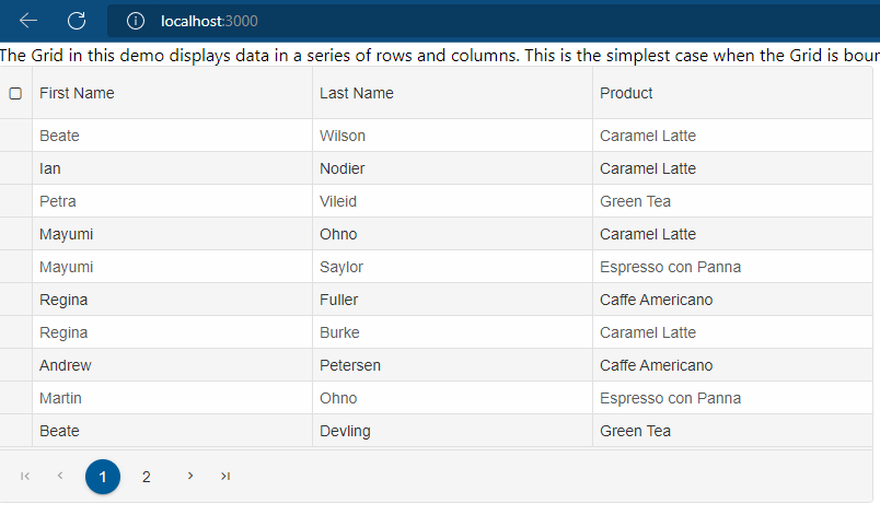
<div>The Grid in this demo displays data in a series of rows and columns. This
is the simplest case when the Grid is bound to a local data source.</div>
<Grid
dataSource={dataSource}
columns={columns}
appearance={appearance}
behavior={behavior}
selection={selection}
paging={paging}
pager={pager}
sorting={sorting}
editing={editing}
>
</Grid>
</div>
);
}