Smart.Grid


The Most Functional Grid in the World
High-performance data grid with virtual scrolling
It is the most feature-complete Grid component available on the market - see here
See online demo
The Smart UI Grid component offers top performance and responsive, fluid design. It offers easy to use and well documented APIs. The Smart UI framework ships with over ready to use 1000 examples. Like all widgets in the Smart UI framework the Grid component works across a range of devices and offers responsive, device-optimized look and behavior on PCs, tablets and mobile phones. The Grid for is trusted by thousands of companies and big user community. We offer excellent techinical support and customization services. The Smart UI framework releases frquent updates with continuous improvements.
Advanced Filtering & Sorting in Smart.Grid with AI is included.
Data Binding in Grid
The data grid component has built-in data binding capabilities and supports Client and server-side model. It can be bound to Local Data, JSON, XML, CSV, TSV, Remote Data (JSONP) and Virtual Data where data is loaded on demand. In order to bind the Grid to a data source you need to set its source property to point to an instance of Smart.DataAdapter and configure the adapter as demonstrated in our docs & examples.Client-side: Bind to local arrays, JSON, XML, CSV.
Server-side: Load-on-demand for remote data via JSONP.
Virtual Data: Handles millions of records without lag.

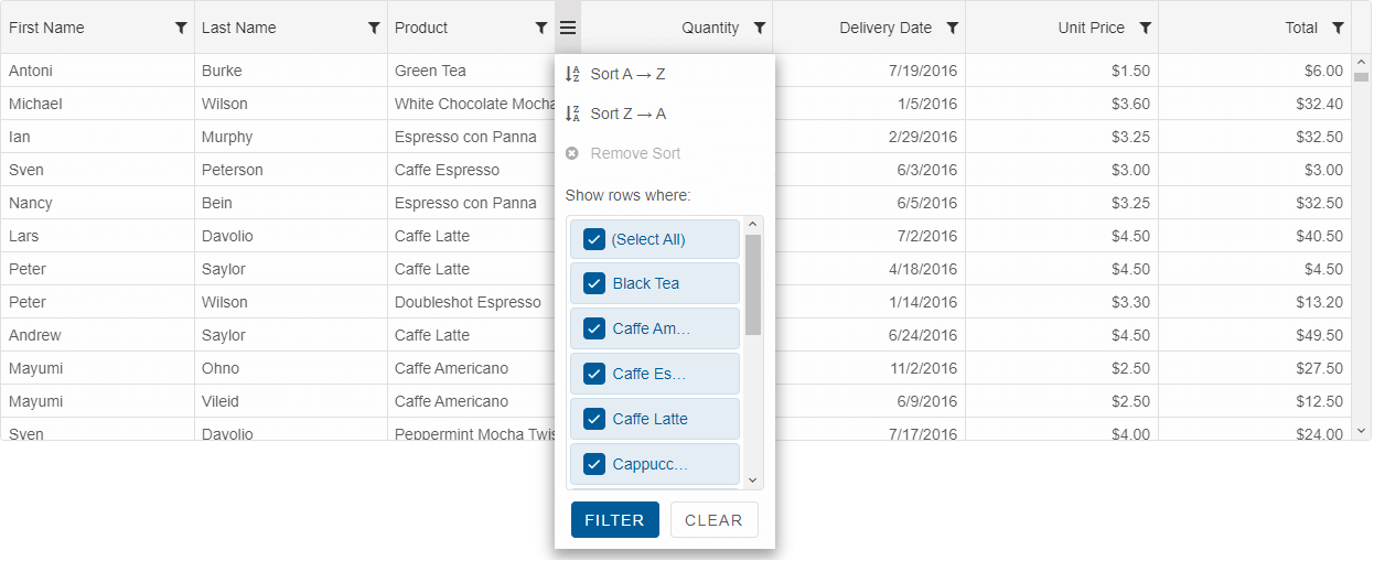
Sorting in Grid
Sorting is a common grid operation. The data in the grid can be sorted in several different ways: Click on a Column header, Sort menu button, Sort Header Panel or programmatically via the APIs of the grid. The default behavior of the sorting function is to apply ascending or descending sort depending values in each column. The grid's API also allow developers to extend and customize the sorting with custom sort and compare functions. The data in the grid can be sorted by one or multiple columns.Sorting with a Sort Panel

Sorting with a Menu

Sorting with a Column Header Click

The below image shows a sort animation appearance option built-in the Grid.

Server-side sorting where data in the Grid is loaded on demand depending on the applied sorting is supported, too.
See online demo
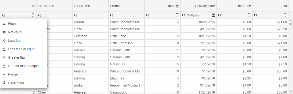
Filtering in Grid
The filtering in the data grid component is extremely flexible. The grid offers standard filters with context menus and selection of filtering operators and conditions. The developer may also choose to use a filter row which will appear at the top of the grid's rows. Users may enter data in each column and the filtration will be done by matching the corresponding records in the grid. The filter menus are fully customizable. The grid also provides Excel-style filters with checkbox selection of the items in each grid column. Filtering can be achieved through API as well.
With the Smart UI grid you can enable filter row in its header by setting the grid's filtering->filterRow->visible property to true. Thus based on the data type of the underlying columns data the grid will render textboxes for string values, numeric inputs or date pickers for filtering in the column headers. The following image illustrates the Filter Row functionality of our Data Grid
You can enable filtering via checkbox list like in Excel in the Smart UI grid filter menu by specifying filtering->filterMenu->mode to "excel" setting.
Server-side filtering where data in the Grid is loaded on demand depending on the applied filter is supported, too.
See online demo
Grouping in Grid
The data in the Data Grid can be grouped and also you can turn on Group Aggregates. You can group by using the Grid Column's Menu or through its API. You can configure whether the groups are expanded or collapsed by default and can choose from several rendering modes.Grouping with a Panel

Grouping with a Column Menu
 Server-side grouping where data in the Groups is loaded on demand is supported, too.
See online demo
Editing in Grid
Our component supports multiple edit modes. Users can edit by cell, by row or through a popup. Edit validation is built-in as well. Some of the editors which can be used are TextBox, DateTimePicker, NumberInput, ComboBox, DropDownList, CheckBox. Custom Editors can be easily applied, too. One of the advanced editing capabilities is the 'Batch Editing' mode. In that mode the edit changes of the Grid are applied after a 'Save' button is clicked or API method is called. Command columns are available and customizable, too.
 Editing can be validated by using custom validation functions. Developers may also add custom editors and customize the editing process through the API.
Nested Grids
Smart.Grid supports nested Grids. Each row may have a sub-grid associated to it. When a toggle button is clicked, the sub-grid can be displayed either in a row detail or in a popup window.
Paging in Grid
Paging allows you to display data sets in different pages. The paging feature is used for easier navigation and faster loading. Our Grid supports two built in paging layouts, but users may customize the rendereing through API, too.
Server-side paging where data in the pages is loaded on demand is supported, too.
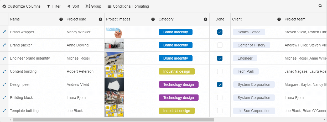
Grid Conditional Formatting
The Grid offers many options for columns and cells formatting. You can align the text in the cells left, right or center and have different bacckround colors. The columns can be shown or hidden and can be auto-sized. You can also have checkboxes, images and other widgets in the columns. In addition Smart UI Grid for enables complex features like column tooltips, foreign key, computed and pinned columns. You can also do reordering and resizing of the columns. Conditional Formatting can be easily applied through a built-in UI Dialog or through the Grid API
See online demo
Spreadsheet
The Smart UI grid can be used in unbound mode as a spreadsheet. Users can merge cells, edit data, resize rows & columns, use keyboard navigation to navigate, cut, copy or paste data and select cells just like in Google Spreadsheet or Excel.
Tree Grid
Smart UI Grid data can be displayed in a hierarchical-mode. The Tree Grid(popular also as Tree List) display mode is suitable display mode, when your data is hierarchical.
Columns & Rows Freeze
Freeze/Pin Columns to 'left' and/or 'right' is supported. You can also freeze rows to 'top' and/or 'bottom'.
Columns & Rows Resize
Resizing of Columns & Rows is supported and not only that, but we have several different resize modes. In the 'split' resize mode, the new column/row size will increase or decrease the next column/row size, while in the default mode, it affects the overall grid size.

Columns & Rows Drag & Drop
You can reorder rows & columns or drag them to different locations and handling the 'dragEnd' event.
Columns with Templates
The content of each column can be customized with HTMLTemplateElement, custom format function which replaces the built-in rendering or a custom String.
Custom Templates can be applied to the Grid cells and because of the built-in UI Virtualization, the rendering will still be fast.
Columns Formatting
The cell values in each grid column can be formatted with a format string. Our Grid component has built-in support for Numeric, Dates and Scientific formats. By using custom format function, custom formats can be applied programmatically, too.
Grid Command Column
Command columns allow you to easily apply built-in actions in a grid component. For example, we have built-in commands for removing a row or editing a row. In your web application scenario, you may need something custom and that is why our grid supports custom command columns, too. They allow you to add a custom column with a callback function and display icons or labels in that column.
See online demo
Grid Localization
Each string used in the grid can be localized. That happens by using two properties - 'locale' and 'messages'. 'messages' is a JSON property in the following format: 'en': { key: value }, where 'en' is the locale. By setting the 'messages' value, you will be able to switch to different locales by setting only the 'locale' property dynamically.
See online demo
Grid Context Menu
Context Menus can be displayed by handling the row & cell click events from the Grid API. The context menu can have any number of menu items handling custom actions.
See online demo
Grid Column Chooser
The column chooser popup allows you to quickly show/hide and reorder your grid columns.
See online demo
Material Design
The UI Themes used in the Grid component follows the Google's Material Design best practises. You can choose from 7 built-in themes available in both Light & Dark modes. The rich styling API allows you to apply styles by setting CSS variables. For more advanced styling, the Grid has SCSS files, but also an online theme builder tool. That allows you to quickly build eye-catching, high-performance, responsive web applications with our UI component.

Bootstrap
Bootstrap is one of the most popular UI Frameworks used in many web applications. Our Grid component can be easily integrated in such applications, because of the professional looking Bootsrap Theme. All you need to do is to refer to our Smart Bootstrap theme file in your web applications in order to use the Grid with Bootstrap style.
Server-side model
The Smart UI grid supports Server-side model. That means that data can be loaded on demand, filtered, sorted & grouped. This is really important when you have an application scenario with millions of data records, which cannot be loaded through the client-side.
Selection & Keyboard Navigation
Users can choose from selection by Row(s), Cell(s) and Excel-like selection. Column & Row headers selection as well as checkboxes in row headers are optional, too.
The Smart UI Grid comes with keyboard navigation. You can navigate to any cell by using the keyboard arrows. Clipboard operations with Ctrl+C, Ctrl+V, Ctrl+X are enabled, too.
The following image illustrates how grid cells selection is applied with dragging.
See online demo
Row Details
Each row in the Grid can have details associated to it. The details can be displayed below the row or within a new popup dialog displayed when you click on the row toggle button.
See online demo
Advanced Features in Grid
For the applications requiring complex features, our DataGrid offers drag and drop (including dragging multiple rows), row details, custom keyboard navigation, deferred scrolling on large data sets, nested grids, master-details grids, toolbars on the grid, status bar, right to left support and more. User Interface Virtualization is supported and enabled by default. That feature in general allows you to bind the Grid to a large data set, the component creates UI elements only for the view and reuses these UI elements while scrolling the data horizontally or vertically.
See online demo
Export and printing in Grid
The Data Grid UI component offers export to Excel, PDF, XML, HTML, CSV, TSV and JSON. Printing is supported, too. The Grid has API to export the Grid data to an image in ".png" format.See online demo
Smart.Grid vs. JS data grid competitors