Blazor Grid
- Flawless data visualization.
- Excel-like Filtering.
- Editing by cell or entire row.
- Multiple column & row customization options.
- Data exporting options like Excel, PDF, CSV and XML.

Visual Studio 2019, Visual Studio 2022, and
Visual Studio for Mac are supported.

Overview
The Blazor Grid component for WebAssembly & Server-side Blazor development. Supporting editing by cell or entire row, grouping, paging, sorting by single or multiple columns, filtering menus and filter header row, print, export and many more features. Save months of UI development with a powerful Blazor Grid. It has everything you need in a Grid.
Data Binding
Bind data easily with various local and remote data sources, such as IEnumerable/List, RESTful services and Observable Collection.
Editing
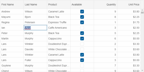
Multiple editing options are available. Users can edit by cell, by row or through a popup. Depending on the column type, the following editors are available: TextBox, DateTimePicker, NumberInput, ComboBox, DropDownList, CheckBox. Custom Editors can be easily applied, too.
Mobile optimized
The Blazor Grid is responsive and has a device-optimized look and behavior on PCs, tablets and mobile phones.
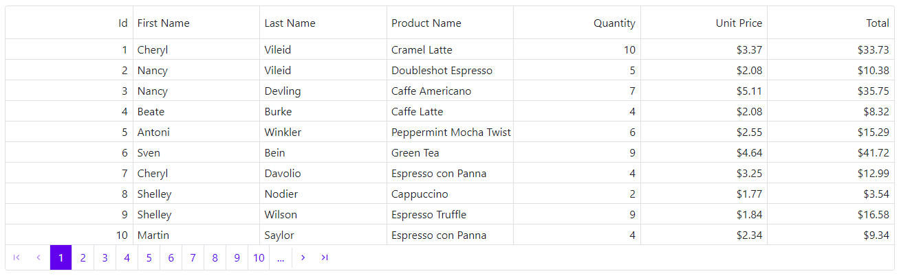
Paging
Paging allows you to display data sets in different pages. The paging feature is used for easier navigation and faster loading. Our Grid supports two built in paging layouts, but users may customize the rendereing through API, too.
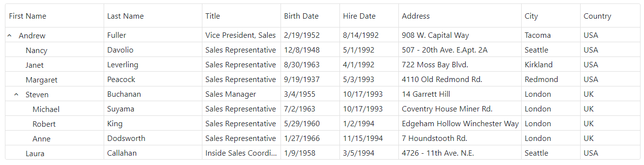
Tree Grid
Blazor Grid supports data rendering in a hierarchical-mode. The Tree Grid(popular also as Tree List) display mode is suitable display mode, when your data is hierarchical.
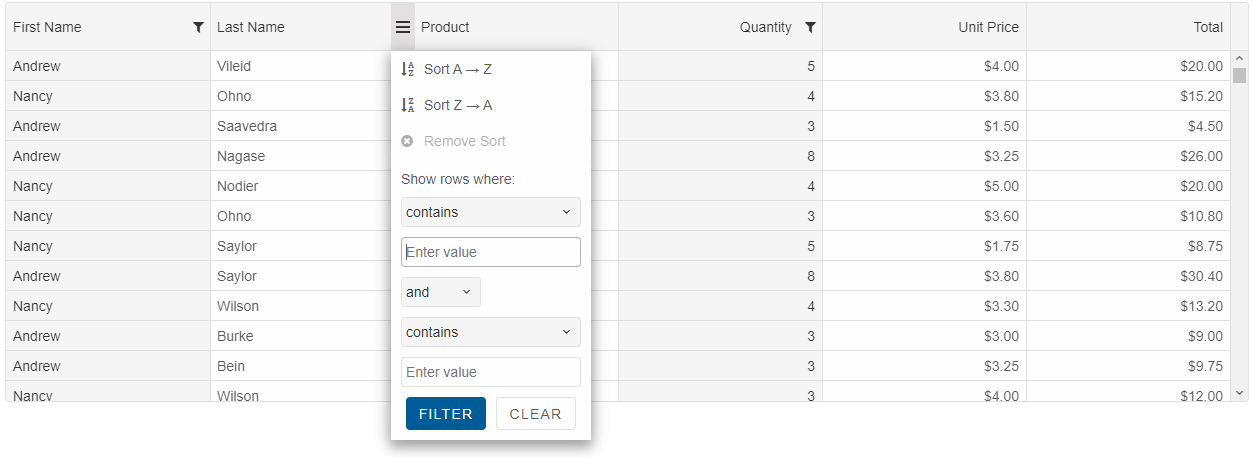
Filter & Sort
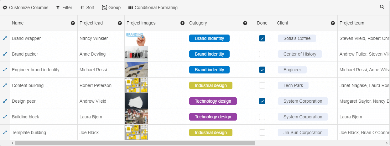
The Blazor Grid's filtering is with excel-like menus or a filter row. The Blazor Grid enables users to sort rows either in the ascending or descending order against a column by simply clicking the header. Sort by multiple columns is supported, too.
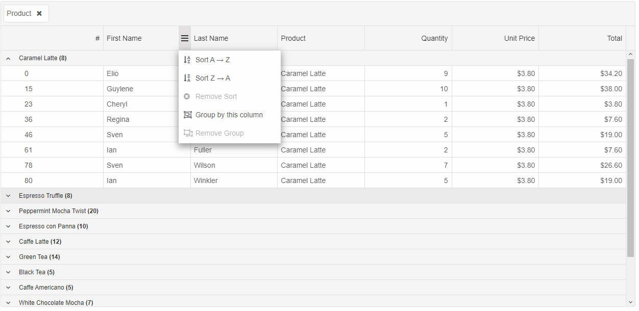
Grouping
The Blazor Grid supports row grouping to display data in a categorized way. Rows can be grouped by dragging and dropping columns in the grouping header area. You can configure whether the groups are expanded or collapsed by default and can choose from several rendering modes.
More features
Clipboard
You can copy the selected rows or cells data into the clipboard by using Ctrl+C key combination to copy data. You can also past data from the clipboard by using Ctrl+V key combination
Row Height
Row height can be customized based on the blazor application's requirements. It is also possible to set row height conditionally..
Themes
The UI Themes used in the Grid component follows the Google's Material Design best practises. You can choose from 7 built-in themes available in both Light & Dark modes
Globalization
Users from different locales can format numbers, dates, currency, etc. to suit their language preferences.
Localization
Each string used in the grid can be localized. That happens by using two properties - 'locale' and 'messages'. .
Right to left
Right-to-left rendering changes the rendering of texts, scrolling and columns layout in the Grid. This improves the UX for RTL languages.
Create a modern Blazor Application with Smart UI for Blazor
Includes all enterprise standards, such as accessibility, i18n, theming, rtl, localization, etc.
Outstanding Performance
Carefully optimized to deliver great performance on a wide range of devices and browsers. Small in size, highly modular and responsive Blazor Grid.
More about this
Across Devices & Browsers
The Blazor Grid is responsive and adjusts for the best user experience across devices. Implements Google's Material Design and Bootstrap.
More about this
Grid for other frameworks
-
 Angular Grid
-
 React Grid
-
 Javascript Grid
-
 Vue Grid
-
 Blazor Grid
The Grid is available in JavaScript, Angular, React, Blazor and Vue frameworks.
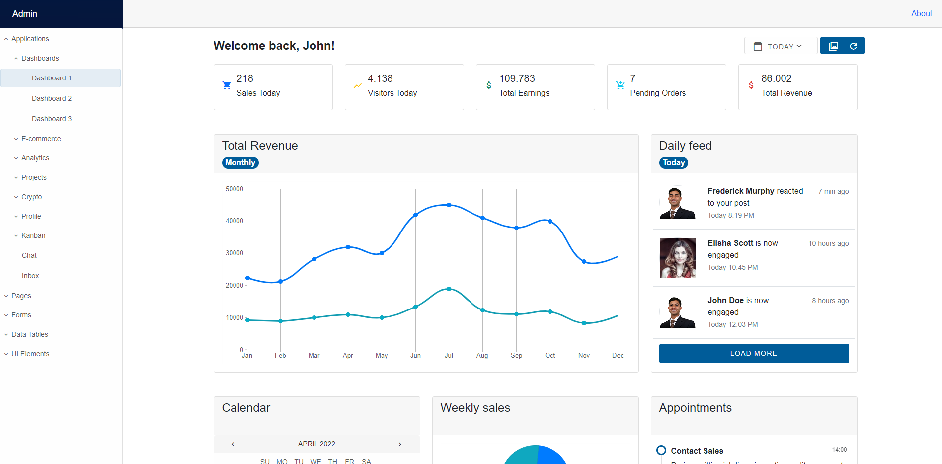
Look how our components can be transformed into modern and eye-catching apps
Admin Dashboard Blazor WebAssembly showcase demo. The demo shows Dashboards, Forms, Client Lists, User Profiles and more.
What customers say about us
-
National Instruments has partnered with JQWidgets Ltd. to bring HTMLElements to NI’s suite of engineering tools and development environments including LabVIEW NXG and SystemLink. Our goal has to bring the ubiquity and accessibility of the web to automated test and measurement applications. To do so we required a partner who could create fully featured controls that met the performance and UI requirements of demanding engineering applications. JQWidgets has built a technology stack with the flexibility to fit into multiple different applications frameworks and visual styles while also providing assurances of the long term sustainability by leverage the latest W3C Custom Element standard.
-
After more than thirty years as a software developer it is always a pleasant surprise to receive such thorough and efficient pre-sales support. Any questions I had were dealt with quickly and courteously and all issues resolved. I have examined the competition and have decided on jQWidgets due to the speed and elegance of the components, clarity and consistency of the API, adherence to standards, regular new feature releases and active support forum.
Frequently Asked Questions
Why should I choose Smart UI Blazor components?
- 70+ Blazor components including DataGrid, Gantt Chart, Scheduler, Rich-Text Editor.
- Supports both server-side and client-side (WebAssembly) applications.
- Smart UI Blazor component library NuGet packages are available in NuGet.org for easy development process.
- The UI components are touch friendly and render adaptively based on the device, providing an optimal user experience on desktops, phones and tablets.
How do I get started with the Smart UI Data Grid?
See the Getting Started documentation article and after that see the Grid setup article.
Can I try the Smart UI Blazor Grid?
Yes, you can try all Smart UI Blaxor Components by signing up for a 30-day trial with dedicated email support(support@jqwidgets.com).
Where can I find the Smart UI Blazor components demos?
You can find our Blazor component library's complete tutorial and showcase demos here.
Will the Smart UI Blazor Grid work for me, if I need a data table?
Yes, the Blazor Grid component is a feature-complete data table. You can use it in any scenario you need to display data in tabular format. Some of the popular features are paging, single or multi-column sorting, filtering, grouping, cell editing and multi-cell selection.
What is the price for the Smart UI Blazor Grid?
A single developer license costs $399.00 USD, including a bundle of products: all Smart UI and jQWidgets components for Blazor, Angular, React, VueJS and Web Components, one year of support and updates. We also offer discounts for volume licensing, academic pricing, and competitive upgrades. Please refer to our license page for more information on pricing.
Can I download and use the Smart UI Blazor components for free?
No, this is a commercial product and requires a paid license. However, a free community license including several components is also available. Learn more about it here