Guides
The designer
On this page · 20 sections
The designer is a page rendered by the same runtime that renders the app, with the design tools around it. What you see is what runs: the components are live, the tags flow, a request goes out and comes back, and the project's diagrams run against the panel while it is shown, as they do in the app. It has four views behind the tabs of its top bar: the Panel (this page), the Diagram - the two sides graphical dataflow has - the Alarms table, and the System view of the stations.
The layout
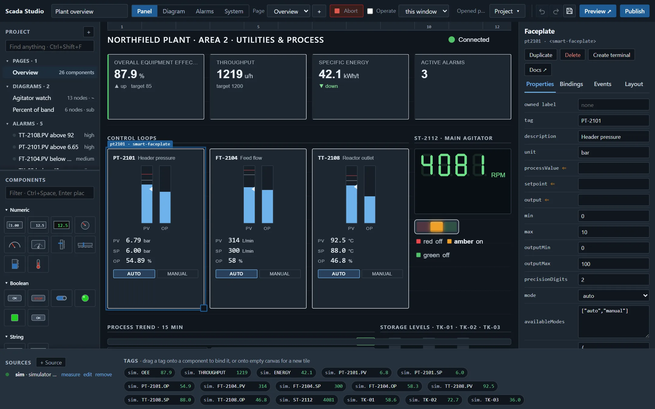
- Top bar: the project name; Panel, Diagram, Alarms or System; the page (or the diagram) and its +; Operate (or the run arrow and the lightbulb); the status; the Project menu - the language, the theme, the touch keyboard, the grid, the licence, a new project from a template, import, export and help; Undo, Redo, Save, Preview, Publish.
- Project (left, above): the pages, the diagrams, the alarms, the types and the sources of the project, with a search for anything in it - see below.
- Palette (left, below): the controls palette - a picture of every component, by group, with a filter. Click one to add it, or drag it where it should go.
- Canvas (middle): the page on its grid. A component is selected by a click, moved by dragging, resized by the handle at its corner, nudged with the arrow keys (Shift + arrows resizes). Shift-click adds a component to the selection and a drag on empty canvas selects an area; a selection moves together, is nudged, duplicated, copied and deleted together, and the inspector offers the alignment tools: left, centre and right edges, top, middle and bottom edges, distribute across and down, same width and height - all to the last component selected.
- Inspector (right): the selected component's Properties, Bindings, Events and Layout.
- Sources and tags (bottom): the data sources with their state, and every tag with its live value.
The controls palette and the Bench theme
The palette opens with the classic groups - Numeric (Numeric Control and Indicator, Digital Readout, Knob, Gauge, Meter, Vertical and Horizontal Slide, Tank, Thermometer), Boolean (Push Button, Stop Button, Toggle Switch, Round and Square LED, Momentary Button), String (String Control and Indicator), Graph (Waveform Chart with its y scale and time scale, Waveform Graph, Digital Waveform, Intensity Graph) and List & Table (Table, and the Drop-down: choices written Stop=0; Run=1; Auto=2, a native select so a panel PC opens its own picker, the choice shown as asked for until the tag confirms it) - each tile a preset: the element it is (the framework's gauge, tank, slider, buttons, numeric and text boxes, the studio's LED, or an industrial component - the Thermometer and the Meter are instruments of their own, not a tank and a gauge wearing different labels), the properties that make it that control, its size, and its owned label - the text a front panel writes above a control, which every component may have (the owned label field at the top of its properties). The graphical dataflow theme (Project › Theme) draws the panel as graphical dataflow tools do: the light grey panel with its alignment dots, plain labels, flat controls with grey borders and a blue accent, a Stop button with STOP in red, LEDs that light. A numeric control's arrows sit on the left, as graphical dataflow puts them.
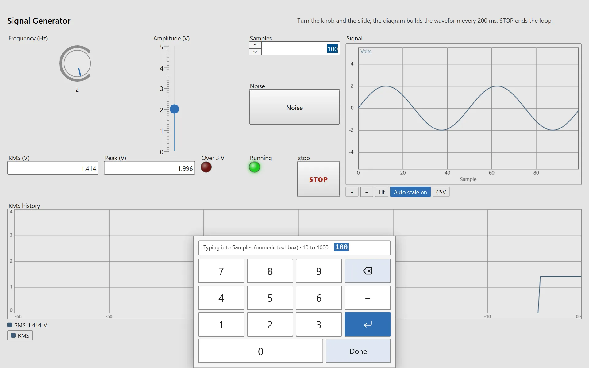
The Decorations group has the classic Raised Box, Recessed Frame and Flat Frame - a box drawn behind the controls placed over it, with a title if you give it one - to group a panel the way a classic front panel is grouped. The signal generator, the first project, is the classic first program on this palette: a knob and a slide, a numeric control, a toggle switch, a waveform graph fed by the diagram, indicators, two LEDs, a Stop button and a chart.
The panel and the diagram
A control placed on the panel is a terminal on the diagram the moment it is placed - as on a block diagram, where every control and indicator has one. A numeric control, a knob, a slide, a switch or a string gets a Panel value node the diagram reads; an indicator, a gauge, a tank, an LED, a chart or a graph gets a Panel indicator node the diagram sets; a button gets a Panel control node that fires on its click. The node goes to the diagram shown (or the project's first, or a new one), in the left column for controls and the right column for indicators, and is named by the control's owned label. Double-click a control on the panel and the designer switches to its terminal on the diagram, selected; double-click a terminal on the diagram (or Find control on the panel on its menu) and the designer switches to the control, on its page. The inspector's Find terminal button does the same, and reads Create terminal for a component that has none yet. A copy - Duplicate, or Ctrl+C and Ctrl+V - gets terminals like its original's, unwired. Deleting a control deletes its terminals with their wires (one undo brings both back). The run arrow on the Panel side is the app's: the diagrams of the app run while the panel is shown, Abort stops them all, Run starts them again; the Diagram side's arrow runs the diagram shown.
Components and properties
The palette holds the 54 Smart.Industrial components and three text blocks (heading, text, label). The inspector is generated from the components' metadata: every property with its type, its default and its allowed values, and its meaning on hover. A property that is a list of records - a trend's pens, a banner's alarms, a selector's states - is edited as a table: a column per field, a row per record, rows added and removed; as JSON swaps to the text editor for what a table cannot say. A property that is not set keeps the component's default, so a project only records what was changed.
Times in properties can be relative: "$now", "$now-3600000" or "$now+60000" anywhere in a component's properties is resolved when the property is applied, so a trend set to show the last hour shows the last hour whenever the page is opened.
Bindings
A binding makes a property follow a tag. Drag a tag from the bar onto a component and its main property (value, processValue, state…) is bound; drop a tag on empty canvas and a bound status tile is made. The Bindings tab binds any property to any tag and, under each, takes the options Connect knows: the tag's unit and the unit it is shown in (displayUnit), and a value map. A write from a control bound that way is converted back: a setpoint typed as 150 °F reaches a °C tag as 65.56 (65.5555…). Choosing another tag keeps the map, and keeps the units only when they are the new tag's too: re-pointed from a °C tag to a % tag, the binding takes the new tag's unit and drops a display unit it does not convert to, and says so. Charts take a feed instead: a stream of records with one field per tag, or a trend with live values and history. A comparison chart draws a bar per field fed to it; a field fed without a bar gets one, named after its tag.
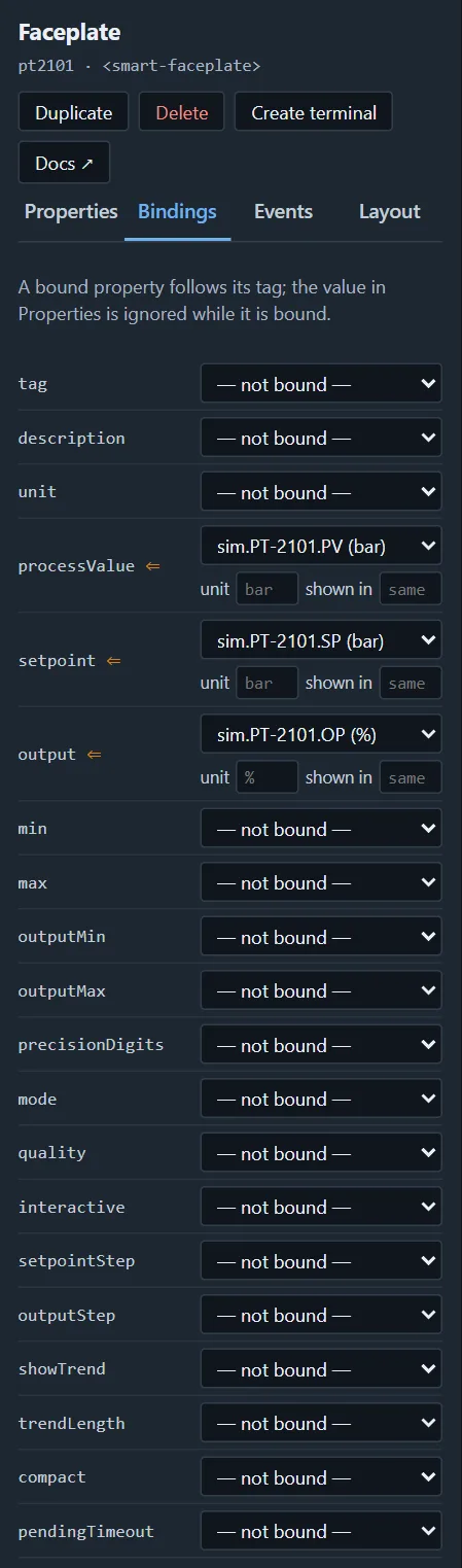
A binding can map a value to what the property is given, written in the project as JSON: { "tag": "sim.P-2101A.RUN", "map": { "true": "running", "false": "stopped" } } reads a pump's run bit as the word a device control shows. "*" catches whatever the map does not name; without it, such a value passes through unchanged.
Events
An interactive component does not change its own value: it raises a request (setpointChange, positionRequest, press…) and keeps showing the value it has. On the Events tab, write to sends the request's value to the tag bound to a property; the confirmed value comes back through the binding. A write can also name its tag outright, with a map for what is written - { "tag": "sim.P-2101A.CMD", "map": { "start": true, "stop": false } } - which is how a device control's Start and Stop reach a command bit; a device's command word counts as its value. A diagram listens to the same events through a Panel control terminal. Tick Operate in the top bar to operate the components on the canvas; otherwise the pointer designs, and a click on a button or a slide selects it without pressing or moving it.
What reaches the tag is what the operator asked for. A number typed is written as typed (in the unit shown, converted to the tag's); a number typed past the control's range is refused on a keyboard as on the touch keypad, and nothing is written; a control that is dragged - a slide, a knob - writes a multiple of its step, or of its interval when that is finer than a tenth of its range. A refused write puts the control back to the plant's value, and that is not written again. A value arriving while the operator types into a field waits until the field is left. When the plant's value is past a control's own range, the control is drawn at the end of its range with a dashed outline, so it is not read as the plant's value.
Requires an electronic signature, under a write, makes the write a signed one (21 CFR Part 11): when the operator changes the control, the signing panel opens with the record - the tag, the value now, the new value, the component - and asks for the user id and the password (verified at the tag's agent by a login, the second component), the meaning (approved, reviewed, verified, responsible, witnessed, authored; locked when you choose it here) and a reason when you require one. The write then goes to the agent with the signature, the agent checks that the session is the signer's, writes, and records both in its trail; the signer sees the manifestation. Only a tag of an agent can be written with a signature, and the agent must have users. The records statement of the validation pack says what a signature carries.
Pages, templates, grid, theme
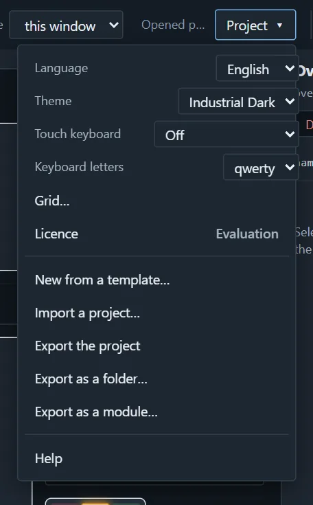
A project has any number of pages, each with its own components; the app shows them as tabs (hidden in kiosk mode). + next to the page adds a blank page or a copy of a page from the sample projects, with the sources and the flows it needs merged in. With nothing selected the inspector shows the page itself: its name, which the page list and the app's tabs use, and Delete page, which takes the page with its components (the diagrams keep their references; the Error list names any left dangling) - the last page stays. Under Project, Grid… sets the columns, the row height and the gap for the project (a page can have its own), and Theme is Bench (the grey front panel), Industrial, Industrial Dark or the default theme; the designer's own chrome follows. The theme is the project's ("theme": "industrial-dark" in the file), so the published app opens in it: the plant overview and five of the other samples are on Industrial Dark, the control-room look.
Touch keyboard gives the running app an on-screen keyboard, for a panel PC that has none: beside the field touched, or across the bottom of the screen, with the letters of Keyboard letters (qwerty, qwertz, azerty). A number field gets a keypad with its range; the value touched is typed over - the first key replaces it - and a number outside the range is refused with the reason instead of being written. Across the bottom, a dialog such as the sign-in moves up above the keys, and Enter in its last field signs in.
The project, the panel, the diagram and the system
The left pane holds the project: its pages, its diagrams, its alarms, its types and its sources, with what each one contains. A line opens what it names - a page on the panel, a diagram on the diagram, an alarm in its row of the table, a source in its dialog - and + adds a page, a diagram, a source or a type. Drag the divider under it to give the palette below more room.
Four views sit behind the tabs at the top left:
- Panel - the page and its components.
- Diagram - the diagrams of the project.
- Alarms - the alarm table: one condition on one tag per row, with its live state. See Alarms.
- System - the stations this project knows, the devices wired to each of them and the screens each one serves. Every station is asked directly (the same /api/status a watchdog reads), so what is shown is the station's own account of itself: each source with its state, its address and its tags with live values. A tag there is dragged onto the panel or the diagram like any other tag. A station the project does not use yet offers Add as a source, which puts it in the project so its tags can be bound. A station that does not answer within five seconds is shown as not answering rather than left loading, and one the project no longer needs is taken off the view with Remove - the station itself is not touched.
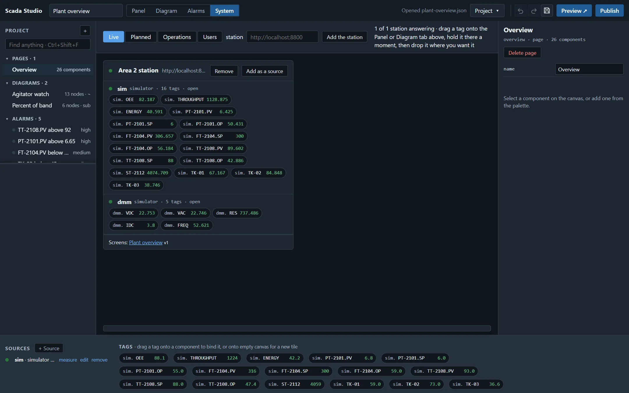
The System view has four tabs:
- Live - what the stations really have, now.
- Planned - the bench as it is meant to be. Plan a device takes one of the instruments the station knows (its templates, with their queries and units) or a plain source type, gives it the id and the address it will have, and puts it on the bench as a plan. Two things can then happen to it: Add to the station, when the device is wired and the address is right, or Simulate it there, which puts it on the station as a simulated source carrying the instrument's own tags - volts in volts, ohms in ohms - so the screens, the diagrams, the alarms and the logs can be built and watched today, and pointed at the real instrument when it arrives. The plan stays in the project file, so it is reviewed and versioned like everything else.
- Operations - what each station does on its own: the recipes an operator loads and the jobs the clock fires.
- Users - who may use each station: its users with their roles (view, operate, engineer), its tokens and its identity provider. An engineer of the station adds a user, changes a role, sets a password or removes one here, and the station takes it at once; the tab asks for an engineer's sign-in first. See security.
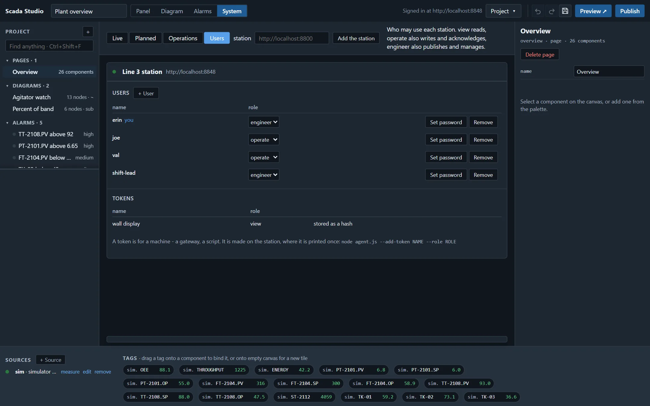
With no hardware at hand, node studio/bench/instruments.js gives a station real devices to find.
A page inside a page
A faceplate drawn once and used on every screen that needs it: the Page block (under Text and decorations) renders another page of the project inside its cell, with that page's bindings live. The loop detail then sits on the overview and on the loop's own screen without being drawn twice. A page cannot hold itself, nor one that already holds it; the cell says so rather than looping.
The canvas at the size of the screen
A designer window is not a wall display. The width beside Operate - this window, 1280, 1440, 1920, 2560 - lays the canvas out at exactly that many pixels and scales it to fit what is on hand, so a row of 40 pixels, a type size and a trend's gridlines land where they will land in the app. The choice belongs to the project, and dragging, resizing and the arrow keys work as they do at any other width.
Finding anything
The box at the top of the project pane (Ctrl+Shift+F) searches the whole project at once: controls by id, label, caption or the tag they are bound to; pages; diagrams; the nodes inside them, by name, type or what is configured on them; the tags a source carries; and the types. A line opens what it names - the control selected on its page, the node revealed on its diagram, the tag in the measurement panel.
Types: a record named once
A control loop reports a process value, a setpoint and a mode; a meter reports volts, amps and a range. Naming that record once, as a type, is better than typing its fields on every diagram that carries it. Project › + › Type (or a line in the Types group of the project pane) opens a type: a name, and its fields with their kind, unit and range.
A Bundle or an Unbundle can then follow a type instead of listing field names: its terminals become the type's fields, and when a field is added to the type, every node that follows it grows the terminal to match. Removing a type leaves the nodes with the names they had - nothing breaks silently.
Types travel in modules: a diagram packed with a module carries the types it follows, and one already in the receiving project with the same fields is used rather than duplicated.
Modules: taking a part of a project to the next one
Project › Export as a module… packs what is in hand - the diagram that is open, the controls that are selected, or the page otherwise - into a .studio-module.json file. A diagram brings the subdiagrams it calls; a page brings its controls with their bindings; the module also carries what it needs: the tags it reads and the components a diagram writes to.
Project › Import a project… takes a module as readily as a project. It shows what the module brings and, for each source its tags name, which source of this project should answer instead - so a diagram written against sim reads dmm here. Ids that would collide are given new ones and every reference inside the module is rewritten to them; anything that cannot be connected is said plainly rather than left to fail later.
This is how a second bench starts from the first one instead of from nothing.
Parts: the pieces a screen is built from
The palette's Parts groups are ready-made pieces of a screen - a control loop with its trend, a trend, a KPI tile, a digital readout, a temperature, a tank level, a pump, an on/off valve, a motor with its current, an andon station, a mode selector, energy by line, the station's recipes and jobs, its shift log, downtime reasons and production orders, a maintenance card, a site overview and a panel PC keyboard. Each is a module of controls whose configuration is the sample projects', proved against the simulator.
A part asks before it is placed: the tag it is for (with the project's tags offered as you type), the words it shows, a scale where it has one, and the source its tags are read from. It will not be placed with a blank in it. Dropped on the canvas it lands where it was let go; clicked, it goes below what is there and the canvas scrolls to it. Either way it arrives selected, to be moved as one. A pump reads <tag>.RUN and writes <tag>.CMD, a valve <tag>.OPEN and <tag>.CMD, a loop <tag>.PV, .SP and .OP - each part says which in its dialog - and every binding can be changed afterwards like any other.
The library is studio/library/parts.json, built by scripts/build-studio-library.js: a part is a module with parameters, written {{name}} in its tags and texts. A property that is one parameter and nothing else takes a number when it is given one.
Recipes and jobs on a screen
The Recipe panel and the Job panel show the station's own records rather than a tag: its recipe book and its scheduled jobs, read from the project's agent source (or the one named in the panel's station field when there are several) and read again every 30 seconds (the recipes) or 10 seconds (the jobs). Load, Run now and the job's switch go back to the station over its API with the viewer's session, so the station checks the role and records who did it; what comes back - a load that half-succeeded, a run that failed - is shown on the panel, with the station's reason. The buttons follow the role the station reports: a viewer sees every recipe and job and no button, an operator may load and run but not switch a job off, an engineer may do all three. A panel made view-only in the designer stays so for everyone.
Measuring a source before you build on it
Every source in the bar at the bottom has a measure link. It opens the source's tags with their live values, their units and how long ago each arrived; a value can be written to any tag the source takes a write for, and the value that comes back is the source's, not the one you typed. One tag at a time is drawn as a trace of the last minutes, and Add to the page puts a tile bound to it on the current page.
This is the first thing to do with a new instrument or a new PLC: prove the address, the scale and the unit here, where there is nothing else to be wrong, before a screen depends on them. With no hardware at all, the bench instruments give you a PLC and a supply to measure.
Sources
+ Source adds a simulator (signals described one per line: NAME min max [period ms] [unit] [kind], where the kind is sine, ramp, step, square, noise or constant, and period=, unit= and kind= may be written as pairs; a constant holds value=, or its min, the same in the designer and on a station), a WebSocket or SSE gateway, an HTTP endpoint polled on an interval (one tag per line, the rest of the line its unit: FLOW L / min), a manual source the application pushes to, or a Scada Studio agent with its tags fetched from it and, when the agent has auth, a token. A gateway or an endpoint needs its address (an agent's may be empty: the station the app is served from); changing a source to another kind asks first, as its tags go with the old one. edit and remove are next to each source; removing one says how many bindings, diagrams, alarms and controls that write its tags will stop.
A PLC or an instrument is not a source of the page but of the station: Modbus TCP and RTU, Siemens S7, EtherNet/IP, OPC UA, MQTT, HTTP, SCPI and VISA are the agent's, configured on it (the source reference has every type), and the page reads them all through one agent source - its tags arrive as agent.plc.TT-101.PV and so on.
Keys
| Key | Does |
|---|---|
| Delete, Backspace | Removes the selection |
| Arrows, Shift + arrows | Moves, resizes |
| Ctrl+D | Duplicates |
| Ctrl+C, Ctrl+V | Copies and pastes, also between projects and browsers |
| Ctrl+Z | Undoes (panel and diagram share one history). In a field still being typed in, the field's own undo; once the field has been left or committed, the project's |
| Ctrl+S | Saves in the browser - what is being typed in a field first, and in a dialog too |
| Ctrl+A | Selects every component of the page (every node of the diagram) |
| Ctrl+U | Cleans the diagram up: lays its nodes out by their wires |
| Ctrl+E | Switches between the panel and the diagram |
| Ctrl+H | Context help on the diagram: the node under the pointer, with its terminals |
| Ctrl+R, Ctrl+. | Runs the diagram here; aborts it |
| F8, F5 | Steps a paused diagram to the next node; continues to the next breakpoint (Alt+click sets one) |
| Ctrl+Shift+F | Finds anything in the project: a control, a page, a node, a tag, a type |
| Ctrl+Space | Quick Drop: the palette filter; Enter places the first match |
| Ctrl+F | Find on the diagram: a node by its name, type or settings; Enter next, Shift+Enter previous |
| Ctrl+Y, Ctrl+Shift+Z | Redoes what Ctrl+Z undid |
| Right-click | The shortcut menu: on a terminal (Create constant, control, indicator), a wire (Insert), a node (Replace, breakpoint), a frame (cases), the canvas (Paste) |
| Escape | Deselects |
A click on one component of a selection of several (not a drag) makes that one the selection. With Operate ticked, a control that has the focus keeps its keys: the arrows move a slider, not the component. The status line keeps a message - a refusal, what an import changed - for six seconds before Saved takes its place.
Where things are kept
The project is kept in the browser's storage as you work (Save, or automatically a moment after a change), and written out with Project › Export the project as one JSON document, or Export as a folder… as a zip with one file per page and per flow for a repository (see the project file). Import a project… takes either back - the folder zip as the designer wrote it, or as any other tool zipped the folder (stored or deflated, with or without the folder itself at the top).
Language
Project › Language switches the designer's chrome - menus, palette groups, the inspector, dialogs - to German, French, Spanish or Chinese, and the components on the canvas to the same language through the library's locale packs; ?lang=de in the address does the same, and the choice is remembered in this browser. The documentation and the node descriptions stay in English. A published app takes ?lang=de too, for its components' words. The licence and the agent token for publishing are kept in the browser, not in the project. Nothing leaves the machine unless you publish.