ComboBox Custom Element
In this blog we will introduce our Combobox custom element.
The ComboBox is one of the basic web components used widely in the UI part of applications in order to facilitate the selection of items. It represents a list of elements displayed in a drop-down and an input text field where information can be entered. The elements from the list can be selected. Also the user can search for a specific element. Combobox Custom Element FeaturesOur HTML Combobox Element supports multiple selection. With the MultiSelect option the user can select multiple elements from the drop down list. The selected elements will appear in the text input field. 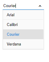
The Open direction of the list of elements can be above, below or centered. The web component enables also auto-complete. With the auto-complete option the element matching the text in the input filed will be shown on top. Checkbox on the left of the elements in the list is also supported. This facilitates the selection of multiple items. The elements in the drop down list can be aligned horizontally or vertically. The horizontal alignment can be left or right and the vertical top or bottom. In addition, the text and the back ground colors can be changed. You can see an example here.
This entry was posted in HTML Elements, Smart ComboBox, Web Components and tagged combobox, combobox custom element, combobox webcomponent, smart combobox, smart combobox element. Bookmark the permalink.
|
|