In this blog we are going introduce you to our CheckBox Custom Element.
The CheckBox Web Component is a kind of button which is usually used to enable the selection of different choices. It represents a box which can be checked, unchecked and undetermined. The different states can be changed by clicking with the mouse over the checkbox.
Checkbox Custom Element Features
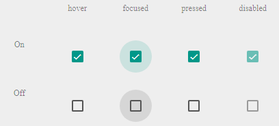
The CheckBox HTML tag supports four states: checked, unchecked, undetermined and disabled.
The CheckBox custom element comes with Light and Dark themes.
It also enables fluid design where the width can be set in percentages.
You can see an example
here.