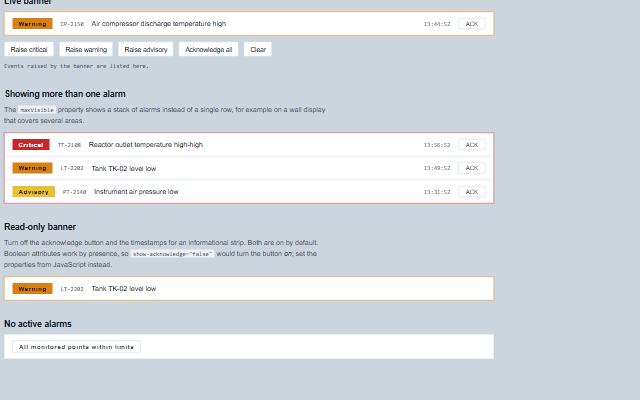
AlarmBanner shows the alarms an operator should deal with next.
From the alarm list it selects the alarms to display: active unacknowledged alarms first, then alarms that returned to normal before they were acknowledged, then acknowledged ones; within each, by priority, then severity, then the oldest. Shelved, suppressed and out-of-service alarms, and alarms that returned to normal and were acknowledged, are not shown (ISA-18.2). Priority 0 and 1 are critical, 2 warning, 3 and above advisory - the reading smart-hmi-shell and smart-alarm-grid use too - and an active unacknowledged critical alarm blinks until it is acknowledged. The component raises the acknowledge event and does not modify the alarm list itself.
English, German, French, Spanish, Chinese (locale packs)
In the demo: Live banner · Showing more than one alarm · Read-only banner · and more. Open the demo
Quick start
Install the package, load the two stylesheets and the component's module, and put the element on the page. The element below is the first one of the demo. Put the script after the module, in a <script type="module">, so that it runs once the component is defined.
The properties the demo sets, then the next ones; the API page lists all 6 with their types and defaults.
Name
Type, default
Description
alarms
array
Sets or retrieves the alarms. Each entry is an object with: id - the identifier of the alarm, returned in the events; tag - the instrument or point tag; message - the alarm text; priority - a number, or a number written as text, as in ISA-18.2: 0 and 1 critical, 2 warning, 3 and above advisory; severity - critical, warning or advisory (any case), which overrides the priority mapping and, for a record without a priority, sets its place in the order; timestamp - a Date, epoch milliseconds or a value Date can parse, shown as the time, or the date and time when it is not today; acknowledged - whether an operator has acknowledged the alarm; active - false once the condition has cleared (absent means active), so an unacknowledged alarm with active false is shown as returned to normal; shelvedUntil, suppressed, outOfService - an alarm shelved into the future, suppressed or out of service is not shown. Flags written as the text "false", "0", "no" or "off" are false. Assign a new array to update the component, or call redraw after modifying the array in place; an array that is deep-equal to the current one does not trigger a redraw.
showAcknowledge
boolean true
Sets or retrieves whether an acknowledge button is shown on unacknowledged alarms. The default is true. Boolean attributes are presence-based, so show-acknowledge="false" in markup enables the button; set the property from script to disable it.
showTimestamps
boolean true
Sets or retrieves whether the alarm timestamp is rendered. Same attribute caveat as showAcknowledge: set the property from script to turn it off.
acknowledgeLabel
string
Sets or retrieves the caption of the acknowledge button. It is empty by default, so the caption comes from the acknowledge message ("Ack" in English) and follows the locale. A value set here takes precedence over the message.
emptyMessage
string
Sets or retrieves the text shown when there are no alarms to display. It is empty by default, so the text comes from the empty message ("No active alarms" in English) and follows the locale. A value set here takes precedence over the message.
maxVisible
number 1
Sets or retrieves the number of alarms shown at once. One row is usual for an operator screen; a larger stack suits a wall display that covers several areas.
Events
The events carry their data in event.detail. acknowledge is a request: the alarm banner keeps alarms as they are until the application sets acknowledged on the alarm and hands the list back. alarmClick reports a click on an alarm row.
Event
Description and detail
acknowledge
This event is triggered when an operator acknowledges an alarm, either from its acknowledge button or through acknowledgeAll. One press raises one event: the repeats of a held Enter or Space are ignored, and the same alarm acknowledged again within 600 ms (a double click) is not raised twice.
alarmany The alarm being acknowledged.
alarmClick
This event is triggered when an alarm row is clicked anywhere other than its acknowledge button, typically used to open the alarm's detail.
alarmany The alarm that was clicked.
Methods
Method
Description
acknowledgeAll()
Raises the acknowledge event once for every unacknowledged alarm the banner would show, including alarms that returned to normal unacknowledged; shelved, suppressed and out-of-service alarms are left alone. Nothing is raised while the banner is disabled. The component does not change the alarms; the application applies the acknowledgements and returns an updated list.
visibleAlarms() returns any
Returns the alarms the banner is currently showing, in the order shown: active unacknowledged, returned to normal unacknowledged, acknowledged; then priority, severity and age.
In Angular, React, Vue and Blazor
The same element with its wrapper. Each page has the installation steps and the full demo in that framework.
The AlarmBanner keeps the alarm the operator should handle next in view and announces new alarms as they arrive. It is a live region with an acknowledge control per alarm, and a composite widget: the whole banner is one tab stop with arrow key navigation between alarms.
Roles: "log"
Key
Action
Tab
Moves into the banner, landing on the acknowledge button that currently holds the tab stop, and out again. The banner is one stop however many alarms are visible.
Arrow Left/Right
Moves between the acknowledge buttons of the visible alarms. Reversed when rightToLeft is set.
Home / End
Moves to the first / last acknowledge button.
Enter or Space
Acknowledges the alarm the focused button belongs to, raising acknowledge. The banner does not change the record itself, the application writes the acknowledgement back once its control system has confirmed it.
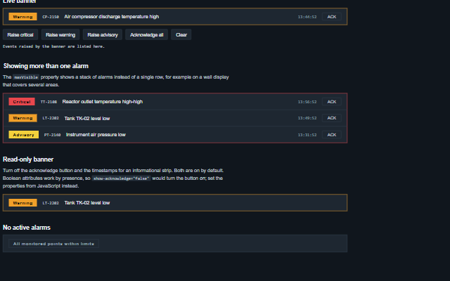
The component follows the theme on the page: the default theme, or the ISA-101 light and dark themes that ship with the package. It declares 2 CSS variables of its own, among them --smart-alarm-banner-blink-duration, --smart-alarm-banner-row-gap. The CSS page lists them; the themes guide covers the tokens every component shares.