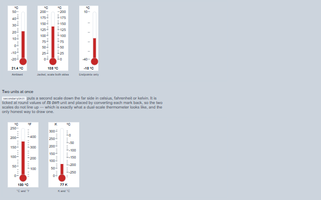
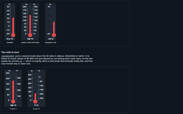
Thermometer shows a temperature as the instrument that measures it: a bulb that always holds the liquid, a capillary stem above it and a column standing at the reading.
It carries what a thermometer carries and a level indicator does not: a second scale in another temperature unit, ticked at round values of its own unit; the maximum and minimum reached since the memory was last reset; a setpoint marker; and alarm bands the column and the bulb can take their colour from. It extends the scale engine, so logarithmic scales, units, precision, inversion and reading quality behave as they do on the gauge, the slider and the knob. It does not clamp the reading: a value past either end of the scale pins the column at that end and shows OVER or UNDER on the bulb, and a value that is not a finite number, such as null or NaN, shows NO DATA on the bulb, with an empty stem. Everything is placed as a percentage of the stem, so the component needs no measurement and survives any resize, zoom or print.
English, German, French, Spanish, Chinese (locale packs)
In the demo: A reading, with the scale on both sides · Two units at once · Alarm bands, a setpoint and the max-min memory · and more. Open the demo
Quick start
Install the package, load the two stylesheets and the component's module, and put the element on the page. The element below is the first one of the demo, with interactive added: the component raises change only when interactive is set. Put the script after the module, in a <script type="module">, so that it runs once the component is defined.
const thermometer = document.getElementById('ambient');

// raised when the reading is changed through the component, which only happens when
// interactive is enabled
thermometer.addEventListener('change', (event) => {
    const { value } = event.detail;
    // ...
});

// the same values as properties
thermometer.precisionDigits = 1;
thermometer.label = 'Ambient';
thermometer.showValue = true;
The properties the demo sets, then the next ones; the API page lists all 43 with their types and defaults.
Name
Type, default
Description
bulb
boolean true
Draws the reservoir at the foot of the stem. Set it to false for an instrument drawn into a panel cut-out, where the bulb sits behind the fascia. Boolean attributes are presence-based, so bulb="false" in markup leaves the bulb on; set the property from script to turn it off.
label
string
The name of what is being measured. It is used as the accessible name of the component.
max
number | Date 100
Sets or gets the top of the scale. A reading above it is kept as written: the column stands at the top of the stem and OVER is shown on the bulb.
min
number | Date 0
Sets or gets the bottom of the scale. A reading below it is kept as written: the column stands at the foot of the stem and UNDER is shown on the bulb.
precisionDigits
number
Sets or gets how many digits are shown after the decimal point in the readout, the marker titles and the accessible text. null shows the reading as written, to at most twelve significant digits.
ranges
{startValue?: number | Date, endValue?: number | Date, className?: string}[]
Sets or gets the alarm bands, as objects with startValue, endValue and className; the stylesheet colours each band by its class. With showRanges the bands are painted along the stem behind the column, and colorByRange gives the column and the bulb the class of the band the reading is in.
setpoint
number
The temperature the process was asked for. null for an instrument that is only watching.
showRanges
boolean false
This property determines whether the gauge’s range indicators are displayed on the gauge component. When set to true, the range segments (such as colored bands or sections representing value intervals) will be visible on the gauge; when set to false, these range indicators will be hidden.
showValue
boolean false
Shows the digital reading below the instrument, at the precision set by precisionDigits, or -- when there is no reading.
value
string | number | date 0
Sets or retrieves the reading, as a number or a numeric string, in the unit of the scale. It is kept as written: a reading past min or max pins the column at that end and shows UNDER or OVER. A value that is not a finite number, such as null, NaN or an empty string, is shown as no reading: an empty stem, -- in the readout and NO DATA on the bulb. With coerce and customInterval, the reading is snapped to the interval.
The events carry their data in event.detail. The thermometer sets value as the operator drags or presses an arrow key, only while interactive is true and readonly is false, and then raises change. extremesReset follows a resetExtremes() call once both markers are back at the reading.
Event
Description and detail
change
This event is triggered when the reading is changed through the component, which only happens when interactive is enabled.
valuenumber The new reading.
extremesReset
This event is triggered when the maximum and minimum memory is reset.
valuenumber The reading both markers were set to.
Methods
Method
Description
resetExtremes()
Puts the maximum and minimum markers back on the current reading, as the pin on a max-min thermometer does. Raises the extremesReset event.
refresh()
Redraws the instrument.
In Angular, React, Vue and Blazor
The same element with its wrapper. Each page has the installation steps and the full demo in that framework.
A thermometer says everything it says by position: the height of a column against a scale. None of that is available to a screen reader, so the reading is carried by the value attributes, and everything else drawn on the stem is carried in words by aria-valuetext — the reading with its unit, whether it is off the scale, the same reading in the second unit when one is shown, the setpoint, and the highest and lowest of the max-min memory. A user who cannot see the instrument is told what a sighted user can see on it, and not less.
Roles: "meter""slider"
Key
Action
Tab
Moves focus to the instrument.
Up arrow, Right arrow
Raises the reading by one step: interval when customInterval is set, otherwise a hundredth of the scale.
The component follows the theme on the page: the default theme, or the ISA-101 light and dark themes that ship with the package. It declares 8 CSS variables of its own, among them --smart-thermometer-length, --smart-thermometer-stem-width, --smart-thermometer-bulb-size, --smart-thermometer-liquid. The CSS page lists them; the themes guide covers the tokens every component shares.
Engineering UnitsUnit conversion, resolution, unit systems and conversion through bindings.
ConnectivitySessions, adapters and bindings that route plant tags into components, with quality and staleness.
From a front panel to the browserEvery control and indicator of a test-and-measurement front panel mapped to a component, the mechanical actions, and where the data comes from.