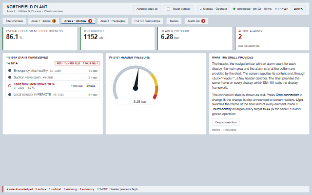
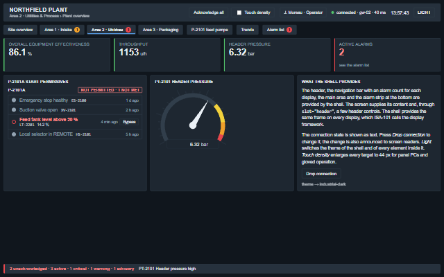
HmiShell is the display frame for operator screens described in ISA-101.
It provides a header with the plant, area and display name, the logged-on user, a clock and the data connection state; a navigation bar across the display hierarchy with the alarm count for each display; a main area for the screen content; and a footer with the alarm summary and the unacknowledged alarm that most needs attention. Content is placed in the main area - including content appended after the shell has started, so a screen can be swapped by removing one child and appending another - and elements with slot="header" or slot="footer" are placed in the header or footer. The clock and the navigation keep working when the shell is moved to another parent. The shell raises the navigate, alarmsClick, userClick and themeChange events, switches the theme for all elements inside it and supports a touch density.
Tag
<smart-hmi-shell>
Module
smart-industrial/source/modules/smart.hmishell.js
Angular
HmiShellModule from smart-industrial/angular/hmishell
English, German, French, Spanish, Chinese (locale packs)
In the demo: P-2101A start permissives · PT-2101 header pressure · What the shell provides. Open the demo
Quick start
Install the package, load the two stylesheets and the component's module, and put the element on the page. The element below is the first one of the demo. Put the script after the module, in a <script type="module">, so that it runs once the component is defined.
const hmiShell = document.getElementById('shell');

// raised when a display is selected in the navigation bar
hmiShell.addEventListener('navigate', (event) => {
    const { id, item, index } = event.detail;
    // the component waits: carry out the request, then set the property from the result
});

// the same values as properties
hmiShell.plant = 'Northfield plant';
hmiShell.area = 'Area 2 · Utilities & Process';
hmiShell.screen = 'Plant overview';
hmiShell.user = 'J. Moreau';
The properties the demo sets, then the next ones; the API page lists all 17 with their types and defaults.
Name
Type, default
Description
plant
string
Sets or retrieves the plant or site name, the header's first line.
area
string
Sets or retrieves the area, the first step of the breadcrumb under the plant name.
screen
string
Sets or retrieves the name of the screen, shown as the last step of the breadcrumb and included in the accessible name of the shell.
user
string
Sets or retrieves who is logged on. Shown as a button in the header that raises userClick, for a application's log-off or e-signature dialog. Empty hides it.
userRole
string
Sets or retrieves the role of the user, shown next to the name. The property is not named role because role is the ARIA attribute of the component.
connection
string unknown
Sets or retrieves the data connection state, using the state words reported by a Smart.Industrial.Connect session, plus unknown for a screen without a session. The state is shown as a word with an indicator dot and exposed as a live status; a lost connection is announced assertively.
connectionDetail
string
Sets or retrieves extra text beside the connection word, the gateway's name, a latency.
navigation
array
Sets or retrieves the displays as [{ id, label, level, active, alarms, disabled }]. level is the ISA-101 display level (1 to 4) and indents the item. alarms is a number or { critical, warning, advisory }; the badge shows the highest non-zero priority with its count, and the priority word is included in the accessible name of the item. A plain number is treated as critical. Pressing an item raises the navigate event; the application changes the screen.
alarms
array
Sets or retrieves the alarms the footer summarises, in the shape AlarmBanner takes: [{ id, tag, message, priority, severity, timestamp, acknowledged, active, shelvedUntil, suppressed, outOfService }], read as ISA-18.2 reads an alarm list. Priority 0 and 1 are critical, 2 warning, 3 and above advisory - a number written as text counts as the number, and a severity (critical, warning, advisory) given on a record wins over its priority. The footer counts the active alarms by priority; counts as unacknowledged both active unacknowledged alarms and alarms that returned to normal before anybody acknowledged them; names the most urgent unacknowledged alarm (by priority, then the newest); and takes its colour from the worst alarm that is active or still unacknowledged. Shelved, suppressed and out-of-service alarms are not active and never named as needing attention; they are counted separately ('2 shelved'). A record without active is active. It acknowledges nothing.
showThemeToggle
boolean false
Determines whether the header offers a switch between lightTheme and darkTheme.
density
string normal
Sets or retrieves the target density. touch makes every target in the shell at least 44 px and the header taller, for panel PCs and gloved operation; normal is the desktop density. The value is reflected to an attribute used by the stylesheet.
The events carry their data in event.detail. navigate is a request: the HMI shell keeps screen and the active item in navigation until the application changes them. themeChange follows a theme the shell has already applied, and alarmsClick and userClick report clicks on the alarm strip and the user area.
Event
Description and detail
navigate
This event is triggered when a display is selected in the navigation bar. The application changes the screen. A held Enter raises it once.
idstring The display's id. itemobject The navigation item as the application supplied it. indexnumber Its position in the list.
alarmsClick
This event is triggered when the alarm strip is pressed - with the mouse, or with Enter or Space, since the strip is a button in the tab order - so that the application can open the alarm list. A control placed in the footer slot by the application does not raise this event.
alarmsany[] A copy of the alarm list.
userClick
This event is triggered when the user button is pressed, for a application's log-off or e-signature dialog.
userstring Who is logged on. rolestring Their role.
themeChange
This event is triggered when the theme is switched through the toggle or setTheme, after every element inside the shell has been switched with it.
themestring The theme now in force. previousThemestring The theme before.
Methods
Method
Description
setTheme(theme)
Sets the theme on the shell and on every element inside it that has a theme, so the whole screen switches at once, and raises the themeChange event.
isDark() returns boolean
Returns whether the current theme is the dark theme: the darkTheme, or any theme whose name ends in -dark.
In Angular, React, Vue and Blazor
The same element with its wrapper. Each page has the installation steps and the full demo in that framework.
The HmiShell is the frame around an operator screen and is built from landmarks: a banner, a navigation, a main and a contentinfo region, each with a name, so a screen reader user can move between the header, the display navigation, the screen content and the alarm strip. The connection state is a status region with the state in words. The navigation bar is a composite widget with one tab stop and arrow key navigation, and the alarm count of every display is part of its accessible name, including the priority word, in addition to the colour of the badge.
Moves through the header controls, into the navigation bar landing on the display that holds the tab stop, then into the screen's own content. The navigation bar is one stop however many displays there are.
Arrow Left/Right
Moves between the displays in the navigation bar.
Home / End
Moves to the first / last display.
Enter or Space
On a display, raises navigate; the application changes the screen. On the user button, raises userClick. On the theme toggle, switches the theme of the shell and everything inside it.
The component follows the theme on the page: the default theme, or the ISA-101 light and dark themes that ship with the package. It declares 7 CSS variables of its own, among them --smart-hmi-shell-height, --smart-hmi-shell-gap, --smart-hmi-shell-header-height, --smart-hmi-shell-target. The CSS page lists them; the themes guide covers the tokens every component shares.