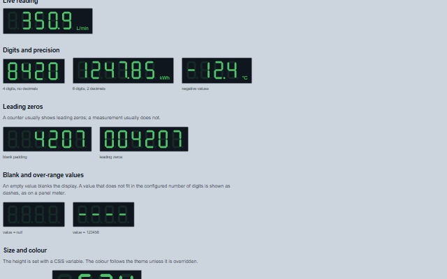
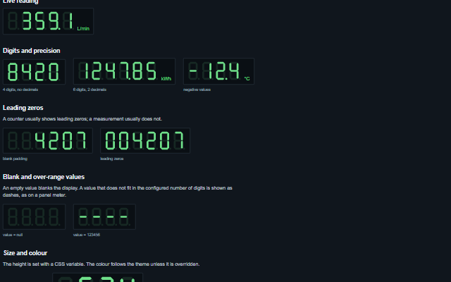
SevenSegment is a numeric display in the style of a seven-segment LED readout, for panel meters, totalizers and counters.
It is rendered as SVG, so it scales to any size, and takes its colours from the theme. Unlit segments are drawn faintly. A value that does not fit in the configured digits lights the top bar of every digit, or the bottom bar when it is negative, and NaN or an infinity shows dashes.
English, German, French, Spanish, Chinese (locale packs)
In the demo: Live reading · Digits and precision · Leading zeros · and more. Open the demo
Quick start
Install the package, load the two stylesheets and the component's module, and put the element on the page. The element below is the first one of the demo. Put the script after the module, in a <script type="module">, so that it runs once the component is defined.
The properties the demo sets, then the next ones; the API page lists all 7 with their types and defaults.
Name
Type, default
Description
digits
number 4
Sets or retrieves how many digit positions are shown. A minus sign occupies a position, as it does on a real panel meter. The component draws 1 to 32 positions; a value outside that range is held to it, a value that is not a number draws 4, and either case writes a console warning.
precisionDigits
number 0
Sets or retrieves the number of decimal places. The decimal point is drawn on the digit preceding the fraction and does not consume a digit position.
unit
string
Sets or retrieves the engineering unit rendered beside the digits.
value
number | null
Sets or retrieves the displayed value: a number or a decimal string. Null, an empty string, other text and values of other types blank the display. NaN or an infinity shows dashes, the readout of a meter with no signal.
color
string
Sets or retrieves an explicit CSS colour for the segments, overriding the theme. The component applies it as the --smart-seven-segment-color variable in its own inline style and rewrites that variable at every redraw, so set the colour through this property or in a stylesheet rule.
leadingZeros
boolean false
Sets or retrieves whether unused leading digits are padded with zeros instead of left blank. A counter usually shows leading zeros; a measurement usually does not.
showOffSegments
boolean true
Sets or retrieves whether unlit segments are drawn faintly. The default is true. Boolean attributes are presence-based, so show-off-segments="false" in markup enables the option; set the property from script to disable it.
Methods
Method
Description
displayText() returns string
Returns the characters currently shown, one per digit position: blanks for padding or no value, '-' in every position for NaN or an infinity, '‾' in every position over range and '_' in every position under range. The decimal point is not part of this string.
In Angular, React, Vue and Blazor
The same element with its wrapper. Each page has the installation steps and the full demo in that framework.
The SevenSegment is a panel meter readout drawn as lit and unlit SVG segments, which have no meaning to a screen reader. The component exposes the number the segments display, not the segments themselves.
The component follows the theme on the page: the default theme, or the ISA-101 light and dark themes that ship with the package. It declares 6 CSS variables of its own, among them --smart-seven-segment-color, --smart-seven-segment-off-opacity, --smart-seven-segment-background, --smart-seven-segment-height. The CSS page lists them; the themes guide covers the tokens every component shares.
Engineering UnitsUnit conversion, resolution, unit systems and conversion through bindings.
ConnectivitySessions, adapters and bindings that route plant tags into components, with quality and staleness.
From a front panel to the browserEvery control and indicator of a test-and-measurement front panel mapped to a component, the mechanical actions, and where the data comes from.