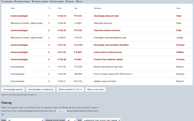
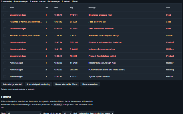
It extends Table, so sorting, filtering, virtualization, column resizing and reordering, state persistence and export are inherited. Each alarm is placed in one of seven states from its condition and the operator actions, including the returned-to-normal-unacknowledged state for alarms that cleared before they were acknowledged. The priority cell carries a marker that tells priorities apart by shape as well as colour - a square for 1 (and 0), a triangle for 2, a diamond for 3, a ring for 4 and above - drawn in its priority colour only while the alarm is abnormal (ISA-101); unacknowledged rows take the text colour of their priority. Below 820 px the default columns take compact widths and the state wraps, so the message keeps its width. A new outstanding alarm is announced to assistive technology - assertively for priority 1 - with the number of new ones. Acknowledging an alarm raises an event; the alarm record is updated by the application.
English, German, French, Spanish, Chinese, except the built-in table controls (filter, row selection, pager), which stay in English (locale packs)
In the demo: A live summary · Filtering · The states. Open the demo
Quick start
Install the package, load the two stylesheets and the component's module, and put the element on the page. The element below is the first one of the demo. Put the script after the module, in a <script type="module">, so that it runs once the component is defined.
The properties the demo sets, then the next ones; the API page lists all 7 with their types and defaults.
Name
Type, default
Description
alarms
array
Sets or retrieves the alarm records as [{ id, tag, area, message, priority, active, acknowledged, shelvedUntil, suppressed, outOfService, timestamp }]. Only id is required. The alarm state is derived from the record, so the application updates active and acknowledged and the summary derives the state. timestamp and shelvedUntil may be epoch milliseconds, a Date or ISO 8601 text; priority may be a number or a number written as text. Flags written as the text "false", "0", "no" or "off" are false. A shelved alarm returns by itself when shelvedUntil passes - the grid sets a timer for the nearest expiry, cleared when it leaves the page. Entries that are not objects are ignored. Assign a new array to update the component; an array modified in place is deep-equal to the current one and does not trigger a redraw. When the update keeps the same alarms in the same order, the rows are patched in place, so the keyboard stays where it was; otherwise the table is rebuilt and the keyboard returns to the same alarm.
defaultSort
string priority-then-time
Sets or retrieves the order rows are presented in.
filters
object
Sets or retrieves which alarms are shown, as { state, priority, area, tag }. state is one state name or an array of names; priority is the largest priority number to include, so 2 shows priorities 1 and 2; area is matched exactly; tag is matched as a case-insensitive substring. Filters change the rows but not counts(), which still returns the totals for the whole alarm list.
showCounts
boolean true
Sets or retrieves whether the counts strip is shown above the rows: the number of alarms in each state for the whole list, not the filtered view - unacknowledged always, and the returned-to-normal, acknowledged, shelved, suppressed and out-of-service counts when there are any. With no alarms it shows the empty message. The same numbers are returned by counts().
shelveDuration
number 1800000
Sets or retrieves the default duration in milliseconds for which shelve shelves an alarm. A shelved alarm returns by itself when its shelvedUntil passes, without an update from the application.
showStateColumn
boolean true
Sets or retrieves whether the derived state has its own column. The property is read when the default columns are built, so set it before the component is initialized.
timestampFormat
string time
Sets or retrieves how the alarm time is written.
Events
The events carry their data in event.detail. acknowledge, shelve, unshelve, suppress and outOfService are requests: the alarm grid keeps the record in alarms as it is until the application writes the result back. stateChange follows each of them at once and carries the action with the state the alarm still has.
Event
Description and detail
acknowledge
This event is triggered when acknowledge or acknowledgeAll is called. The grid has no acknowledge control of its own, so the application provides the button that calls them. The record is not changed: handle this event and write the acknowledgement back through the alarms property once the control system has confirmed it.
idstring | number The alarm's id. alarmobject The alarm record.
outOfService
This event is triggered when an alarm is taken out of or put back into service.
idstring | number The alarm's id. outOfServiceboolean The requested state.
shelve
This event is triggered when an alarm is shelved.
idstring | number The alarm's id. shelvedUntilnumber When the shelf expires, as a timestamp. durationnumber How long the shelf is, in milliseconds.
stateChange
This event is triggered together with the event of acknowledge, shelve, unshelve, suppress and outOfService, so that an application can log these actions in one handler. acknowledgeAll raises only acknowledge events.
idstring | number The alarm's id. actionstring Which action was taken. statestring The alarm's state at the time of the action. alarmobject The alarm whose state changed.
suppress
This event is triggered when an alarm is suppressed by design.
idstring | number The alarm's id. suppressedboolean The requested state.
unshelve
This event is triggered when an alarm is taken back off the shelf.
idstring | number The alarm's id.
Methods
Method
Description
acknowledge(id)
Reports that an alarm was acknowledged. Raises the event and does not change the record; the application writes the acknowledgement to the control system.
acknowledgeAll()
Reports every outstanding alarm as acknowledged, with one event per alarm. Only the two unacknowledged states are outstanding; shelved, suppressed and out-of-service alarms are not affected.
alarmById(id) returns object
Returns the alarm record with the given id. Look up alarms by id rather than by row index, because the grid is sorted and filtered and a row index changes when either changes.
selectedAlarms() returns object[]
Returns the alarm records whose rows are selected (with selection on). Use it rather than getSelection(), which returns the table's own row keys, not the alarm ids: pass each record's id to acknowledge() or shelve().
counts() returns object
Returns the number of alarms in each state, before filtering, plus outstanding and total. The counts describe the whole alarm list, not the current view.
outOfService(id, outOfService?)
Reports that an alarm should be taken out of service or returned to service. Out of service is a maintenance decision and takes precedence over every other state.
shelve(id, duration?)
Reports that an alarm should be shelved until a given time. Shelving is an operator decision with an expiry; suppression is a design decision without one.
suppress(id, suppressed?)
Reports that an alarm should be suppressed by design, for a plant state in which it is not meaningful.
unshelve(id)
Reports that a shelved alarm should be returned before its shelf expires.
In Angular, React, Vue and Blazor
The same element with its wrapper. Each page has the installation steps and the full demo in that framework.
The AlarmGrid is an ISA-18.2 alarm summary built on the Table component. It renders a table element with the grid role, and the alarm rows take one tab stop with arrow key navigation between them. The state of every alarm is available as text and not only as a colour.
Roles: "grid""presentation"
Key
Action
Tab
Moves into the alarm rows and out again. The rows take one tab stop.
Arrow Up/Down
Moves between alarm rows. Past the last row the focus goes to the first, and the reverse.
Home / End
Moves to the first / last row.
Page Up / Page Down
Moves the focus ten rows up / down, stopping at the first / last row.
Enter or Space
Selects the focused row, or clears it if it is selected, while selection is on. It goes through the Table's own selection, so it raises the Table's change event.
The component follows the theme on the page: the default theme, or the ISA-101 light and dark themes that ship with the package. It declares 2 CSS variables of its own, among them --smart-alarm-grid-height, --smart-table-cell-padding. The CSS page lists them; the themes guide covers the tokens every component shares.