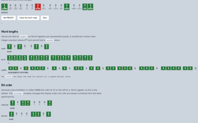
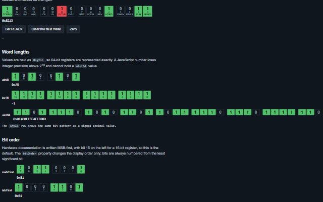
BitField displays a fixed-width register as individual bits with names, keeping the word value and the bits in sync.
It supports named and reserved bits, MSB-first or LSB-first order, and word widths up to 64 bits. Values are held as BigInt, so 64-bit registers are represented exactly. A register wider than its panel wraps whole groups onto further rows. Only an interactive register's bits are buttons; a read-only one shows them as images named with their state, with no tab stop.
Tag
<smart-bit-field>
Module
smart-industrial/source/modules/smart.bitfield.js
Angular
BitFieldModule from smart-industrial/angular/bitfield
English, German, French, Spanish, Chinese (locale packs)
In the demo: A named status register · Word lengths · Bit order. Open the demo
Quick start
Install the package, load the two stylesheets and the component's module, and put the element on the page. The element below is the first one of the demo. Put the script after the module, in a <script type="module">, so that it runs once the component is defined.
const bitField = document.getElementById('status');

// raised when the word changes through the component, a click, the keyboard, setBit or
// mask
bitField.addEventListener('change', (event) => {
    const { value, oldValue, bit } = event.detail;
    // ...
});

// the same values as properties
bitField.interactive = true;
The properties the demo sets, then the next ones; the API page lists all 8 with their types and defaults.
Name
Type, default
Description
bits
array
Sets or retrieves the register map, as [{ index, label, description, readOnly, color }]. index counts from the least significant bit. A bit marked readOnly refuses to change, a register map is a contract, and a UI that lets an operator flip a reserved bit is lying about the hardware. An entry that is not an object is skipped.
interactive
boolean false
Sets or retrieves whether the bits can be toggled by click or keyboard. The property is named for the enabled state because boolean attributes are presence-based, and a property that defaulted to true could not be turned off from markup. When false the bits are not buttons and not in the tab order.
radixDisplay
string hex
Sets or retrieves how the word value is written beneath the bits.
showIndices
boolean true
Sets or retrieves whether each bit shows its number. Boolean attributes are presence-based, so set the property from script to turn it off.
value
string | null 0
Sets or retrieves the word. Accepts a number, a BigInt, a boolean, or a string with an optional sign and 0x, 0b or 0o prefix (-0x1 is minus one; 1e3 is 1000); a negative value is treated as two's complement. The value is read back as a decimal string - signed for a signed word length, so an int16 at all ones reads -1 - because a 64-bit value cannot be represented exactly as a number. A value wider than the word length is masked, and one that cannot be read becomes 0: whatever was assigned, the property reads back in this form.
wordLength
string uint16
Sets or retrieves the register width and signedness. Signedness shows only in the decimal readout: the same bit pattern is 65535 as a uint16 and -1 as an int16.
bitOrder
string msbFirst
Sets or retrieves the display order of the bits. It affects the display only; bits are always numbered from the least significant bit, so bit 3 is the same bit in both orders.
groupSize
number 4
Sets or gets the number of bits grouped together visually. Groups are counted from the least significant end, so nibble boundaries line up with the hexadecimal digits underneath. 0 removes the grouping.
Events
The events carry their data in event.detail. The bit field toggles a bit in value when the operator clicks it, only while interactive is true, and then raises change; setBit() and mask() do the same. A bit marked readOnly in bits stays as it is.
Event
Description and detail
change
This event is triggered when the word changes through the component, a click, the keyboard, setBit or mask. Assigning the value property directly does not raise it.
valuestring The new word, as a decimal string. oldValuestring The previous word. bitnumber Which bit changed, or null when a mask changed several at once.
Methods
Method
Description
bit(index) returns boolean
Returns the value of one bit. The index counts from the least significant bit regardless of the bitOrder property.
mask(mask, on?)
Sets or clears every bit that is set in the mask, as a "clear faults" command does. A bit marked readOnly in the register map is not changed, and bits beyond the word length are ignored.
setBit(index, on?)
Sets, clears or toggles one bit. A bit marked readOnly in the register map is not changed.
In Angular, React, Vue and Blazor
The same element with its wrapper. Each page has the installation steps and the full demo in that framework.
The BitField shows a hardware register as its individual bits. It is a composite widget: a 16-bit or 64-bit register is one tab stop with arrow key navigation between the bits, not one tab stop per bit. Every bit announces its number, its name where the register map provides one, and its state, because a lit or unlit block conveys nothing to a screen reader.
Roles: "group"
Key
Action
Tab
Moves into the register, landing on the bit that holds the tab stop, and out again. One stop for the whole word.
Arrow Left/Right
Moves between bits, in display order. Reversed when rightToLeft is set.
Home / End
Moves to the first / last bit as displayed.
Enter or Space
Toggles the focused bit, when interactive is set. A bit marked readOnly in the register map does not change.
The component follows the theme on the page: the default theme, or the ISA-101 light and dark themes that ship with the package. It declares 5 CSS variables of its own, among them --smart-bit-size, --smart-bit-off-color, --smart-bit-on-color, --smart-bit-gap. The CSS page lists them; the themes guide covers the tokens every component shares.
Engineering UnitsUnit conversion, resolution, unit systems and conversion through bindings.
ConnectivitySessions, adapters and bindings that route plant tags into components, with quality and staleness.
From a front panel to the browserEvery control and indicator of a test-and-measurement front panel mapped to a component, the mechanical actions, and where the data comes from.