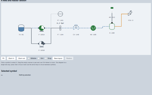
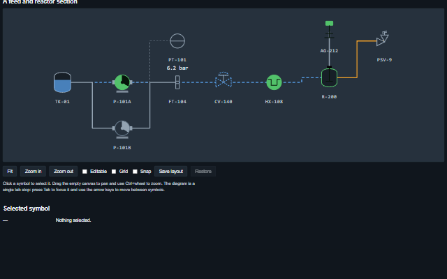
Equipment is placed on the canvas as MimicSymbol elements, connected with orthogonal routed lines, and the diagram can be panned and zoomed. Each symbol keeps its tag, state and reading and reports its own clicks. The layout of the diagram can be saved and restored. The canvas is one tab stop - the current symbol - arrowed between symbols; the viewport itself is not a tab stop. A disabled diagram raises no events and does not pan or zoom.
English, German, French, Spanish, Chinese, except the symbol type in the spoken name, which is its identifier (for example reliefValve) (locale packs)
In the demo: A feed and reactor section · Selected symbol. Open the demo
Quick start
Install the package, load the two stylesheets and the component's module, and put the element on the page. The element below is the first one of the demo, with editable added: the component raises layoutChange only when editable is set. Put the script after the module, in a <script type="module">, so that it runs once the component is defined.
const mimic = document.getElementById('plant');

// raised when a symbol has been dragged to a new position
mimic.addEventListener('layoutChange', (event) => {
    const { id, layout } = event.detail;
    // ...
});

// example values
mimic.editable = true;
mimic.gridSize = 10;
mimic.maxZoom = 8;
The properties the demo sets, then the next ones; the API page lists all 13 with their types and defaults.
Name
Type, default
Description
connections
array
Sets or retrieves the connections between symbols as [{ from, to, flowing, reverse, className, waypoints }]. from and to are symbol ids. A connection that names a symbol which is not on the diagram is skipped. waypoints overrides the automatic orthogonal routing.
editable
boolean false
Sets or retrieves whether symbols can be dragged to new positions. Panning and zooming work either way.
showGrid
boolean false
Sets or retrieves whether a background grid is drawn. The grid scales with the zoom, so it moves with the diagram.
snapToGrid
boolean false
Sets or retrieves whether dragged symbols snap to the grid.
symbolSize
number 56
Sets or gets the default size of a symbol in pixels. A symbol can override it with its own size.
symbols
array
Sets or retrieves the equipment on the diagram as [{ id, symbol, x, y, label, state, quality, value, rotate, level, size, stubs }]. Positions are numbers in stage coordinates, so a layout can be serialised. The symbol elements are updated rather than rebuilt when the property changes, and only what changed is written - a reading that moved patches that symbol's text, and the connections are redrawn only when a symbol moves - so keyboard focus and the selection are kept and a large diagram stays responsive. A number given as value is shown as text; a null entry is skipped. Assign a new array to update the component.
gridSize
number 20
Sets or gets the spacing of the background grid and the step used when snapToGrid is enabled.
maxZoom
number 4
Sets or gets the maximum zoom of the viewport. The zoom is clamped when it is assigned.
minZoom
number 0.25
Sets or gets the minimum zoom of the viewport.
panX
number 0
Sets or gets the horizontal pan of the stage in pixels.
The events carry their data in event.detail. The mimic sets selection and then raises selectionChange, and while editable is true it moves a dragged symbol in symbols and then raises layoutChange. symbolClick reports the symbol that was clicked or activated.
Event
Description and detail
layoutChange
This event is triggered when a symbol has been dragged to a new position. Handle it to persist the layout.
idstring | number The symbol that moved. layoutobject The whole layout after the move.
selectionChange
This event is triggered when the selected symbol changes.
idstring | number The newly selected id, or null. symbolobject Its specification.
symbolClick
This event is triggered when a symbol is chosen, by pointer or keyboard, typically used to open its detail.
idstring | number The symbol id. symbolobject Its specification.
Methods
Method
Description
fit(padding?)
Fits the whole diagram into the viewport, so an operator who has zoomed into a unit can return to the plant view with one action.
layout(value?) returns object
Gets or sets the whole diagram (symbols, connections and viewport) as a plain object. Call the method without an argument to read the layout, or pass a saved layout to restore it. Returns copies, so a saved layout is not affected by later edits. Can be combined with the autoSaveState property of DockingLayout for the panels around the diagram.
select(id)
Selects a symbol by id, or clears the selection with null. Raises selectionChange only when the selection actually changes.
symbolAt(x, y) returns object
Returns the symbol at a point in stage coordinates, or null. When two symbols overlap, the topmost one is returned, as for a click.
zoomAt(x, y, factor)
Zooms around a point in the viewport. Zooming around the pointer keeps the point under the pointer in place, which is the expected behaviour of wheel zoom.
zoomBy(factor)
Zooms around the centre of the viewport.
In Angular, React, Vue and Blazor
The same element with its wrapper. Each page has the installation steps and the full demo in that framework.
A process diagram is difficult to make accessible because much of its meaning is spatial. The Mimic makes every piece of equipment reachable and describable: the canvas is a single tab stop, the arrow keys move between symbols, and each symbol carries its tag, state and reading as text.
Roles: "group"
Key
Action
Tab
Moves into the diagram, landing on the symbol that holds the tab stop, and out again. One stop however many items are on it.
Arrow keys
Move between symbols in document order. Reversed horizontally when rightToLeft is set.
Home / End
Move to the first / last symbol.
Enter or Space
Selects the focused symbol and raises symbolClick - the same event a pointer click raises, so a keyboard user reaches the detail view by the same path.
Ctrl or Cmd + wheel
Zooms about the pointer. A plain wheel is left to the page, because a mimic usually sits on a scrolling screen and hijacking the wheel outright means the page cannot be scrolled past the diagram.
The component follows the theme on the page: the default theme, or the ISA-101 light and dark themes that ship with the package. It declares 5 CSS variables of its own, among them --smart-mimic-height, --smart-mimic-canvas-background, --smart-mimic-grid-size, --smart-mimic-grid-color. The CSS page lists them; the themes guide covers the tokens every component shares.