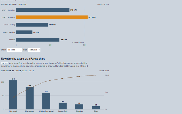
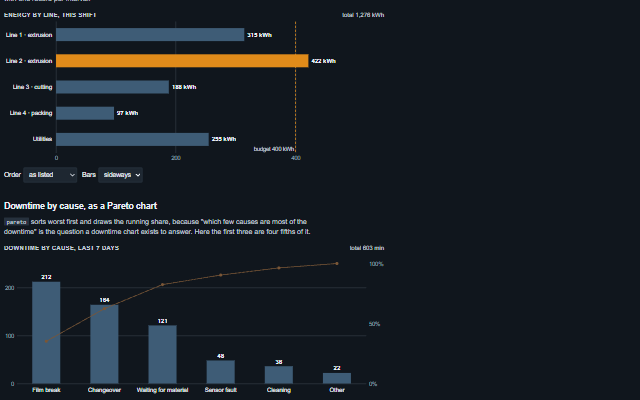
ComparisonChart puts like values side by side - energy per line, output per shift, downtime per cause, the share of each product in a day - and answers which is the biggest, and by how much.
Bars by default, horizontal so the names read without tilting a head, or vertical; sorted when asked, or as a Pareto chart with the running share. A limit draws a line and marks the bars past it, and nothing else is coloured. A donut shows shares of one whole with the total in the hole, folding the smallest items into one "other" slice. Values arrive through push(record), which is what Connect.stream() calls, so each bar can follow its own tag. Every figure is also in a table a screen reader reads.
English, German, French, Spanish, Chinese (locale packs)
In the demo: Energy by line, against a budget · Downtime by cause, as a Pareto chart · Shares of one whole. Open the demo
Quick start
Install the package, load the two stylesheets and the component's module, and put the element on the page. The element below is the first one of the demo. Put the script after the module, in a <script type="module">, so that it runs once the component is defined.
const comparisonChart = document.getElementById('energy');

// the same values as properties
comparisonChart.label = 'Energy by line, this shift';
comparisonChart.unit = 'kWh';
comparisonChart.limitLabel = 'budget 400 kWh';
The properties the demo sets, then the next ones; the API page lists all 14 with their types and defaults.
Name
Type, default
Description
items
array
Sets or retrieves the items, as [{ field, label, value, unit, color }]. field is the key push() and Connect.stream() fill; label is what the bar is called; unit and color override the chart's for one item. An item without a value is listed as unknown rather than drawn as zero. Assign a new array to update the component.
orientation
string horizontal
Sets or retrieves which way the bars run. Horizontal reads long names without tilting them; vertical suits a few items and a Pareto chart's running share.
sort
string none
Sets or retrieves the order of the bars: as listed, largest first or smallest first. An item without a value goes last either way.
limit
number?
Sets or retrieves a value the bars are held against - a budget, a target - drawn as a dashed line. A bar past it takes the warning colour and its row in the table says so. Empty for none.
limitLabel
string
Sets or retrieves the name written at the limit line. Empty writes the limit's value.
unit
string
Sets or retrieves the unit written after every value and the total.
label
string
Sets or retrieves the heading of the chart. It is also the caption of the table a screen reader reads.
kind
string bars
Sets or retrieves how the items are drawn: as bars, or as a donut of shares of one whole with the total in the hole. A value below zero has no share of a whole, so while any value is negative the items are drawn as bars, no shares are given in the table, and the total line says so.
pareto
boolean false
Sets or retrieves whether the chart is a Pareto chart: largest first, with the running share of the total - a line over upright bars, a figure beside sideways ones - so the few items that make up most of the whole stand out. With a value below zero there is no running share, and the line or figure is left out.
min
number 0
Sets or retrieves the bottom of the scale. A value below it is not clipped: the scale extends down to a round number under the smallest value, and a negative bar runs from zero the other way.
Takes a record of values by field and shows them: chart.push({ line2: 421 }). It is what Connect.stream() calls with one record per interval, so each bar can follow its own tag. Fields the chart has no item for are ignored; an item the record does not name keeps its value.
clear()
Empties every value and keeps the items.
describe() returns string
Returns what the chart shows as one sentence: how many items, the highest and its value, the total and how many are past the limit. It is the accessible name of the chart.
In Angular, React, Vue and Blazor
The same element with its wrapper. Each page has the installation steps and the full demo in that framework.
The ComparisonChart is never only a picture. The drawing is hidden from assistive technology, and every figure it shows is also in a table beside it - off the screen, not out of the page - with a caption, a row per item, its value, its share of the total and, on a Pareto chart, the running share. A bar past the limit says so in words in its row, since a colour is not something a screen reader reports. The chart as a whole is named by one sentence: how many items, the highest and its value, the total, and how many are past the limit.
The component follows the theme on the page: the default theme, or the ISA-101 light and dark themes that ship with the package. It declares 3 CSS variables of its own, among them --smart-comparison-chart-height, --smart-comparison-chart-grid-color, --smart-comparison-chart-mono. The CSS page lists them; the themes guide covers the tokens every component shares.