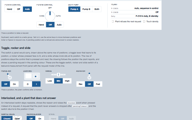
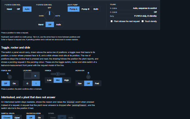
SelectorSwitch is a switch with a set of named positions, such as a Hand-Off-Auto selector, a duty/standby selector or a local/remote switch.
The positions can be displayed as a row of segments or as a rotary knob. The current position is set by the application through the value property; pressing another position raises the positionRequest event and shows the position as pending until the application updates the value or pendingTimeout elapses. The confirm property requires a second press, and an interlocked switch shows the reason and raises the blocked event. Arrow keys move between positions and Enter or Space requests the focused one.
English, German, French, Spanish, Chinese, except the hint after a request times out, which stays in English (locale packs)
In the demo: A pump control station · Toggle, rocker and slide · Interlocked, and a plant that does not answer. Open the demo
Quick start
Install the package, load the two stylesheets and the component's module, and put the element on the page. The element below is the first one of the demo. Put the script after the module, in a <script type="module">, so that it runs once the component is defined.
const selectorSwitch = document.getElementById('segmented');

// raised when a position is requested
selectorSwitch.addEventListener('positionRequest', (event) => {
    const { position, from } = event.detail;
    // the component waits: carry out the request, then set the property from the result
});

// the same values as properties
selectorSwitch.label = 'P-2101A control';
selectorSwitch.value = 'auto';
The properties the demo sets, then the next ones; the API page lists all 11 with their types and defaults.
Name
Type, default
Description
positions
array
Sets or retrieves the positions, as [{ id, label, description }]. Empty shows Hand. Off. Auto, localized.
value
string
Sets or retrieves the id of the current position, as reported by the plant. Setting it clears a pending request, whether or not it is the requested position, and raises the change event.
label
string
Sets or retrieves the name of the device the switch controls, shown above the positions and used in the accessible name.
density
string normal
Sets or retrieves the target size. touch makes each position 52px high for a gloved hand.
appearance
string segmented
Sets or retrieves how the positions are drawn: a joined row of segments; a knob with a pointer over the segments; or, above the segments, the switch a panel would carry: a toggle lever that leans to its position, a rocker whose pressed face is lit, or a slide whose knob sits at its position. The segments stay the part that is pressed and read. While a request is pending the pointer, lever, lamp or knob shows it halfway or in the pending colour.
confirm
boolean false
Determines whether a position has to be pressed twice to request it. The first press arms the position and shows it as armed; a press on a different position arms that one instead. The second press has to be a separate decision: the second click of a double-click, a press within 300 ms of the first and the repeat of a held key do not send the request. The second press has to be a second decision: the second click of a double-click or a double tap, a press within 300 ms of the first and a held key do not confirm.
confirmTimeout
number 5000
Sets or retrieves how long an armed position waits for its second press, in milliseconds.
pendingTimeout
number 10000
Sets or retrieves how long a request stays shown as pending before it is dropped as unanswered, in milliseconds. When it runs out the switch raises requestTimeout and says under the switch that the plant did not confirm the position.
interlocked
boolean false
Determines whether the switch is interlocked. An interlocked switch stays readable, shows interlockReason, drops any pending request, and raises blocked instead of positionRequest.
interlockReason
string
Sets or retrieves why the switch will not act, shown under it while interlocked and read out when pressed.
The events carry their data in event.detail. positionRequest is a request: the selector switch shows the position as pending and keeps value until the application sets it, and clears the pending mark without an event after pendingTimeout. With confirm true a second press within confirmTimeout sends the request, change reports a new value from the application, and blocked reports a press refused while interlocked is true.
Event
Description and detail
positionRequest
This event is triggered when a position is requested. The application writes it to the plant and reports the answer through value.
positionstring The id of the position requested. fromstring The id of the position in force.
requestTimeout
This event is triggered when a requested position was not confirmed by the plant within pendingTimeout. The request is dropped and the switch says so.
positionstring The id of the position that was requested. valuestring The id of the position the plant still reports.
change
This event is triggered when value changes, when the plant reports a position.
valuestring The id of the position now in force. previousValuestring The id of the position before.
blocked
This event is triggered when an interlocked switch is pressed. Nothing is requested.
positionstring The id of the position that was pressed. reasonstring The interlockReason.
Methods
Method
Description
request(id) returns boolean
Requests a position, as a press does. With confirm enabled, the first call arms the position and a second call within confirmTimeout sends the request. The value does not change until the application reports the new position. One request per intent: the position in force and the position already requested and not yet answered are not requested again, and false is returned. Nothing is requested while the switch is disabled, read-only or interlocked.
pending() returns string
Returns the id of the requested position not yet confirmed by the plant, or null.
In Angular, React, Vue and Blazor
The same element with its wrapper. Each page has the installation steps and the full demo in that framework.
The SelectorSwitch is a radio group whose radio buttons are buttons: one tab stop, the arrow keys move between positions, and Enter or Space requests a position. The checked radio is the position in force, as reported by the plant, not the position that was pressed; a requested position is named "requested" until the plant confirms it, and the group name states the position in force. Moving between positions with the arrow keys does not request any of them.
Roles: "group""radiogroup""radio""status"
Key
Action
Tab
Moves onto the position in force, and off the switch. The switch is one stop.
Arrow Right / Arrow Down
Moves focus to the next position, wrapping. Nothing is requested.
Arrow Left / Arrow Up
Moves focus to the previous position, wrapping. Nothing is requested.
Home / End
Moves focus to the first / last position.
Enter / Space
Requests the focused position, raising positionRequest. With confirm on, the first press arms it and the second sends it; a second press within 300 ms of the first does not count. A held key requests once. The focus stays on the position.
The component follows the theme on the page: the default theme, or the ISA-101 light and dark themes that ship with the package. It declares 7 CSS variables of its own, among them --smart-selector-size, --smart-selector-background, --smart-selector-border, --smart-selector-selected. The CSS page lists them; the themes guide covers the tokens every component shares.
Engineering UnitsUnit conversion, resolution, unit systems and conversion through bindings.
ConnectivitySessions, adapters and bindings that route plant tags into components, with quality and staleness.
From a front panel to the browserEvery control and indicator of a test-and-measurement front panel mapped to a component, the mechanical actions, and where the data comes from.