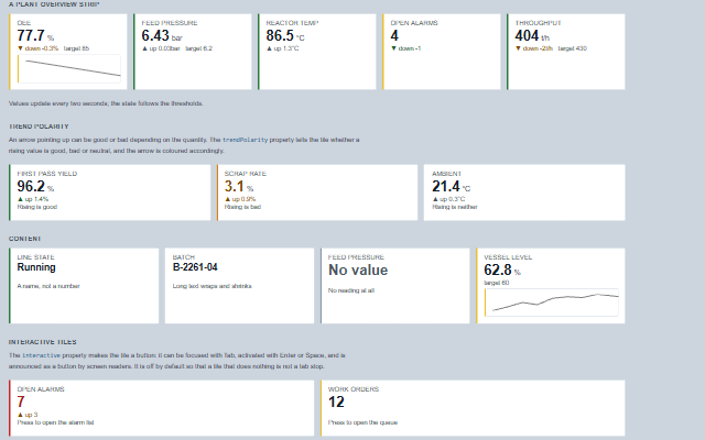
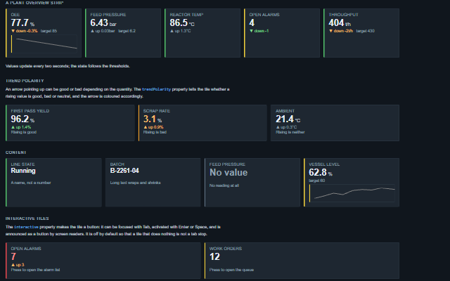
StatusTile displays one process value with its label, unit, state and trend direction, for status walls and plant overview screens.
The state (ok, advisory, warning, critical or unknown) sets the colour of the tile and is included in the accessible name, so it is available to screen readers as well as visually. The value is formatted with precisionDigits.
English, German, French, Spanish, Chinese (locale packs)
In the demo: Status tile · A plant overview strip · Trend polarity · and more. Open the demo
Quick start
Install the package, load the two stylesheets and the component's module, and put the element on the page. The element below is the first one of the demo. Put the script after the module, in a <script type="module">, so that it runs once the component is defined.
The properties the demo sets, then the next ones; the API page lists all 14 with their types and defaults.
Name
Type, default
Description
label
string
Sets or gets the name of the reading, shown above the value, for example 'OEE', 'Feed pressure' or 'Open alarms'.
value
number | null
Sets or gets the reading. The value is not limited to numbers: 'PASS', 'Running' or a batch identifier are valid readings, and a tile holding text is sized so that the text fits. A reading that failed - NaN or an infinity, as a number or as the text 'NaN' or 'Infinity', or an object when no formatFunction is set - is shown as -- and read out as no reading, never as the words NaN, Infinity or [object Object].
unit
string
Sets or gets the engineering unit, shown next to the value and included in the accessible name.
state
string neutral
Sets or gets the state of the reading. The state is drawn as a marker along the leading edge rather than as a fill across the tile, so that a wall of tiles stays readable and colour is used only where it has a meaning. The static stateFor method derives the state from thresholds.
trend
string none
Sets or gets the direction of the reading. The direction is written as a word in addition to the arrow, because an arrow glyph is not read correctly by screen readers.
trendValue
number | null
Sets or gets the amount by which the reading changed, shown next to the direction with the unit after a space, for example "down 0.06 bar". Optional; an amount that is NaN, an infinity or an object is left out and only the direction is shown.
trendPolarity
string neutral
Sets or gets which direction is good: a rising yield and a rising scrap rate have the same arrow and opposite meanings. Without this property the tile can show a direction but not judge it. Use neutral for a reading that is neither, such as an ambient temperature.
target
number | null
Sets or gets the target value of the reading, shown next to the trend. A target that is NaN, an infinity or an object is not shown.
footnote
string
Sets or gets a short line under the reading, for example the source, the time window or what pressing the tile does.
precisionDigits
number
Sets or gets the number of decimal places of a numeric reading. Values outside 0 to 20 are held to that range. Ignored when formatFunction is set and when the value is text.
sparkline
array
Sets or retrieves recent history for a small chart under the reading, as an array of numbers. The series is scaled before it is drawn; the sparkline shows the shape of the history and the value of the tile shows the magnitude.
The events carry their data in event.detail. activate reports a press on the status tile, fires only while interactive is true and changes nothing. stateChange reports a new state from the application.
Event
Description and detail
activate
This event is triggered when an interactive tile is pressed with the pointer or with Enter or Space. It is not raised when interactive is off.
labelstring The tile's label. valueany The reading. statestring The tile's state.
stateChange
This event is triggered when the state changes. The event detail contains the new state and the previous state.
statestring The new state. oldStatestring The state before.
Methods
Method
Description
static stateFor(value, thresholds) returns string on the class: customElements.get('smart-status-tile').stateFor(…)
Maps a reading to a state against a set of thresholds, so a screen can classify a value without a tile. Available as a static method and on the element. The thresholds are given as an object with advisory, warning and critical members and an optional direction: 'above' (the default) when a higher reading is worse, or 'below' for readings such as capability indices and yields where a lower reading is worse. The reading must be a finite number or a decimal string: null, an empty or blank string, NaN, an infinity, true or a hex string such as '0x1F' returns 'unknown', as does a missing thresholds object.
In Angular, React, Vue and Blazor
The same element with its wrapper. Each page has the installation steps and the full demo in that framework.
A status tile shows four things: what the value is, its reading, whether the reading is normal, and its trend direction. The StatusTile includes the state in its accessible name as a word, so an operator who cannot distinguish amber from red still reads "Warning".
Roles: "group""button"
Key
Action
Tab
Moves focus to the tile, and away from it.
Enter
Raises the activate event.
Space
Raises the activate event. The page is prevented from scrolling.
The component follows the theme on the page: the default theme, or the ISA-101 light and dark themes that ship with the package. It declares 6 CSS variables of its own, among them --smart-status-tile-value-size, --smart-status-tile-label-size, --smart-status-tile-meta-size, --smart-status-tile-marker-width. The CSS page lists them; the themes guide covers the tokens every component shares.