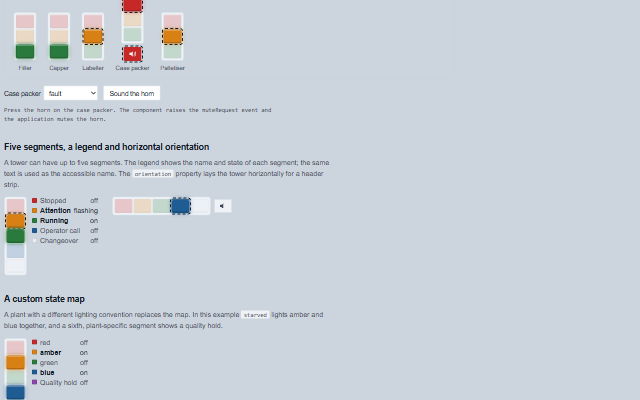
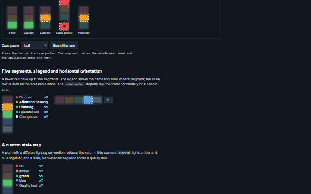
StackLight displays the tower light of a machine as a column of coloured segments that can be off, on, flashing or flashing fast, with an optional horn.
The segments can be set individually or derived from a state word such as running, starved or fault through the stateMap property. The default map follows the common production floor convention and the PackML vocabulary. Pressing the horn raises the muteRequest event for the application to handle. The describe() method returns the current state of the light as text and is used as the accessible name.
English, German, French, Spanish, Chinese (locale packs)
In the demo: A packaging line · Five segments, a legend and horizontal orientation · A custom state map. Open the demo
Quick start
Install the package, load the two stylesheets and the component's module, and put the element on the page. The element below is the first one of the demo. Put the script after the module, in a <script type="module">, so that it runs once the component is defined.
const stackLight = document.getElementById('filler');

// raised when the horn is pressed while it is sounding
stackLight.addEventListener('muteRequest', (event) => {
    const { label } = event.detail;
    // the component waits: carry out the request, then set the property from the result
});

// the same values as properties
stackLight.label = 'Filler';
stackLight.state = 'running';
The properties the demo sets, then the next ones; the API page lists all 9 with their types and defaults.
Name
Type, default
Description
label
string
Sets or gets the station or machine the light belongs to, the first words of its accessible name.
segments
array
Sets or gets the segments from top to bottom as { id, color, label, state }. color is one of red, amber, green, blue and white, or any CSS colour; state is off, on, flash or fast. A segment given as a string is a colour whose id and label are that word. When empty, a red, amber and green tower is shown.
state
string
Sets or gets a state word known to the stateMap (running, ready, warning, starved, blocked, stopped, fault, call, maintenance, changeover or off), which lights the segments through the map. The word is matched as written, then trimmed and without regard to case, so Fault and FAULT light the red segment. When empty, the segments are driven directly by their own state. The default map lights the blue segment for call and maintenance and the white segment for changeover, which the default three-segment tower does not have; a state the tower cannot show, and a word the map does not know, are said under the tower and in its accessible name rather than shown as a dark tower, and warned about once in the console. Give segments a blue and a white segment to show them.
stateMap
object?
Sets or gets the map from a state word to the segments it lights, for example { running: { green: 'on' }, fault: { red: 'fast' } }. A segment not named in an entry is off. null uses the default production floor convention: running lights green, ready flashes green, warning lights amber, starved and blocked flash amber, stopped lights red, fault flashes red fast, call lights blue, maintenance flashes blue, changeover lights white and off lights nothing. A state word the map does not contain lights nothing.
horn
string off
Sets or gets the horn state: off, on or muted. The horn is shown while it is on or muted. Pressing it while it is on raises the muteRequest event; the application responds by setting the horn to muted.
orientation
string vertical
Sets or gets whether the tower stands or lies: vertical, red at the top, or horizontal, red on the left.
showLabels
boolean false
Sets or gets whether a legend beside the tower names each segment and says whether it is off, on or flashing.
flashRate
number 800
Sets or gets the duration of one flash in milliseconds. A fast segment flashes at half this duration. The shortest rate used is 667 ms, so that the fast flash stays at or below three flashes a second (WCAG 2.3.1); a smaller value is raised to it, with one console warning. The component writes the value to the --smart-stack-flash-rate variable on itself at every redraw, so set this property rather than the variable.
announceChanges
boolean false
Sets or gets whether every change of the light's description is announced through the live region. Off by default, because an andon board contains many lights and a screen reader user reads the one they open.
Events
The events carry their data in event.detail. muteRequest is a request: the stack light raises it when the operator presses the horn while horn is on, and keeps horn at on until the application sets it to muted. stateChange reports a new state from the application, and segmentClick reports a click on a segment.
Event
Description and detail
stateChange
This event is triggered when the state word changes.
statestring The new state word. oldStatestring The previous state word.
segmentClick
This event is triggered when a segment is clicked. While anything listens for it, the segments are keyboard buttons - one tab stop, the arrow keys along the tower, Enter or Space to press - and the tower is a group; with no listener it is an image. It is not raised while the light is disabled.
idstring The segment's id. statestring Its state: off, on, flash or fast.
muteRequest
This event is triggered when the horn is pressed while it is sounding. The application silences the horn and sets the horn property to muted. It is raised once per sounding: a second press before the application answers with a new horn value, or within five seconds, asks nothing. It is not raised while the light is disabled.
labelstring The light's label.
Methods
Method
Description
segmentState(id) returns string
Returns the state of one segment, off, on, flash or fast, or null for an id the tower does not have.
activeSegments() returns any[]
Returns the segments that are lit, top first, as drawn: { id, color, label, state }.
describe() returns string
Returns the current state of the light as text, which is also the text given to assistive technology: the lit segments and their states, the horn and the state word.
unshown() returns object
Returns what the state word asks for that the tower cannot show - { state, unknown: true } for a word the map does not know, { state, missing } for one whose lit segments the tower does not have - or null when the tower shows it.
In Angular, React, Vue and Blazor
The same element with its wrapper. Each page has the installation steps and the full demo in that framework.
A stack light communicates by colour, which is not available to a screen reader, so the tower is exposed as an image whose accessible name describes it in words, for example "Case packer: red flashing fast, horn sounding, fault". The name is built from the lit segments, their states, the horn and the state word, and is updated on every change. The same text is returned by describe(), so an application can show it in its own status line. When the horn is on or muted it is a button: pressing it raises muteRequest, and its pressed state indicates whether the application has muted it. The optional legend repeats the label and state of each segment as text.
Roles: "img"
Key
Action
Tab
Moves to the horn button when the horn is on or muted. A tower with no horn has no tab stop: it is an image.
Enter or Space
On the horn while it sounds, raises muteRequest. The light does not silence the horn itself; the application answers by setting horn to muted.
The component follows the theme on the page: the default theme, or the ISA-101 light and dark themes that ship with the package. It declares 12 CSS variables of its own, among them --smart-stack-segment-width, --smart-stack-segment-height, --smart-stack-gap, --smart-stack-flash-rate. The CSS page lists them; the themes guide covers the tokens every component shares.