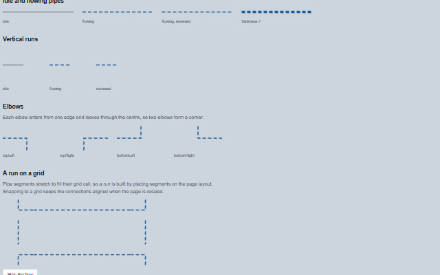
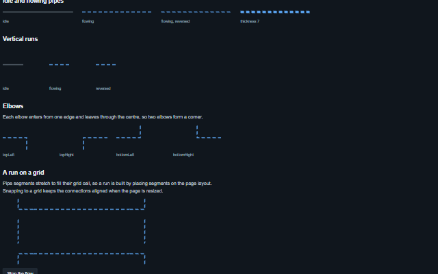
Pipe displays a section of process line on a mimic diagram.
It has a flow state and direction, and an in-service state. A flowing pipe animates a dashed line in the direction of flow; where the user has asked for reduced motion (prefers-reduced-motion) the line stands still and chevrons along it point the way the flow goes, so forward and reverse still look different. Pipe segments stretch to fill their container so a run can be built on a grid. A pipe is decoration and hidden from assistive technology; given role="img", it is named from its messages with the direction of flow - "Process line, flowing from the left to the right" - unless it has an aria-label of its own.
English, German, French, Spanish, Chinese, except the spoken flow direction, which stays in English (locale packs)
In the demo: Idle and flowing pipes · Vertical runs · Elbows · and more. Open the demo
Quick start
Install the package, load the two stylesheets and the component's module, and put the element on the page. The element below is the first one of the demo. Put the script after the module, in a <script type="module">, so that it runs once the component is defined.
The properties the demo sets, then the next ones; the API page lists all 5 with their types and defaults.
Name
Type, default
Description
flowing
boolean false
Sets or retrieves whether the line is carrying flow. A flowing pipe animates a marching dash and takes the active colour. With reduced motion the dash stands still and chevrons show the direction.
elbow
string none
Sets or retrieves whether the segment turns a corner, and which way.
orientation
string horizontal
Sets or retrieves the direction of the segment.
reverse
boolean false
Sets or retrieves whether the flow animation runs the other way, for a line that returns.
thickness
number 3
Sets or retrieves the stroke width of the line in pixels. The stroke does not scale with the segment, so a long run has the same weight as a short one. 1 to 64; a value that is not a number draws the default 3. The direction chevrons are sized from it.
In Angular, React, Vue and Blazor
The same element with its wrapper. Each page has the installation steps and the full demo in that framework.
A Pipe is a section of process line between two symbols on a mimic. The meaning of a diagram is in the equipment at either end of the line, so the pipe is decorative and does not appear in the accessibility tree.
The component follows the theme on the page: the default theme, or the ISA-101 light and dark themes that ship with the package. It declares 3 CSS variables of its own, among them --smart-pipe-color, --smart-pipe-flow-color, --smart-pipe-flow-duration. The CSS page lists them; the themes guide covers the tokens every component shares.