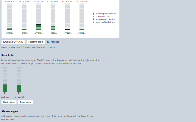
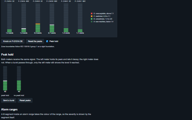
BarGraph is a segmented level meter, such as the column of lit blocks on an audio console or a vibration monitor.
It extends Tank, so min, max, value, interval, coerce, logarithmicScale, precisionDigits and inverted work as they do on Tank. The alarm ranges colour the segments while showRanges is set, the unit is written with the value while showUnit is set, orientation lays the bar vertically (the default) or horizontally, and rightToLeft reverses the Left and Right arrow keys. Tank's scientificNotation and mechanicalAction are inherited, but the bar graph does not apply them. The component adds the segmented display and peak hold, which keeps short transients visible. A lit segment in the normal range takes the process colour (--smart-bar-segment-on); green, amber and red come only from ranges marked ok, warning or critical. An aria-label written by the author names the meter.
Tag
<smart-bar-graph>
Module
smart-industrial/source/modules/smart.bargraph.js
Angular
BarGraphModule from smart-industrial/angular/bargraph
English, German, French, Spanish, Chinese, except the default accessible name, which keeps the language the bar graph was created in (locale packs)
In the demo: A vibration monitoring rack · Peak hold · Alarm ranges · and more. Open the demo
Quick start
Install the package, load the two stylesheets and the component's module, and put the element on the page. The element below is the first one of the demo, with interactive added: the component raises change only when interactive is set. Put the script after the module, in a <script type="module">, so that it runs once the component is defined.
const barGraph = document.getElementById('ch1');

// raised when the value changes through a click or the keyboard
barGraph.addEventListener('change', (event) => {
    const { value } = event.detail;
    // ...
});

// example values
barGraph.peakDecay = 25;
barGraph.peakHold = true;
barGraph.peakHoldTime = 3000;
The properties the demo sets, then the next ones; the API page lists all 7 with their types and defaults.
Name
Type, default
Description
peakDecay
number 0
Sets or retrieves the rate at which a held peak falls after its hold time expires, in scale units per second. 0 drops the peak straight back to the signal; a small value makes it fall gradually, like an analogue meter, which keeps a burst of transients readable. The fall is steady, measured from the peak as it was caught, however often the value updates.
peakHold
boolean false
Sets or retrieves whether the highest value reached is marked and held. Works the same set in markup or as a property, and after the meter is moved to another parent.
peakHoldTime
number 1500
Sets or gets the time in milliseconds a peak is held before it starts to fall.
segments
number 20
Sets or retrieves the number of segments the bar is divided into. A segment lights when the value passes its lower edge, so half of the scale lights exactly half of the segments. Values below 1 draw one segment and values above 500 draw 500.
showValue
boolean false
Sets or retrieves whether the value is written beside the bar.
interactive
boolean false
Sets or retrieves whether the meter can be operated as a control. The meter is read-only by default and is not in the tab order, so that a meter which cannot be operated is not an empty tab stop. The property is named for the enabled state because boolean attributes are presence-based, and a property that defaulted to true could not be turned off from markup. A read-only meter has the meter role; an interactive one is a slider. A click on an interactive meter sets the value there, clamped and snapped to interval when coerce is set, and moves the display.
segmentGap
number 2
Sets or gets the gap between segments in pixels.
Events
The events carry their data in event.detail. The bar graph sets value as the operator clicks or presses an arrow key, only while interactive is true, and then raises change; the application reads the new value from event.detail.
Event
Description and detail
change
This event is triggered when the value changes through a click or the keyboard. Only raised when interactive is set, a read-only meter reports nothing.
valuenumber The new value.
Methods
Method
Description
resetPeak()
Clears the held peak, for example to reset the meters after an event.
In Angular, React, Vue and Blazor
The same element with its wrapper. Each page has the installation steps and the full demo in that framework.
The BarGraph is a segmented level meter. It is read-only by default and is not in the tab order, so that a meter that cannot be operated does not become an empty tab stop. Setting interactive turns it into a control, which is then focusable and keyboard-operable.
Roles: "slider"
Key
Action
Arrow Up/Right
Increases the value by interval. Only when interactive is set. Right is reversed under rightToLeft.
The component follows the theme on the page: the default theme, or the ISA-101 light and dark themes that ship with the package. It declares 5 CSS variables of its own, among them --smart-bar-graph-width, --smart-bar-graph-height, --smart-bar-segment-off, --smart-bar-segment-on. The CSS page lists them; the themes guide covers the tokens every component shares.
Engineering UnitsUnit conversion, resolution, unit systems and conversion through bindings.
ConnectivitySessions, adapters and bindings that route plant tags into components, with quality and staleness.
From a front panel to the browserEvery control and indicator of a test-and-measurement front panel mapped to a component, the mechanical actions, and where the data comes from.