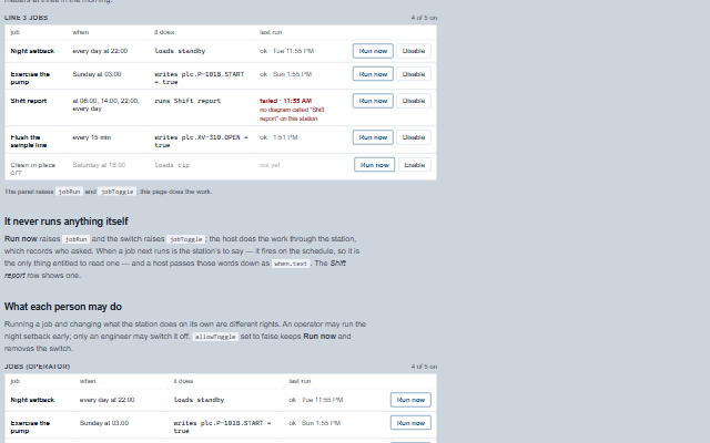
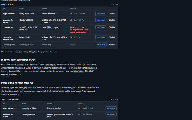
JobPanel shows what a station does on its own - the jobs it runs because of the clock rather than because of a person - with what each does, when it runs and how it went last time.
A job that failed says so where it is read, not only in a log, and a switched-off job keeps its place and recedes, in the secondary text colour, rather than disappearing. The panel never runs anything: Run now raises the jobRun event and the switch raises jobToggle, and the application does the work through the station, which records who asked. Times read in 24 hours, and a job update keeps the keyboard focus on the button it was on.
Tag
<smart-job-panel>
Module
smart-industrial/source/modules/smart.jobpanel.js
Angular
JobPanelModule from smart-industrial/angular/jobpanel
English, German, French, Spanish, Chinese (locale packs)
In the demo: A station’s jobs · It never runs anything itself · What each person may do. Open the demo
Quick start
Install the package, load the two stylesheets and the component's module, and put the element on the page. The element below is the first one of the demo. Put the script after the module, in a <script type="module">, so that it runs once the component is defined.
const jobPanel = document.getElementById('line3');

// raised when the operator runs a job by hand, after the confirmation when one is asked
// for
jobPanel.addEventListener('jobRun', (event) => {
    const { id, name, action } = event.detail;
    // the component waits: carry out the request, then set the property from the result
});

// the same values as properties
jobPanel.label = 'Line 3 jobs';
The properties the demo sets, then the next ones; the API page lists all 6 with their types and defaults.
Name
Type, default
Description
jobs
array
Sets or retrieves the jobs as [{ id, name, enabled, when, action, lastRun, lastResult, runs, error }]. when is { daily: 'hh:mm' }, { weekly: { days, at } }, { every: milliseconds } or { cron }, and may carry text - the words the station's own schedule reader made of it, shown in place of the expression. action is { kind: 'recipe', recipe }, { kind: 'write', tag, value } or { kind: 'flow', flow }. lastResult is { ok, error }. The shape is what a Scada Studio station returns from /api/jobs. Assign a new array to update the component.
label
string
Sets or retrieves the heading of the panel. It is also the accessible name of the group.
allowToggle
boolean true
Sets or retrieves whether the Enable/Disable button is offered. Running a job and changing what the station does on its own are different rights - an operator may run the night setback early, only an engineer may switch it off - so an application can give the first without the second. When false the button is removed rather than disabled.
running
string
Sets or retrieves the id of the job the application is running now. Its row says so and its button cannot be pressed twice. The application sets it on jobRun and clears it when the run comes back. From a jobRun until the application sets running, or for two seconds when it never does, the panel raises no other jobRun - so a held Enter or a double click runs a job once.
readOnly
boolean false
Sets or retrieves whether the panel only shows the jobs. The Run now and Enable/Disable buttons are removed rather than disabled, because a control that cannot be used should not invite a press; every job and how it last went stays readable.
confirm
boolean true
Sets or retrieves whether running a job by hand asks first. The confirmation says what the job does. A job writes into a plant, and running the night setback in the middle of the afternoon is a thing to be sure about, so this is on by default. The confirmation runs exactly what it showed: the job's action is copied when it opens, so a jobs update while it is open cannot change what Run it sends. A job that has left the station by then is not run. Escape, Cancel and Run it give the focus back to the Run now button.
Events
The events carry their data in event.detail. jobRun and jobToggle are requests: the job panel raises them only while readOnly is false, asks for confirmation before jobRun while confirm is true, and keeps jobs and running as they are. The application sets running while a job runs and updates jobs with the result or the new enabled state.
Event
Description and detail
jobRun
This event is triggered when the operator runs a job by hand, after the confirmation when one is asked for. The component does not run it: the application asks the station to, sets the running property while it does, and hands back the updated jobs. It cannot know who is pressing the button or how the run should be audited, so it does not pretend to. Raised once per press: a held key or a double click does not raise it again.
idstring The id of the job. namestring The name of the job, as the operator saw it. actionany What the job does, as it was given in jobs.
jobToggle
This event is triggered when the operator switches a job on or off. The list is not changed; the application stores the change on the station and hands back the updated jobs. A second click on the same switch within a second is the same press and raises nothing.
idstring The id of the job. namestring Its name. enabledboolean Whether the job is asked to be on: true to switch it on, false to switch it off.
In Angular, React, Vue and Blazor
The same element with its wrapper. Each page has the installation steps and the full demo in that framework.
The JobPanel is a table: one row per job, with the job's name as the row header and what it does, when it runs and how it last went as cells, all as text. A job runs without anybody pressing anything, so its result is exactly the kind of thing that would otherwise never reach somebody who cannot see the table: the newest outcome is announced once - assertively when a job failed, politely when it ran. A failure is also written as the word failed, not only coloured, and a switched-off job carries the word off as well as fading.
Roles: "group""alertdialog"
Key
Action
Tab
Moves through the Run now and Enable/Disable buttons, row by row. With allowToggle false there is no Enable/Disable button; with readOnly there are no buttons and the panel has no stop.
Enter or Space
On Run now, asks for confirmation, or raises jobRun when confirm is false. On Enable/Disable, raises jobToggle. The list is not changed; the application does the work and hands back the updated jobs.
The component follows the theme on the page: the default theme, or the ISA-101 light and dark themes that ship with the package. It declares 3 CSS variables of its own, among them --smart-job-panel-failed-color, --smart-job-panel-ok-color, --smart-job-panel-mono. The CSS page lists them; the themes guide covers the tokens every component shares.