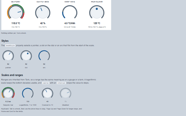
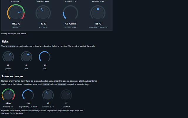
It extends Tank, so min, max, value, interval, coerce, logarithmicScale, ranges, unit, precisionDigits, inverted, mechanicalAction and rightToLeft work as they do on Gauge, Slider and Tank. The unit is shown after the value only when showUnit is true, and the ranges are drawn only when showRanges is true. The readout is formatted with precisionDigits alone: scientificNotation, significantDigits and decimalSeparator are not applied. On the knob, rightToLeft swaps the Left and Right arrow keys. The component adds the rotary display and circular drag. The mechanicalAction property defines when the value is committed while the knob is turned. An aria-label written by the author names the knob; without one it is named by its knobLabel message.
English, German, French, Spanish, Chinese (locale packs)
In the demo: A controller front panel · Styles · Scales and ranges. Open the demo
Quick start
Install the package, load the two stylesheets and the component's module, and put the element on the page. The element below is the first one of the demo. Put the script after the module, in a <script type="module">, so that it runs once the component is defined.
const knob = document.getElementById('setpoint');

// raised when the value changes through the pointer or the keyboard
knob.addEventListener('change', (event) => {
    const { value } = event.detail;
    // ...
});

// example values
knob.dragMode = 'circular';
knob.dragSensitivity = 300;
knob.endAngle = 360;
The properties the demo sets, then the next ones; the API page lists all 6 with their types and defaults.
Name
Type, default
Description
knobStyle
string pointer
Sets or retrieves how the value is marked.
dragMode
string both
Sets or retrieves how a pointer drag changes the value: vertical - up increases, dragSensitivity pixels covering the full range; circular - turning round the centre turns the knob through the same angle; both - the first few pixels of movement decide which. Either way the drag is relative: it moves the value from where it was, so the press itself writes nothing and a tap without movement is no change. The drag belongs to the primary button of the pointer that started it; a second finger or the right button does nothing.
dragSensitivity
number 150
Sets or gets the number of pixels of vertical drag that cover the full range. A larger value gives a finer adjustment.
endAngle
number 495
Sets or gets the angle at which the scale ends, in degrees clockwise from twelve o'clock. The value may exceed 360.
showValue
boolean true
Sets or retrieves whether the value is shown under the dial. Boolean attributes are presence-based, so set the property from script to turn it off.
startAngle
number 225
Sets or gets the angle at which the scale starts, in degrees clockwise from twelve o'clock. The default leaves a gap at the bottom, like the stop of a panel knob.
Events
The events carry their data in event.detail. The knob sets value as the operator turns it and then raises change; the application reads the new value from event.detail. mechanicalAction decides whether change fires while dragging or once on release.
Event
Description and detail
change
This event is triggered when the value changes through the pointer or the keyboard. When it fires depends on mechanicalAction: switchWhileDragging reports continuously, switchWhenReleased reports once on release, and switchUntilReleased is momentary: the knob takes the value while it is held and goes back on release. A press without movement changes nothing. A drag that is cancelled - the touch cancelled, the knob disabled, made readonly or removed - raises nothing it had not already reported. A value set by the application during a drag is held until the drag ends and is shown then, unless the drag committed a value of its own; under switchUntilReleased the knob returns to that value.
valuenumber The new value.
In Angular, React, Vue and Blazor
The same element with its wrapper. Each page has the installation steps and the full demo in that framework.
The Knob is a rotary control that extends Tank, so it inherits the WAI-ARIA slider behaviour. It is focusable, announces itself as a slider with its current value, and can be operated fully from the keyboard without the circular drag.
Roles: "slider"
Key
Action
Arrow Up/Right
Increases the value by interval, which is 1 by default. When interval is not a positive number, the step is a hundredth of the range. Right is reversed when rightToLeft is set; up never is.
The component follows the theme on the page: the default theme, or the ISA-101 light and dark themes that ship with the package. It declares 5 CSS variables of its own, among them --smart-knob-size, --smart-knob-track-color, --smart-knob-body-color, --smart-knob-marker-color. The CSS page lists them; the themes guide covers the tokens every component shares.
Engineering UnitsUnit conversion, resolution, unit systems and conversion through bindings.
ConnectivitySessions, adapters and bindings that route plant tags into components, with quality and staleness.
From a front panel to the browserEvery control and indicator of a test-and-measurement front panel mapped to a component, the mechanical actions, and where the data comes from.