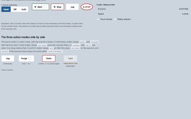
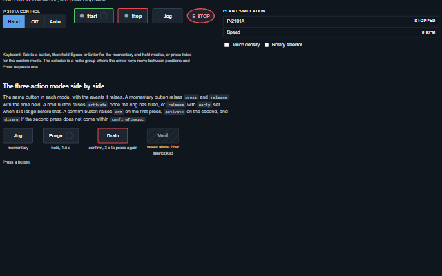
MomentaryButton is an operator button with three action modes.
In momentary mode the button acts while it is pressed and stops when it is released. In hold mode the action starts only after the button has been held for holdDuration, shown by a progress ring. In confirm mode the action requires a second press within confirmTimeout. An interlocked button stays readable, shows the reason and raises the blocked event when pressed. The state property shows the device feedback as a lamp and is set by the application.
English, German, French, Spanish, Chinese (locale packs)
In the demo: A motor control station · Plant simulation · The three action modes side by side. Open the demo
Quick start
Install the package, load the two stylesheets and the component's module, and put the element on the page. The element below is the first one of the demo. Put the script after the module, in a <script type="module">, so that it runs once the component is defined.
The properties the demo sets, then the next ones; the API page lists all 9 with their types and defaults.
Name
Type, default
Description
label
string
Sets or retrieves the word on the button. It carries the meaning the kind colour cannot.
mode
string momentary
Sets or retrieves the action mode. momentary raises press and release as they happen; hold raises activate after holdDuration and reports an early release; confirm arms on the first press and raises activate on a second press within confirmTimeout. A confirm press counts when it is let go of on the button; a press that slides off, is cancelled or is ended by an interlock neither arms nor activates.
holdDuration
number 1000
Sets or retrieves how long a hold-mode button must be held before it acts, in milliseconds.
kind
string normal
Sets or retrieves the button style following the colour conventions of push button panels: a green ring for a start button, a red ring for a stop button, and a round mushroom head for an emergency stop. The colour is applied to the ring, not the whole face, so the label stays readable.
state
string
Sets or retrieves the device feedback reported by the plant, as a word such as running, stopped, open, closed or fault, shown as a lit lamp. An empty value shows no lamp. The property is set by the application from the feedback tag, not by the button. The button is announced as pressed (aria-pressed) only while the state is an on word - anything but stopped, closed, off, fault, tripped or unknown.
interlocked
boolean false
Determines whether the button is interlocked. An interlocked button stays readable and focusable, shows interlockReason, ends any press in progress without acting, disarms an armed button, and raises blocked instead of acting.
interlockReason
string
Sets or retrieves why the button will not act, shown under it while interlocked and read out when pressed.
density
string normal
Sets or retrieves the target size. touch makes the button 60px high for a gloved hand.
confirmTimeout
number 5000
Sets or retrieves how long a confirm-mode button stays armed after the first press, in milliseconds. The timeout disarms it without acting.
Events
The events carry their data in event.detail. press, release and activate are commands: the momentary button raises them and changes no property, and its lamp follows state when the application sets it. arm and disarm report the button arming and disarming itself in confirm mode, and blocked reports a press refused while interlocked is true.
Event
Description and detail
press
This event is triggered when a momentary button is pressed.
atnumber The time of the press, in milliseconds since the epoch.
release
This event is triggered when a momentary button is released, or a hold button is let go before holdDuration.
durationnumber How long it was held, in milliseconds. earlyboolean true when a hold was let go too early to act.
activate
This event is triggered when a hold button has been held for holdDuration, or a confirm button is pressed the second time.
modestring 'hold' or 'confirm'. durationnumber The hold duration met, for a hold.
arm
This event is triggered when a confirm button is pressed the first time.
timeoutnumber How long it stays armed, in milliseconds.
disarm
This event is triggered when an armed confirm button times out or is disarmed without acting.
blocked
This event is triggered when an interlocked button is pressed. Nothing acts.
reasonstring The interlockReason.
Methods
Method
Description
press()
Begins a press, as a pointer or the keyboard would. The method is public so that an application can drive the button from its own input, for example a physical key on a pendant. It does nothing while the button is pressed, disabled or interlocked; an interlocked button raises the blocked event. A button that is not on a page cannot be pressed.
release()
Ends a press. A release always follows a press, so a momentary action is always stopped. A press also ends at once, as a cancelled press, when the button is removed or moved to another parent, disabled, hidden, when the focus or the pointer leaves it, or when the window loses the focus or the page is hidden. A cancelled press releases a momentary button and ends a hold early, but is not a step of a confirm. A second finger on a held button neither presses nor releases it, and a held key that repeats does not press again.
isPressed() returns boolean
Returns whether the button is currently pressed.
isArmed() returns boolean
Returns whether a confirm-mode button is armed and waiting for its second press.
disarm()
Disarms a button in confirm mode without activating it.
In Angular, React, Vue and Blazor
The same element with its wrapper. Each page has the installation steps and the full demo in that framework.
The MomentaryButton is a button. Its accessible name contains the label, the action mode and the state reported by the plant, for example "Start, hold for 1 s, stopped", so a screen reader user knows before pressing that the key has to be held, and hears the device state without relying on colour. An interlock is included in the name and, when the button is pressed anyway, announced as an assertive message with the reason. A completed hold and a confirmed press are announced through the label, because the button does not change in a way a screen reader could report.
Roles: "status"
Key
Action
Tab
Moves onto the button, and off it. An interlocked button is still a stop.
Space / Enter (down)
Presses the button, as a finger would. A momentary button raises press; a hold button starts its ring; a confirm button waits for the key to come up. Key repeat does not press again.
Space / Enter (up)
Releases the button. A momentary button raises release; a hold button raises release with early if the hold was not met; a confirm button arms, or acts if it was armed.
Focus leaving
Releases the button, the way a pointer leaving does. A jog held by a key that has lost focus is not still jogging.
The component follows the theme on the page: the default theme, or the ISA-101 light and dark themes that ship with the package. It declares 8 CSS variables of its own, among them --smart-momentary-size, --smart-momentary-background, --smart-momentary-border, --smart-momentary-accent. The CSS page lists them; the themes guide covers the tokens every component shares.
Engineering UnitsUnit conversion, resolution, unit systems and conversion through bindings.
ConnectivitySessions, adapters and bindings that route plant tags into components, with quality and staleness.
From a front panel to the browserEvery control and indicator of a test-and-measurement front panel mapped to a component, the mechanical actions, and where the data comes from.