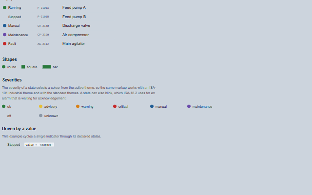
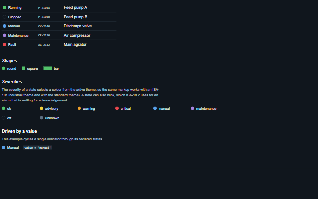
MultiStateIndicator is a read-only lamp that shows one of several named states, such as running, stopped, manual, fault or unknown.
The states are declared with their labels and colours, and the component resolves its value against them. The state name is included in the accessible name.
English, German, French, Spanish, Chinese; the built-in Unknown label switches at the next value change (locale packs)
In the demo: Equipment states · Shapes · Severities · and more. Open the demo
Quick start
Install the package, load the two stylesheets and the component's module, and put the element on the page. The element below is the first one of the demo. Put the script after the module, in a <script type="module">, so that it runs once the component is defined.
The properties the demo sets, then the next ones; the API page lists all 6 with their types and defaults.
Name
Type, default
Description
shape
string round
Sets or retrieves the shape of the lamp.
showLabel
boolean false
Sets or retrieves whether the label of the resolved state is rendered next to the lamp.
states
array
Sets or retrieves the state definitions. Each entry is an object with: value - the value this state matches; label - the text shown when showLabel is enabled, also used as the accessible name; severity - one of ok, advisory, warning, critical, manual, maintenance, off, unknown, which selects a colour from the active theme (an off lamp is an empty ring with a border that keeps 3:1 contrast); color - an explicit CSS colour that overrides the severity; blink - whether the lamp blinks, as ISA-18.2 uses for a state awaiting acknowledgement.
value
string | null
Sets or retrieves the current value. A value that arrives as text from an attribute or a JSON payload matches a state declared with a number when it is that number written in decimal ("3" matches 3; "0x1" does not), and a text value matches a text state ignoring case and surrounding spaces. Missing data matches no state: null, an empty or blank string, false, NaN, an array or an object show the unknown state (a hatched lamp, the unknown label, and the unmatched attribute) instead of the first declared state.
unknownLabel
string
Sets or retrieves the label used when the current value matches none of the declared states. It is empty by default, so the label comes from the unknown message ("Unknown" in English) and follows the locale, including after applyLocale. A value set here takes precedence over the message.
quality
string good
Sets or retrieves the quality of the value, as the Tank family takes it: good, uncertain (the lamp is dimmed), bad (hatched and outlined) or stale (faded). The lamp keeps the state it resolved but does not look live, and the quality word is added to the label and the accessible name, for example 'Running (quality bad)'.
Methods
Method
Description
stateFor(value?) returns any
Returns the state definition matching a value, or null when none matches. Called without arguments it resolves the component's current value. Matching is as described for value: missing data matches nothing.
In Angular, React, Vue and Blazor
The same element with its wrapper. Each page has the installation steps and the full demo in that framework.
The MultiStateIndicator reports a state and is not operated. It is exposed as an image with a text alternative rather than as a control, so a screen reader announces the equipment state without suggesting that the indicator can be pressed.
The component follows the theme on the page: the default theme, or the ISA-101 light and dark themes that ship with the package. It declares 3 CSS variables of its own, among them --smart-multi-state-indicator-default-size, --smart-multi-state-indicator-bar-width, --smart-multi-state-indicator-blink-duration. The CSS page lists them; the themes guide covers the tokens every component shares.