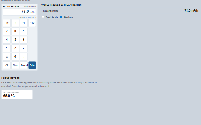
NumericKeypad is an on-screen keypad for entering a numeric value such as a setpoint on a touch panel.
It validates the entry against min and max and shows the reason when the value is out of range instead of clamping it, limits the entry to the configured precisionDigits, keeps the current value in view while the new one is typed, and provides optional step keys. Accepting the entry raises the change event. A physical keyboard can also type into the keypad while it has focus, and the touch density enlarges the keys for gloved use. The decimal separator shown is the locale's, a comma for de, fr and es, and the entry is announced to screen readers as it is typed.
English, German, French, Spanish, Chinese (locale packs)
In the demo: Inline keypad with limits and precision · Values received by the application · Popup keypad. Open the demo
Quick start
Install the package, load the two stylesheets and the component's module, and put the element on the page. The element below is the first one of the demo. Put the script after the module, in a <script type="module">, so that it runs once the component is defined.
The properties the demo sets, then the next ones; the API page lists all 12 with their types and defaults.
Name
Type, default
Description
min
number
Sets or retrieves the lowest value accepted. null sets no floor.
max
number
Sets or retrieves the highest value accepted. null sets no ceiling.
precisionDigits
number
Sets or retrieves the maximum number of decimal places of the entry. null allows any number of decimals; 0 makes the keypad integer-only and replaces the decimal key with a clear key. A key that would exceed the precision is ignored. Values above 15 are taken as 15, the most decimal places a number holds. A step key finer than the precision moves the entry by at least one decimal place in its direction.
unit
string
Sets or retrieves the engineering unit, shown next to the entry, the current value and the limits.
label
string
Sets or retrieves what is being entered, the tag and the quantity, shown above the entry and in its accessible name.
allowNegative
boolean true
Determines whether the sign key is offered. Off, the key becomes a clear key.
steps
array
Sets or retrieves quick steps, for example [-10, -1, 1, 10], shown as keys that adjust the entry from the current value.
density
string normal
Sets or retrieves the key size. touch makes keys 60 px with a wider gap, for a panel PC with gloves. Reflected to an attribute the stylesheet keys on.
value
number
Sets or retrieves the last accepted value, or the value the keypad was opened with. It is shown as the current value while a new value is typed.
layout
string calculator
Sets or retrieves the digit layout. calculator places 7 8 9 on the top row, as on an HMI keypad; phone places 1 2 3 there.
The events carry their data in event.detail. input reports the text being typed and invalid an entry the numeric keypad refused. On accept the keypad sets value and then raises change, and cancel follows once the entry is back at the current value.
Event
Description and detail
change
This event is triggered when an entry is accepted. Raised once per entry.
valuenumber The value accepted. previousValuenumber The value it replaces, or null.
invalid
This event is triggered when an entry is refused. Nothing is written.
textstring The entry as typed. reasonstring 'empty', 'notANumber', 'tooPrecise', 'belowMin' or 'aboveMax'.
cancel
This event is triggered when the entry is abandoned.
input
This event is triggered on every key that changes the entry.
textstring The entry so far.
Methods
Method
Description
open(value?)
Starts an entry from a value, shows it as the current value and takes focus. The first key replaces the shown value, as on a calculator.
press(key)
Presses a key: a digit, '.', '-', 'backspace', 'clear', 'enter', 'escape', or a step given as a number. A digit beyond fifteen significant digits is ignored, as a number holds no more.
accept() returns boolean
Validates the entry against the limits and the precision. If the entry is valid, sets the value and raises the change event. If it is not, the entry stays on screen, the reason is shown and the invalid event is raised. Returns whether the entry was accepted. Only something typed is accepted: with nothing typed since open, accept or cancel - a second Enter, a double click or a double tap on Enter, a held Enter - it raises nothing and returns false, and it returns false while the keypad is disabled.
cancel()
Abandons the entry, shows the current value again and raises the cancel event. Raises nothing while the keypad is disabled.
validate() returns string
Returns the reason the entry would be rejected ('empty', 'notANumber', 'tooPrecise', 'belowMin' or 'aboveMax'), or null when it would be accepted. A point typed first shows as 0. and is 'empty' until a digit follows: the zero was not typed.
text() returns string
Returns the text entered so far.
In Angular, React, Vue and Blazor
The same element with its wrapper. Each page has the installation steps and the full demo in that framework.
The NumericKeypad is one tab stop and accepts input from a physical keyboard: the digits, the decimal point, minus, Backspace, Delete, Enter and Escape work while it has focus, so an operator at a desk does not need the on-screen keys. The entry field is a read-only text box named for the value being entered, the current value and the limits are plain text next to it, and a rejected entry is an alert with the reason, read as soon as Enter is pressed.
Roles: "group""textbox""alert"
Key
Action
Tab
Moves onto the keypad, and off it. The keypad is one stop.
0-9
Types a digit. The first key after opening replaces the shown value; a digit beyond the precision does nothing.
. or ,
Types the decimal point, unless the precision is 0.
-
Changes the sign, when negative values are allowed.
Backspace / Delete
Removes the last character / clears the entry.
Enter
Accepts the entry, raising change - or refuses it with the reason, raising invalid, and leaves it on screen.
Escape
Cancels the entry and shows the value in force again, raising cancel.
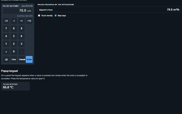
The component follows the theme on the page: the default theme, or the ISA-101 light and dark themes that ship with the package. It declares 7 CSS variables of its own, among them --smart-numeric-keypad-key-size, --smart-numeric-keypad-gap, --smart-numeric-keypad-key-background, --smart-numeric-keypad-key-border. The CSS page lists them; the themes guide covers the tokens every component shares.
Engineering UnitsUnit conversion, resolution, unit systems and conversion through bindings.
ConnectivitySessions, adapters and bindings that route plant tags into components, with quality and staleness.
From a front panel to the browserEvery control and indicator of a test-and-measurement front panel mapped to a component, the mechanical actions, and where the data comes from.