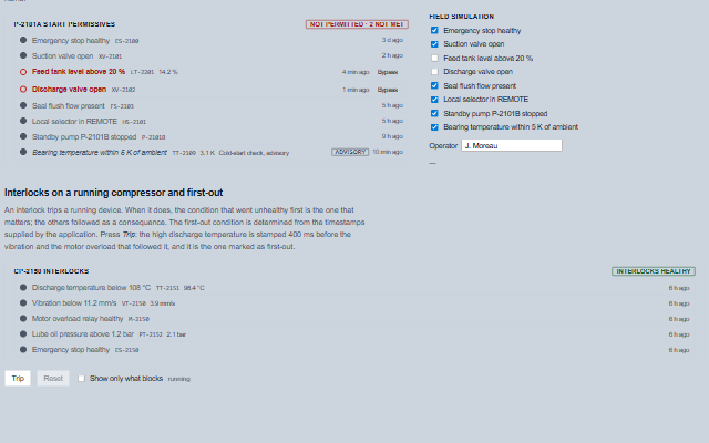
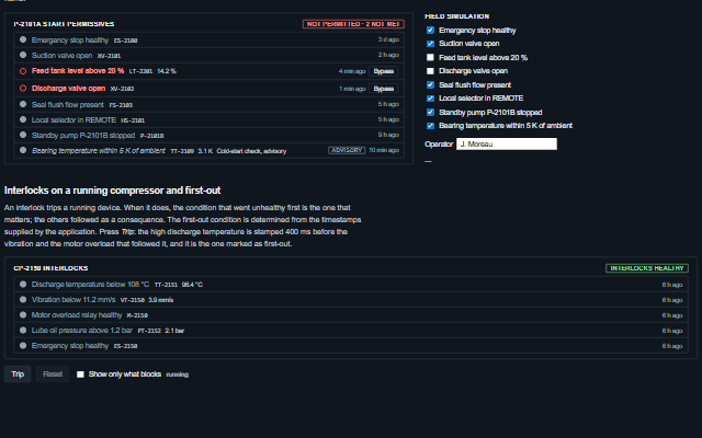
Permissive displays a list of conditions that a start requires or that a running device depends on, with whether each condition is met.
Required conditions that are not met block the start, bypassed conditions count as met and are listed separately, and advisory conditions never block. In interlock mode the condition that went unhealthy first is marked from the timestamps supplied by the application. A bypass request raises the bypassRequest event and is not applied by the component.
English, German, French, Spanish, Chinese (locale packs)
In the demo: Start permissives for a feed pump · Field simulation · Interlocks on a running compressor and first-out. Open the demo
Quick start
Install the package, load the two stylesheets and the component's module, and put the element on the page. The element below is the first one of the demo. Put the script after the module, in a <script type="module">, so that it runs once the component is defined.
The properties the demo sets, then the next ones; the API page lists all 8 with their types and defaults.
Name
Type, default
Description
conditions
array
Sets or retrieves the conditions as [{ id, label, satisfied, required, bypassed, bypassedBy, tag, value, description, timestamp }]. required defaults to true; an advisory condition is listed but never blocks. timestamp is the time the condition last changed state and is used to determine the first-out condition. Assign a new array to update the component. Flags given as text, as a tag database may hand them over, are read as such: 'false', '0', 'no', 'off' and '' are not set.
label
string
Sets or retrieves the title of the list, usually the device name and the purpose of the list.
showSatisfied
boolean true
Determines whether met conditions are listed. When off, a long list shows only the conditions that block; the verdict still counts every condition.
allowBypass
boolean false
Determines whether a bypass control is offered on each required condition that blocks, and a removal control on each bypassed one. The control raises bypassRequest and changes nothing itself.
mode
string permissive
Sets or retrieves the type of the list. A permissive list gates a start, and the verdict reads ready or not permitted. An interlock list trips a running device, the verdict reads healthy or tripped, and the first-out condition is marked.
showFirstOut
boolean true
Determines whether the earliest unsatisfied required condition, by timestamp, is marked as first-out. Applies in interlock mode only. Conditions without a timestamp cannot be first-out, and a tie is reported as no first-out.
showTimestamps
boolean true
Determines whether each condition shows how long it has been in its state, from its timestamp. The ages tick without the rows being rebuilt.
announceChanges
boolean true
Determines whether a change of verdict is read through the live region, assertively for a trip, politely otherwise.
Events
The events carry their data in event.detail. bypassRequest is a request: the bypass button appears only while allowBypass is true, and the component keeps the condition as it is until the application sets bypassed on it in conditions. readyChange reports a change of the overall verdict, and conditionClick reports a click on a row.
Event
Description and detail
readyChange
This event is triggered when the verdict changes, a start becomes possible or a device trips, and not on every redraw. It also fires when the list is emptied (ready false, nothing blocking) and when it is filled again.
readyboolean Whether every required condition is met or bypassed. blockingany[] The ids of the required conditions not met. firstOutstring The id of the first-out condition, or null.
bypassRequest
This event is triggered when a bypass control is pressed. The list is not changed; the application applies the bypass, records who applied it, and returns an updated list. It is raised once per press: the control waits for the application's updated list, or five seconds, before it asks again. Each bypass control is named after its condition.
idstring The condition's id. bypassboolean True to apply a bypass, false to remove one. conditionobject The condition as the application supplied it.
conditionClick
This event is triggered when a condition row is clicked, so that the application can open the faceplate or trend of the tag.
idstring The condition's id. conditionobject The condition as the application supplied it.
Methods
Method
Description
summary() returns object
Returns a summary of the list as { total, required, satisfied, unsatisfied, bypassed, ready, blocking, firstOut }, where blocking is the ids of the required conditions that are not met and firstOut is an id or null. With no conditions, ready is false: an empty list permits nothing.
conditionById(id) returns object
Returns the condition with the given id, as the application supplied it, or null.
In Angular, React, Vue and Blazor
The same element with its wrapper. Each page has the installation steps and the full demo in that framework.
The Permissive is a list of conditions and a verdict, all as text. The verdict is shown as a word as well as a colour, each condition carries its state in its accessible name, and a change of the verdict is announced through the live region: politely when a start becomes possible and assertively when a device trips. The bypass controls are a composite widget with one tab stop and arrow key navigation.
Roles: "group""list"
Key
Action
Tab
Moves into the bypass controls, landing on the one that holds the tab stop, and out again. The controls are one stop however many there are; without allowBypass the list has no stop at all.
Arrow Up/Down
Moves between the bypass controls.
Home / End
Moves to the first / last control.
Enter or Space
Raises bypassRequest for the focused condition. The list is not changed; the application applies the bypass and hands back the updated conditions.
The component follows the theme on the page: the default theme, or the ISA-101 light and dark themes that ship with the package. It declares 6 CSS variables of its own, among them --smart-permissive-blocked-color, --smart-permissive-blocked-fill, --smart-permissive-bypass-color, --smart-permissive-bypass-fill. The CSS page lists them; the themes guide covers the tokens every component shares.