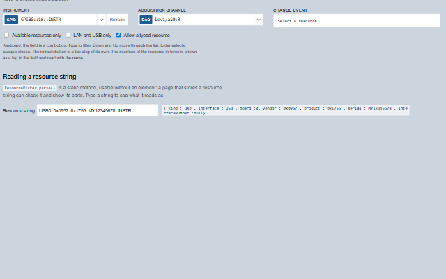
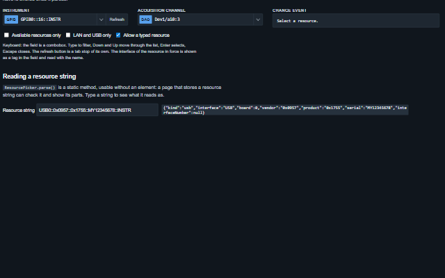
ResourcePicker selects an instrument or a channel: it lists the resources the application has found, grouped by interface and named by alias, filters them as text is typed, and reads a typed resource string before it is accepted.
The refresh button raises a request; the application performs the discovery and assigns the list. GPIB, LAN, USB, serial, PXI and DAQ names are parsed into their parts by a static method usable without an element.
English, German, French, Spanish, Chinese (locale packs)
In the demo: The bench · Reading a resource string. Open the demo
Quick start
Install the package, load the two stylesheets and the component's module, and put the element on the page. The element below is the first one of the demo. Put the script after the module, in a <script type="module">, so that it runs once the component is defined.
const resourcePicker = document.getElementById('instrument');

// raised when the refresh button is pressed
resourcePicker.addEventListener('refreshRequest', (event) => {
    // the component waits: carry out the request, then set the property from the result
});

// the same values as properties
resourcePicker.label = 'Instrument';
resourcePicker.value = 'GPIB0::16::INSTR';
resourcePicker.allowCustom = true;
The properties the demo sets, then the next ones; the API page lists all 10 with their types and defaults.
Name
Type, default
Description
resources
array
Sets or retrieves the resources found. Each is an object with name (the resource string), alias, description, kind (gpib, tcpip, usb, serial, pxi, daq or other; worked out from the name when absent), available and an optional id. A plain string is taken as a resource name; null and anything else that is not an object is skipped, with one console warning per list.
value
string
Sets or retrieves the resource string in force.
kinds
array
Sets or retrieves the kinds listed. Empty lists every kind.
allowCustom
boolean false
Accepts a typed resource the list does not have, once it parses as a resource name.
availableOnly
boolean false
Lists only the resources that are available.
refreshable
boolean true
Shows the refresh button, which raises refreshRequest.
busy
boolean false
Shows discovery in progress: the refresh button waits and the empty list says so. The application sets it while it searches.
label
string
Sets or retrieves the label above the field, which also names the combobox.
placeholder
string
Sets or retrieves the text shown when nothing is selected. Empty uses the localized default.
readonly
boolean false
Shows the value without allowing a change.
Events
The events carry their data in event.detail. change reports a resource the resource picker has already set as value, and open and close report its list opening and closing; while readonly is true the list stays closed. refreshRequest is a request: the picker raises it only while busy is false and shows the new list when the application sets resources.
Event
Description and detail
change
This event is triggered when a resource is selected from the list or typed and accepted.
valuestring The resource string. previousValuestring The one before. resourceobject The entry of the list, or null for a typed resource. parsedobject The parts of the name, as parse() reads them.
refreshRequest
This event is triggered when the refresh button is pressed. The application performs the discovery, sets busy while it runs and assigns the resources it found.
open
This event is triggered when the list opens.
close
This event is triggered when the list closes.
Methods
Method
Description
open()
Opens the list.
close()
Closes the list and shows the value again.
select(name)
Selects a resource by name and raises change. A name the list does not have is taken only when custom entries are allowed and it parses; otherwise the hint says so.
static parse(name) returns object on the class: customElements.get('smart-resource-picker').parse(…)
Also available as a static method of the class. Reads a resource string into its parts by the VISA resource syntax (IVI VPP-4.3): { kind, interface, ... } with the fields of its kind - board, address (0 to 30) and secondary (0 to 30, or 96 to 126 as the bus code some tools write; reported as written) for GPIB; board, host, addressType (ipv4, ipv6 or hostname), device, port, socket and protocol (vxi-11, hislip or socket) for LAN, where the host is an IPv4 address of four octets 0 to 255, an RFC 1123 host name or an IPv6 address - in brackets as VISA writes it (TCPIP0::[fe80::1]::inst0::INSTR), or bare where that is unambiguous, and the port is 0 to 65535; vendor, product (0 to 0xFFFF), serial and interfaceNumber for USB; board and port for serial (ASRL3, ASRLCOM3, and device paths such as ASRL/dev/ttyUSB0, whose board is null); board, bus (0 to 255), device (0 to 31), function (0 to 7), chassis and slot for PXI, from any of its three forms - PXI[bus]::device[::function], PXI[interface]::[bus-]device[.function] and PXI[interface]::CHASSISn::SLOTn[::FUNCn] - where only the last names a slot and the others give slot null, since a PCI device number is not a slot; device, channelType, channel and channelEnd for DAQ. The trailing ::INSTR may be left out, as the syntax allows. Text that is not a resource, including one that breaks these ranges (GPIB0::31::INSTR, TCPIP0::999.1.1.1::INSTR, PXI0::2::11::INSTR), is { kind: "other", name, reason } with reason the rule it broke in English, or null; empty text is null.
static isValid(name) returns boolean on the class: customElements.get('smart-resource-picker').isValid(…)
Also available as a static method of the class. True for a name the picker recognises as a resource: one that parse() reads as a kind other than "other", within the VISA ranges.
In Angular, React, Vue and Blazor
The same element with its wrapper. Each page has the installation steps and the full demo in that framework.
The ResourcePicker is a combobox: a text field with a list of options that opens under it. The field is named by the label, the list is named, the active option is announced as the arrow keys move through it, and the interface of the selected resource is part of what is read with the name. A typed resource that is not accepted is explained in a status line.
The component follows the theme on the page: the default theme, or the ISA-101 light and dark themes that ship with the package. It declares 4 CSS variables of its own, among them --smart-resource-height, --smart-resource-background, --smart-resource-border, --smart-resource-list-background. The CSS page lists them; the themes guide covers the tokens every component shares.
From a front panel to the browserEvery control and indicator of a test-and-measurement front panel mapped to a component, the mechanical actions, and where the data comes from.
Engineering MathsDSP, statistical process control and series reduction functions, usable without the components.
PerformanceMeasured throughput of the strip chart, scope, trend, alarm grid, heatmap, terminal and audit trail, and how the figures are achieved.