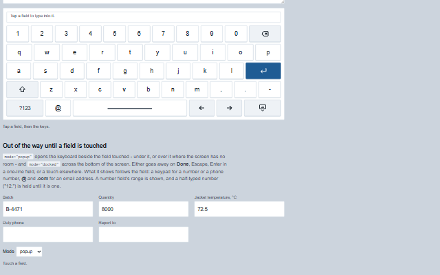
TouchKeyboard is the on-screen keyboard for a panel PC that has none, or a kiosk browser whose system keyboard covers the field it types into.
It types at the caret of a field - the target, or the last text field focused - and raises the field's own input event, so whatever listens to the field hears typing. It sits in the page, or out of the way until a field is touched: beside the field (popup) or across the bottom of the screen (docked), going away on Done, Escape, Enter in a one-line field or a touch elsewhere. What it shows follows the field: a keypad for a number, a decimal or a phone number, @ and .com for an email address, / and .com for a URL, the letters otherwise. A number field's range is shown, and a half-typed number ("12.") is held until it is one. A number field or a numeric text box touched afresh shows its value selected and is typed over - the first key replaces it - and a number outside the field's range is refused on Enter or Done, with the reason, instead of being handed to a field that would clamp it. Docked, it lifts a dialog the field is in above its keys. Keys are at least 44 pixels, Shift twice is caps lock, Backspace held repeats, and the keys are one tab stop moved through with the arrow keys. A number outside the field's range is held on the preview line and is never written into the field or sent through its input events; the field keeps the value it had when the entry began. A read-only or disabled field is never typed into.
English, German, French, Spanish, Chinese (locale packs)
In the demo: Following focus · Out of the way until a field is touched · Layouts. Open the demo
Quick start
Install the package, load the two stylesheets and the component's module, and put the element on the page. The element below is the first one of the demo. Put the script after the module, in a <script type="module">, so that it runs once the component is defined.
const touchKeyboard = document.getElementById('keyboard');

// raised by Enter in a one-line field, which also raises the field's keydown and keyup of
// Enter and its change event (a numeric text box commits on them), and submits the…
touchKeyboard.addEventListener('accept', (event) => {
    const { value } = event.detail;
    // ...
});

// the same values as properties
touchKeyboard.target = '#batchForm';
The properties the demo sets, then the next ones; the API page lists all 9 with their types and defaults.
Name
Type, default
Description
layout
string qwerty
Sets or retrieves the letters: qwerty, qwertz with the German letters, or azerty with the French ones.
target
string | null
Sets or retrieves the field to type into, as an element or a selector - or a form or any other container, whose fields the keyboard serves, following focus among them and no others. Two keyboards on one page are kept apart this way. A number field named here is typed over when it is touched afresh, as one found through autoAttach is.
mode
string inline
Sets or retrieves where the keyboard sits: in the page; beside the field touched, under it or over it where the screen has no room (popup); or across the bottom of the screen (docked), where a dialog the field is in moves up above the keys. A popup or docked keyboard follows focus and shows only while a field is being typed into.
autoAttach
boolean false
Sets or retrieves whether the keyboard follows focus, typing into whichever text field on the page was last focused.
keypad
string auto
Sets or retrieves when the keypad replaces the letters: for number, decimal and phone fields (by type or inputmode), always, or never.
opened
boolean false
Sets or retrieves whether a popup or docked keyboard is showing.
value
string
Sets or retrieves what the keyboard has typed when there is no field.
masked
boolean false
Sets or retrieves whether the preview is masked. A password field is masked anyway.
showPreview
boolean true
Sets or retrieves whether the line naming the field, and what it holds, is shown above the keys.
Events
The events carry their data in event.detail. change reports a key the touch keyboard has already added to value and fires only when no field is attached; accept follows Enter once the text is in the field or in value. In popup and docked mode the keyboard closes itself and then raises close; in inline mode close is a request and the application hides the keyboard.
Event
Description and detail
accept
This event is triggered by Enter in a one-line field, which also raises the field's keydown and keyup of Enter and its change event (a numeric text box commits on them), and submits the field's form as a keyboard's Enter would - through its default button, or with none when the field is its only one-line field - and puts a popup or docked keyboard away. In a text area Enter starts a new line instead. A number outside the field's range is not accepted: the keyboard stays up and says so.
valuestring The value of the field, or of the keyboard when there is no field.
change
This event is triggered when the keyboard's own value changes, when there is no field. With a field, listen to the field's input event.
valuestring The new value.
close
This event is triggered when the keyboard is put away - by Done, Escape, Enter or a touch elsewhere - or, in the page, by the hide key or Escape, for the application to decide.
Methods
Method
Description
open(field?)
Shows a popup or docked keyboard for a field, or for the one it follows.
close()
Puts a popup or docked keyboard away, raising close.
In Angular, React, Vue and Blazor
The same element with its wrapper. Each page has the installation steps and the full demo in that framework.
The TouchKeyboard is a group of buttons. Letters, digits and symbols are named by what they type; every other key - Backspace, Enter, Shift, the symbols switch, Space, the arrows and Hide - is drawn as an icon and named in words. A line above the keys names the field being typed into, which a screen reader can read and which a sighted operator needs when the keyboard covers the field.
Roles: "group"
Key
Action
Tab
Moves to the keys as one stop, on the last key used.
Arrow keys
Move between keys: across a row, and up and down to the nearest key in the next row.
Home / End
Go to the first and last key of the row.
Enter or Space
Presses the focused key, typing into the last field used.
Escape
In the page, raises close. A popup or docked keyboard goes away - from its keys or from the field.
Tab
From a field to the next one: a popup or docked keyboard follows, and goes away when focus leaves the fields.
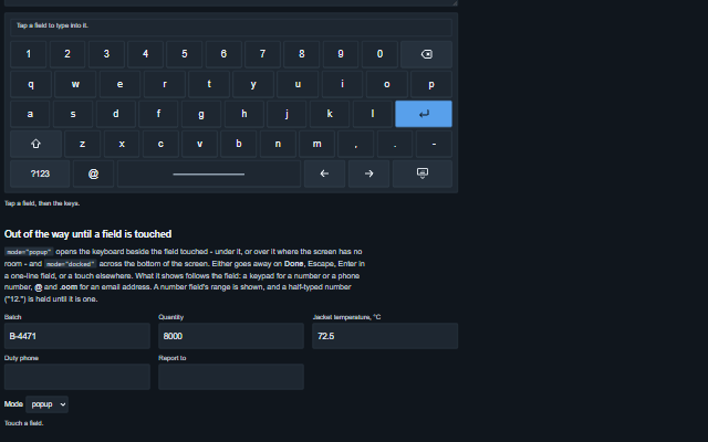
The component follows the theme on the page: the default theme, or the ISA-101 light and dark themes that ship with the package. It declares 3 CSS variables of its own, among them --smart-touch-keyboard-key-height, --smart-touch-keyboard-gap, --smart-touch-keyboard-mono. The CSS page lists them; the themes guide covers the tokens every component shares.
Engineering UnitsUnit conversion, resolution, unit systems and conversion through bindings.
ConnectivitySessions, adapters and bindings that route plant tags into components, with quality and staleness.
From a front panel to the browserEvery control and indicator of a test-and-measurement front panel mapped to a component, the mechanical actions, and where the data comes from.