Dropdown Button Custom Element
In this blog we are going to show you our DropDown Button custom element.
The DropDown button web component is a button element which when pressed opens a drop down list. The drop down list contain a set of selectable items. The list can be opened or closed with the help of arrow pointers on the right end of the button. Drop Down Button Custom Element FeaturesScrolling. When the button is pressed you can scroll through the elements of the dropdown list. 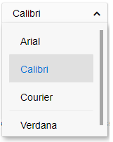
Segmented button. The segmented dropdown button will show the current selected item and will not open the dropdown list when you press it. The dropdown list can be opened with the arrow in this case. Open directions. The dropdown list can open below or above the button. You can see an example here. Date Picker Custom Element
In this blog we are going to show you our Date Picker custom element.
The Date Picker web component allows you to pick a date with the help of a calendar component. The custom element can be used in cases when the user needs to pick or input the date. The date can be selected by clicking the calendar button and selecting the date from the calendar, or enter the date manually in the input text filed. Date Picker Custom Element FeaturesAn important feature of our Date Picker html tag is localization in different languages and time formats. 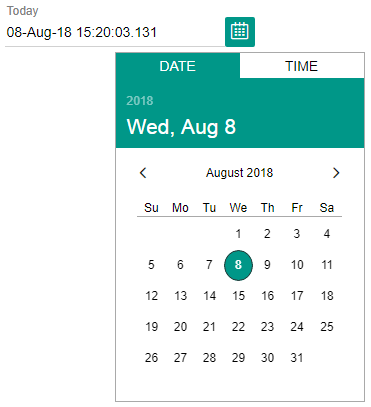
The web component has built-in date parsing functionality and supports choosing a date in different formats. Colors and theming. The background color and the text color of the items can be defined. You can also use the built in themes. You can see an example here. Posted in: HTML Elements, Smart Calendar, Web Components Tagged: datepicker custom element Leave a comment ListBox Custom Element with ImagesThe ListBox web component is a drop down list of selectable items which can be scrolled up and down. The user can select an item of the list. The ListBox can also contain rows with complex items such as conversations. The ListBox html tag supports images and icons on the left of the items. The images can also be pictures. ListBox Custom Element with Images FeaturesScrolling. The web component supports scrolling of the items. 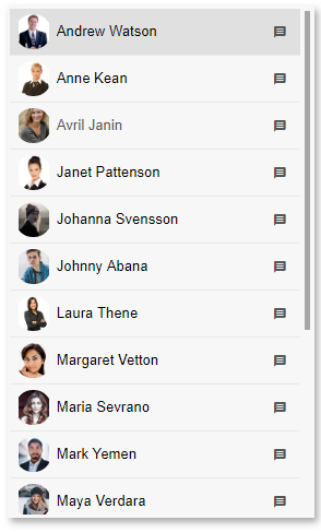
Drag and drop. You can move items between listboxes by dragging an item from one of the listsboxes and dropping it on another. Colors and theming. The background color and the text color of the items can be defined. You can also use the built in themes. Animation. By enabling animation you can see a nice effect when clicking on an item from the listbox. You can see an example here. Grid Infinite Scroll
For large data sets or when the exact data records count cannot be determined in advance, you can supply data to the Grid while you scroll when the user reaches the bottom of the grid. In this case, the Grid's scrolling is called infinite scrolling mode. The scrollbar reflects the currently loaded amount of data. When new data records are supplied, the scroll bar re-adjusts its size and allows you to scroll and view the newly loaded data records. To illustrate the infinite scrolling functionality of Smart.Grid, we prepared this demo:
Demo: Grid Infinite Scroll Posted in: HTML Elements, Smart Grid, Web Components Tagged: datagrid custom element, Grid, Grid Control, grid custom element, Smart Grid Leave a comment Vertical Menu Custom Element
In this blog we are going to show you our Vertical Menu Custom Element.
The menu web component is used very frequently in user interfaces. It enables the selection of an item from a list of items. The Vertical Menu HTML tag is a menu custom element which instead of horizontally opens vertically. This is useful for example in cases where the menu has a long list of items or the sub menus have long lists. To make the menu web component appear vertically you have to set the mode property. Vertical Menu Custom Element FeaturesAnimation. When you enable animation you can see a nice effect when clicking an item from the menu or when the sub menus appear or disappear. 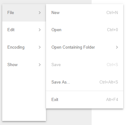
Images. You can set images the left of the item of the Vertical Menu. Colors and theming. The background color and the text color of the items can be defined. You can also use the built in themes. Open direction. The sub menus can be opened on the left or on the right of the menu items. You can see an example here. Checkbox Custom Element
In this blog we are going introduce you to our CheckBox Custom Element.
The CheckBox Web Component is a kind of button which is usually used to enable the selection of different choices. It represents a box which can be checked, unchecked and undetermined. The different states can be changed by clicking with the mouse over the checkbox. Checkbox Custom Element FeaturesThe CheckBox HTML tag supports four states: checked, unchecked, undetermined and disabled. 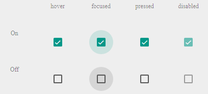
The CheckBox custom element comes with Light and Dark themes. It also enables fluid design where the width can be set in percentages. You can see an example here. Linear Progress Bar custom element
In this blog we will introduce our Linear Progress Bar custom element.
The ProgressBar Web Component indicates the progress of an operation. It is very often used as an indicator when a file or content is being loaded. It can also be used as a refresh indicator. The linear progress bar represents a line which shows the progress on a scale between 0 and 100. Linear ProgressBar Custom Element FeaturesDeterminate. When the Linear Progress Bar is set to determinate it goes from 0 to 100 following the progress of the operation without going back. 
Indeterminate. When the Progress Bar Web component is set to indeterminate it shows a line going from 0to 100 repeatedly. The ProgressBar HTML tag comes with a Light and Dark themes. You can see an example Linear Progress Bar. Calendar Custom Element
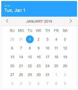
In this blog we will introduce our Calendar custom element.
The Calendar Web Component enables you to visualize and select the year, month and date. The years and the months can be easily changed by navigating the calendar from the title bar. The selected day is indicated by a colored circle. The calendar is one of the basic custom elements used when you need to change or select dates. Calendar Custom Element FeaturesWhen you select a date from the HTML Calendar element the current date stays indicated by a filled circle with paler color. 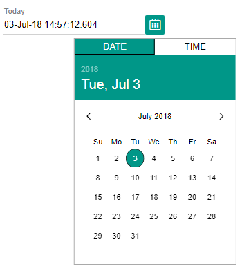
If you click on the year in the title bar there appears a list with years below it. You can select a year from the list. Likewise, if you click on the month in the title bar there appears a list with months below it. You can select a month from the list. The Calendar Web component is responsive and mobile ready. In addition, the text and the back ground colors can be changed. You can see an example here. ComboBox Custom Element
In this blog we will introduce our Combobox custom element.
The ComboBox is one of the basic web components used widely in the UI part of applications in order to facilitate the selection of items. It represents a list of elements displayed in a drop-down and an input text field where information can be entered. The elements from the list can be selected. Also the user can search for a specific element. Combobox Custom Element FeaturesOur HTML Combobox Element supports multiple selection. With the MultiSelect option the user can select multiple elements from the drop down list. The selected elements will appear in the text input field. 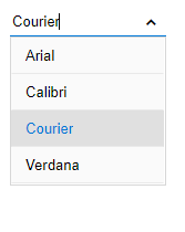
The Open direction of the list of elements can be above, below or centered. The web component enables also auto-complete. With the auto-complete option the element matching the text in the input filed will be shown on top. Checkbox on the left of the elements in the list is also supported. This facilitates the selection of multiple items. The elements in the drop down list can be aligned horizontally or vertically. The horizontal alignment can be left or right and the vertical top or bottom. In addition, the text and the back ground colors can be changed. You can see an example here. Grid Custom Element
The latest release of Smart Custom Element includes an initial version of a Grid Web Component.
Demos: https://www.htmlelements.com/demos/grid/. Docs: https://www.htmlelements.com/docs/grid/. Context Menu Custom Element
In this blog we will introduce our Context Menu Custom Element.
The Menu Web Component is used to show different choices grouped in a hierarchical structure. It is one of the most frequently used HTML interface elements. The Context Menu can be used when you want to change the menu items based on the state of your application. Context Menu Custom Element FeaturesOur Contextual Menu Web Component supports images. The images can be positioned on the left of the text of the menu items. In addition to images you can also add check boxes. Menu elements which are not relevant in the current moment can be removed. In addition you can disable items which need certain condition in order to be active. Animation can also be enabled. When you enable animation you can see a nice fading effect. Our HTML Context Menu can also be shown as minimized. You can see an example here. Web Components 1.2.0
We are glad to share with you that our Team tested Smart Custom Elements with the latest version of Web Components and we did not find any issues. We updated all our demos to use only ES6 code. This does not mean that you would not be able to use our product with older browsers. You can still use the transpiled ES5 version of the files, if you target IE11 or other browsers without ES6 and CSS Variables support.
Posted in: HTML Elements Tagged: custom elements, smart custom elements, web components Leave a comment Smart Custom Element
Smart Custom Element provides a set of useful API, Data Binding, Templates, Device Agnostic Event Handling, Resize handling, Style Change Notifications, Property and Attribute Change Notifications, Property Value and Type validation, Localization, Lifecycle callback functions and much more. Our framework allows you to easily build Custom HTML Elements. Custom Elements are the web platform's native solution for component-based development. With Custom Elements, you get reusable HTML tags that can be used just like the browser’s built-in native html elements, or break your app up into small pieces, making your code cleaner and easier to maintain.
For more information, please visit: https://www.htmlelements.com/docs/base-element/ GitHub repo: https://github.com/HTMLElements/smart-custom-element NPM: https://www.npmjs.com/package/@smarthtmlelements/smart-custom-element Posted in: HTML Elements Tagged: custom element, smart custom element, smart elements Leave a comment Smart Tabs Custom Element
Smart Tabs is a Tabs Custom HTML Element that make it easy to explore and switch between different views, part of the Smart HTML Elements. Tabs can be paired with components like top app bars, or nested in components like cards and sheets. Users can navigate between tabs by tapping a tab, or by performing a swipe gesture over content
WebComponents.org: https://www.webcomponents.org/element/HTMLElements/smart-tabs. NPM Installation: Smart Tabs Smart Calendar
Smart Calendar represents a Calendar Custom Element, which you can use to pick a Date interactively. It is built with Javascript, CSS and HTML. The Calendar does not depend on any third-party libraries.
 Smart Calendar NPM package has been publishte: https://www.npmjs.com/package/@smarthtmlelements/smart-calendar GitHub repo: https://github.com/HTMLElements/smart-calendar WebComponents: https://www.webcomponents.org/element/htmlelements/smart-calendar Posted in: HTML Elements, Smart Calendar Tagged: calendar, date picker, datepicker, html calendar, html datepicker, javascript calendar, smart calendar Leave a comment Smart Accordion
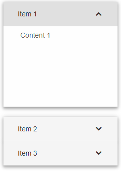
Smart Accordion is a custom element which contains expandable panels. Each panel has Header and Content. In the Header and Content, you can put any HTML or HTML Element. Our Smart Accordion custom element now has a GitHub repository, Bower(type bower install htmlelements/smart-accordion) and NPM packages and is also available on the WebComponents.org website - smart-accordion.
 Smart Button
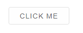
 is a simple custom element which represents a Button. It can contain any content like Image, Text or any HTML. Our Smart Button custom element now has a GitHub repository, Bower(type bower install htmlelements/smart-button) and NPM packages and is also available on the WebComponents.org website - smart-button.
 Posted in: HTML Elements, Smart Button Tagged: button, button component, buttons, css button, custom button element, html button, html button element, smart button, ui button Leave a comment About Smart HTML ElementsWhat is Smart HTML Elements?
Smart HTML Elements represents a UI framework based on Javascript, HTML 5 and CSS 3 for building responsive web-based applications. Smart HTML Elements includes more than 30 UI components. Some of them are: Sliders, Tabs, Tank, Gauge, Buttons, Lists, Dropdowns, Dialog Window, Toast, etc. |
|