Smart UI Desktop App with Blazor and Windows FormsBlazor - Desktop CrossplatformGetting StartedThis tutorial will show you how you can use Smart components in a Blazor Desktop app with .NET 6, running in both a web browser and in WinForms. Prerequisites
Before getting started you need to have Visual Studio 2022 with .NET 6 SDK installed. Blazor Server AppFirst, we will start by opening Visual Studio 2022 and creating a Blazor Server App called CrossPlatformBlazor with target framework .NET 6.0 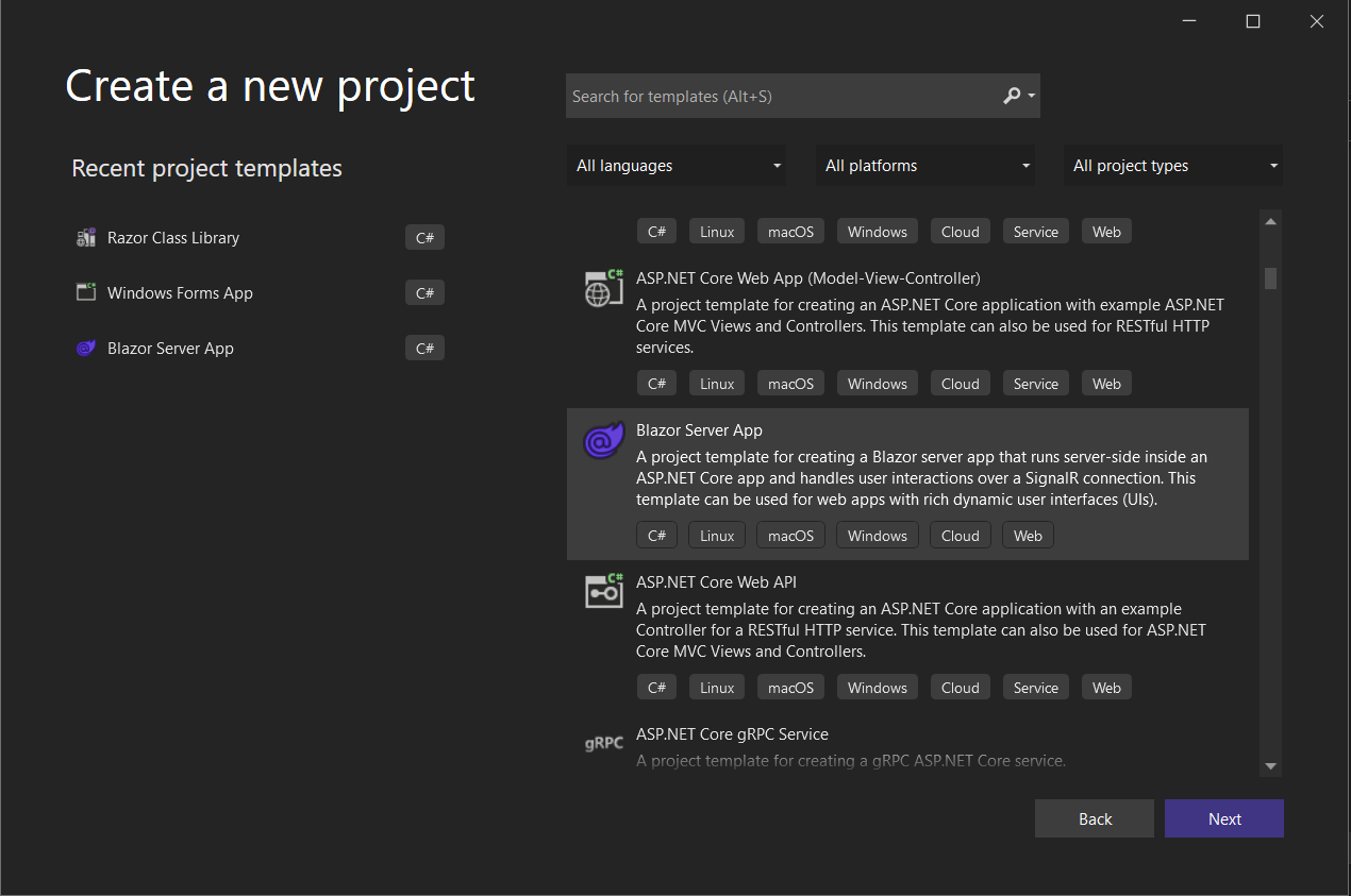
Then we need to add Smart.Blazor NuGet package to the project. 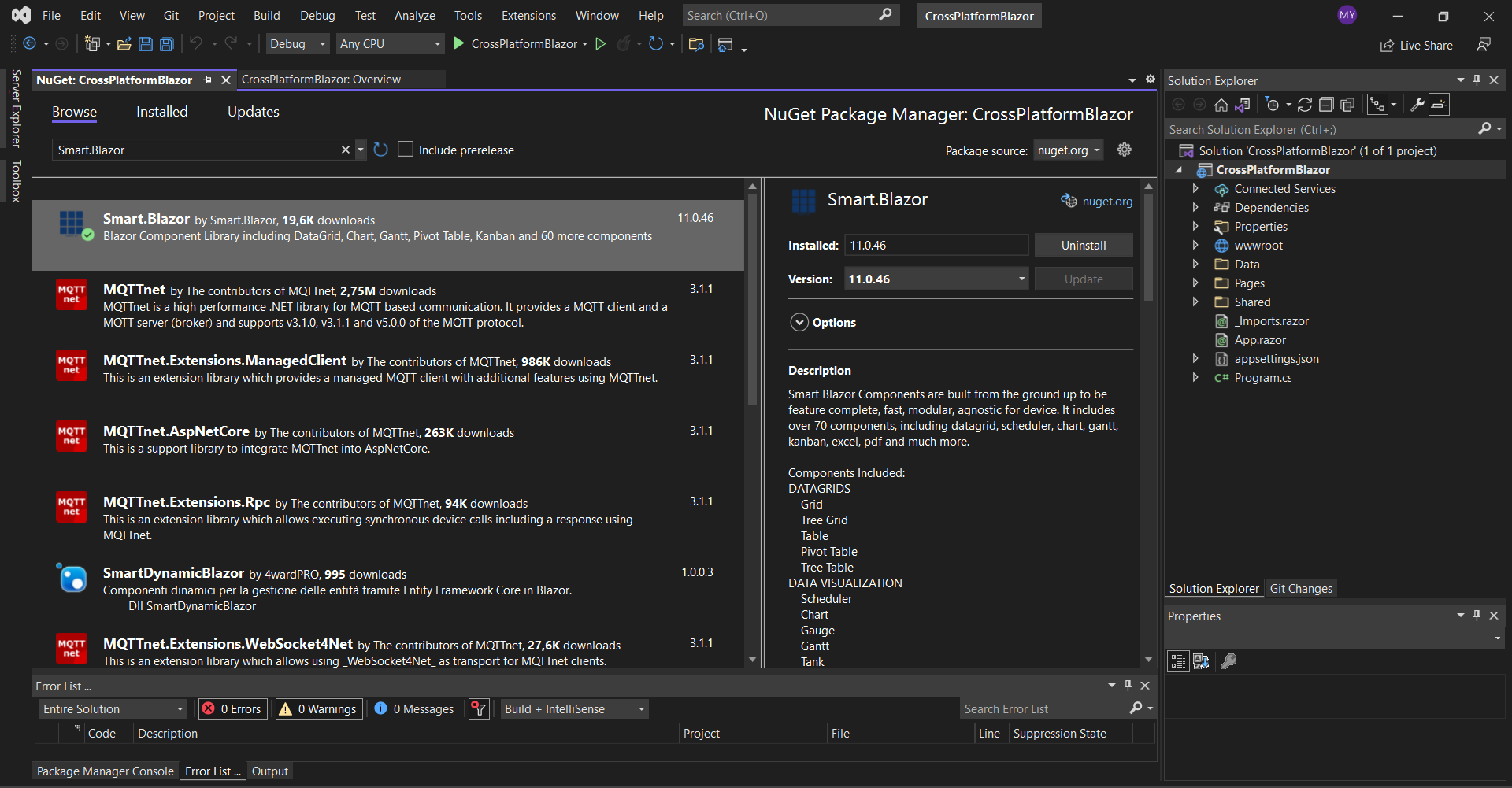
Open the
<link href="_content/Smart.Blazor/css/smart.default.css" rel="stylesheet" />
and Smart source files by adding this snipet:
  <script src="_content/Smart.Blazor/js/smart.blazor.js"><script>
  <script src="_content/Smart.Blazor/js/smart.elements.js"></script>
The next step is to open the Program.cs file and to add
    using CrossPlatformBlazor.Data;
    using Microsoft.AspNetCore.Components;
    using Microsoft.AspNetCore.Components.Web;
    using Smart.Blazor;

    var builder = WebApplication.CreateBuilder(args);

    // Add services to the container.
    builder.Services.AddRazorPages();
    builder.Services.AddServerSideBlazor();
    builder.Services.AddSingleton<WeatherForecastService>();
    // Add Smart UI for Blazor.
    builder.Services.AddSmart();

    var app = builder.Build();

    // Configure the HTTP request pipeline.
    if (!app.Environment.IsDevelopment())
    {
        app.UseExceptionHandler("/Error");
        // The default HSTS value is 30 days. You may want to change this for production scenarios, see https://aka.ms/aspnetcore-hsts.
        app.UseHsts();
    }

    app.UseHttpsRedirection();

    app.UseStaticFiles();

    app.UseRouting();

    app.MapBlazorHub();
    app.MapFallbackToPage("/_Host");

    app.Run();
Now you can open the
    @page "/"
    @using CrossPlatformBlazor.Data

    @inject WeatherForecastService ForecastService

    <h1>Weather forecast</h1>

    <p>This component demonstrates fetching data from the server.</p>

    @if (forecasts == null)
    {
      <p><em>Loading...</em></p>
    }
    else
    {
      <Table Selection="true" SortMode="TableSortMode.One" class="table">
        <table>
          <thead>
            <tr>
              <th>Date</th>
              <th>Temp. (C)</th>
              <th>Temp. (F)</th>
              <th>Summary</th>
            </tr>
          </thead>
          <tbody>
            @foreach (var forecast in forecasts)
            {
              <tr>
                <td>@forecast.Date.ToShortDateString()</td>
                <td>@forecast.TemperatureC</td>
                <td>@forecast.TemperatureF</td>
                <td>@forecast.Summary</td>
              </tr>
            }
          </tbody>
        </table>
      </Table>
    }

    @code {
      private WeatherForecast[] forecasts;

      protected override async Task OnInitializedAsync()
      {
        forecasts = await ForecastService.GetForecastAsync(DateTime.Now);
      }
    }
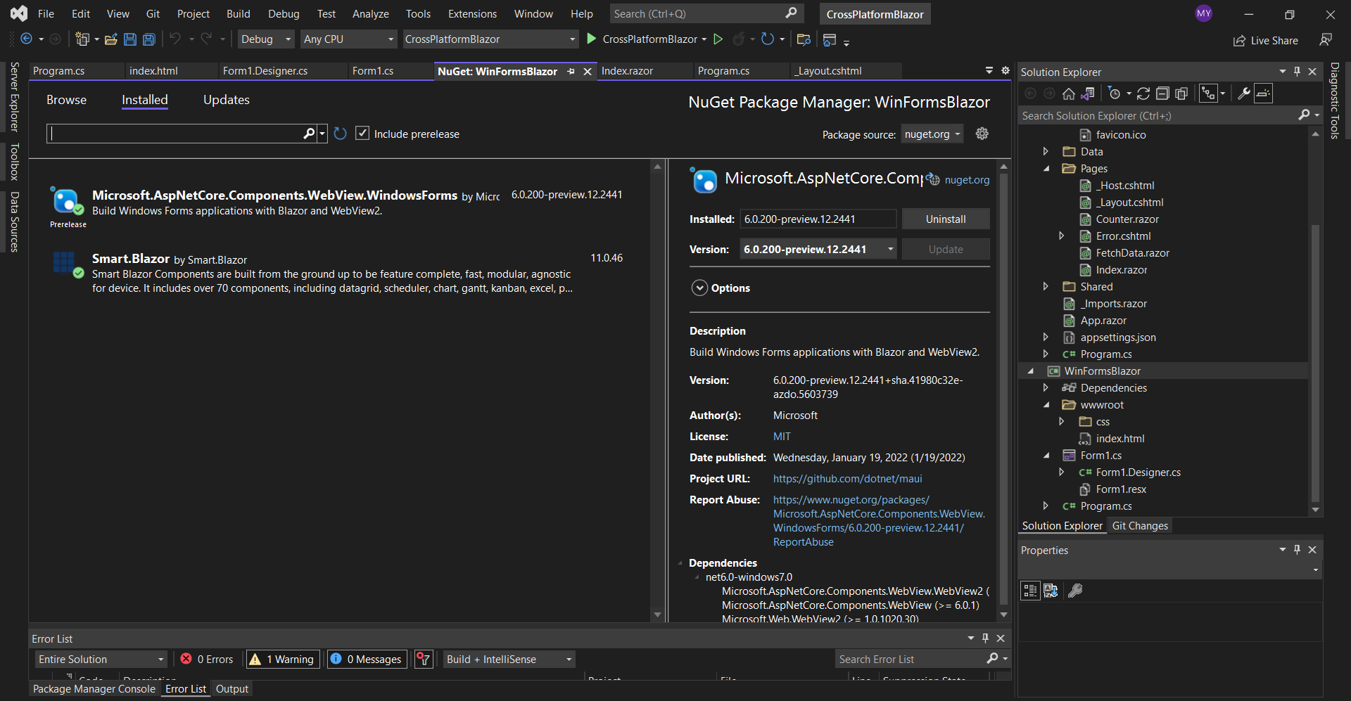
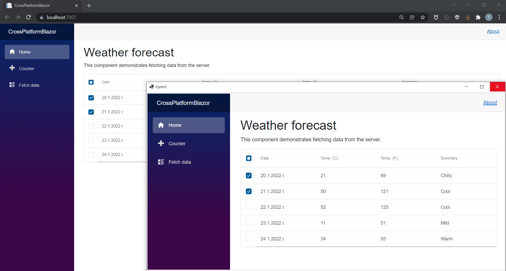
We are ready with the web part of our application. If you run the project you should see the following result: 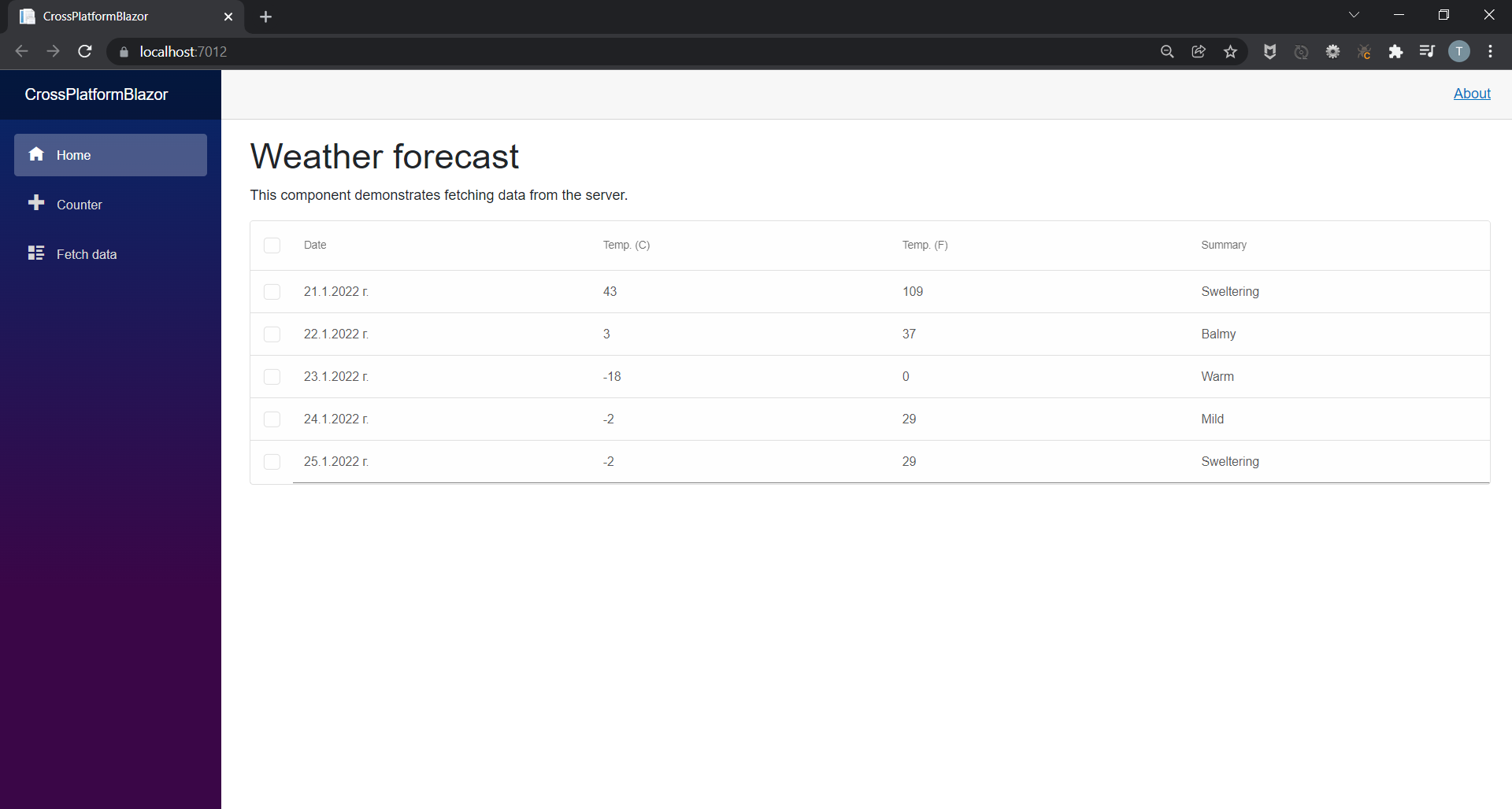
Windows Forms BlazorThe next step is to add a new Windows Forms App to the solution. We will name it WinFormsBlazor. 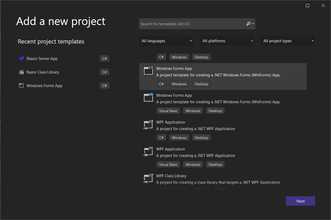
Add the Smart.Blazor and Microsoft.AspNetCore.Components.WebView.WindowsForms NuGet packages to the project.
    <!DOCTYPE html>
    <html>

    <head>
        <meta charset="utf-8" />
        <meta name="viewport" content="width=device-width, initial-scale=1.0, maximum-scale=1.0, user-scalable=no" />
        <title>Blazor WinForms app</title>
        <base href="/" />
        <link rel="stylesheet" href="css/bootstrap/bootstrap.min.css" />
        <link href="css/site.css" rel="stylesheet" />
        <link href="WinFormsBlazor.styles.css" rel="stylesheet" />
        <link href="_content/Smart.Blazor/css/smart.default.css" rel="stylesheet" />

    </head>

    <body>

        <div id="app"></div>

        <div id="blazor-error-ui">
            An unhandled error has occurred.
            <a href="" class="reload">Reload</a>
            <a class="dismiss">🗙</a>
        </div>

        <script src="_framework/blazor.webview.js"></script>
        <script src="_content/Smart.Blazor/js/smart.blazor.js"></script>
        <script src="_content/Smart.Blazor/js/smart.elements.js"></script>
    </body>

    </html>
Blazor Class Library
We will extract the code shared between the Blazor Desktop app and the Blazor Server app in a separate Razor Class Library that we will call BlazorClassLibrary.
<Nullable>enable</Nullable>
with
<AddRazorSupportForMvc>true</AddRazorSupportForMvc>
and add:
    <ItemGroup>
        <FrameworkReference Include="Microsoft.AspNetCore.App" />
    </ItemGroup>
Note, that you need to add a reference to the class library in the Blazor Server App and the Windows Forms App by right-clicking on them and choosing Add Project Refrence...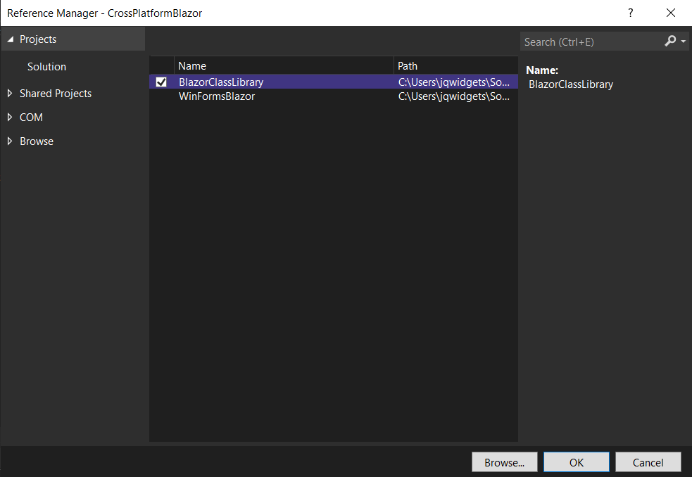 Now you can move Data, Pages, Shared and wwwroot folders and _Imports.razor and App.Razor files from CrossPlatformBlazor to BlazorClassLibrary.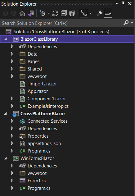 Then you should fix the reference of ILogger inside \Pages\Error.cshtml.cs by adding:
using Microsoft.Extensions.Logging;
Inside _Imports.razor replace:
    @using CrossPlatformBlazor
    @using CrossPlatformBlazor.Shared
with
    @using BlazorClassLibrary
    @using BlazorClassLibrary.Shared
Inside \Pages\_Layout.cshtml file you need to change the references of the css files by replacing:
    <link rel="stylesheet" href="css/bootstrap/bootstrap.min.css" />
    <link href="css/site.css" rel="stylesheet" />
with
    <link rel="stylesheet" href="_content/BlazorClassLibrary/css/bootstrap/bootstrap.min.css" />
    <link href="_content/BlazorClassLibrary/css/site.css" rel="stylesheet" />
And finally, inside \Pages\_Host.cshtml add:
@using BlazorClassLibrary
Final Configurations
Lastly, in the WinFormsBlazor project you should open the
    using BlazorClassLibrary;
    using CrossPlatformBlazor.Data;
    using Microsoft.AspNetCore.Components.WebView.WindowsForms;
    using Microsoft.Extensions.DependencyInjection;
    using Smart.Blazor;

    namespace WinFormsBlazor
    {
        public partial class Form1 : System.Windows.Forms.Form
        {
            public Form1()
            {
                var serviceCollection = new ServiceCollection();
                serviceCollection.AddBlazorWebView();

                serviceCollection.AddSingleton<WeatherForecastService>();

                serviceCollection.AddSmart();

                InitializeComponent();

                blazorWebView1.HostPage = @"wwwroot\index.html";
                blazorWebView1.Services = serviceCollection.BuildServiceProvider();
                blazorWebView1.RootComponents.Add<App>("#app");
            }
        }
    }
Then open also the Form1.Designer.cs file and paste the following code:
    namespace WinFormsBlazor
    {
        partial class Form1
        {
            /// <summary>
            ///  Required designer variable.
            /// </summary>
            private System.ComponentModel.IContainer components = null;

            /// <summary>
            ///  Clean up any resources being used.
            /// </summary>
            /// <param name="disposing">true if managed resources should be disposed; otherwise, false.</param>
            protected override void Dispose(bool disposing)
            {
                if (disposing && (components != null))
                {
                    components.Dispose();
                }
                base.Dispose(disposing);
            }

            #region Windows Form Designer generated code

            /// <summary>
            ///  Required method for Designer support - do not modify
            ///  the contents of this method with the code editor.
            /// </summary>
            private void InitializeComponent()
            {
                this.blazorWebView1 = new Microsoft.AspNetCore.Components.WebView.WindowsForms.BlazorWebView();
                this.SuspendLayout();
                //
                // blazorWebView1
                //
                this.blazorWebView1.Anchor = ((System.Windows.Forms.AnchorStyles)((((System.Windows.Forms.AnchorStyles.Top | System.Windows.Forms.AnchorStyles.Bottom)
                | System.Windows.Forms.AnchorStyles.Left)
                | System.Windows.Forms.AnchorStyles.Right)));
                this.blazorWebView1.Location = new System.Drawing.Point(3, 7);
                this.blazorWebView1.Name = "blazorWebView1";
                this.blazorWebView1.Size = new System.Drawing.Size(796, 436);
                this.blazorWebView1.TabIndex = 20;
                //
                // Form1
                //
                this.AutoScaleDimensions = new System.Drawing.SizeF(8F, 20F);
                this.AutoScaleMode = System.Windows.Forms.AutoScaleMode.Font;
                this.ClientSize = new System.Drawing.Size(800, 450);
                this.Controls.Add(this.blazorWebView1);
                this.Name = "Form1";
                this.Text = "Form1";
                this.ResumeLayout(false);

            }

            #endregion

            private Microsoft.AspNetCore.Components.WebView.WindowsForms.BlazorWebView blazorWebView1;
        }
    }
The last thing you need to do is to open the WinFormsBlazor's project file WinFormsBlazor.csproj and change the first line to:
<Project Sdk="Microsoft.NET.Sdk.Razor">
and add the following lines:
    <ItemGroup>
      <Content Update="wwwroot\**">
        <CopyToOutputDirectory>PreserveNewest</CopyToOutputDirectory>
      </Content>
    </ItemGroup>

    <ItemGroup>
      <Content Update="wwwroot\css\site.css">
        <CopyToOutputDirectory>PreserveNewest</CopyToOutputDirectory>
        <ExcludeFromSingleFile>true</ExcludeFromSingleFile>
        <CopyToPublishDirectory>PreserveNewest</CopyToPublishDirectory>
      </Content>
    </ItemGroup>
Now if you start both the CrossPlatformBlazor and WinFormsBlazor projects you should get the following result: Posted in: Uncategorized Tagged: blazor, blazor desktop, blazor desktop application, blazor server app, windows forms, windows forms blazor Leave a comment Smart UI v12.0.0Smart UI v12.0.0 Release, Jan-20-2022What's New:
What's Fixed:
Posted in: Angular, HTML Elements, Javascript, React, Smart Accordion, Smart Button, Smart Calendar, Smart ComboBox, Smart Grid, Smart ListBox, Smart Tabs, Smart.Chart, Vue, Web Components Tagged: dateinput, Grid, kanban Leave a comment Smart UI for Blazor v11.0.38 Release, Jan-03-2022
We are happy to announce that we have just released the first version of Smart.Blazor for this year. The Gantt Chart, Kanban, Grid, Scheduler & Editor come with major new features. More than 70 new documentation help tutorials and 100+ examples are in our updated blazor demos page: https://www.htmlelements.com/blazor/blazor-ui/demos/
Please, find below the list of changes:
Smart UI v11.0.0Smart UI v11.0.0 Release, Nov-30-2021What's New:
What's Fixed:
Posted in: Angular, HTML Elements, Javascript, React, Vue, Web Components Tagged: gantt, gantt chart, Grid Leave a comment Smart UI v10.0.0Smart UI v10.0.0 Release, August-16-2021What's New:
Breaking Changes:
Smart UI v9.4.1Smart UI v9.4.1 Release, July-07-2021What's New:
Smart UI 9.3.0Smart UI v9.3.0 Release, May-10-2021What's New:
Posted in: Angular, Javascript, React, Vue, Web Components Tagged: bootstrap, bootstrap sass, bootstrap scss, bootstrap theme, dark theme, light theme, sass, scss Leave a comment Bootstrap Admin Dashboard Template
We are happy to announce the availability of our New Admin Dashboard Template: Bootstrap Admin Template. This template aims to demonstrate the usage of Smart UI along with Bootstrap. Smart UI now features a brand new Bootstrap Theme included in the download package. All Smart UI components natively integrate into Bootstrap-driven layouts. That means that now it is easier than ever to achieve web application adaptivity and consistent look across browsers and devices using jQWidgets products.
 Posted in: Angular, HTML Elements, Javascript, React Tagged: bootstrap, bootstrap admin template, bootstrap colors, bootstrap components, bootstrap controls, bootstrap dashboard, bootstrap design, bootstrap layout, bootstrap template, bootstrap theme, bootstrap ui, bootstrap ux, bootstrap4 Leave a comment Smart UI R1 2021 Release Is HereSmart UI Release is Here!The first release of 2021 of Smart UI is available, bringing many advanced features and updates across our Javascript & Blazor libraries 
What's New:
Download Free Trial: https://www.htmlelements.com/download/ License: https://www.jqwidgets.com/license/ Happy coding, The jQWidgets & Smart UI Team Posted in: Angular, HTML Elements, Javascript, React, Smart Accordion, Smart Button, Smart Calendar, Smart ComboBox, Smart Context Menu, Smart Grid, Smart ListBox, Smart Tabs, Smart.Chart, Vue, Web Components Tagged: admin dashboard, admin template, bootstrap, bootstrap template, bootstrap5, dashboard template, templates, theme, themeforest, ui, uikit, uilibrary, ux Leave a comment Smart UI 9.0.0
We are happy to announce the new version of Smart UI. The major new thing in this release is the new feature-complete Scheduler component.
What's New:
Posted in: Angular, HTML Elements, Javascript, React, Smart Grid, Vue, Web Components Leave a comment Smart UI 8.1.1
We are happy to announce the new version of our software.
What's New:
You can get the new production build from: Download Blazor Component LibraryBlazor ComponentsWe are happy to announce Smart UI for Microsoft Blazor. Both server-side and client-side (WASM) Blazor are supported.What's Included:
Demos: Smart UI Blazor Demos Posted in: Uncategorized Tagged: blazor, blazor component library, blazor components, blazor grid, blazor kanban, blazor server side, blazor wasm, microsoft blazor 2 Comments Smart UI for Vue 3
Vue 3 is faster, smaller, more maintainable and it's easier to target native.
Composition APIOne of the most significant changes is that a new API that will allow for a function-based way of writing your component, inspired by React Hooks. It lets you encapsulate logic into "composition functions" and reuse that logic across componentOther changes in Vue 3 compared to Vue 2Virtual DOM rewrite for better performance and improved TypeScript support Native portals – now called Teleport Fragments (virtual elements that won't be rendered in the DOM tree) More flexibility for global mounting Conditional suspending of component rendering Smart UI for Vue 3Smart UI for Vue 3 is available at: https://www.htmlelements.com/vue/. All components are fully available and tested for Vue 3 web development. API & Getting Started Docs for Vue 3 have been added to https://www.htmlelements.com/docs/ Posted in: Smart Accordion, Smart Button, Smart Calendar, Smart ComboBox, Smart Context Menu, Smart Grid, Smart ListBox, Smart Tabs, Smart.Chart, Vue Tagged: vue 3, vue composition api, vuejs, vuejs 3 Leave a comment Smart UI v8.0.0Smart UI v8.0.0 Release, Sep-15-2020What's New:
Posted in: Angular, HTML Elements, Javascript, React, Web Components Tagged: pivot datagrid, pivot grid, pivot table Leave a comment Blazor Components coming soonBlazor UI ComponentsA week ago, we released our jQWidgets Blazor UI components: https://blazor.jqwidgets.com/. Now, we plan to do the same for our Smart product line. What is Blazor?Blazor is a new UI framework that was included in .NET Core 3. Blazor server-side and WebAssembly are both now shipping as part of .NET Core 3.2.0. Conceptually, Blazor is more like Angular or React rather than ASP.NET MVC. It’s a component-based framework for building rich and interactive web applications. The main difference between Blazor and traditional JavaScript frameworks is that Blazor components are written entirely in C# and Razor. No JavaScript required! Web apps are composed of reusable web UI components implemented using C#, HTML, and CSS. Both client and server code is written in C#, allowing you to share code and libraries. Blazor has two models: Server and WebAssembly. The server model was shipped with .NET Core 3. At that time, WebAssembly was still in preview, but has now been fully released with Blazor 3.2. Both are now production ready. Code running in the browser executes in the same security sandbox as JavaScript frameworks. Blazor code executing on the server has the flexibility to do anything you would normally do on the server, such as connecting directly to a database. What is WebAssemblyWebAssembly (abbreviated “Wasm”) is an instruction set designed to run on any host capable of interpreting those instructions, or compiling them to native machine code and executing them.Wasm is an instruction set that is formatted in a specific binary format. Any host (hardware or software) that adheres to this specification is therefore capable of reading binaries and executing them – either interpreted, or by compiling directly to machine language specific to the device. Wasm is akin to the common instruction set (Common Intermediate Language) that .NET source code compiles to. Just like .NET, Wasm can be generated from higher languages such as C#. Our new components will support both: Blazor WebAssembly hosting model and Blazor Server hosting model. Below is an image of a Smart.Button Blazor component. 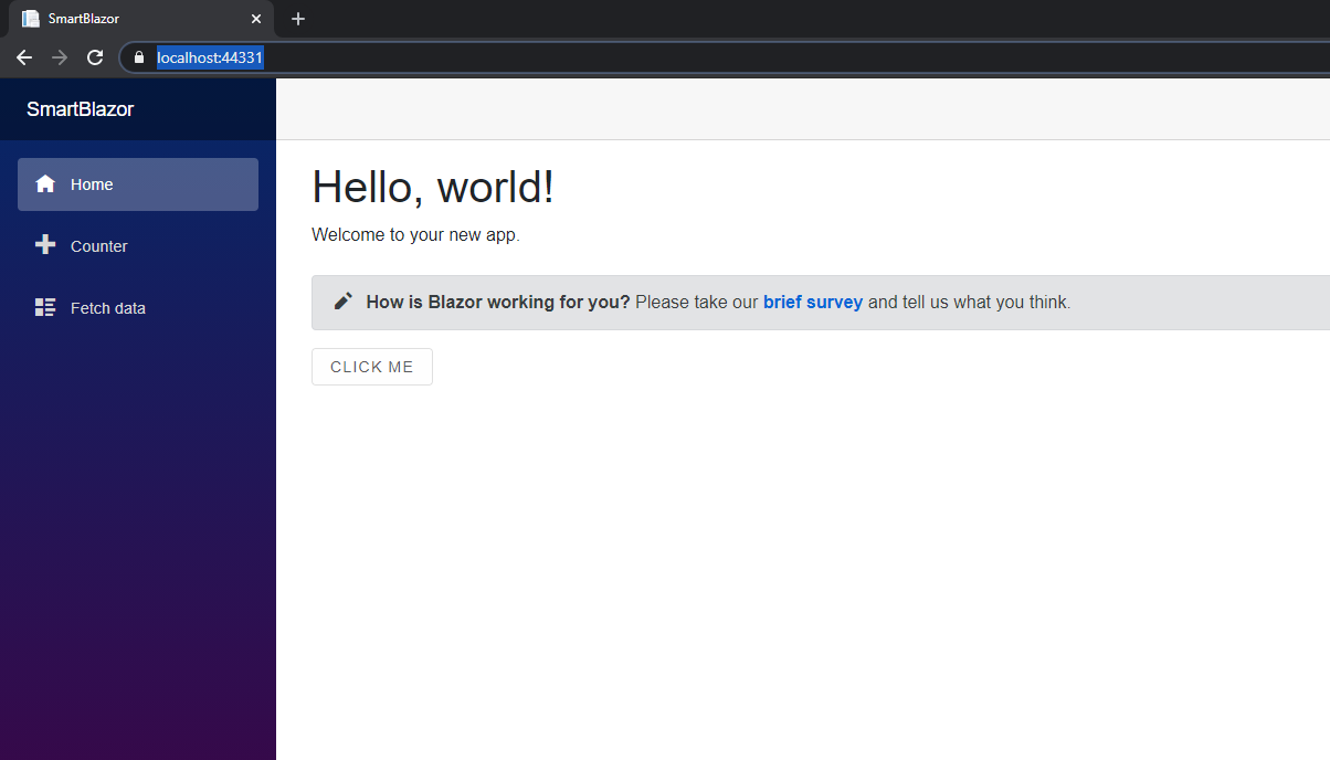
When is the first release of Smart UI for Blazor?Our plans are to release an early preview of Smart UI for Blazor by end of October and provide demos and documentation for most of the components, we currently have like DataGrid, Charting, Kanban, Table, CardView, etc. The installation would be through a NuGet package. Github repo for posting issues and feature request will also be available.For those of you who want to create Blazor applications with our components NOW, please refer to our help tutorial here: https://www.htmlelements.com/docs/blazor/ Update 07-July-2021Smart.Blazor NUGET package is available. All Blazor demos are available here: https://www.htmlelements.com/blazor/Posted in: HTML Elements, Web Components Tagged: .NET, blazor, C#, microsoft blazor, razor, web assembly Leave a comment Angular RxJS with DataGrid
Reactive programming is an asynchronous programming paradigm concerned with data streams and the propagation of change. RxJS (Reactive Extensions for JavaScript) is a library for reactive programming using observables that makes it easier to compose asynchronous or callback-based code. In this blog post we will show how to use our Angular DataGrid component with RxJS.
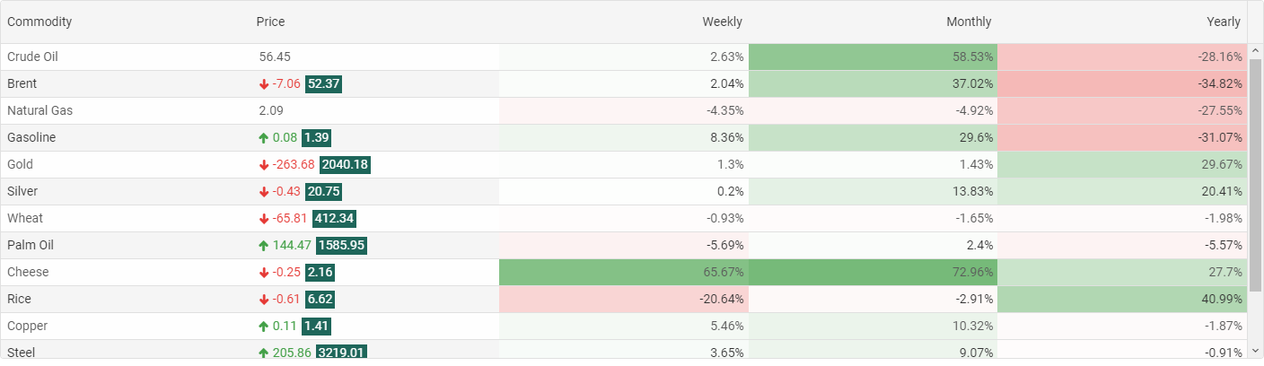
Observable creation functionsRxJS offers a number of functions that can be used to create new observables. These functions can simplify the process of creating observables from things such as events, timers, promises, and so on. For exampleUsing Smart.Grid with RxJS
In order to use our DataGrid with Angular and RxJS, you will need to do the following:
1. Create a new Angular project.
2. Install smart-webcomponents-angular vie npm install smart-webcomponents-angular or ng add smart-webcomponents-angular
3. Import the Smart.Grid module in app.module.ts
import { NgModule } from '@angular/core';
import { BrowserModule } from '@angular/platform-browser';
import { GridModule } from 'smart-webcomponents-angular/grid';
import { AppComponent } from './app.component';
import { FormsModule } from '@angular/forms';
import { HttpClientModule } from '@angular/common/http';
@NgModule({
    declarations: [ AppComponent ],
    imports: [ BrowserModule, FormsModule, GridModule, HttpClientModule ],
    bootstrap: [ AppComponent ],
	entryComponents: [ AppComponent ]
})
export class AppModule { }
4. Edit app.component.ts
import { Component, ViewChild, AfterViewInit, ViewEncapsulation } from '@angular/core';
import { GridComponent, GridColumn, DataAdapter, Smart } from 'smart-webcomponents-angular/grid';
import { GetData } from './data'
import { Observable, from  } from 'rxjs';
@Component({
    selector: 'app-root',
    templateUrl: './app.component.html',
    styleUrls: ['app.component.css'],
    encapsulation: ViewEncapsulation.None
})
export class AppComponent implements AfterViewInit {
	@ViewChild("grid", { read: GridComponent, static: false }) grid: GridComponent;
    // setup Datagrid's price column template.
    changeTemplate(formatObject: any) {
        const value: number = formatObject.value, opacity: number = Math.abs(value) / 100;
        if (value < 0) {
            formatObject.cell.background = `rgba(229, 57, 53, ${opacity})`;
        }
        else if (value > 0) {
            formatObject.cell.background = `rgba(67, 160, 71, ${opacity})`;
        }
        formatObject.template = value + '%';
    }
	// setup Datagrid appearance.
	appearance = {
        alternationCount: 2,
        showColumnLines: false,
        showColumnHeaderLines: false
    };
	// setup Datagrid columns resize.
    behavior = { columnResizeMode: 'growAndShrink' };
    // setup Datagrid data source.
    dataSource = new window.Smart.DataAdapter({
        dataSource: [],
        dataFields: [
            'commodity: string',
            'price: number',
            'priceChange: number',
            'day: number',
            'week: number',
            'month: number',
            'year: number',
            'date: date'
        ]
    });
	// setup Datagrid columns.
    columns = [
        { label: 'Commodity', dataField: 'commodity' },
        {
            label: 'Price', dataField: 'price', align: 'left', cellsAlign: 'left', template: function (formatObject: any) {
                const value: number = formatObject.value.toFixed(2);
				const priceChange: number = (this as any).grid.dataSource[formatObject.row.index].priceChange;
  			    if (priceChange === 0) {
                    formatObject.template = value;
                }
                else {
                    formatObject.template = `
${priceChange}
${value}`;
                }
            }
        },
        { label: 'Weekly', dataField: 'week', template: this.changeTemplate },
        { label: 'Monthly', dataField: 'month', template: this.changeTemplate },
        { label: 'Yearly', dataField: 'year', template: this.changeTemplate }
    ];
    ngAfterViewInit(): void {
		const that = this;
		// init demo server.
		const demoServer = this.setupDemoServer(),
		initServer = demoServer.init(),
		serverData = demoServer.getData();
	  	initServer.subscribe(function(dataRows) {
		that.dataSource = new window.Smart.DataAdapter({
				dataSource: dataRows.slice(0),
				dataFields: [
					'commodity: string',
					'price: number',
					'priceChange: number',
					'day: number',
					'week: number',
					'month: number',
					'year: number',
					'date: date'
				]
			});
		serverData.subscribe(function(rows) {
				// suspend updates.
				that.grid.beginUpdate();
				// update cell values.
				for(let i = 0; i < that.grid.rows.length; i++) {
					const row = that.grid.rows[i];
					const priceCell = row.getCell('price');
					const priceCellChange = row.getCell('priceChange');
					row.data.priceChange = rows[i].priceChange;
					row.data.price = rows[i].price;
				}
				// resume updates.
				that.grid.endUpdate();
		  });
		});
    }
	// setup demo server.
	setupDemoServer() {
	  function demoServer() {
		'use strict';
		this.dataRows = [];
	  }
	  // init server and fetch data from url.
	  demoServer.prototype.init = function() {
		return from(
		  new Promise((resolve, reject) => {
			  fetch('https://raw.githubusercontent.com/HTMLElements/smart-webcomponents-angular/master/data.json')
			  .then(response => response.json())
			  .then(data => {
					let dataSet = data;
					this.dataRows = dataSet.map((value) => {
						const newData = Object.assign(value);
						newData.priceChange = 0;
						return newData;
					});
					resolve(this.dataRows);
			  });
		  })
		);
	  };
      // get data and update it every 1s using Observable.
	  demoServer.prototype.getData = function() {
		const that = Object(this);
		// dynamic updates.
		return Observable.create(function(observer) {
		  const interval = setInterval(() =>{
			for (let i = 0; i < that.dataRows.length; i++) {
			    const index = Math.floor(that.dataRows.length * Math.random());
				const currentdataRows = that.dataRows[index];
				let value = currentdataRows.price;
				if (Math.random() > 3 / 5) {
					value = value + 1e-10;
					currentdataRows.priceChange = 0;
					continue;
				}
				let valueChange = (Math.random() > 0.5 ? 1 : -1) * value * ((Math.random() * 15 + 1) / 100);
				valueChange = parseFloat(valueChange.toFixed(2));
				value = Math.max(1, parseFloat((value + valueChange).toFixed(2)));
				currentdataRows.price = value;
				currentdataRows.priceChange = valueChange;
			}
			observer.next(that.dataRows);
		  }, 1000);
		  return function() {
			window.clearInterval(interval);
		  };
		});
	  };
	  return new demoServer();
	}
}
Full tutorial: https://www.htmlelements.com/docs/angular-rxjs/ DataGrid Validation Coming soonDataGrid Data ValidationThe next version will include a much requested feature - Data Validation for the DataGrid component. The DataGrid control will allow you to perform validation at both the cell and row level. With cell-level validation, you validate individual properties of a bound data object when a user updates a value. With row-level validation, you validate entire data objects when a user commits changes to a row. You can also provide customized visual feedback for validation errors, or use the default visual feedback that the DataGrid control provides. The available set of validation rules are: 'min', 'max', 'minLength', 'maxLength', 'minDate', 'maxDate', 'null', 'email', 'required', 'requiredTrue' and 'pattern'. 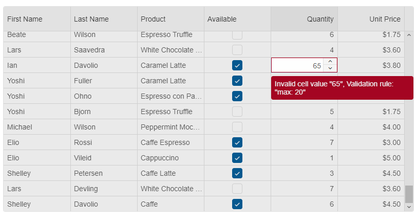
Shadow DOM Support with Smart UI 7.7.1What is Shadow DOM?The shadow DOM is an encapsulated version of the DOM. This allows authors to effectively isolate DOM fragments from one another, including anything that could be used as a CSS selector and the styles associated with them. Generally, any content inside of the document’s scope is referred to as the light DOM, and anything inside a shadow root is referred to as the shadow DOM. How to use Shadow DOM with Smart Web Components?The new version(7.7.1) of our library adds complete Shadow DOM support for all web components. To use the components with Shadow Dom enabled, you need to refer the "source/components" folder. When you use these components, you no longer have to add a reference to the "smart.default.css" file as all required styles by the component are included in its file. Example: https://www.htmlelements.com/demos/grid/shadow-dom/ We added some useful API for importing Styles into the Shadow DOM. Each Web component has a new "addStyle" method which accepts a CSS string. There is also a "style-url" attribute. When you set that attribute during initialization time, the referred CSS file will be included into the Shadow DOM of your component. Why should I use Shadow DOM?Benefits of using Shadow DOM are CSS scoping, DOM encapsulation and composition. The web components will be isolated by the other parts of your application and there will be no CSS conflicts.Posted in: Uncategorized Tagged: css variables, light dom, shadow document, shadow dom, shadow root, shadow styles, web components Leave a comment Reactive Form Web ComponentReactive FormA new Reactive Form will arrive in Smart UI 7.7.0. It will have two types of initialization. Reactive forms use an explicit and immutable approach to managing the state of a form at a given point in time. Each change to the form state returns a new state, which maintains the integrity of the model between changes. Reactive forms are built around observable streams, where form inputs and values are provided as streams of input values, which can be accessed synchronously. Reactive forms also provide a straightforward path to testing because you are assured that your data is consistent and predictable when requested. Any consumers of the streams have access to manipulate that data safely. The purpose of our new Form component is to provide you an awesome and modern looking Form component, which is easy customizable and will help you to deliver better and professional looking web Forms.Create a Form from HTML TemplateIt will be possible to create a new Smart.Form from an existing HTML Form component and will add validation, AJAX submit, control states such as: 'dirty', 'touched', 'pristine', 'valid', 'invalid'.Example:
  const form = new Smart.Form('#profileForm', {
        firstName: ['', {
            validationRules: [
               { type: 'required', message: 'First Name is required' },
               { type: 'stringLength', min: 2, message: 'First Name requires minimum 2 characters' }
            ]
        }],
        lastName: ['', {
          validationRules: [{ type: 'required', message: 'Last Name is required' }]
        }
        ],
        address: new Smart.FormGroup({
          street: ['', {
            validationRules: [
                { type: 'required', message: 'Street is required' }
            ]
          }
          ],
          city: [''],
          state: [''],
          zip: ['']
        })
      });
Create a Form from JSONThe Form will be created dynamically from JSON object where we specify each Form Control and Form Group. Example:
 const form = new Smart.Form('#profileForm', {
			controls: [{
				controlType: 'group',
				columns: 2,
				label: 'Employee',
				dataField: 'employee',
				labelPosition: 'left',
				controls: [
					{
						label: 'Photo',
						template: '<div style=" overflow: hidden;"><img width="125" src="../../images/people/andrew.png"/></div>',
						controlType: 'template'
					},
					{
						label: 'Name',
						dataField: 'name',
						controlType: 'group',
						controls: [
							{
								dataField: 'firstName',
								controlType: 'input',
								label: 'First name',
								required: true,
								info: 'Enter first name',
								placeholder: 'First name',
								cssClass: 'outlined',
								infoPosition: 'right'
							},
							{
								dataField: 'lastName',
								controlType: 'input',
								label: 'Last name',
								placeholder: 'Last name',
								required: true,
								cssClass: 'outlined',
								info: 'Enter last name'
							}
						]
					},
					{
						label: 'Details',
						dataField: 'details',
						controlType: 'group',
						columnSpan: 2,
						controls: [
							{
								dataField: 'company',
								controlType: 'input',
								label: 'Company',
								placeholder: 'Company name',
								cssClass: 'outlined',
								required: false
							},
							{
								dataField: 'address',
								controlType: 'input',
								label: 'Address',
								placeholder: 'Address',
								required: true,
								cssClass: 'outlined'
							},
							{
								dataField: 'city',
								controlType: 'input',
								label: 'City',
								placeholder: 'City',
								cssClass: 'outlined',
								required: true
							},
							{
								dataField: 'state',
								controlType: 'dropdownlist',
								label: 'State',
								required: true,
								cssClass: 'outlined',
								controlOptions: {
									placeholder: 'State',
									dataSource: ['California', 'New York', 'Oregon', 'Illinois', 'Texas']
								}
							},
							{
								dataField: 'zip',
								controlType: 'input',
								placeholder: 'Zip',
								cssClass: 'outlined',
								label: 'Zip code',
								required: true
							}
						]
					}
				]
			},
			{
				controlType: 'group',
				columns: 2,
				controls: [
					{
						controlType: 'button',
						action: 'submit',
						label: 'Sign up',
						cssClass: 'success',
						align: 'right'
					},
					{
						controlType: 'button',
						action: 'reset',
						label: 'Cancel',
						align: 'left'
					}
				]
			}
		]}
    );
The output of the above code is: 
Posted in: Angular, HTML Elements, Javascript, React, Web Components Tagged: form, forms, reactive form, reactive form web component, reactive forms, reactive ui form Leave a comment New React UI Components, Awesome Grid Updates and more
The newest release of Smart came out. It brings a new toolkit built for React JS and available through NPM installation. The new version also extends the Grouping and Filtering functionality of the DataGrid control and adds 4 new Input Components.
What's New:
DataGrid Grouping Panel, Row and Column Reorder
The next release of Smart will include awesome new DataGrid features - Group Panel, Row and Column Reorder.
Grouping DataGrid data with Grouping panelData in DataGrid can be grouped by one column or by several. When a column is used for grouping, it is added to the group panel. By default, the group panel is hidden. To make it visible, we added a boolean property. With the grouping panel, you can drag a column header to group by it and you can also sort by that column by clicking on it. To remove the DataGrid grouping, all you need to do is to drag a column from the grouping panel and drop it into the Grid. 
DataGrid Row ReorderRow Reorder feature adds the ability for rows in a DataGrid to be reordered through user interaction with the table (click and drag / touch and drag). This feature will be turned on by using a boolean property, called "allowRowReorder". Each row will have a property called "allowReorder" which will allow you to disable the feature for a specific datagrid row.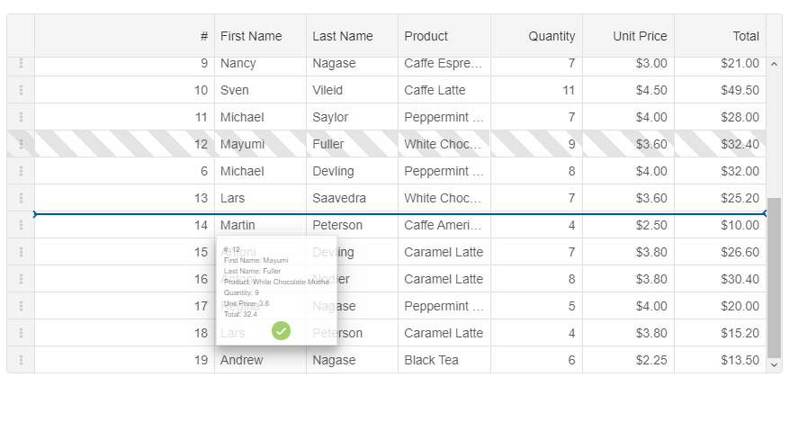
DataGrid Column ReorderColumn Reorder feature adds the ability for columns in a DataGrid to be reordered through user interaction with the table (click and drag / touch and drag). This feature will be turned on by using a boolean property, called "allowColumnReorder". Each column will have a property called "allowReorder" which will allow you to disable the feature for a specific datagrid column.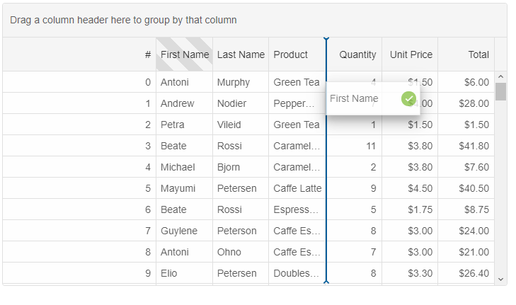
Posted in: Uncategorized Tagged: datagrid, datagrid angular, datagrid reactjs, datagrid vuejs, datagrid vuew, datagrid web component Leave a comment Do you like React? Smart UI for React is coming soon
React is one of the most popular Javascript libraries. We are working hard on releasing Smart UI for React. Smart UI for React will be a collection of React Components, which you can use to build feature rich, native React apps. These React components are built for business applications and include features such as Localization, Accessibility and Right-to-left layouts support.
The following demonstrates how to create a React Grid component with Smart UI for React:
import React from "react";
import ReactDOM from "react-dom";
import { Smart, Grid } from 'smart-webcomponents-react/grid';
import { GetData } from './common/data'
class App extends React.Component {
	behavior = {
		columnResizeMode: 'growAndShrink'
	}
	appearance = {
		alternationCount: 2,
		showRowHeader: true,
		showRowHeaderSelectIcon: true,
		showRowHeaderFocusIcon: true
	}
	paging = {
		enabled: true
	}
	pager = {
		visible: true
	}
	sorting = {
		enabled: true
	}
	editing = {
		enabled: true
	}
	selection = {
		enabled: true,
		allowCellSelection: true,
		allowRowHeaderSelection: true,
		allowColumnHeaderSelection: true,
		mode: 'extended'
	}
	dataSource = new Smart.DataAdapter({
		dataSource: GetData(500),
		dataFields: [
			'id: number',
			'firstName: string',
			'lastName: string',
			'productName: string',
			'quantity: number',
			'price: number',
			'total: number'
		]
	})
	columns = [{
		label: 'First Name',
		dataField: 'firstName',
		columnGroup: 'name'
	},
	{
		label: 'Last Name',
		dataField: 'lastName',
		columnGroup: 'name'
	},
	{
		label: 'Product',
		dataField: 'productName',
		columnGroup: 'order'
	},
	{
		label: 'Quantity',
		dataField: 'quantity',
		columnGroup: 'order'
	},
	{
		label: 'Unit Price',
		dataField: 'price',
		cellsFormat: 'c2',
		columnGroup: 'order',
		formatFunction(settings) {
			const rowId = settings.row;
			const columnDataField = settings.column;
			const template = settings.template;
			if (settings.value >= 4) {
				settings.cell.background = '#00A45A';
				settings.cell.color = '#fff';
			} else if (settings.value < 2) {
				settings.cell.background = '#DF3800';
				settings.cell.color = '#fff';
			} else {
				settings.cell.background = '#FFFDE1';
				settings.cell.color = '#333';
			}
			settings.value = '$' + new Number(settings.value).toFixed(2);
		}
	},
	{
		label: 'Total',
		dataField: 'total',
		cellsFormat: 'c2',
		columnGroup: 'order',
		formatFunction(settings) {
			const rowId = settings.row;
			const columnDataField = settings.column;
			const template = settings.template;
			if (settings.value >= 20) {
				settings.cell.background = '#00A45A';
				settings.cell.color = '#fff';
			}
			if (settings.value <= 5) {
				settings.cell.background = '#DF3800';
				settings.cell.color = '#fff';
			} else {
				settings.cell.background = '#FFFDE1';
				settings.cell.color = '#333';
			}
			settings.value = '$' + new Number(settings.value).toFixed(2);
		}
	}
	]
	columnGroups = [{
		label: 'Customer Name',
		align: 'center',
		name: 'name'
	},
	{
		label: 'Order Detals',
		align: 'center',
		name: 'order'
	}
	]
	componentDidMount() {
	}
	render() {
		return (
			<div>
				<div class="demo-description">The Grid in this demo displays data in a series of rows and columns. This
			        is the simplest case when the Grid is bound to a local data source.</div>
				<Grid
					dataSource={this.dataSource}
					columns={this.columns}
					columnGroups={this.columnGroups}
					appearance={this.appearance}
					behavior={this.behavior}
					selection={this.selection}
					paging={this.paging}
					pager={this.pager}
					sorting={this.sorting}
					editing={this.editing}
					ref="grid">
				</Grid>
			</div>
		);
	}
}
ReactDOM.render(<App />, document.querySelector("#root"));
export default App;
Online Demo: React Grid Posted in: Uncategorized Tagged: react, react apps, react business apps, reactjs, smart for react, ui for react Leave a comment New Kanban ComponentEnterprise-ready Kanban ComponentWe are happy to share with you that our Smart UI 7.4.0 release, brings a new Kanban UI component. Demos are available for both Web Components & Angular here: https://www.htmlelements.com/demos/kanban/overview/ and https://www.htmlelements.com/angular/demos/kanban/overview/
Kanban represents a UI component for mapping and visualizing each step of your process as a flow. The Kanban is usually named after the project you are assigned to work on. Every Kanban has three main sections that show the state of your tasks in the flow:
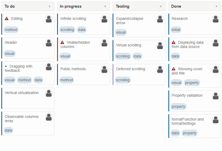 Some of the Kanban features are:
Visual Studio Code Snippets for Smart UIAngular TypeScript Snippets for VS Code**Now includes Grid Snippets This extension for Visual Studio Code adds snippets for Angular for TypeScript and HTML. UsageType part of a snippet, press Alternatively, press Command Palette Commands
TypeScript Angular Snippets
HTML Snippets
Installation
Angular Modules
Using Smart with Angular just became easier. We are happy to announce that Smart ver. 7 brings Angular Modules and Components as part of the Professional package. API Documentation for Angular and Typescript is also available and the Typescript definitions have been optimized and updated. All online examples are available in Typescript, too.
To learn how to use Smart for Angular, please navigate to https://www.htmlelements.com/docs/angular-cli/. Typescript Definitions Updated
New Web Components Showcase Demos
We just published new showcase examples built with Smart Web Components.
Flights Booking demo uses the following UI components: Accordion, Tabs, Grid, DateTimePicker, Menu, DropDownList, Inputs and Buttons 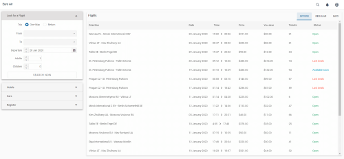 Flights Booking Doctor Dashboard demo uses the following UI components: Grid, Chart, Calendar, Menu, DateTimePicker, Listbox, Inputs and Buttons 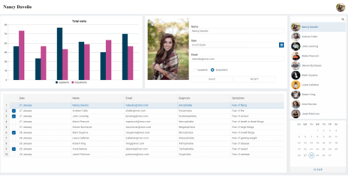 Doctors Dashboard QA Dashboard demo uses the following UI components: Grid, Rating, Google Maps, Card, Menu 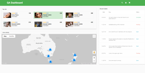 QA Dashboard Shopping demo uses the following UI components: Grid, Menu, Inputs, DropDownList, Buttons 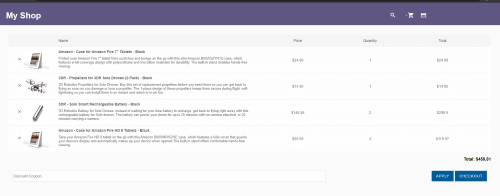 Shopping Posted in: HTML Elements, Smart Grid, Smart ListBox, Smart Tabs, Smart.Chart, Web Components Tagged: button, chart, combobox, datetimepicker, dropdownlist, Grid, input, main menu, mega menu, showcase demo, web components, webcomponents Leave a comment Typescript definitions
We are happy to announce that we just released a new version of our product, which brings Typescript definitions for all web components. This means that now you can use our Web Components with intelliSense support and also compile time type-checking.
To learn how to use Smart Web Components with Typescript, please refer to: Typescript for Web Components Typescript Web ComponentsTypescript Web ComponentsTypescript support comes with the next version of Smart Web Components. We are super excited about this. We will expose Interfaces, Types and Classes for all our stuff. Each API member will include descriptions, which will help you to use our product and see the intellisense suggestions by Visual Studio Code, Visual Studio and other IDEs with such support. Grid Typescript InitThis sample shows how to create basic Grid using TypeScript import {Grid, GridColumn, DataAdapter, Smart} from "../typescript/smart.elements";
window.onload = function () {
const grid: Grid = <Grid>document.createElement("smart-grid");
grid.columns = <GridColumn[]>[
{label: "First Name", dataField: "firstName"},
{label: "Last Name", dataField: "lastName"}
]
const adapter = new Smart.DataAdapter( {
dataSource: [
{firstName: "Name", lastName: "Last Name"},
{firstName: "Name 2", lastName: "Last Name 2"},
{firstName: "Name 3", lastName: "Last Name 3"},
{firstName: "Name 4", lastName: "Last Name 4"},
{firstName: "Name 5", lastName: "Last Name 5"}
],
dataFields: [
'firstName: string',
'lastName: string'
]
}) as DataAdapter;
grid.dataSource = adapter;
document.body.appendChild<Grid>(grid);
}
Posted in: Smart Grid, Web Components Tagged: Grid, ts, ts grid, typescript, typescript language, typescript web components, typing web components, typings, web components Leave a comment Microsoft Chromium Edge and Smart Web ComponentsMicrosoft Chromium-based EdgeMicrosoft today released the first stable version of its new Chromium-based Edge browser, just over a year after it first announced that it would stop developing its own browser engine and go with what has become the industry standard. 
The new Microsoft Edge provides best in class compatibility with extensions and web sites, with great support for the latest rendering capabilities, modern web applications, and powerful developer tools across all supported platforms. Faster and clean-lookingOne of the first things you’ll notice about the new Edge is just how it looks, and how fast web sites load in it. Even when using 15 or more tabs, we didn’t find it slow down.What's important for your development with Smart Web ComponentsWe were regularly testing all releases of the new Edge with our product so on our end there are no surprises.The first important thing that we will point out is that Smart Web Components are fully compatible with the new Microsoft Edge browser. The second thing is that you will no longer need to include the webcomponents.js polyfill with Edge. More information about the Web Components support table: https://caniuse.com/#search=web%20components Posted in: HTML Elements, Javascript Tagged: edge, edge web browser, microsoft chromium edge, microsoft edge, web components Leave a comment Blazor and Web Components
The Blazor framework enables you to build flexible and fast web applications with C# instead of JavaScript. The framework uses WebAssembly-based .NET runtime (client-side Blazor) and server-side ASP.NET Core (server-side Blazor). A Blazor app can invoke JavaScript functions from .NET and .NET methods from JavaScript code.
To call into JavaScript from .NET, use the IJSRuntime abstraction. The InvokeAsync As it is possible to use Javascript with Blazor, it is easy to use Web Components with Blazor, too. The following tutorial will show you how to add our Grid Web Component and data bind it to a WeatherForecast web service within a Blazor web application: https://www.htmlelements.com/docs/blazor/ After following the steps in the tutorial you will have the following output: 
Smart HTML Elements v5.1.0Smart HTML Elements v5.1.0 Release, Dec-03-2019What's New:
What's Improved:
Constructable Stylesheets
Constructable Stylesheets make it possible to create stylesheets imperatively by invoking the CSSStyleSheet() constructor. The CSSStyleSheet object has two new methods that make it safer to add and update stylesheet. These methods are replace and replaceSync. replace() returns a Promise that resolves once any external references (@imports) are loaded, whereas replaceSync() doesn’t allow external references at all.
Shadow DOM and Constructed StyleSheetsConstructable StyleSheets are very useful, when we use Shadow DOM. There is a new property called adoptedStyleSheets, which is available on Shadow Roots and Documents. This allows us to apply the styles defined by a CSSStyleSheet to a given DOM subtree. To do so, we set the property to an array of one or more stylesheets to apply to that element.Example:
// Create our shared stylesheet:
const sheet = new CSSStyleSheet();
sheet.replaceSync('a { color: red; }');
// Apply the stylesheet to a document:
document.adoptedStyleSheets = [sheet];
// Apply the stylesheet to a Shadow Root:
const node = document.createElement('div');
const shadow = node.attachShadow({ mode: 'open' });
shadow.adoptedStyleSheets = [sheet];
With Constructable StyleSheets, web application developers now have an explicit solution for creating CSS StyleSheets and applying them to Shadow DOM trees. The source code below, shows how to import a 'styles.css' file into the Grid's ShadowDOM.
const sheet = new CSSStyleSheet();
// replace all styles, allowing external resources:
sheet.replace('@import url("styles.css")')
  .then(sheet => {
	console.log('Styles loaded successfully');
  })
  .catch(err => {
	console.error('Failed to load:', err);
  });
grid.shadowRoot.adoptedStyleSheets = [sheet];
Material Dashboard and Premium Material Dashboard
We are announcing two new Dashboard Templates, which will come as part of the Commercial subscription.
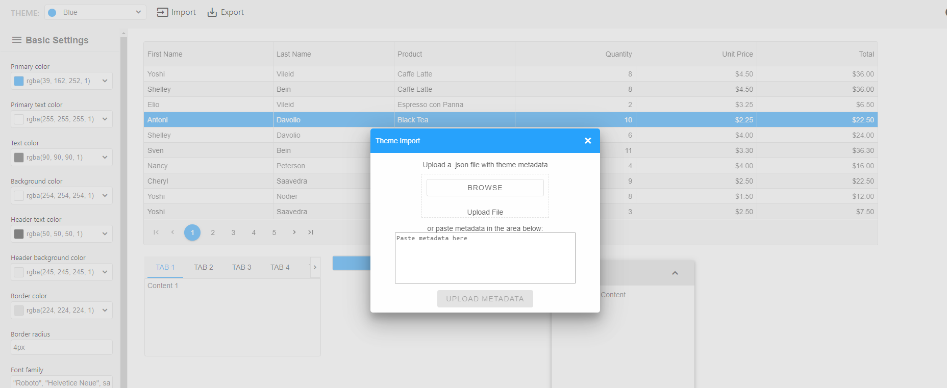
Material Dashboard ProMaterial Dashboard is a Material Admin Dashboard with a design inspired by Google's Material Design. We are very excited to introduce it as we demonstrate how our web components play well with the material concepts. Material Dashboard was built over the latest version of Smart Web Components framework.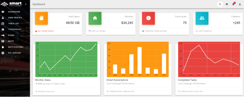 Material Dashboard Premium Dashboard ProSave development time with this template with bright and fresh colors. It features a huge number of smart web components that can help you create amazing web apps.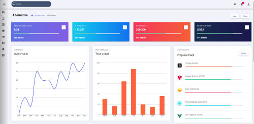 Premium Dashboard Web Components Theme BuilderTheme BuilderWe are excited to announce that the Theme Builder for Smart Web Components is available now.We have built a new web tool that enables you to create or customize existing themes. The Theme builder generates a CSS file, which you can download and apply to your web application. The good news is that the tool is Shadow DOM friendly, because of the CSS variables support deeply integrated into Smart Web Components. 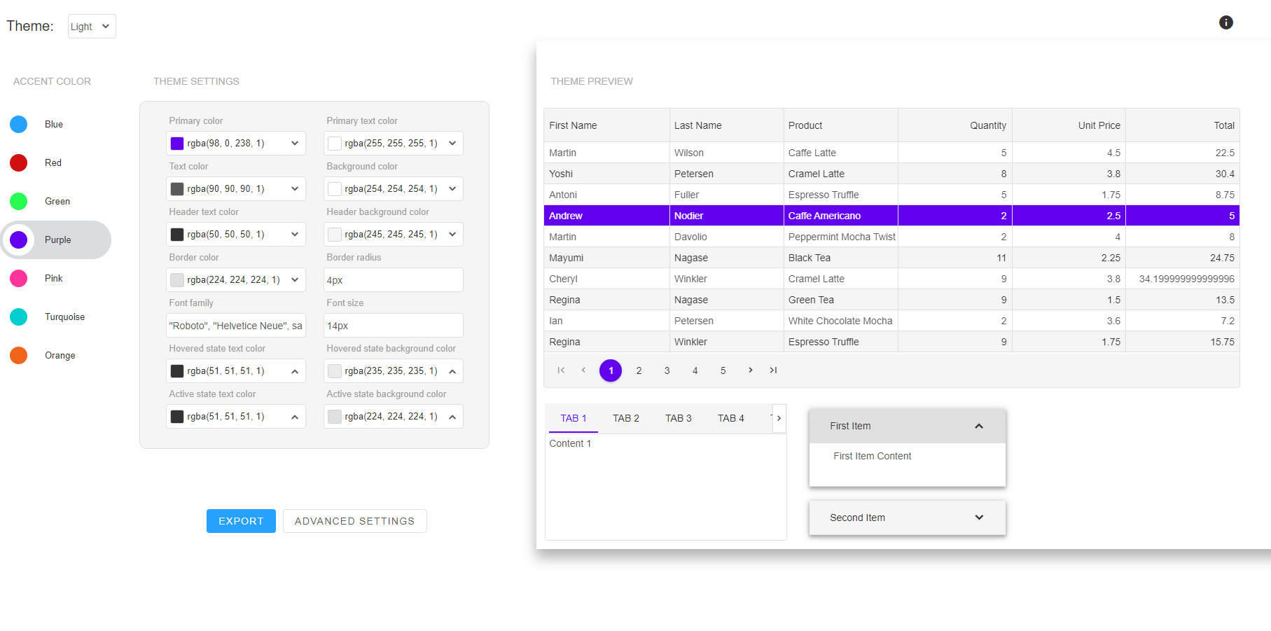
Highlights
Using the theme builderNavigate to the theme builder application at the Theme Builder web page. The theme builder application page is divided into two main sections - theme settings on the left and preview on the right.
Advanced settingsThe advanced settings mode adds many more customization options for precise Theme design. From the left section, you can choose which component category to design and select a color for specific settings such as "Row Alternation Text Color".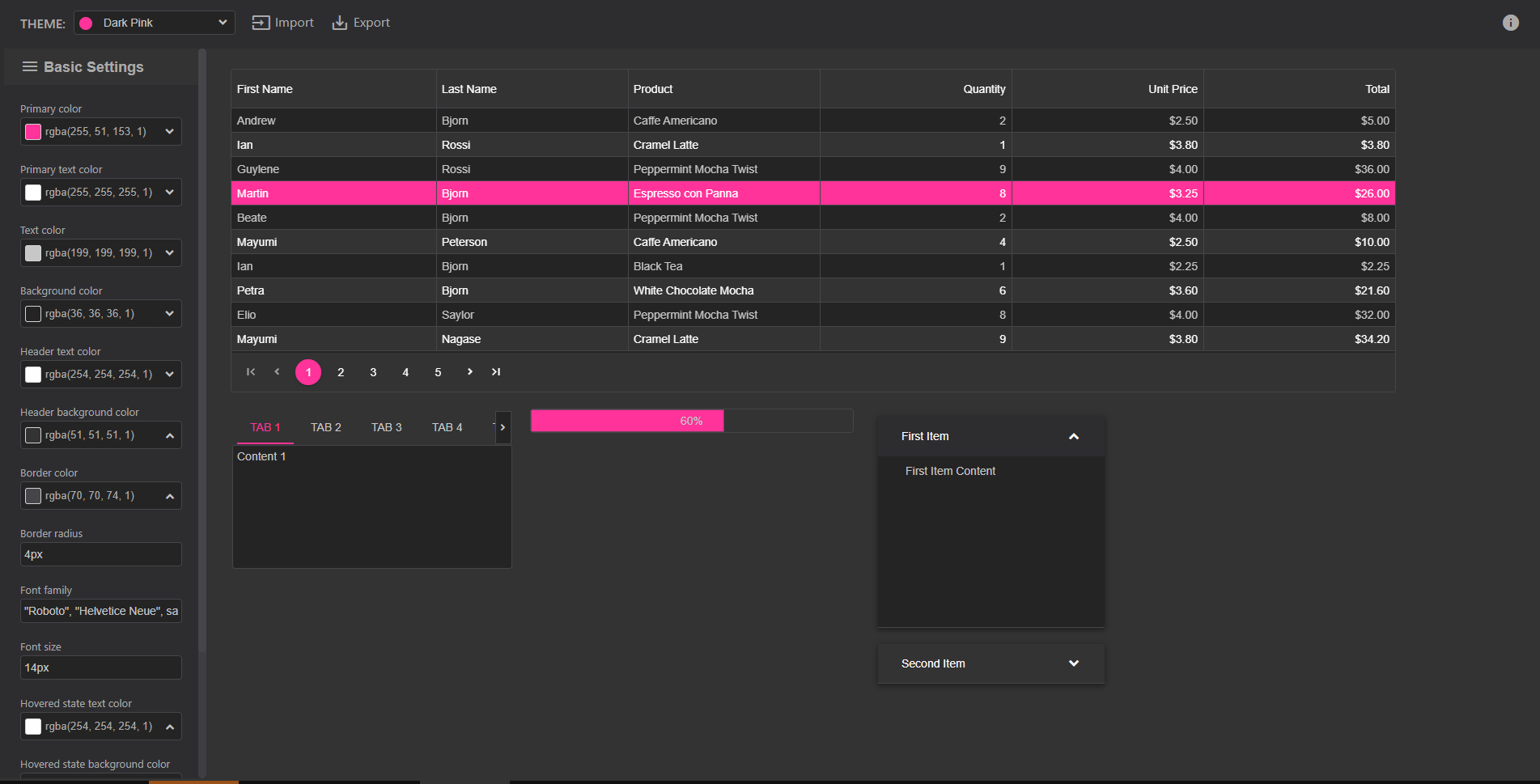
Posted in: HTML Elements Tagged: awesome styles, css, css styling, css variables, custom css, custom themes, material design, material style, theme builder, theme builder css, theme studio, themebuilder, themes, theming, web application, web components themes, web design, webdesign, webstyle Leave a comment Grid Charting, Nested Grid Dialog, TreeGrid CheckboxesSmart HTML Elements v4.5.0 Release, Sep-19-2019The latest version just came out with multiple new Smart.Grid features. The list with all changes is below: 
What's New:
What's Fixed:
Breaking ChangesThe Grid API is updated with new "behavior" and "layout" categories. Some of the existing properties are moved into that categories. To migrate from previous versions to 4.5.0, we advice you to look at the Grid API Docs: https://www.htmlelements.com/docs/grid-api/. The changes are related to: rowHeight, rowMinHeight, columnWidth, columnResizeMode, rowResizeMode, showRowNumber, scrollMode.Advanced Data Visualization with Grid ChartingSmart.Chart integration with Smart.GridThe next version of Smart Web Components will bring integrated charting functionality that allows users to chart directly inside the Grid Web Component. We are happy to announce that Smart Grid is the First Enterprise Grid with such feature available. The charting is implemented through our Smart.Chart Web Component and is using the grid data source. Charts can be exported to .PDF, .PNG of .JPEG. There are two approaches to create a Chart.
Smart.ChartThe charting used in the Grid and Chart integration is our own-made Smart.Chart component. Smart.Chart is a Web Component built through the Smart Framework and is based on the broadly used jQWidgets Charting solution. It does not have any third-party dependencies. It is created by our own Team as all other UI components in our package. 
Chart ToolbarThe Toolbar with Charting options is displayed in the Grid header. By clicking a Chart Type, the Grid will create it. To create Charts, users will need to import the Smart.Grid, Smart.Chart and Smart.Window modules and enable the Charting in the Grid. Below is displayed a Chart created through selection by dragging or by keyboard navigation a Cells Range of Numeric values.
Charts are displayed in our Smart.Window component. You can resize it, maximize it, move it, change its header position, stick it to screen edge, minimize it or just collapse it. Smart.Window is designed to be the most feature-complete Dialog component. It can be either modal or non-modal. Below is displayed a Bar Chart created by selecting multiple rows.
Below is displayed a Pie Chart created by selecting multiple columns. 
Below is displayed a Column Chart by cells selection. 
Charts SettingsAs our Charting solution is evolving for the last 10 years, it has quite a lot of settings and Chart types like Financial Charts, Zooming, Spider Charts, etc. You may learn more about our Charting on our demos and documentation pages. Posted in: HTML Elements, Smart Grid, Smart.Chart Tagged: charting grid, charting grid data, grid charting, grid charts Leave a comment Smart HTML Elements v4.3.0 ReleaseSmart HTML Elements v4.3.0 Release, Aug-28-2019What's New:
What's improved:
What's Fixed:
Data Export to XLSX, PDF, CSV, TSV, XML, HTML and JSON
The newest 4.2.0 version of the Smart UI toolkit includes a very important business feature - Grid Data Export. You can now export the data from your grid component to various formats. The supported formats are .xlsx, .xml, .pdf, .csv, .tsv, .html and .json. You can also import data from .xlsx file. The Export feature takes into account the Grid Style, Data Format, Data Type and whether the data is grouped by some criteria. Check out the updated Grid demos: https://www.htmlelements.com/demos/grid/data-export/.
Using Web Components with Angular
We are happy to announce that with the release of Smart HTML Elements ver. 4.1.0, we added "Using with Angular" example for each web component. These Angular examples are available in the Demos section and will help you to use our Web Components in your current or future Angular projects. The source code is included in the download package and can be found in the demos/angular/ folder. The full list of changes in ver.4.1.0 can be found here: https://www.htmlelements.com/docs/release-notes/.
Data Grid Angular Demo: Grid with Angular Smart HTML Elements v4.0.0 ReleaseSmart HTML Elements v4.0.0 Release, Aug-01-2019What's New:
What's Fixed:
DockingLayout Web Component with AngularUsing Smart.DockingLayout Web Component in Angular applicationThis post shows how to use the DockingLayout component with Angular and how easy the integration is. app.component.htmlIn the app.component.html, we add the smart-docking-layout tag. <smart-docking-layout [layout]="layout"></smart-docking-layout> app.module.tsTo make Angular work with Web Components, we add the CUSTOM_ELEMENTS_SCHEMA to the app module and import the Smart Elements import { NgModule, CUSTOM_ELEMENTS_SCHEMA } from '@angular/core';
import { BrowserModule } from '@angular/platform-browser';
import { FormsModule } from '@angular/forms';
import { AppComponent } from './app.component';
import '@smarthtmlelements/smart-elements/source/smart.elements.js';
@NgModule({
declarations: [AppComponent],
imports: [BrowserModule, FormsModule],
schemas: [CUSTOM_ELEMENTS_SCHEMA],
providers: [],
bootstrap: [AppComponent]
})
export class AppModule { }
app.component.tsBelow, we put the Docking Layout component's settings.import { Component, ViewChild, AfterViewInit } from '@angular/core';
import { setTimeout } from 'timers';
@Component({
selector: 'app-root',
templateUrl: './app.component.html',
styleUrls: ['app.component.css']
})
export class AppComponent implements AfterViewInit {
layout: any = [
{
type: 'LayoutGroup',
orientation: 'horizontal',
items: [
{
id: 'item0',
label: 'Tabs 0',
autoHide: true,
autoHidePosition: 'left',
tabPosition: 'bottom',
items: [{
label: 'Tab A',
selected: true,
content: 'What is Lorem Ipsum?\n' +
'Lorem Ipsum is simply dummy text of the printing and typesetting industry. Lorem Ipsum has been the industry\'s standard dummy text ever since the 1500s, when an unknown printer took a galley of' + 'type and scrambled it to make a type specimen book. It has survived not only five centuries, but also the leap into electronic typesetting, remaining essentially unchanged. It was popularised in ' + 'the 1960s with the release of Letraset sheets containing Lorem Ipsum passages, and more recently with desktop publishing software like Aldus PageMaker including versions of Lorem Ipsum.\n' +
'Why do we use it?\n' +
'It is a long established fact that a reader will be distracted by the readable content of a page when looking at its layout. The point of using Lorem Ipsum is that it has a more-or-less normal ' + 'distribution of letters, as opposed to using \'Content here, content here\', making it look like readable English. Many desktop publishing packages and web page editors now use Lorem Ipsum as their' + 'default model text, and a search for \'lorem ipsum\' will uncover many web sites still in their infancy. Various versions have evolved over the years, sometimes by accident, sometimes on ' + 'purpose (injected humour and the like).'
}]
},
{
type: 'LayoutGroup',
items: [
{
tabPosition: 'bottom',
type: 'LayoutPanel',
id: 'tabPanel',
label: 'Input',
items: [{
label: 'TextBox Tab',
content: '<smart-multiline-text-box id="multiLine">Write more text here ...</smart-multiline-text-box>'
},
{
label: 'Slider Tab',
content: '<smart-slider id="slider"></smart-slider>'
}],
size: '50%'
},
{
type: 'LayoutPanel',
label: 'Output',
items: [
{
id: 'outputTab',
label: 'Output',
headerPosition: 'none',
content: 'Write more text here ...'
}
]
}
],
orientation: 'vertical'
}
]
}]
ngAfterViewInit(): void {
document.readyState === 'complete' ? init() : window.onload = init;
function init() {
document.getElementById('tabPanel').addEventListener('change', (event: any) => {
if (event.target instanceof window['Smart'].Slider) {
document.getElementById('outputTab').innerHTML = event.detail.value;
}
else if (event.target instanceof window['Smart'].MultilineTextBox) {
document.getElementById('outputTab').innerHTML = event.target.value;
}
else if (event.target.tagName === 'Smart-TABS') {
const selectedTabItem = event.target.getElementsByTagName('smart-tab-item')[event.target.selectedIndex];
if (selectedTabItem === undefined) {
return;
}
if (selectedTabItem.label.toLowerCase().indexOf('slider') > -1) {
document.getElementById('outputTab').innerHTML = selectedTabItem.querySelector('smart-slider').value;
}
else if (selectedTabItem.label.toLowerCase().indexOf('textbox') > -1) {
document.getElementById('outputTab').innerHTML = selectedTabItem.querySelector('smart-multiline-text-box').value;
}
}
});
}
}
}
Live Example in Stackblitz: https://stackblitz.com/edit/github-m7vjva-qamazf. 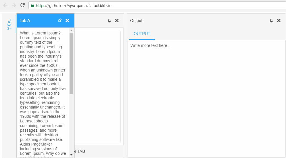 Define a Custom Element
In this post, we will show you how to define a Custom Element with Smart Framework. We will create a Material Color Picker custom element.
1. Define the Custom Element. To define a new custom element with Smart Framework, we need to call the Smart function with two parameters - the tag name and the Class with the logic.
Smart('smart-colors', class SmartColors extends Smart.BaseElement {
}
2. Smart Framework gives us useful things like Templates, Data Binding, Typed Properties, Lifecycle callbacks, Event Handling. Read more about this https://www.htmlelements.com/docs/base-element/. In our Custom Element, we will use some of these features. We will use the 'ready' lifecycle callback. It is invoked once, when the element is attached for first time. We use this function to create and initialize the custom element. The 'properties' definition includes a property called 'color'. This property has default value - '#fff' and its type is 'string'. This means that when you try to set a 'bool', 'date', 'numeric' value, the element will throw an error with 'Invalid property type'. To raise the 'change' event, we use the '$.fireEvent' method. 3. The full code of our custom element is below
  // Define Custom Element
Smart('smart-colors', class SmartColors extends Smart.BaseElement {
  // Declare properties
  static get properties() {
    return {
      'color':
        {
           value: '#fff',
           type: 'string'
        }
    };
  }
  // Ready is called when the element is in the DOM.
  ready () {
    const that = this;
    that._renderGrid();
    that._addHandlers();
  }
  // Renders the Color Panel.
  _renderGrid() {
    const that = this;
    const labelsAndPaletteContainer = document.createElement('div');
    that._renderShades();
    that._renderColorPalette();
    that._renderColorLabels();
    labelsAndPaletteContainer.classList = 'smart-labels-and-palette'
    labelsAndPaletteContainer.appendChild(that._colorLabelsContainer);
    labelsAndPaletteContainer.appendChild(that._paletteContainer);
    that.appendChild(labelsAndPaletteContainer);
  }
  // Rneders all colors.
  _renderColorPalette() {
    const that = this;
    const colorsArray = [
      ['#ffebee', '#ffcdd2', '#ef9a9a', '#e57373', '#ef5350', '#f44336', '#e53935', '#d32f2f', '#c62828', '#b71c1c', '#ff8a80', '#ff5252', '#ff1744', '#d50000'],
      ['#fce4ec', '#f8bbd0', '#f48fb1', '#f06292', '#ec407a', '#e91e63', '#d81b60', '#c2185b', '#ad1457', '#880e4f', '#ff80ab', '#ff4081', '#f50057', '#c51162'],
      ['#f3e5f5', '#e1bee7', '#ce93d8', '#ba68c8', '#ab47bc', '#9c27b0', '#8e24aa', '#7b1fa2', '#6a1b9a', '#4a148c', '#ea80fc', '#e040fb', '#d500f9', '#aa00ff'],
      ['#ede7f6', '#d1c4e9', '#b39ddb', '#9575cd', '#7e57c2', '#673ab7', '#5e35b1', '#512da8', '#4527a0', '#311b92', '#b388ff', '#7c4dff', '#651fff', '#6200ea'],
      ['#e8eaf6', '#c5cae9', '#9fa8da', '#7986cb', '#5c6bc0', '#3f51b5', '#3949ab', '#303f9f', '#283593', '#1a237e', '#8c9eff', '#536dfe', '#3d5afe', '#304ffe'],
      ['#e3f2fd', '#bbdefb', '#90caf9', '#64b5f6', '#42a5f5', '#2196f3', '#1e88e5', '#1976d2', '#1565c0', '#0d47a1', '#82b1ff', '#448aff', '#2979ff', '#2962ff'],
      ['#e1f5fe', '#b3e5fc', '#81d4fa', '#4fc3f7', '#29b6f6', '#03a9f4', '#039be5', '#0288d1', '#0277bd', '#01579b', '#80d8ff', '#40c4ff', '#00b0ff', '#0091ea'],
      ['#e0f7fa', '#b2ebf2', '#80deea', '#4dd0e1', '#26c6da', '#00bcd4', '#00acc1', '#0097a7', '#00838f', '#006064', '#84ffff', '#18ffff', '#00e5ff', '#00b8d4'],
      ['#e0f2f1', '#b2dfdb', '#80cbc4', '#4db6ac', '#26a69a', '#009688', '#00897b', '#00796b', '#00695c', '#004d40', '#a7ffeb', '#64ffda', '#1de9b6', '#00bfa5'],
      ['#e8f5e9', '#c8e6c9', '#a5d6a7', '#81c784', '#66bb6a', '#4caf50', '#43a047', '#388e3c', '#2e7d32', '#1b5e20', '#b9f6ca', '#69f0ae', '#00e676', '#00c853'],
      ['#f1f8e9', '#dcedc8', '#c5e1a5', '#aed581', '#9ccc65', '#8bc34a', '#7cb342', '#689f38', '#558b2f', '#33691e', '#ccff90', '#b2ff59', '#76ff03', '#64dd17'],
      ['#f9fbe7', '#f0f4c3', '#e6ee9c', '#dce775', '#d4e157', '#cddc39', '#c0ca33', '#afb42b', '#9e9d24', '#827717', '#f4ff81', '#eeff41', '#c6ff00', '#aeea00'],
      ['#fffde7', '#fff9c4', '#fff59d', '#fff176', '#ffee58', '#ffeb3b', '#fdd835', '#fbc02d', '#f9a825', '#f57f17', '#ffff8d', '#ffff00', '#ffea00', '#ffd600'],
      ['#fff8e1', '#ffecb3', '#ffe082', '#ffd54f', '#ffca28', '#ffc107', '#ffb300', '#ffa000', '#ff8f00', '#ff6f00', '#ffe57f', '#ffd740', '#ffc400', '#ffab00'],
      ['#fff3e0', '#ffe0b2', '#ffcc80', '#ffb74d', '#ffa726', '#ff9800', '#fb8c00', '#f57c00', '#ef6c00', '#e65100', '#ffd180', '#ffab40', '#ff9100', '#ff6d00'],
      ['#fbe9e7', '#ffccbc', '#ffab91', '#ff8a65', '#ff7043', '#ff5722', '#f4511e', '#e64a19', '#d84315', '#bf360c', '#ff9e80', '#ff6e40', '#ff3d00', '#dd2c00'],
      ['#efebe9', '#d7ccc8', '#bcaaa4', '#a1887f', '#8d6e63', '#795548', '#6d4c41', '#5d4037', '#4e342e', '#3e2723'],
      ['#fafafa', '#f5f5f5', '#eeeeee', '#e0e0e0', '#bdbdbd', '#9e9e9e', '#757575', '#616161', '#424242', '#212121'],
      ['#eceff1', '#cfd8dc', '#b0bec5', '#90a4ae', '#78909c', '#607d8b', '#546e7a', '#455a64', '#37474f', '#263238'],
    ]
    const paletteContainer = document.createElement('div');
    for (let index = 0, length = colorsArray.length; index < length; index++) {
      const currentRow = colorsArray[index];
      const currentUl = that._renderRow(currentRow, 'smart-color-cell', false);
      paletteContainer.appendChild(currentUl);
    }
    paletteContainer.className = 'smart-palette';
    that._paletteContainer = paletteContainer;
  }
  // Renders all shades.
  _renderShades() {
    const that = this;
    const shadesContainer = document.createElement('div');
    const shadesArray = [50, 100, 200, 300, 400, 500, 600, 700, 800, 900, 'A 100', 'A 200', 'A 400', 'A 700'];
    const shadesRow = that._renderRow(shadesArray, 'smart-shade-cell', true);
    shadesContainer.className = 'smart-shades';
    shadesContainer.appendChild(shadesRow);
    that.appendChild(shadesContainer);
  }
  _renderColorLabels() {
    const that = this;
    const colorLabelsContainer = document.createElement('div');
    const colorLabelsArray = ['Red', 'Pink', 'Purple', 'Deep Purple', 'Indigo', 'Blue', 'Light Blue', 'Cyan', 'Teal', 'Green', 'Light Green', 'Lime', 'Yellow', 'Amber', 'Orange', 'Deep Orange', 'Brown', 'Grey', 'Blue Grey'];
    const colorLabelsColumn = that._renderRow(colorLabelsArray, 'smart-color-label', true);
    colorLabelsContainer.className = 'smart-color-labels';
    colorLabelsContainer.appendChild(colorLabelsColumn);
    that._colorLabelsContainer = colorLabelsContainer;
  }
  // Renders a single row of colors.
  _renderRow(array, cellClass, addInnerHtml) {
    const ul = document.createElement('ul');
    for (let index = 0, length = array.length; index < length; index++) {
      const currentElement = array[index];
      const li = document.createElement('li');
      if (addInnerHtml) {
        li.innerHTML = currentElement;
      }
      else {
        li.style.background = currentElement;
        li.setAttribute('data-color', currentElement);
      }
      li.className = cellClass;
      ul.appendChild(li);
    }
    return ul;
  }
  // Fires a 'change' event when a color is selected.
  _addHandlers() {
    const that = this;
    const cells = that.querySelectorAll('.smart-color-cell');
    for(let i = 0; i < cells.length; i++) {
      const  cell = cells[i];
      cell.addEventListener('click', function() {
        that._currentColorHex = event.target.getAttribute('data-color');
        that._currentColorRgb = event.target.style.background;
        that.color = that.getColor().hex.toString();
        that.$.fireEvent('change');
      });
    }
  }
  // gets the selected color.
  getColor() {
    const that = this;
    const rgb = that._currentColorRgb.match(/\d+/g);
    return {
      hex: that._currentColorHex.substring(1),
      r: parseInt(rgb[0]),
      g: parseInt(rgb[1]),
      b: parseInt(rgb[2])
    };
  }
});
See the Pen SMART HTML ELEMENTS by Boyko Markov (@boyko-markov) on CodePen. TreeGrid and GroupingTree Grid, Grouping, Context MenusThe latest version of Smart HTML Elements brings important new features to our Smart Grid Web Component. It is now possible to display data hierarchies in the web component. The Grid allows you to display data as a combination of Tree and Grid. The Tree Grid mode has full support for data sorting, data filtering and data editing. The Grouping features allows you to group data by columns. The context menu feature allows you to quickly add a context menu functionality to the Grid. Tree GridTree Grid mode allows you to display hierarchical data in the Grid and make the component work like a hybrid between Tree and Grid. 
Tree Grid Virtual Tree GridIn Virtual Mode, new rows are loaded on demand when you expand a row. This process repeats until the "leaf" property of the row is set to true. Virtual Tree Grid Virtual Tree Grid PaginationWith Pagination enabled, Root rows are loaded on demand when the current page is changed. Sub Rows are loaded when a treegrid row is expanded. 
Virtual Tree Grid Pagination Grid GroupingGrouping enables you to group the component by one or multiple columns. The grouping styling is customizable through CSS Variables.  Grouping
 Grouping Styling
Grid Context Menu Context Menu
Posted in: HTML Elements, Javascript, Smart Grid Tagged: data grouping, grouping, tree-grid, treegrid Leave a comment New Grid FeaturesNewest features in the Grid
Lazy Initialization of Web ComponentsThis post shows how to create a Grid Web component and initialize it from a DIV tagThe next version ver3.1.0 of Smart HTML Elements will introduce an alternative way to create a Web Component on demand from an existing HTML Element.Let's look at the sample below. In the 'index.htm' web page code, we see a HTMLDIVElement(DIV tag) with id="grid". We will use that HTML element to create a new Grid Web Component instance. <!DOCTYPE html> <html xmlns="http://www.w3.org/1999/xhtml"> <head> <title>Grid Lazy Load Demo</title> <meta http-equiv="X-UA-Compatible" content="IE=edge" /> <meta http-equiv="Content-Type" content="text/html; charset=utf-8" /> <meta name="viewport" content="width=device-width, initial-scale=1.0, maximum-scale=1.0" /> <link rel="stylesheet" type="text/css" href="../../../source/styles/smart.default.css" /> <link rel="stylesheet" type="text/css" href="../../../styles/demos.css" /> <link rel="stylesheet" type="text/css" href="../../../styles/common.css" /> <link rel="stylesheet" type="text/css" href="styles.css" /> <script type="text/javascript" src="../../../scripts/common.js"></script> <script type="text/javascript" src="https://cdnjs.cloudflare.com/ajax/libs/webcomponentsjs/1.2.0/webcomponents-lite.js"></script> <script type="module" src="index.js"> </script> </head> <body> <div id="grid"></div> </body> </html> The 'index.js' file is defined as a Javascript Module. In that module our grid web component is created on window.onload, within a function called 'init()'. That is achieved by calling the Smart.Grid function and passing as a first argument the 'id' of the DIV tag and as a second argument the initialization object with the Grid web component's dataSource, columns and other configuration options. As a result, our DIV tag is replaced with a 'smart-grid' tag and a Grid is displayed. That approach is useful, when we want to update an existing application with minimum changes or to create a Smart Web Component on demand with ES6 code.
import "../../../source/smart.elements.js";
import "../../../scripts/data.js";
document.readyState === 'complete' ? init() : window.onload = init;
 function init() {
   const grid = new Smart.Grid('#grid', {
     dataSource: new Smart.DataAdapter(
     {
       dataSource: Data,
       dataFields:
       [
         'id: number',
         'firstName: string',
         'lastName: string',
         'productName: string',
         'available: bool',
         'quantity: number',
         'price: number',
         'total: number'
       ]
     }),
     columns: [
     {
       label: 'First Name', dataField: 'firstName'
     },
     { label: 'Last Name', dataField: 'lastName' },
     { label: 'Product', dataField: 'productName' },
     { label: 'Available', dataField: 'available', template: 'checkBox', editor: 'checkBox' },
     { label: 'Quantity', dataField: 'quantity', editor: 'numberInput' },
     { label: 'Unit Price', dataField: 'price', editor: 'numberInput', cellsFormat: 'c2' }
     ]
   });
 }
Posted in: HTML Elements, Javascript, Web Components Tagged: custom elements, html elements, htmlelements, web components Leave a comment Chart Custom Element ReleasedBest Chart Custom Element has just arrivedThe latest version of Smart HTML Elements, brings a full featured Chart Custom Element with more than 30 different Data Visualization options. The Chart Types supported are listed: Chart Types. Our Chart Custom Element is written in JavaScript and CSS. It does not depend on any other third-party scripts. The rendering is achieved with SVG and HTML5 canvas. The Chart works well on mobile browsers and is the most feature-complete chart available in the web components world. Data displayed on the Chart can be formatted in multiple different ways. For example, the charting element has a property called 'formatSettings' with the following data formatting options.
The image below illustrates the Axes supported by the custom element. Smart.Chart has two main types of axes - valueAxis and xAxis. Typically the valueAxis represents the vertical axis in the chart although you may choose to rotate the axes and in this case the valueAxis will be displayed horizontally. 
Smart.Chart also ships with 32 built-in color schemes which are used to automatically set colors for different series. You can change the color scheme by setting the colorScheme property of the chart. The available value are from 'scheme01' to 'scheme32'. By setting its 'theme' property, users can Data Visualize their graphics in 'Light' and 'Dark' mode. Smart.Chart is based on: jqxChart. We invite you to look at our Chart Custom Element demos: Chart overview Binding to Row, Cell and Column Events in Grid Web Component
This post shows how to bind to the Grid Web Component events. The code below initializes the Grid instance and binds to the 'click' event. Within the event handler, we can get details about which part of the Grid was clicked - Cell, Row or Column. This is achieved by utilizing the 'event.path' array. It is also important to note that each Data Grid Column has 'data-field' attribute and each Row has 'data-id' attribute. The data source, which is used in the example is available in the 'data.js' file from the download package.
AutoComplete Input Custom Element also known as Typeahead
The newest version of our framework marks the availability of a new AutoComplete Input tag. We needed such lightweight component for the purposes of our Grid web component.
There, it is used as an inline cell editor. You can check it out here: grid-editing-cell-auto-complete. Here is how the web component looks like when you add it to your web page: 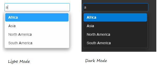
All you need to do is to add a reference to smart.elements.js, smart.default.css and type the following: <smart-input data-source="[South America, North America, Asia, Africa, Europe]"></smart-input> Extend Elements with Behaviors
Our Web Components library has a feature, which allows you to dynamically extend a Custom Element with additional behaviors. We call them Modules. To add a new module, you have to call the 'addModule' method. In this blog, we will show you how to create a new module, which adds a 'color' property to a Custom Element. We will call it 'ColorModule'.
class ColorModule  {
	 static get properties() {
		 const properties =
		 {
			 'color': {
				 value: 'red',
				 type: 'string',
				 observer: 'setColor'
			 }
		 }
		 return properties;
	 }
	ready() {
		this.ownerElement.$.root.style.color = this.color;
	}
	setColor(oldColor, color) {
		this.ownerElement.$.root.style.color = this.color;
	}
}
The 'ColorModule' defines a 'color' property. The default property value is 'red'. Whenever the 'color' property is changed, the 'setColor' method is invoked which applies the Color to the element. The below code adds the Module to the 'smart-toggle'button' Custom Element.
window.Smart.Elements.whenRegistered('smart-toggle-button', function (proto) {
    proto.addModule(ColorModule, true);
});
Note that the second parameter is 'true'. This means that our 'ColorModule' will be added to all sub-classes of the 'smart-toggle-button' i.e 'smart-radio-button', 'smart-check-box' and 'smart-switch-button'. All these custom elements will have the 'color' property. Usage example:
window.onload = function() {
    document.querySelector('smart-radio-button').color = "blue";
}
|
|


