Build your web apps using Smart Custom Elements
Smart 3d Chart - configuration and usage
3D Chart Types
Smart 3d Chart supports over 30 common and specialized chart types. You can easily plot series of different types within the same chart. A type must be specified for each series group. Currently, Smart 3d Chart supports the following series types:
- 'column' - simple column series
- 'stackedcolumn' - stacked column series
- 'stackedcolumn100' - percentage stacked columns
- 'rangecolumn' - floating column between two values
- 'waterfall' - waterfall series
- 'stackedwaterfall' - stacked waterfall series
- 'line' - simple straight lines connecting the value points
- 'stackedline' - stacked lines
- 'stackedline100' - percentage stacked lines
- 'spline' - smooth lines connecting the value points
- 'stackedspline' - smooth stacked lines
- 'stackedspline100' - percentage stacked smooth lines
- 'stepline' - step line
- 'stackedstepline' - stacked step line
- 'stackedstepline100' - percentage stacked step line
- 'area' - area connecting the value points with straight lines
- 'stackedarea' - stacked area with straight lines between the points
- 'stackedarea100' - percentage stacked area with straight lines between the points
- 'rangearea' - floating area between pairs of value points
- 'splinearea' - smooth area connecting the value points
- 'stackedsplinearea' - stacked smooth area connecting the value points
- 'stackedsplinearea100' - percentage stacked smooth area
- 'splinerangearea' - smooth floating area between pairs of value points
- 'steprangearea' - step area between pairs of value points
- 'stackedsplineara' - smooth stacked area
- 'steparea' - step area connecting the value points
- 'stackedsteparea' - step stacked area
- 'stackedsteparea100' - percentage stacked step area
- 'pie' - circular chart divided into sectors, illustrating proportion
- 'donut' - chart divided into circular sectors with different inner and outer radius
- 'scatter' - data is displayed as a collection of points
- 'stackedscatter' - data is displayed as a collection of points and the values are stacked
- 'stackedscatter100' - data is displayed as a collection of points and the values are percentage stacked
- 'bubble' - data is displayed as a collection of bubbles
- 'stackedbubble' - data is displayed as a collection of bubbles and the values are stacked
- 'stackedbubble100' - data is displayed as a collection of bubbles and the values are percentage stacked
- 'candlestick' - display candlestick series using open, high, low, close data points
- 'ohlc' - display OHLC series using open, high, low, close data points
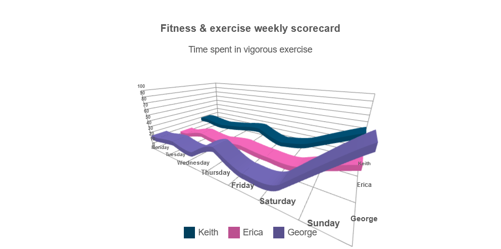
Different chart types can be used to visualize the same data.
For series such as 'line', 'column' and 'bar', each serie is positioned on its own layer in the Z-axis
The following code defines a single series group with three series which will be rendered as lines:
seriesGroups:
    [
        {
            type: 'line',
            series: [
                { dataField: 'Keith', displayText: 'Keith' },
                { dataField: 'Erica', displayText: 'Erica' },
                { dataField: 'George', displayText: 'George' }
            ]
        }
    ]
The following full example:
<!DOCTYPE html>
<html xmlns="http://www.w3.org/1999/xhtml">
<head>
    <title>3D Chart Line Series Example</title>
    <link rel="stylesheet" type="text/css" href="../../../source/styles/smart.default.css" />
    <script type="text/javascript" src="https://cdnjs.cloudflare.com/ajax/libs/webcomponentsjs/2.2.7/webcomponents-bundle.js"></script>
    <script type="text/javascript" src="../../../source/smart.element.js"></script>
    <script type="text/javascript" src="../../../source/smart.elements.js"></script>
    <script type="text/javascript">
        const sampleData = [
            { Day: 'Monday', Keith: 30, Erica: 15, George: 25 },
            { Day: 'Tuesday', Keith: 25, Erica: 25, George: 30 },
            { Day: 'Wednesday', Keith: 30, Erica: 20, George: 25 },
            { Day: 'Thursday', Keith: 35, Erica: 25, George: 45 },
            { Day: 'Friday', Keith: 20, Erica: 20, George: 25 },
            { Day: 'Saturday', Keith: 30, Erica: 20, George: 30 },
            { Day: 'Sunday', Keith: 60, Erica: 45, George: 90 }
        ];

        Smart('#3d-chart', class {
            get properties() {
                return {
                    caption: 'Fitness & exercise weekly scorecard',
                    description: 'Time spent in vigorous exercise',
                    dataSource: sampleData,
                    colorScheme: 'scheme29',
                    cameraPosition: {
                        x: 40,
                        y: 25,
                        z: 60
                    },
                    xAxis:
                    {
                        dataField: 'Day',
                    },
                    valueAxis:
                    {
                        description: 'Time in minutes',
                        minValue: 0,
                        maxValue: 100,
                        unitInterval: 10
                    },
                    seriesGroups:
                        [
                            {
                                type: 'spline',
                                series: [
                                    { dataField: 'Keith', displayText: 'Keith' },
                                    { dataField: 'Erica', displayText: 'Erica' },
                                    { dataField: 'George', displayText: 'George' }
                                ]
                            }
                        ]
                };
            }
        });
    </script>
</head>
<body>
    <smart-3d-chart id="3d-chart"></smart-3d-chart>
</body>
</html>
results in the 3D Chart shown in the image below:
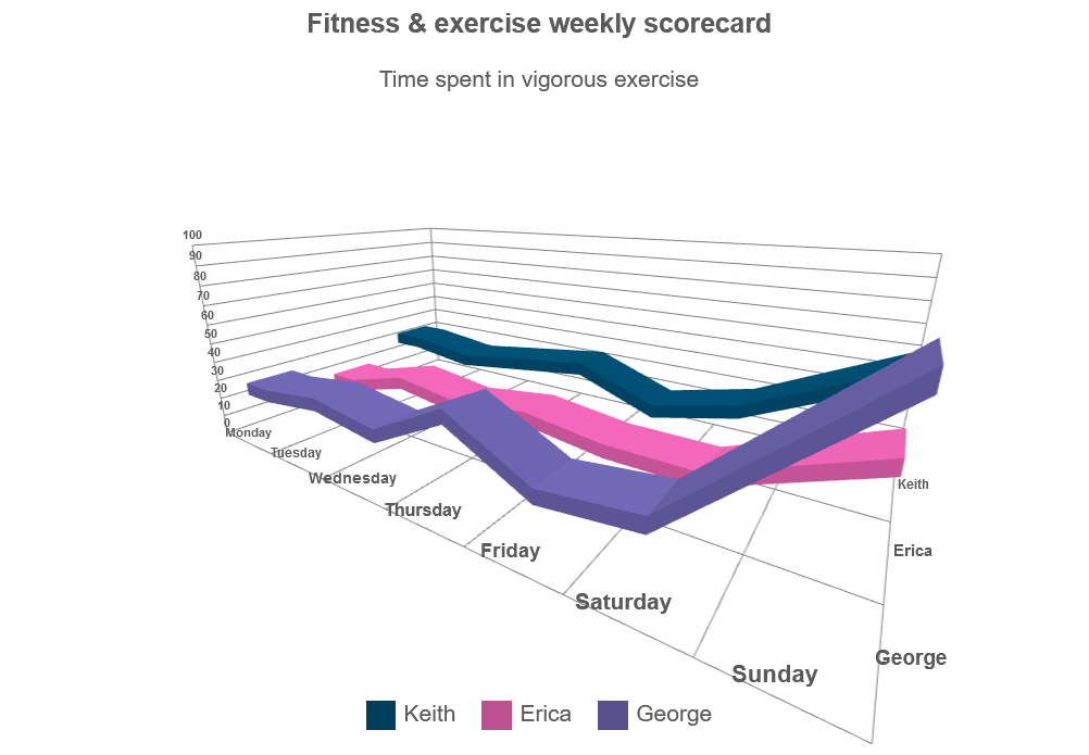
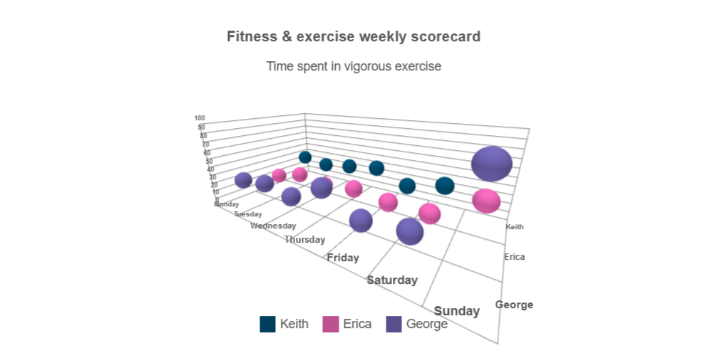
By just changing the type of the series group, we can get the following visualizations:
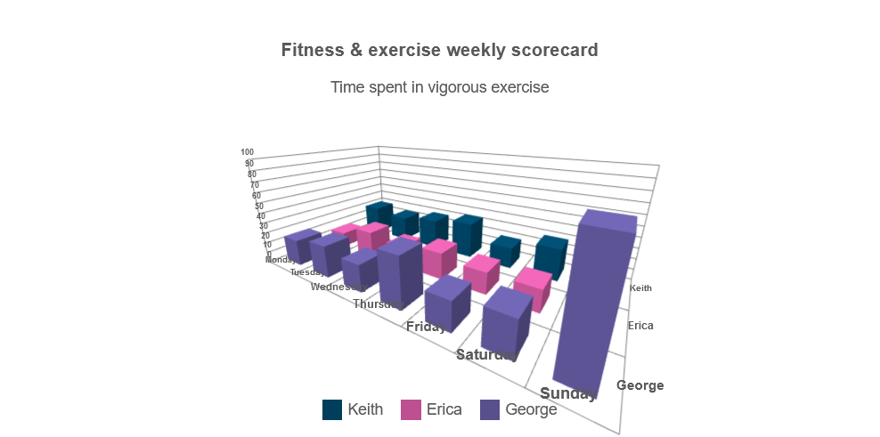 |
 |
| type: 'column' | type: 'spline' |
 |
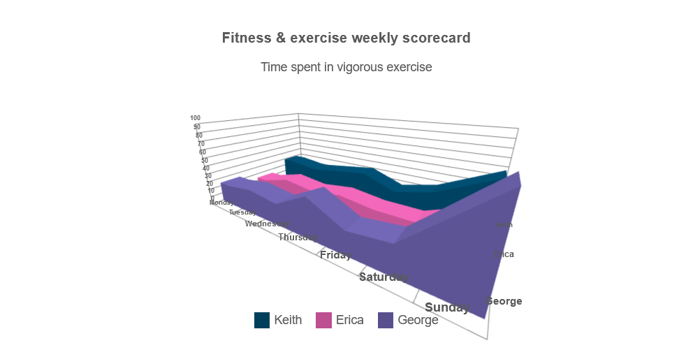 |
| type: 'bubble' | type: 'area' |
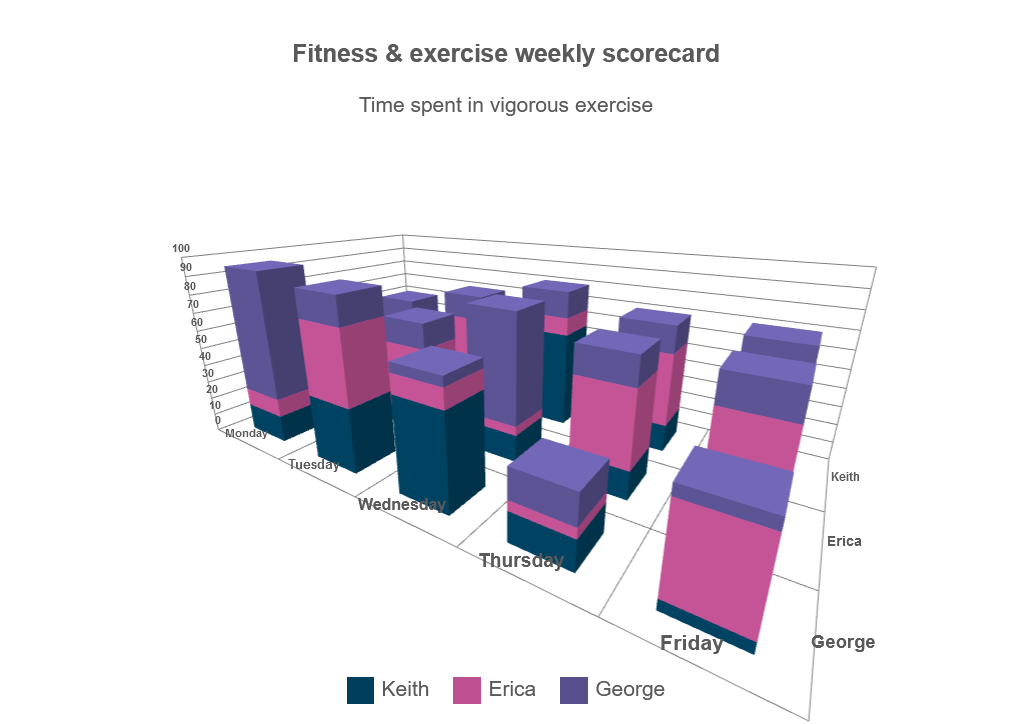
3D Chart with Stacked Series Types
Stacked Series Types allow you to visualize the total value as well as the composition of the data.
Each Series Group is positioned on its own layer on the Z-axis, while the Series inside of a Group are stacked on top of each other.
The following code defines a single series group with three series which will be rendered as stacked on each other:
seriesGroups: [
    {
        type: "stackedcolumn",
        dataField: "Keith",
        displayText: "Keith",
        series: [
        {
            dataField: "Running",
            displayText: "Running",
        },
        {
            dataField: "Cycling",
            displayText: "Cycling",
        },
        {
            dataField: "Swimming",
            displayText: "Swimming",
        },
        ],
    }
]
The following full example:
<!DOCTYPE html>
<html xmlns="http://www.w3.org/1999/xhtml">
<head>
    <title>3D Chart Line Series Example</title>
    <link rel="stylesheet" type="text/css" href="../../../source/styles/smart.default.css" />
    <script type="text/javascript" src="https://cdnjs.cloudflare.com/ajax/libs/webcomponentsjs/2.2.7/webcomponents-bundle.js"></script>
    <script type="text/javascript" src="../../../source/smart.element.js"></script>
    <script type="text/javascript" src="../../../source/smart.elements.js"></script>
    <script type="text/javascript">
    const sampleData = [{Day: "Monday",Keith: {  Running: 10,  Swimming: 20,  Cycling: 30},Erica: {  Running: 13,  Swimming: 30,  Cycling: 23,},George: {  Running: 15,  Swimming: 70,  Cycling: 10,},   },   {Day: "Tuesday",Keith: {  Running: 15,  Swimming: 15,  Cycling: 40,},Erica: {  Running: 10,  Swimming: 15,  Cycling: 40,},George: {  Running: 35,  Swimming: 15,  Cycling: 40,},   },   {Day: "Wednesday",Keith: {  Running: 55,  Swimming: 15,  Cycling: 10,},Erica: {  Running: 15,  Swimming: 60,  Cycling: 5,},George: {  Running: 50,  Swimming: 5,  Cycling: 10,},   },   {Day: "Thursday",Keith: {  Running: 15,  Swimming: 15,  Cycling: 40,},Erica: {  Running: 15,  Swimming: 15,  Cycling: 40,},George: {  Running: 15,  Swimming: 15,  Cycling: 5,},   },   {Day: "Friday",Keith: {  Running: 15,  Swimming: 15,  Cycling: 40,},Erica: {  Running: 15,  Swimming: 15,  Cycling: 40,},George: {  Running: 5,  Swimming: 5,  Cycling: 40,},   }, ];

        Smart('#3d-chart', class {
            get properties() {
                return {
                    caption: 'Fitness & exercise weekly scorecard',
                    description: 'Time spent in vigorous exercise',
                    dataSource: sampleData,
                    colorScheme: 'scheme29',
                    cameraPosition: {
                        x: 40,
                        y: 25,
                        z: 60
                    },
                    xAxis:
                    {
                        dataField: 'Day',
                    },
                    valueAxis:
                    {
                        description: 'Time in minutes',
                        minValue: 0,
                        maxValue: 100,
                        unitInterval: 10
                    },
                    seriesGroups: [
                        {
                            type: "stackedcolumn",
                            dataField: "Keith",
                            displayText: "Keith",
                            series: [
                            {
                                dataField: "Running",
                                displayText: "Running",
                            },
                            {
                                dataField: "Cycling",
                                displayText: "Cycling",
                            },
                            {
                                dataField: "Swimming",
                                displayText: "Swimming",
                            },
                            ],
                        },
                        {
                            type: "stackedcolumn",
                            dataField: "Erica",
                            displayText: "Erica",
                            series: [
                            {
                                dataField: "Running",
                                displayText: "Running",
                            },
                            {
                                dataField: "Cycling",
                                displayText: "Cycling",
                            },
                            {
                                dataField: "Swimming",
                                displayText: "Swimming",
                            },
                            ],
                        },
                        {
                            type: "stackedcolumn",
                            dataField: "George",
                            displayText: "George",
                            series: [
                            {
                                dataField: "Running",
                                displayText: "Running",
                            },
                            {
                                dataField: "Cycling",
                                displayText: "Cycling",
                            },
                            {
                                dataField: "Swimming",
                                displayText: "Swimming",
                            },
                            ],
                        }
                    ]
                };
            }
        });
    </script>
</head>
<body>
    <smart-3d-chart id="3d-chart"></smart-3d-chart>
</body>
</html>
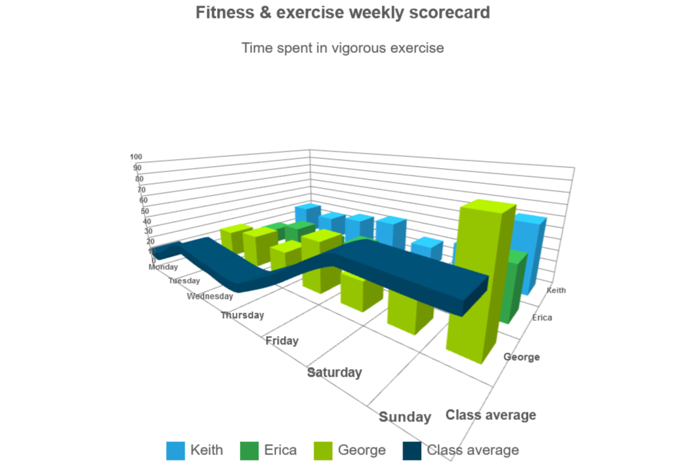
3D Chart with Multiple Series Types
If you want to display multiple series with different types you can define several series groups and change the type property, as in the following code:
<!DOCTYPE html>
<html xmlns="http://www.w3.org/1999/xhtml">
<head>
    <title>3D Chart Multiple Series Types Example</title>
    <link rel="stylesheet" type="text/css" href="../../../source/styles/smart.default.css" />
    <script type="text/javascript" src="https://cdnjs.cloudflare.com/ajax/libs/webcomponentsjs/2.2.7/webcomponents-bundle.js"></script>
    <script type="text/javascript" src="../../../source/smart.element.js"></script>
    <script type="text/javascript" src="../../../source/smart.elements.js"></script>
    <script type="text/javascript">
        const sampleData = [
            { Day: 'Monday', Keith: 30, Erica: 15, George: 25, Monica: 20, Maria: 15, Average: 20 },
            { Day: 'Tuesday', Keith: 25, Erica: 25, George: 30, Monica: 25, Maria: 20, Average: 38 },
            { Day: 'Wednesday', Keith: 30, Erica: 20, George: 25, Monica: 10, Maria: 20, Average: 33 },
            { Day: 'Thursday', Keith: 35, Erica: 25, George: 45, Monica: 30, Maria: 30, Average: 31 },
            { Day: 'Friday', Keith: 20, Erica: 20, George: 25, Monica: 45, Maria: 30, Average: 52 },
            { Day: 'Saturday', Keith: 30, Erica: 20, George: 30, Monica: 60, Maria: 40, Average: 75 },
            { Day: 'Sunday', Keith: 60, Erica: 45, George: 90, Monica: 70, Maria: 50, Average: 73 }
        ];

        Smart('#chart', class {
            get properties() {
                return {
                    caption: 'Fitness & exercise weekly scorecard',
                    description: 'Time spent in vigorous exercise',
                    showLegend: true,
                    padding: { left: 5, top: 5, right: 5, bottom: 5 },
                    titlePadding: { left: 90, top: 0, right: 0, bottom: 10 },
                    dataSource: sampleData,
                    xAxis:
                    {
                        dataField: 'Day',
                        gridLines: {
                            visible: true
                        }
                    },
                    valueAxis:
                    {
                        unitInterval: 10,
                        minValue: 0,
                        maxValue: 100,
                        displayValueAxis: true,
                        description: 'Time in minutes',
                        axisSize: 'auto',
                        tickMarksColor: '#888888'
                    },
                    seriesGroups:
                        [
                            {
                                type: 'column',
                                columnsGapPercent: 50,
                                seriesGapPercent: 0,
                                colorScheme: 'scheme29',
                                series: [
                                    { dataField: 'Keith', displayText: 'Keith' },
                                    { dataField: 'Erica', displayText: 'Erica' },
                                    { dataField: 'George', displayText: 'George' },
                                    { dataField: 'Monica', displayText: 'Monica' },
                                    { dataField: 'Maria', displayText: 'Maria' }
                                ]
                            },
                            {
                                type: 'spline',
                                colorScheme: 'scheme05',
                                series: [
                                    { dataField: 'Average', displayText: 'Class average', lineWidth: 5 }
                                ]
                            }
                        ]
                }
            }
        });
    </script>
</head>
<body>
    <smart-3d-chart id="chart"></smart-3d-chart>
</body>
</html>
3D Pie, Donut and Pyramid Series
Chart series such as Pie, Donut and Pyramid can also be used both independently and with one another.
In order to vizualize them together, each serie must be set into its own seriesGroup.
For example, the following code visulizes nested Donut series:
const source = [
    { Browser: "Chrome", Share: 55 },
    { Browser: "Safari", Share: 30 },
    { Browser: "Firefox", Share: 10 },
    { Browser: "Other", Share: 5 },
];

const source2 = [
    { Browser: "Chrome", Share: 20 },
    { Browser: "Safari", Share: 40 },
    { Browser: "Firefox", Share: 10 },
    { Browser: "Android", Share: 10 },
    { Browser: "Other", Share: 20 },
];

JQX(
    "#chart",
    class {
        get properties() {
        return {
            autoRotate: false,
            caption: "Desktop browsers share",
            description: "(source: gs.statcounter.com)",
            showLegend: true,
            legendLayout: {
            flow: "vertical",
            left: 30,
            },
            cameraPosition: {
            x: 15,
            y: 30,
            z: 15,
            },
            dataSource: source,
            colorScheme: "scheme01",
            seriesGroups: [
            {
                type: "donut",
                showLabels: true,
                labelType: "percentage",
                dataSource: source,
                series: [
                {
                    dataField: "Share",
                    displayText: "Browser",
                    initialAngle: 0,
                    radius: 10,
                    centerOffset: 0,
                    width: 4,
                },
                ],
            },
            {
                type: "donut",
                showLabels: false,
                labelType: "percentage",
                dataSource: source2,
                series: [
                {
                    dataField: "Share",
                    displayText: "Browser",
                    initialAngle: 0,
                    radius: 18,
                    centerOffset: 0,
                    width: 4,
                },
                ],
                xAxis: {
                formatSettings: { sufix: " (mobile)" },
                },
            },
            ],
        };
        }
    }
);
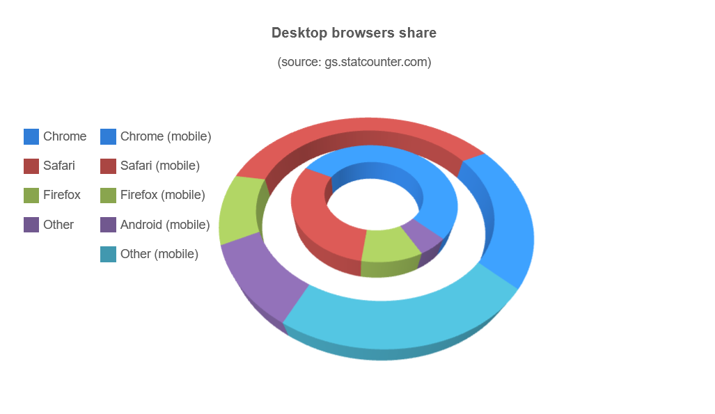
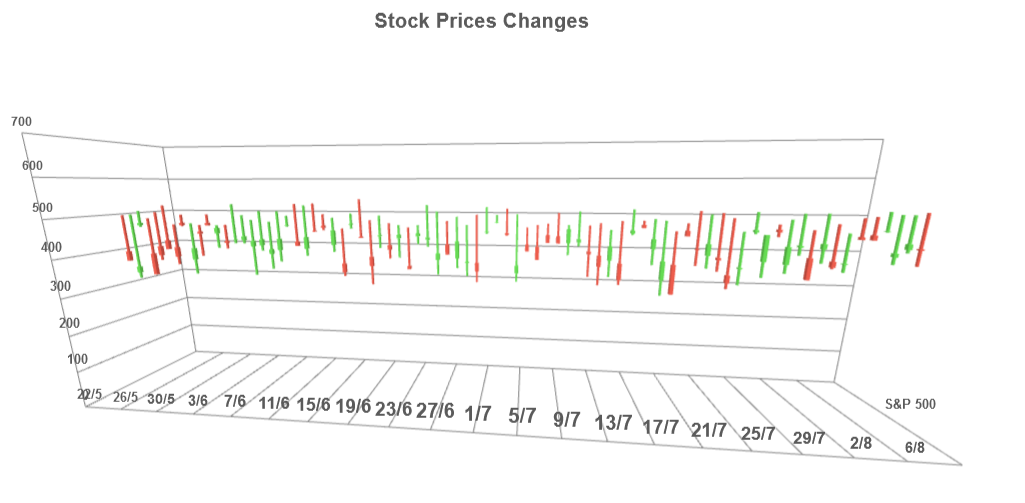
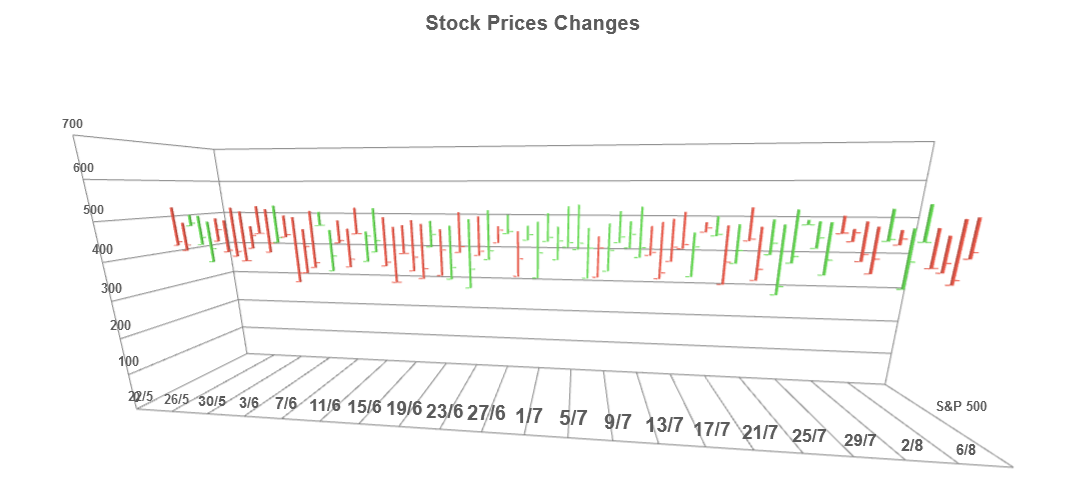
Financial 3D Chart Types (OHLC and Candlestick)
Smart 3d Chart provides two chart types specifically suitable for displaying financial data - OHLC and candlestick. Both OHLC (open-high-low-close) and candlestick (also known as Japanese candlestick) charts are types of chart typically used to illustrate movements in the price of a financial instrument over time. Each vertical line on the chart shows the price range (the highest and lowest prices) over one unit of time, e.g., one day or one hour. Tick marks project from each side of the line indicating the opening price (e.g., for a daily bar chart this would be the starting price for that day) on the left, and the closing price for that time period on the right. The bars may be shown in different hues depending on whether prices rose or fell in that period.
The following is an example of an OHLC Smart 3d Chart:
<!DOCTYPE html>
<html xmlns="http://www.w3.org/1999/xhtml">
<head>
    <title>OHLC Example</title>
    <link rel="stylesheet" type="text/css" href="../../../source/styles/smart.default.css" />
    <script type="text/javascript" src="https://cdnjs.cloudflare.com/ajax/libs/webcomponentsjs/2.2.7/webcomponents-bundle.js"></script>
    <script type="text/javascript" src="../../../source/smart.element.js"></script>
    <script type="text/javascript" src="../../../source/smart.elements.js"></script>
    <script type="text/javascript">
    let sampleData = [];
    let startingDate = new Date("2020-05-21");
    for(let i=0; i<80; i++){
      startingDate.setDate(startingDate.getDate() + 1);
      let fomrattedDate =  startingDate.getDate()+"/"+(startingDate.getMonth()+1);
      let high = Math.floor(Math.random() * 100) + 500;
      do{
        var low = Math.floor(Math.random() * 100) + 400
      }while(low >= high);
      do{
        var openPrice = Math.floor(Math.random() * 100) + 400;
      }while(openPrice > high || openPrice < low);
      do{
        var closePrice = Math.floor(Math.random() * 100) + 400;
      }while(closePrice > high || closePrice < low);

      sampleData.push({
        Date: fomrattedDate,
        SPClose: closePrice,
        SPOpen: openPrice,
        SPHigh: high,
        SPLow: low,
      })
    }

    Smart(
      "#3d-chart",
      class {
        get properties() {
          return {
            caption: "Stock Prices Changes",
            description: "",
            showLegend: false,
            cameraPosition: {
              x: 5,
              y: 10,
              z: 45,
            },
            dataSource: sampleData,
            colorScheme: "scheme29",
            xAxis: {
              dataField: "Date",
            },
            valueAxis: {
              unitInterval: 100,
              minValue: 0,
              maxValue: 700,
            },
            seriesGroups: [
              {
                type: "ohlc",

                series: [
                  {
                    dataFieldClose: 'SPClose',
                    displayTextClose: 'Close price',
                    dataFieldOpen: 'SPOpen',
                    displayTextOpen: 'Open price',
                    dataFieldHigh: 'SPHigh',
                    displayTextHigh: 'High price',
                    dataFieldLow: 'SPLow',
                    displayTextLow: 'Low price',
                    displayText: 'S&P 500',
                }
                ],
                colorFunction: function (value, itemIndex, serie, group) {
                  return (value.close > value.open) ? '#E25848' : '#61D14F';
                }

              },
            ],
          };
        }
      }
    );
    </script>
</head>
<body>
    <smart-3d-chart id="chart"></smart-3d-chart>
</body>
</html>
By changing the series group type to 'candlestick', we get the following visualization of the data: