Build your web apps using Smart UI
Smart.Grid - Cascading Cell Editors
Cascading Cell Editors in Grid
Cascading Cell Editors can be implemented in Smart.Grid in order to make the available options for cell values in one column dependent on the already selected cell value of another column on the same row.
In this help topic, we will set up a Grid with two columns - "Country" and "City". When a country is selected from a drop down list of available options, the available cities in the second column's drop down change accordingly, thus creating a cascading effect. To achieve cascading editing, both columns have to have custom editors implemented.
Below you can find the TypeScript source code that sets up the Grid and implements cascading editing. We will look at each major part of it in detail afterwards.
/// <reference path="../../../source/typescript/smart.elements.d.ts" />

import { Grid, DropDownList } from "../../../source/typescript/smart.elements"

const data = [{ "Country": "Belgium", "City": "Brussels" }, { "Country": "France", "City": "Paris" }, { "Country": "USA", "City": "Washington" }, { "Country": "Lebanon", "City": "Beirut" }], // STEP (1)
    cities: Record<string, string[]> = {
        Belgium: ["Bruges", "Brussels", "Ghent"],
        France: ["Bordeaux", "Lille", "Paris"],
        USA: ["Los Angeles", "Minneapolis", "Washington"],
        Lebanon: ["Beirut", "Sidon", "Byblos"]
    };
let grid: Grid;
let change: boolean = false;

window.Smart('#grid', class {
    get properties() {
        return {
            // STEP (1)
            dataSource: new window.Smart.DataAdapter(
                {
                    dataSource: data,
                    dataFields:
                        [
                            'Country: string',
                            'City: string'
                        ]
                }),
            // STEP (1)
            editing: {
                enabled: true,
                mode: 'cell'
            },
            columns: [
                // STEP (2)
                {
                    label: 'Country', dataField: 'Country', editor: {
                        template: '<smart-drop-down-list></smart-drop-down-list>',
                        onInit(row: number, column: string, editor: HTMLElement) {
                            const dropDownList = (editor.firstElementChild as DropDownList);

                            dropDownList.dataSource = ['Belgium', 'France', 'USA', 'Lebanon'];
                            dropDownList.dropDownAppendTo = 'body';
                            dropDownList.selectedValues = [grid.rows![row].cells![0].value];

                            dropDownList.addEventListener('change', function () {
                                change = true;
                            });
                        },
                        onRender(row: number, column: string, editor: HTMLElement) {
                            (editor.firstElementChild as DropDownList).selectedValues = [grid.rows![row].cells![0].value];
                        },
                        getValue() {
                            return ((this as any).firstElementChild as DropDownList).selectedValues![0];
                        }
                    }
                },
                // STEP (3)
                {
                    label: 'City', dataField: 'City', editor: {
                        template: '<smart-drop-down-list></smart-drop-down-list>',
                        onInit(row: number, column: string, editor: HTMLElement) {
                            const dropDownList = (editor.firstElementChild as DropDownList);

                            dropDownList.dropDownAppendTo = 'body';
                            dropDownList.placeholder = 'Select a city...';
                        },
                        onRender(row: number, column: string, editor: HTMLElement) {
                            const countryValue: string = grid.rows![row].cells![0].value,
                                citiesSource: string[] = cities[countryValue],
                                dropDownList = (editor.firstElementChild as DropDownList);

                            dropDownList.dataSource = citiesSource;
                            dropDownList.selectedValues = [grid.rows![row].cells![1].value];
                        },
                        getValue() {
                            return ((this as any).firstElementChild as DropDownList).selectedValues![0] || 'Select a city...';
                        }
                    }
                }
            ]
        }
    }
});

window.onload = function () {
    grid = <Grid>document.getElementById('grid');

    // STEP (4)
    grid.addEventListener('endEdit', function (event: any) {
        const detail = event.detail;

        if (detail.column.dataField === 'Country' && change) {
            detail.row.cells[1].value = 'Select a city...';
        }

        change = false;
    })
};
Step (1)
The Grid is bound to a static data source (data), that comprises the initial view, by setting the dataSource property. Cell editing is enabled by setting editing enabled to true and mode to 'cell'.
Step (2)
The first column in the columns array ("Country") has a custom cell editor with the following fields:
- template - denotes that the editor to be used is the Smart custom element DropDownList (smart-drop-down-list).
- onInit - called the first time a cell from the column is edited and the editor is initialized. Here, we set the available countries as data source of the drop down list and select the initial value. We also denote that the drop down is appended to the document's body (
dropDownList.dropDownAppendTo = 'body'). Finally, we bind to the editor's change event in order to set a flag when an actual change to the selected country occurs (to be used in Step (4)). - onRender - called each time a cell is edited. Here, the current cell value is selected in the editor when an edit operation begins.
- getValue - called when the edit operation ends. In this callback function, the editor's selected value is applied as a cell value of the Grid.
Step (3)
The second column in the columns array ("City") also has a custom cell editor with the same fields:
- template - denotes that the editor to be used is the Smart custom element DropDownList (smart-drop-down-list).
- onInit - called the first time a cell from the column is edited and the editor is initialized. Here, we denote that the drop down is appended to the document's body (
dropDownList.dropDownAppendTo = 'body') and set the placeholder of the drop down list to "Select a city..." - it will be displayed when a country is changed and a respective city has to be selected. - onRender - called each time a cell is edited. Here, a data source with cities based on the country selected in the first column is applied. If the cell value is an applicable city, it is also selected in the drop down list.
- getValue - called when the edit operation ends. In this callback function, the editor's selected value is applied as a cell value of the Grid. If a city has not been chosen yet, the cell value is "Select a city...".
Step (4)
We bind to the Grid's endEdit event and when a change to the "Country" column has occurred and reset the value of the respective "City" cell to "Select a city..." in order to prompt the user to select a city from the newly chosen country.
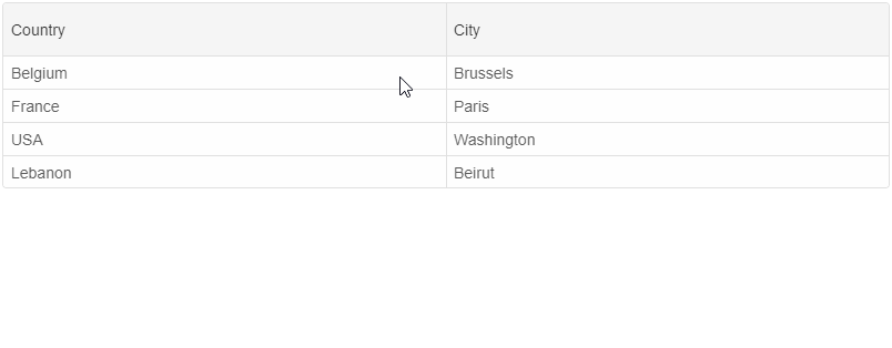
Result
A live version of the code presented in this tutorial can be found in the demo Grid Cascading Cell Editors. Here is what the application looks like when launched.
For AI tooling
Developer Quick Reference
Topic: grid-cascading-cell-editors Component: Grid Framework: JavaScript
Main methods: addEventListener()
Common config keys: dataSource, editing, columns
Implementation Notes
Compatibility: Modern browsers / Web Components API access pattern: const component = document.querySelector(...) + component.method()
Lifecycle guidance: Initialize configuration first, then invoke imperative API when element is available in DOM.
Common pitfalls:
- Calling methods before element initialization.
- Reassigning large configuration partially without understanding merge behavior.
- Missing required module script import for component type.
Validation checklist:
- Ensure module scripts and CSS are loaded once.
- Keep data schema aligned with columns/series definitions.
- Verify method calls target initialized component instance.