Blazor - Get Started with Smart.ColorPicker
Setup The Project
Follow the Getting Started guide to set up your Blazor Application with Smart UI.
Setup Basic ColorPicker
Smart.ColorPicker is a custom input element that allows users to select a color from a dropdown list of options.
- Add the ColorPicker component to the Pages/Index.razor file:
<ColorPicker></ColorPicker> - Optionally, set the
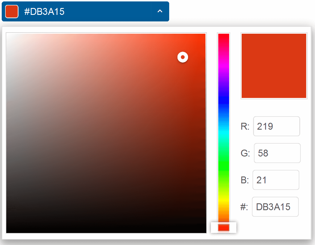
Valueproperty to a color value:<ColorPicker Value="#DB3A15"></ColorPicker> - By default, the input is only editable through selection. To enable editing through typing, set the
Editableproperty<ColorPicker Value="#DB3A15" Editable="true"></ColorPicker>
Display Mode
Smart.ColorPicker offers a wide range of display modes such as grid, hexagon, palette and more.
The display mode is set using the DisplayMode property.
Additional properties such as ColumnCount, ApplyValueMode and Palette are available depending on the display mode.
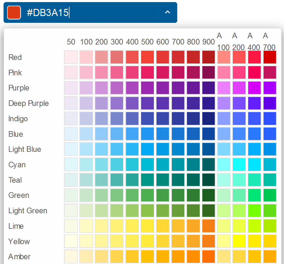
<ColorPicker Value="#DB3A15" Editable="true" DisplayMode="ColorDisplayMode.Grid"></ColorPicker>
-
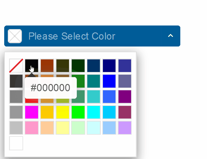
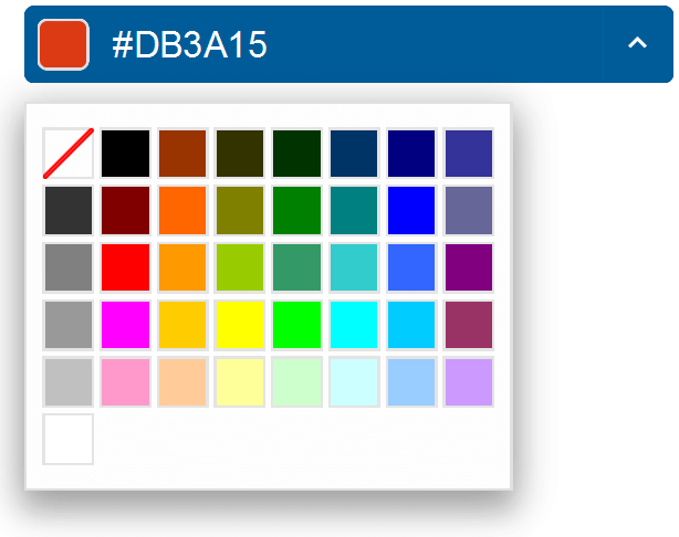
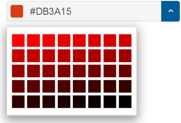
Grid:
-
Hexagon:
-
Material Grid:
-
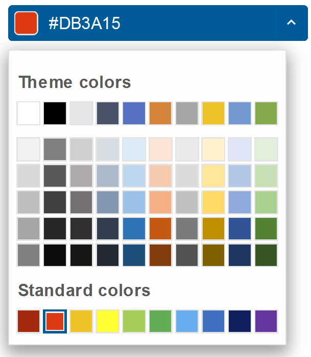
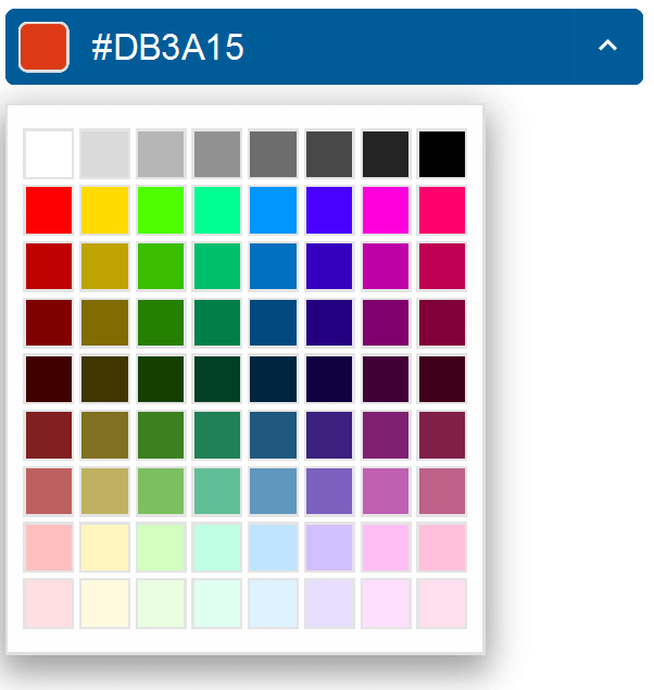
Pallete:
-
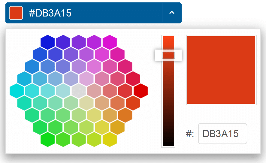
Radial:
-
SpectrumGrid:
Color Palette
The color palestte of the component with display mode 'grid' or 'spectrum grid' can be set to a specific color. The demo below sets the color pallete only to red
<ColorPicker Value="#DB3A15" Editable="true" DisplayMode="ColorDisplayMode.Grid" Palette="ColorPalette.Red"></ColorPicker>
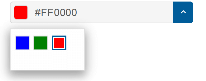
Alternatively, it is possible to create a custom palette using the PaletteColors property:
<ColorPicker  DisplayMode="ColorDisplayMode.Grid" Palette="ColorPalette.Custom" PaletteColors="@colors"></ColorPicker>

@code{
  string[] colors = new string[]{"#0000FF", "rgb(0,128,0)", "#FF0000"};
}
Custom Colors
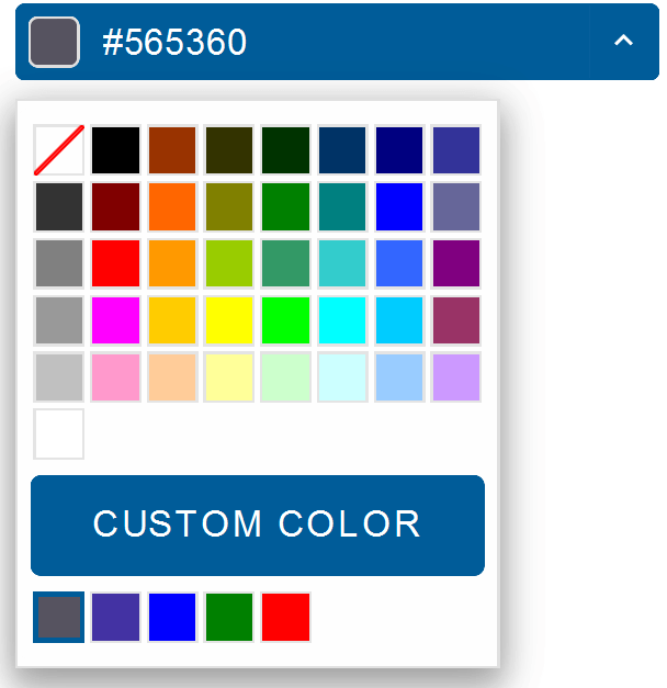
The EnableCustomColors property allows users to select a custom color via an editor popup.
Custom color selection is available in modes that don't have this option by default, like: 'grid', 'default, 'spectrum grid'
When the user makes a selection, the custom color will be added to a color palette below the 'custom color' button
In addition, it is possible to set an additional custom colors that will appear below the custom color palette
<ColorPicker  DisplayMode="ColorDisplayMode.Grid" PaletteCustomColors="@colors" EnableCustomColors="true"></ColorPicker>

@code{
  string[] colors = new string[]{"#0000FF", "rgb(0,128,0)", "#FF0000"};
}
ColorPicker Events
Smart.ColorPicker provides multiple events that can help you expand the components' functionality.
Events can feature a detail object with additional parameters
OnActionButtonClick- triggered when user clicks on the action button. 'Ok' button is visible only when "applyValueMode" is set to "useButtons".
Event Details: N/AOnCancelButtonClick- triggered when the cancel button is clicked. 'Cancel' button is visible only when "applyValueMode" is set to "useButtons".
Event Details: N/AOnChange- triggered when the color value is changed.
Event Details: dynamic value, dynamic oldValueOnClose- triggered when the drop down is closed.
Event Details: N/AOnClosing- triggered when the drop down is about to be closed.
Event Details: N/AOnCustomColorSelection- triggered when the custom color selection view is opened/closed. Custom color selection view is available when "enableCustomColors" property is true.
Event Details: dynamic valueOnDropDownButtonClick- triggered when user clicks on the drop down button.
Event Details: N/AOnOkButtonClick- triggered when the ok button is clicked.
Event Details: N/AOnOpen- triggered when the drop down is opened.
Event Details: N/AOnOpening- triggered when the drop down is about to be opened.
Event Details: N/AOnResizeStart- triggered when user starts resizing the drop down.
Event Details: N/AOnResizeEnd- triggered when the resizing of the drop down is finished.
Event Details: N/A
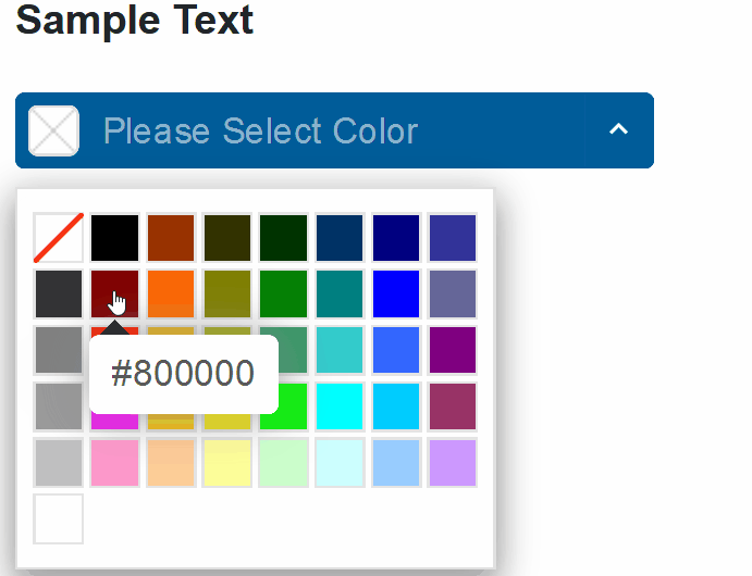
The demo below uses the OnChange Event to change the text color according to the selected value:
<div style="color:@selectedColor">Sample Text</div>
<ColorPicker DisplayMode="ColorDisplayMode.Grid" OnChange="OnChange"></ColorPicker>
@code{
    string selectedColor = "";
    private void OnChange(Event ev){
        ColorPickerChangeEventDetail detail = ev["Detail"];
        selectedColor = detail.Value;
    }
}
Two-way Value Binding
The ColorPicker component also supports two-way value binding:
<div>@selectedColor</div>
<ColorPicker DisplayMode="ColorDisplayMode.Grid" @bind-Value="selectedColor"></ColorPicker>
@code{
    string selectedColor = "";
}