Cells Editing in Grid
Grid Cell Editing
The following code shows how to enable the cell editing in Grid. To enable the editing, theediting.enabled should be set to true and depending on the chosen
editing.mode the editing would be single cell or full row. The default editing mode is "cell" and we will describe it in this topic.
The code sample below shows how to enable cell editing.
const gridOptions = {
    dataSourceSettings: {
        dataFields: [
            { name: 'firstName', dataType: 'string' },
            { name: 'lastName', dataType: 'string' },
            { name: 'productName', map: 'product.name', dataType: 'string' },
            { name: 'payment', map: 'product.payment', dataType: 'string' },
            { name: 'quantity', map: 'product.quantity', dataType: 'number' },
            { name: 'price', map: 'product.price', dataType: 'number' },
            { name: 'total', map: 'product.total', dataType: 'number' }
        ]
    },
    editing: {
        enabled: true
    },
    selection: {
        enabled: true,
        allowCellSelection: true,
        mode: 'extended'
    },
    filtering: {
        enabled: true
    },
    behavior: {
        allowColumnReorder: true,
        allowColumnFreeze: true,
        columnResizeMode: 'growAndShrink'
    },
    sorting: {
        enabled: true
    },
    dataSource: [
        {
            firstName: 'Andrew',
            lastName: 'Burke',
            product: {
                name: 'Ice Coffee', price: 10, quantity: 3, total: 30, payment: 'Visa'
            }
        },
        {
            firstName: 'Petra',
            lastName: 'Williams',
            product: {
                name: 'Espresso', price: 7, quantity: 5, total: 35, payment: 'Visa'
            }
        },
        {
            firstName: 'Anthony',
            lastName: 'Baker',
            product: {
                name: 'Frappucino', price: 6, quantity: 4, total: 24, payment: 'Mastercard'
            }
        }
    ],
    columns: [
        {
            label: 'First Name', dataField: 'firstName', width: 150
        },
        { label: 'Last Name', dataField: 'lastName', width: 150 },
        { label: 'Product', dataField: 'productName', width: 150 },
        {
            label: 'Quantity', dataField: 'quantity', cellsAlign: 'right', width: 150
        },
        {
            label: 'Unit Price', dataField: 'price', cellsAlign: 'right', cellsFormat: 'c2', width: 150
        }
    ]
}
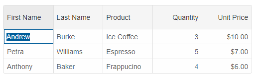
When editing is enabled, the 'F2', 'Backspace', 'Space'. The 'Delete' key clears the cell content without starting an editing process, while the 'Backspace' key clears the cell and starts the editing.
You can configure whether the editing starts on single or double mouse click. For configuration of the edit action, use the editing.action property. The possible values are 'none', 'click' and 'doubleClick'.
Pressing any alpha-numeric character starts the editing, too. When that happens, the default editor places the pressed character into the edit field and the editing starts after that character.
The
beginEdit(rowId, dataField), endEdit() and cancelEdit() methods can be used to start, end and cancel editing.
grid.beginEdit(0, 'firstName');The
onCellUpdate for cell editing and onRowUpdate for row editing are callback functions which allow you to confirm or cancel the data updates depending on custom conditions.
The following code will confirm all changes except the 'Quantity' column updates when cell values are over 20.
onCellUpdate(cells, oldValues, values, confirm) {
	if (cells[0].column.dataField === 'quantity') {
		if (values[0] <= 20) {
			setTimeout(() => {
				confirm(true);
			}, 500);
		}
		else {
			setTimeout(() => {
				confirm(false);
			}, 500);
		}
	}
	else {
		confirm(true);
	}
}
If we want to achieve the same result by used the onRowUpdate function, we can use this:
onRowUpdate(indexes, rows, oldDatas, datas, confirm) {
	if (datas[0]['quantity'] <= 20) {
		setTimeout(() => {
			confirm(true);
		}, 500);
	}
	else {
		confirm(false);
	}
}
The events which you can use for handling edits are: beginEdit, endEdit and cancelEdit. For batch editing, saveBatchEdit and clearBatchEdit.
If you need to get the edit cells, you can use the
getEditCells method. In cell edit mode, the method returns an array with one cell. When editing.mode is equal to "row", the returned value is an array of cells.
const cells = grid.getEditCells();

for (let i = 0; i < cells.length; i++) {
	// grid cell.
	const cell = cells[i];
	// row id.
	const rowID = cell.row.id;
	// data field.
	const dataField = cell.column.dataField;
	// cell value.
	const value = cell.value;
};
Editors
- Input Editor
The default cell editor is Input. When editing is enabled, unless you set theeditorproperty, the editor will be Input element.
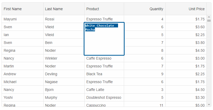
- Textarea Input Editor
To handle multiline text editing, you can use the Textarea editor. To do this, theeditorproperty should be set to the 'textArea' string value.columns: [ { label: 'First Name', dataField: 'firstName', editor: 'textArea' }, { label: 'Last Name', dataField: 'lastName', editor: 'textArea' }, { label: 'Product', dataField: 'productName', width: 150, editor: 'textArea' }, { label: 'Quantity', dataField: 'quantity', editor: 'numberInput' }, { label: 'Unit Price', dataField: 'price', editor: 'numberInput', cellsFormat: 'c2' } ]
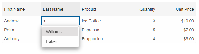
- Auto-complete Input Editor
The auto-complete editor is similar to the Input, but uses the column's data and auto-completes the typed text.
columns: [
	{
		label: 'First Name', dataField: 'firstName', editor: 'input'
	},
	{ label: 'Last Name', dataField: 'lastName', editor: 'autoComplete' },
	{ label: 'Product', dataField: 'productName', editor: 'dropDownList' },
	{
		label: 'Quantity', dataField: 'quantity', cellsAlign: 'right', editor: 'numberInput'
	},
	{
		label: 'Unit Price', dataField: 'price', cellsAlign: 'right', cellsFormat: 'c2', editor: 'numberInput'
	}
]
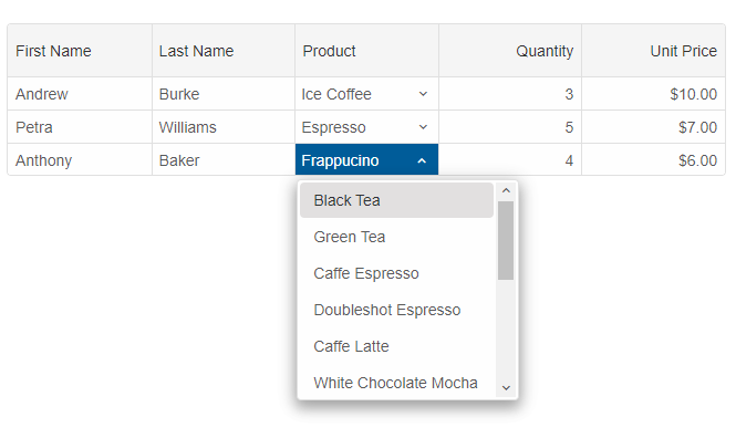
- Dropdownlist Editor
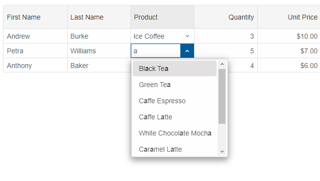
The dropdownlist editor allows you to choose an item from a dropdown-list of items. All items in that list are unique items from the column's data source. In the following code sample, the
'Product' column is with dropdownlist editor.
columns: [
	{
		label: 'First Name', dataField: 'firstName', editor: 'input'
	},
	{ label: 'Last Name', dataField: 'lastName', editor: 'autoComplete' },
	{ label: 'Product', dataField: 'productName', editor: 'dropDownList' },
	{
		label: 'Quantity', dataField: 'quantity', cellsAlign: 'right', editor: 'numberInput'
	},
	{
		label: 'Unit Price', dataField: 'price', cellsAlign: 'right', cellsFormat: 'c2', editor: 'numberInput'
	}
]
You can customize the items, by setting theeditorproperty to an object.columns: [ { label: 'First Name', dataField: 'firstName', editor: 'input' }, { label: 'Last Name', dataField: 'lastName', editor: 'autoComplete' }, { label: 'Product', dataField: 'productName', template: 'dropDownList', editor: { template: 'dropDownList', dataSource: ["Black Tea", "Green Tea", "Caffe Espresso", "Doubleshot Espresso", "Caffe Latte", "White Chocolate Mocha", "Caramel Latte", "Caffe Americano", "Cappuccino", "Espresso Truffle", "Espresso con Panna", "Peppermint Mocha Twist"] } }, { label: 'Quantity', dataField: 'quantity', cellsAlign: 'right', editor: 'numberInput' }, { label: 'Unit Price', dataField: 'price', cellsAlign: 'right', cellsFormat: 'c2', editor: { template: 'numberInput' } } ]
- Combobox Editor
The combobox editor allows you to input text and also to select items from a list of items similarly to the dropdownlist editor.
columns: [
	{
		label: 'First Name', dataField: 'firstName', editor: 'input'
	},
	{ label: 'Last Name', dataField: 'lastName', editor: 'autoComplete' },
	{
		label: 'Product', dataField: 'productName', template: 'dropDownList', editor: {
			template: 'comboBox',
			dataSource: ["Black Tea", "Green Tea",
				"Caffe Espresso", "Doubleshot Espresso",
				"Caffe Latte", "White Chocolate Mocha",
				"Caramel Latte", "Caffe Americano",
				"Cappuccino", "Espresso Truffle",
				"Espresso con Panna", "Peppermint Mocha Twist"]
		}
	},
	{
		label: 'Quantity', dataField: 'quantity', cellsAlign: 'right', editor: 'numberInput'
	},
	{
		label: 'Unit Price', dataField: 'price', cellsAlign: 'right', cellsFormat: 'c2', editor: {
			template: 'numberInput'
		}
	}
]
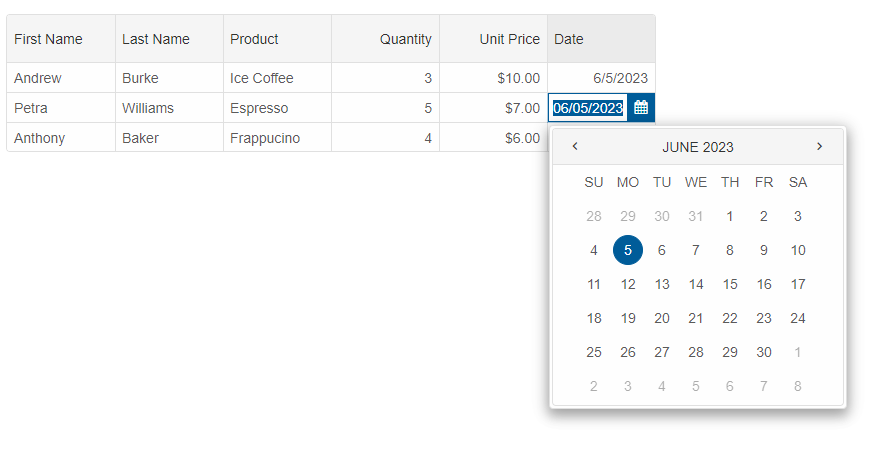
- Date input editor
The date input is the default editor for date columns. The following sample code shows how to create a date input editor and restrict the user input by using the 'min' and 'max' properties.
columns: [
	{
		label: 'First Name', dataField: 'firstName'
	},
	{ label: 'Last Name', dataField: 'lastName' },
	{ label: 'Product', dataField: 'productName' },
	{
		label: 'Date', dataField: 'date', cellsFormat: 'd', editor: {
			template: 'dateInput',
			min: new Date(2022, 5, 1),
			max: new Date(2022, 10, 1)
		}
	},
	{
		label: 'Quantity', dataField: 'quantity', editor: 'numberInput'
	},
	{ label: 'Unit Price', dataField: 'price', editor: 'numberInput', cellsFormat: 'c2' }
]
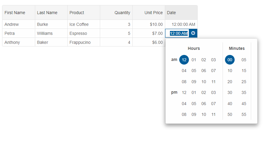
- Time input editor
The time input cell editor is applied to date/time columns by setting the
editorproperty to 'timeInput'.const gridOptions = { dataSourceSettings: { dataFields: [ { name: 'firstName', dataType: 'string' }, { name: 'lastName', dataType: 'string' }, { name: 'productName', map: 'product.name', dataType: 'string' }, { name: 'payment', map: 'product.payment', dataType: 'string' }, { name: 'quantity', map: 'product.quantity', dataType: 'number' }, { name: 'price', map: 'product.price', dataType: 'number' }, { name: 'total', map: 'product.total', dataType: 'number' }, { name: 'date', dataType: 'date' } ] }, editing: { enabled: true }, selection: { enabled: true, allowCellSelection: true, mode: 'extended' }, filtering: { enabled: true }, behavior: { allowColumnReorder: true, allowColumnFreeze: true, columnResizeMode: 'growAndShrink' }, sorting: { enabled: true }, dataSource: [ { firstName: 'Andrew', lastName: 'Burke', product: { name: 'Ice Coffee', price: 10, quantity: 3, total: 30, payment: 'Visa' }, date: new Date(2023, 5, 5) }, { firstName: 'Petra', lastName: 'Williams', product: { name: 'Espresso', price: 7, quantity: 5, total: 35, payment: 'Visa' }, date: new Date(2023, 5, 5) }, { firstName: 'Anthony', lastName: 'Baker', product: { name: 'Frappucino', price: 6, quantity: 4, total: 24, payment: 'Mastercard' }, date: new Date(2023, 5, 5) } ], columns: [ { label: 'First Name', dataField: 'firstName', editor: 'input' }, { label: 'Last Name', dataField: 'lastName', editor: 'autoComplete' }, { label: 'Product', dataField: 'productName', editor: 'dropDownList' }, { label: 'Quantity', dataField: 'quantity', cellsAlign: 'right', editor: 'numberInput' }, { label: 'Unit Price', dataField: 'price', cellsAlign: 'right', cellsFormat: 'c2', editor: 'numberInput' }, { label: 'Date', dataField: 'date', cellsAlign: 'right', cellsFormat: 'T', editor: 'timeInput' } ] }
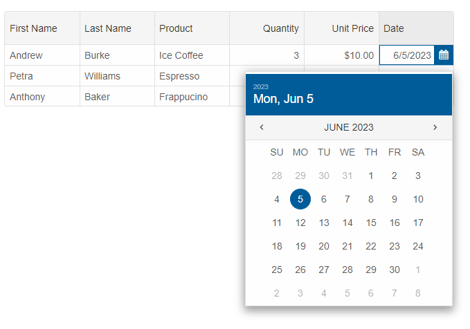
- Datetime picker editor
The date/time picker editor allows you to edit date/time values even when you need DateTime precision up to a yoctosecond (10⁻²⁴ second).
columns: [
	{
		label: 'First Name', dataField: 'firstName', editor: 'input'
	},
	{ label: 'Last Name', dataField: 'lastName', editor: 'autoComplete' },
	{ label: 'Product', dataField: 'productName', editor: 'dropDownList' },
	{
		label: 'Quantity', dataField: 'quantity', cellsAlign: 'right', editor: 'numberInput'
	},
	{
		label: 'Unit Price', dataField: 'price', cellsAlign: 'right', cellsFormat: 'c2', editor: 'numberInput'
	},
	{
		label: 'Date', dataField: 'date', cellsAlign: 'right', cellsFormat: 'd', editor: 'dateTimePicker'
	}
]
If you need to customize the DateTimePicker's settings, you can set the 'editor' to an object like this:columns: [ { label: 'First Name', dataField: 'firstName', editor: 'input' }, { label: 'Last Name', dataField: 'lastName', editor: 'autoComplete' }, { label: 'Product', dataField: 'productName', editor: 'dropDownList' }, { label: 'Quantity', dataField: 'quantity', cellsAlign: 'right', editor: 'numberInput' }, { label: 'Unit Price', dataField: 'price', cellsAlign: 'right', cellsFormat: 'c2', editor: { template: 'numberInput', min: 5, max: 15 } }, { label: 'Date', dataField: 'date', cellsAlign: 'right', cellsFormat: 'd', editor: { template: 'dateTimePicker', importantDates: [ new Date(2022, 9, 20), new Date(2022, 9, 9) ] } } ]
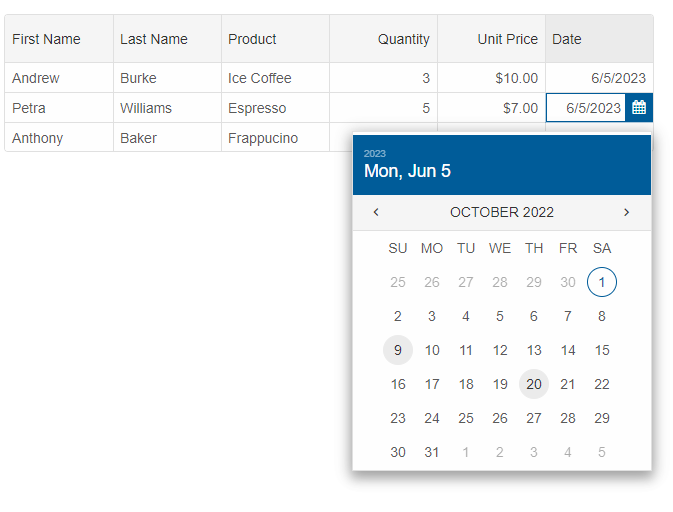
TheimportantDatesis a property from the DateTimePicker's API. - Number input editor
The number input cell editor is built with the purpose to edit numbers in different formats. It restricts the user-input to numbers.
columns: [
	{
		label: 'First Name', dataField: 'firstName', editor: 'input'
	},
	{ label: 'Last Name', dataField: 'lastName', editor: 'autoComplete' },
	{ label: 'Product', dataField: 'productName', editor: 'dropDownList' },
	{
		label: 'Quantity', dataField: 'quantity', cellsAlign: 'right', editor: 'numberInput'
	},
	{
		label: 'Unit Price', dataField: 'price', cellsAlign: 'right', cellsFormat: 'c2', editor: 'numberInput'
	}
]
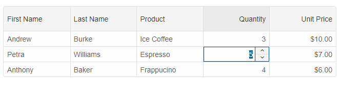
The numeric editor can be used for currency, percentage and other types of numeric input.
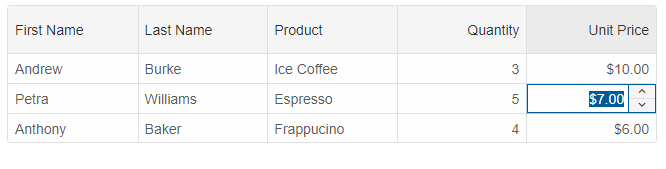
You can restrict the input by customizing the editor. For example, the input value in the following code sample is restricted to minimum 5 and maximum 15.{ label: 'Unit Price', dataField: 'price', cellsAlign: 'right', cellsFormat: 'c2', editor: { template: 'numberInput', min: 5, max: 15 } } - Password editor
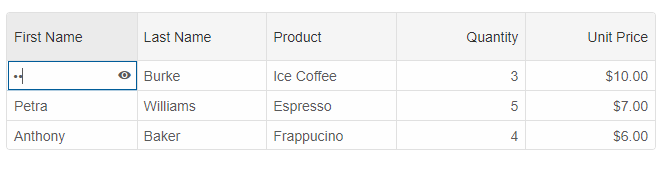
To setup a password editor, you need to set the editor property to 'password'.
{
	label: 'First Name', dataField: 'firstName', editor: 'password'
}
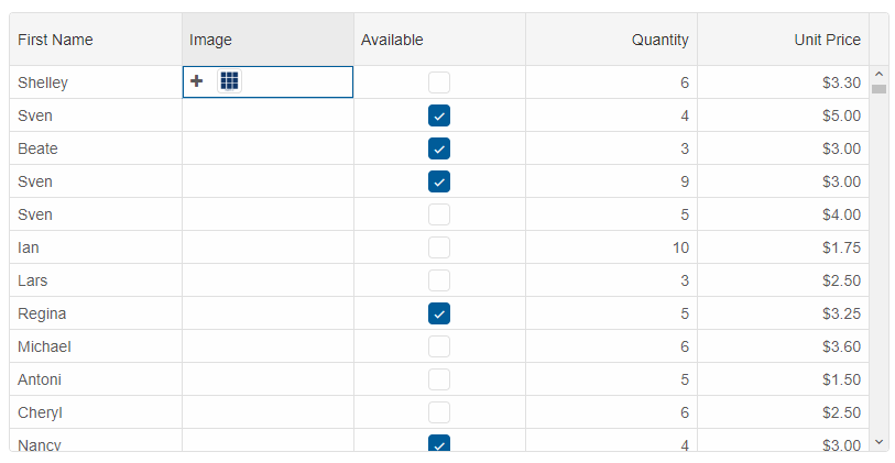
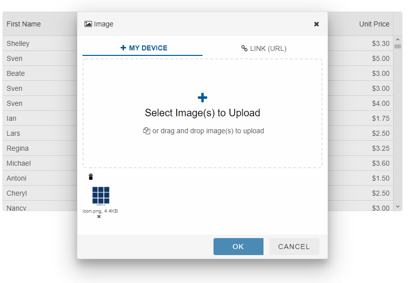
- Image editor
To setup an image editor, you need to set the editor property to 'image'.
columns: [
	{
		label: 'First Name', dataField: 'firstName', editor: 'autoComplete'
	},
	{
		label: 'Image', allowEdit: true, dataField: 'image', template: 'image', editor: {
			template: 'image'
		}
	},
	{ label: 'Available', dataField: 'available', template: 'checkBox', editor: 'checkBox' },
	{ label: 'Quantity', dataField: 'quantity', editor: 'numberInput' },
	{ label: 'Unit Price', dataField: 'price', editor: 'numberInput', cellsFormat: 'c2' }
]
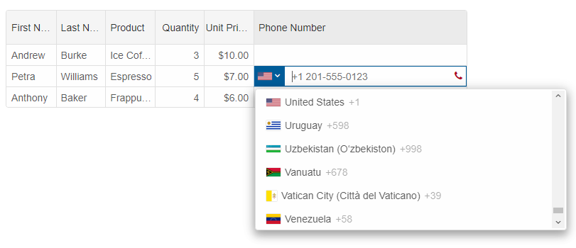
- Phone input editor
The phone editor is used for editing phone numbers. It validates the entered phone number taking into account the country code.
columns: [
	{
		label: 'First Name', dataField: 'firstName'
	},
	{ label: 'Last Name', dataField: 'lastName', editor: 'autoComplete' },
	{ label: 'Product', dataField: 'productName', editor: 'dropDownList' },
	{
		label: 'Quantity', dataField: 'quantity', cellsAlign: 'right', editor: 'slider',
	},
	{
		label: 'Unit Price', dataField: 'price', cellsAlign: 'right', cellsFormat: 'c2', editor: 'numberInput'
	},
	{
		label: 'Phone Number', width: 300, dataField: 'phone', editor: 'phone'
	}
]
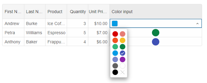
- Color input editor
The color editor is used for colors. It can be used in combination with the 'color' template.
columns: [
	{
		label: 'First Name', dataField: 'firstName'
	},
	{ label: 'Last Name', dataField: 'lastName', editor: 'autoComplete' },
	{ label: 'Product', dataField: 'productName', editor: 'dropDownList' },
	{
		label: 'Quantity', dataField: 'quantity', cellsAlign: 'right', editor: 'slider',
	},
	{
		label: 'Unit Price', dataField: 'price', cellsAlign: 'right', cellsFormat: 'c2', editor: 'numberInput'
	},
	{
		label: 'Color input', width: 300, dataField: 'color', template: 'color', editor: 'colorInput'
	}
]
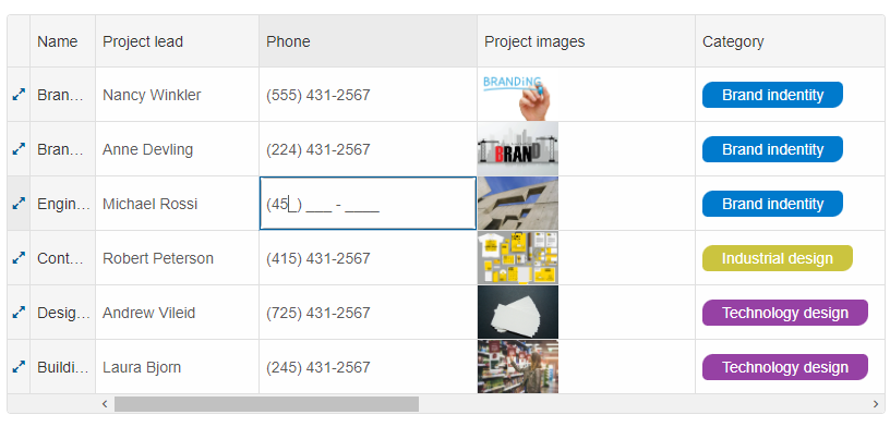
- Mask Input editor
The mask editor is used to edit alphanumeric values and to restrict the user input to a given mask.
columns: [
	{ label: 'Name', dataField: 'name', freeze: true, allowResize: true },
	{
		label: 'Project lead', width: 150, dataField: 'projectLead', allowResize: true
	},
	{
		label: 'Phone', width: 200, dataField: 'phone', formatFunction(settings) {
			const formatPhoneNumber = (value) => {
				const formattedValue = ('' + value).replace(/\D/g, '');
				const match = formattedValue.match(/^(1|)?(\d{3})(\d{3})(\d{4})$/);
				if (match) {
					let intlCode = (match[1] ? '+1 ' : '');
					return [intlCode, '(', match[2], ') ', match[3], '-', match[4]].join('');
				}
				return null;
			};
			settings.value = formatPhoneNumber(settings.value);
		}, editor: {
			template: 'maskedTextBox',
			mask: '(###) ### - ####'
		}, allowResize: true
	},
	{
		label: 'Project images', width: 200, dataField: 'projectImages', allowResize: true,
		template: function (formatObject) {
			formatObject.template = `<img style="width: 75px;" src="../../images/${formatObject.value}.jpg">`;
		}
	},
	{
		label: 'Category', width: 200, dataField: 'category', allowResize: true,
		template: function (formatObject) {
			let color;
			if (formatObject.value === 'Brand indentity') {
				color = '#007ACC';
			}
			else if (formatObject.value === 'Industrial design') {
				color = '#CBC43F';
			}
			else {
				color = '#9641A4';
			}
			formatObject.template = `<span style="margin-left: 7px; padding: 4px 18px; border-radius: 10px 5px; color: #fff; background: ${color}";>${formatObject.value}</span>`;
		}
	},
	{ label: 'Done', width: 80, dataField: 'completed', template: 'checkBox', align: 'center', allowResize: true },
	{
		label: 'Client', width: 200, dataField: 'client', allowResize: true,
		template: function (formatObject) {
			formatObject.template = `<span style="margin-right: 7px; margin-left: 10px; padding: 4px 18px; border-radius: 10px 5px; background: #E9EEF9";>${formatObject.value}</span>`;
		}
	},
	{
		label: 'Project team', width: 300, dataField: 'projectTeam', allowResize: true
	},
	{ label: 'Kickoff date', editor: 'dateInput', width: 200, dataField: 'kickoffDate', cellsFormat: 'd', allowResize: true },
	{ label: 'Due date', editor: 'dateInput', width: 200, dataField: 'dueDate', cellsFormat: 'd', allowResize: true }
]
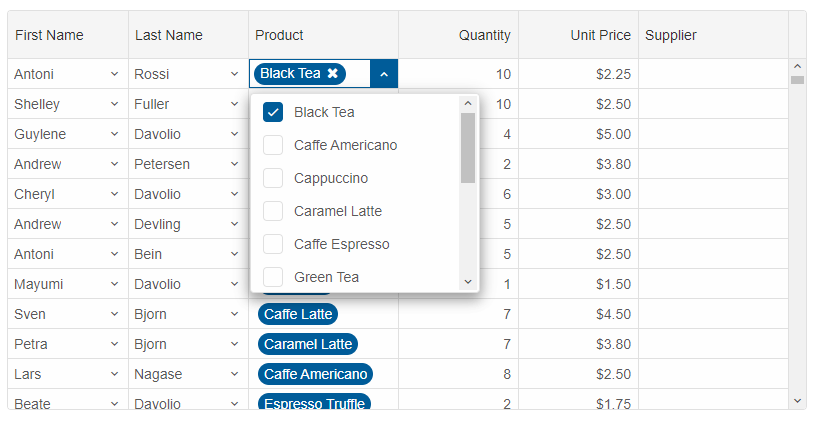
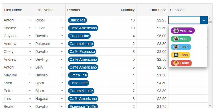
- Multi combo cell editor
This editor is similar to the combobox, but it allows you to select multiple items. You can also customize the items look. This type of editor is usually combined with the 'tags' template.
columns: [
	{
		label: 'First Name', dataField: 'firstName', template: 'dropDownList', editor: 'dropDownList'
	},
	{
		label: 'Last Name', dataField: 'lastName', template: 'dropDownList', editor: 'dropDownList'
	},
	{
		label: 'Product', allowEdit: true, width: 150, dataField: 'productName', template: 'tags', editor: {
			template: 'multiComboInput'
		}
	},
	{ label: 'Quantity', dataField: 'quantity', editor: 'numberInput' },
	{ label: 'Unit Price', dataField: 'price', editor: 'numberInput', cellsFormat: 'c2' },
	{
		label: 'Supplier', width: 150, dataField: 'custom', template: 'tags',
		editor: {
			template: 'multiComboInput',
			readonly: true,
			dropDownButtonPosition: 'right',
			autoOpen: true,
			pills: true,
			colorItems: true,
			singleSelect: true,
			dataSource: [
				{ value: 0, color: '#8E24AA', label: 'Andrew', image: '../../images/people/andrew.png' },
				{ value: 1, color: '#41B883', label: 'Anne', image: '../../images/people/anne.png' },
				{ value: 2, color: '#53B9E6', label: 'Janet', image: '../../images/people/janet.png' },
				{ value: 3, color: '#FFCD42', label: 'John', image: '../../images/people/john.png' },
				{ value: 4, color: '#DD5347', label: 'Laura', image: '../../images/people/laura.png' }
			]
		}
	}
]
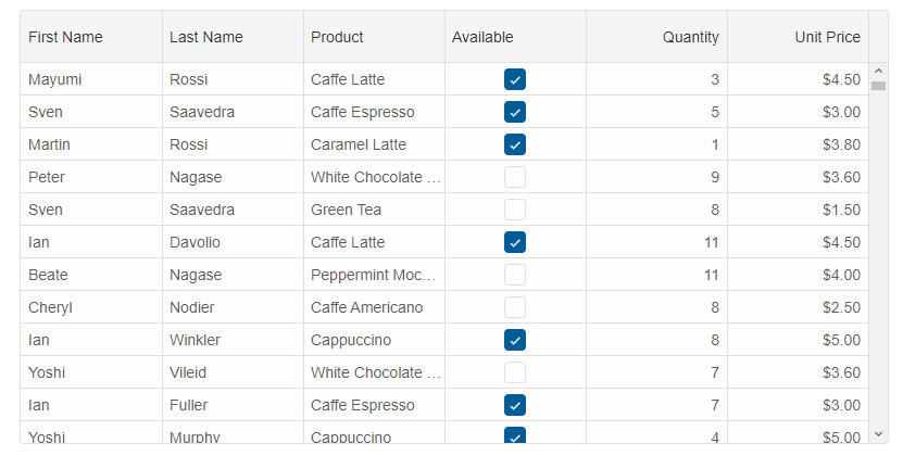
- Checkbox Boolean editor
The checkbox editor is used for updating boolean values.
columns: [
	{
		label: 'First Name', dataField: 'firstName'
	},
	{ label: 'Last Name', dataField: 'lastName' },
	{ label: 'Product', dataField: 'productName' },
	{ label: 'Available', dataField: 'available', template: 'checkBox', editor: 'checkBox' },
	{ label: 'Quantity', dataField: 'quantity', editor: 'numberInput' },
	{ label: 'Unit Price', dataField: 'price', editor: 'numberInput', cellsFormat: 'c2' }
]
- Custom cell editor
Custom cell editors could be used by setting the editor property. The following example shows how to setup a custom editor from HTMLTemplateElement and how to setup custom editor from HTML Input tags.
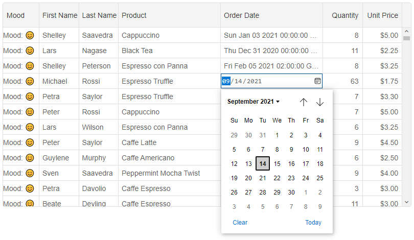
columns: [
	{
		label: 'Mood', dataField: '', editor: {
			template: '#moodEditorTemplate',
			onInit(index, dataField, editor) {
				editor.addEventListener('click', function (event) {
					editor.firstElementChild.value = event.target.innerHTML;
				});
			}
		}, width: 70, align: 'left', template: '#moodTemplate',
	},
	{
		label: 'First Name', dataField: 'firstName', editor: '<input/>'
	},
	{
		label: 'Last Name', dataField: 'lastName', editor: '<input/>'
	},
	{ label: 'Product', width: 200, dataField: 'productName', editor: '#template' },
	{ label: 'Order Date', width: 200, dataField: 'date', editor: '<input type="date"/>'
	},
	{ label: 'Quantity', dataField: 'quantity', editor: '<input type="range"/>' },
	{ label: 'Unit Price', dataField: 'price', editor: '<input type="number"/>', cellsFormat: 'c2' }
]
The 'onInit', 'onRender', 'setValue' and 'getValue' methods can be used when setting up a custom editor. 'onInit' is called once when the editor is created. It is used for initialization purposes. 'onRender' is called every time the editor is opened. 'setValue' is used for setting a value to the editor. 'getValue' should return the value which will be saved in the Grid after the editing.
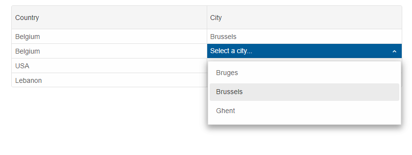
Let's look at the sample below which creates a Cascade editing with custom editors.columns: [ { label: 'Country', dataField: 'Country', editor: { template: '<smart-drop-down-list></smart-drop-down-list>', onInit(row, column, editor) { const dropDownList = editor.firstElementChild; dropDownList.dataSource = ['Belgium', 'France', 'USA', 'Lebanon']; dropDownList.dropDownAppendTo = 'body'; dropDownList.selectedValues = [grid.rows[row].cells[0].value]; dropDownList.addEventListener('change', function () { change = true; }); }, onRender(row, column, editor) { editor.firstElementChild.selectedValues = [grid.rows[row].cells[0].value]; }, getValue() { return this.firstElementChild.selectedValues[0]; } } }, { label: 'City', dataField: 'City', editor: { template: '<smart-drop-down-list></smart-drop-down-list>', onInit(row, column, editor) { const dropDownList = editor.firstElementChild; dropDownList.dropDownAppendTo = 'body'; dropDownList.placeholder = 'Select a city...'; }, onRender(row, column, editor) { const countryValue = grid.rows[row].cells[0].value, citiesSource = cities[countryValue], dropDownList = editor.firstElementChild; dropDownList.dataSource = citiesSource; dropDownList.selectedValues = [grid.rows[row].cells[1].value]; }, getValue() { return this.firstElementChild.selectedValues[0] || 'Select a city...'; } } } ]
Editing Validation
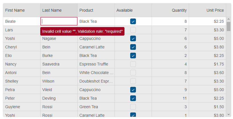
You can restrict the user input by defining validation rules. ThevalidationRules property determines the validation rules of the column values. The available set of rules are: 'min', 'max', 'minLength', 'maxLength', 'minDate', 'maxDate', 'null', 'email', 'required', 'requiredTrue' and 'pattern'.
A cell editor is active until a valid value is entered by the user. In the sample code below, 'First Name', 'Last Name' and 'Product Name' are with 'required' and 'minLength' validation rules. The 'Quantity' and 'Unit Price' columns are with 'min' and 'max' set to '1' and '20'.
validation rules.
columns: [
	{
		label: 'First Name', dataField: 'firstName', validationRules: [{ type: 'required' }, { type: 'minLength', value: 5 }]
	},
	{ label: 'Last Name', dataField: 'lastName', validationRules: [{ type: 'required' }, { type: 'minLength', value: 5 }] },
	{ label: 'Product', dataField: 'productName', validationRules: [{ type: 'required' }, { type: 'minLength', value: 5 }] },
	{ label: 'Available', dataField: 'available', template: 'checkBox', editor: 'checkBox', validationRules: [{ type: 'requiredTrue' }] },
	{ label: 'Quantity', dataField: 'quantity', editor: 'numberInput', validationRules: [{ type: 'max', value: 20 }, { type: 'min', value: 1 }] },
	{ label: 'Unit Price', dataField: 'price', editor: 'numberInput', cellsFormat: 'c2', validationRules: [{ type: 'max', value: 20 }, { type: 'min', value: 1 }] }
]
Undo/Redo
Undo/Redo is a common feature built-in the Grid. The following keyboard shortcuts are available when undo / redo is enabled:Ctrl+Z: will undo the last cell edit(s).
Ctrl+Y: will redo the last undo.
Programatically, you can use the 'undo' and 'redo' methods.
For AI tooling
Developer Quick Reference
Topic: grid-cell-edit Component: Grid Framework: JavaScript
Main methods: beginEdit(), getEditCells(), addEventListener()
Common config keys: editing, selection, filtering, behavior, sorting, dataSource, columns
Implementation Notes
Compatibility: Modern browsers / Web Components API access pattern: const component = document.querySelector(...) + component.method()
Lifecycle guidance: Initialize configuration first, then invoke imperative API when element is available in DOM.
Common pitfalls:
- Calling methods before element initialization.
- Reassigning large configuration partially without understanding merge behavior.
- Missing required module script import for component type.
Validation checklist:
- Ensure module scripts and CSS are loaded once.
- Keep data schema aligned with columns/series definitions.
- Verify method calls target initialized component instance.