The Grid's header and footer options allow you to add your own components to the grid's header and footer.
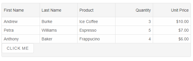
Grid Footer
To turn on the Grid's footer, you can use thefooter property.
The code sample below shows how to show a footer and apply a custom rendering to it.
footer: {
	visible: true,
	template: (element) => {
		element.innerHTML = `<div style="display: flex; height: 100%;">
			<smart-button>Save</smart-button>
		</div>`
	}
}
Another way is to use HTMLTemplateElement. For example:
<template id="footerTemplate">
	<div>
		<smart-button>
			Click Me
		</smart-button>
	</div>
</template>
and the footer property will look like that:
footer: {
	visible: true,
	template: '#footerTemplate'
}
Grid Header
Similarly to the footer, the header is enabled by using theheader property.
header: {
	visible: true,
	template: '#headerTemplate'
}
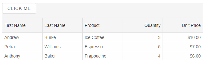
The Grid has built-in header template, so if you do not set the
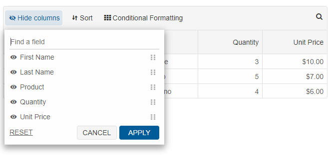
template property, the default haeder template will be displayed with options to sort, filter, group, search and customize columns.
The header.buttons property determines which buttons in the header will be displayed. The list with buttons is ['columns', 'filter', 'group', 'sort', 'format', 'search'].
For AI tooling
Developer Quick Reference
Topic: grid-header-and-footer Component: Grid Framework: JavaScript
Main methods: (none detected)
Common config keys: footer, header
Implementation Notes
Compatibility: Modern browsers / Web Components API access pattern: const component = document.querySelector(...) + component.method()
Lifecycle guidance: Initialize configuration first, then invoke imperative API when element is available in DOM.
Common pitfalls:
- Calling methods before element initialization.
- Reassigning large configuration partially without understanding merge behavior.
- Missing required module script import for component type.
Validation checklist:
- Ensure module scripts and CSS are loaded once.
- Keep data schema aligned with columns/series definitions.
- Verify method calls target initialized component instance.