Getting Started with Splitter Web Component
Smart UI Web Components work with current evergreen browsers and Node 18+ for local tooling; pin package versions to match your project policy.
Smart UI is distributed as the smart-webcomponents NPM package. You can also use the full download from the Download page.
Quick start
- Install the package:
npm install smart-webcomponents
- Load the Splitter module (ES module script):
<script type="module" src="node_modules/smart-webcomponents/source/modules/smart.splitter.js"></script>
- Add the default stylesheet (prefer angular.json / bundler entry in app codebases; for plain HTML use a link):
<link rel="stylesheet" type="text/css" href="node_modules/smart-webcomponents/source/styles/smart.default.css" />
- Add markup in one of two ways - semantic custom element (the component tag is in your HTML) or a host
div(you mount programmatically with appendTo):
Semantic element (id matches the selector in Smart()):
<smart-splitter id="splitter"></smart-splitter>
Host container (id matches appendTo on Smart.Splitter):
<div id="splitterContainer"></div>
- Initialize after the module loads: define a const splitterOptions object, then either bind with Smart('#splitter', ...) on the semantic tag or use new Smart.Splitter({ ...splitterOptions, appendTo: '#splitterContainer' }) on the host
div:
<script type="module"> import 'node_modules/smart-webcomponents/source/modules/smart.splitter.js'; const splitterOptions = { dataSource: [ { id: 'item0', size: '50%', content: 'Item 1 Item 2 Item 3
Uncomment Option B when you use the host
div; use Option A when you use the semantic element. The Runtime cookbook also documents new Smart.Splitter('#splitter', splitterOptions) with appendChild, and document.createElement('smart-splitter') with .props or Object.assign (all are valid patterns; do not combine overlapping patterns for the same instance unless you intend multiple components). - Serve the folder over HTTP (or use your bundler dev server) and open the page.
Runtime cookbook
Alternative creation patterns and imperative APIs. These are all valid ways to create Smart UI components: semantic markup + Smart(); new Smart.Splitter({ ...options, appendTo: '#...' }); new Smart.Splitter('#splitter', splitterOptions) plus appendChild on the returned element; and document.createElement('smart-splitter') then assigning options via .props or Object.assign on the element.
Constructor with a selector string and options, then append the returned element (for example const mySplitter = new Smart.Splitter('#splitter', splitterOptions)):
const splitterOptions = {
dataSource: [
{
id: 'item0',
size: '50%',
content: 'Item 1 Item 2 Item 3
Create with document.createElement('smart-splitter'), assign properties (same as any custom element), then append:
const splitterOptions = {
dataSource: [
{
id: 'item0',
size: '50%',
content: 'Item 1 Item 2 Item 3
Host on a div with appendTo (import the module, then instantiate when the document is ready; the container id must match appendTo):
import "../../source/modules/smart.splitter.js";
document.readyState === 'complete' ? init() : window.addEventListener('load', init);
function init() {
const splitterOptions = {
dataSource: [
{
id: 'item0',
size: '50%',
content: 'Item 1 Item 2 Item 3
Adding Content
The content of the Splitter is nested inside Smart.SplitterItem(s). Splitter items can contain any HTML.
There are three ways to add content to a Smart.Splitter:
-
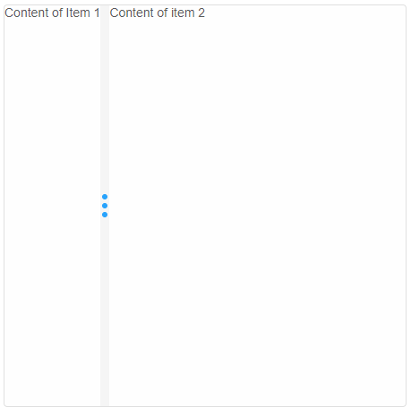
Create splitter items in the HTML code:
<!DOCTYPE html>
<html>
<head>
 <link rel="stylesheet" href="./../../source/styles/smart.default.css" type="text/css" />
 <script type="text/javascript" src="https://cdnjs.cloudflare.com/ajax/libs/webcomponentsjs/1.2.0/webcomponents-lite.js">
 </script>
 <script type="text/javascript" src="../../source/Smart.element.js"></script>
 <script type="text/javascript" src="../../source/Smart.button.js"></script>
 <script type="text/javascript" src="../../source/Smart.Splitter.js"></script>
</head>
<body>
    <smart-splitter>
        <smart-splitter-item> Content of Item 1 </smart-splitter-item>
        <smart-splitter-item> Content of item 2 </smart-splitter-item>
    </smart-splitter>
</body>
</html>
Demo
-
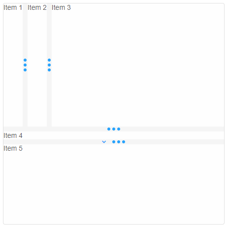
Set the dataSource property to an Array that defines the internal stucture of the Splitter:
<!DOCTYPE html> <html> <head> <link rel="stylesheet" href="./../../source/styles/smart.default.css" type="text/css" /> <script type="text/javascript" src="https://cdnjs.cloudflare.com/ajax/libs/webcomponentsjs/1.2.0/webcomponents-lite.js">
All available Splitter item properties can be set in the object definition in the dataSource array. Collapsible is one of the properties that is set to the item with id 'item5'.
</script> <script type="text/javascript" src="../../source/Smart.element.js"></script> <script type="text/javascript" src="../../source/Smart.button.js"></script> <script type="text/javascript" src="../../source/Smart.Splitter.js"></script> <script> window.onload = function() { const dataSource = [ { id: 'item0', size: 250, content: '<smart-splitter> ' + '<smart-splitter-item id="item1">Item 1</smart-splitter-item> ' + '<smart-splitter-item id="item2">Item 2</smart-splitter-item> ' + '<smart-splitter-item id="item3">Item 3</smart-splitter-item> ' + '</smart-splitter>' }, { id: 'item4', content: 'Item 4' }, { id: 'item5', content: 'Item 5', collapsible: true }]; document.querySelector('smart-splitter').dataSource = dataSource; } </script> </head> <body> <smart-splitter orientation="horizontal"></smart-splitter> </body> </html>Demo
-
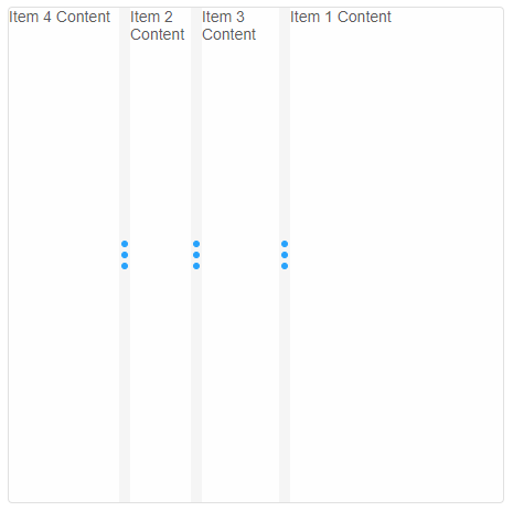
Create splitter items via the API methods after element initialization:
<!DOCTYPE html>
<html>
<head>
 <link rel="stylesheet" href="./../../source/styles/smart.default.css" type="text/css" />
 <script type="text/javascript" src="https://cdnjs.cloudflare.com/ajax/libs/webcomponentsjs/1.2.0/webcomponents-lite.js">
 </script>
 <script type="text/javascript" src="../../source/Smart.element.js"></script>
 <script type="text/javascript" src="../../source/Smart.button.js"></script>
 <script type="text/javascript" src="../../source/Smart.Splitter.js"></script>
<script>
    window.onload = function() {
        const item1 = document.createElement('smart-splitter-item'),
              item2 = document.createElement('smart-splitter-item'),
              item3 = document.createElement('smart-splitter-item'),
              splitter = document.querySelector('smart-splitter');
        item1.innerHTML = 'Item 1 Content';
        //Append the item to the end
        splitter.appendChild(item1);
        item2.innerHTML = 'Item 2 Content';
        //Insert item2 before item1
        splitter.insertBefore(item2, item1);
        item3.innerHTML = 'Item 3 Content';
        //Insert item3 at position 1
        splitter.insert(1, item3);
        //Splitter item object definition
        const item4 = {
            content: 'Item 4 Content',
            size: 100
        };
        //Insert method also accepts a Splitter Item object definition as it's second argument
        splitter.insert(0, item4)
    }
</script>
</head>
<body>
    <smart-splitter></smart-splitter>
</body>
</html>
Demo
Updating
Splitter items can be updated after their initialization using the API methods and properties.
This can be done in one of the following ways:
-
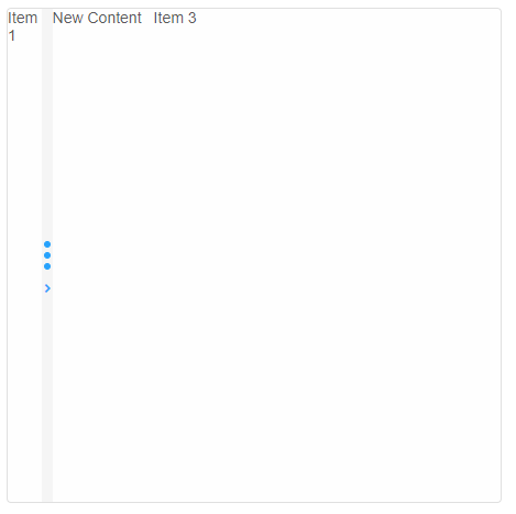
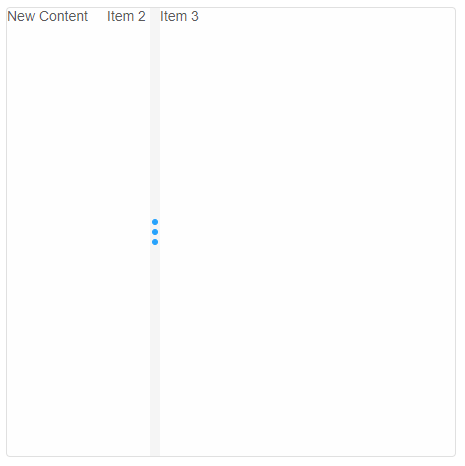
By manipulating the Splitter Item directly. In order to do that the user needs a reference to the desired item:
    const splitter = document.querySelector('smart-splitter');
    const items = splitter.items;
    items[1].content = 'New Content';
    items[1].collapsible = true;
    items[1].collapse();
    items[1].expand();
    const bars = splitter.bars;
    bars[0].lock();
    bars[0].unlock();
    bars[1].hide();
Demo
-
Taking adventage of the Splitter's API methods:
    const splitter = document.querySelector('smart-splitter');
    splitter.update(0, { content: 'New Content', collapsible: true });
    //Will work only if the item at position 0 is collapsible
    splitter.collapse(0);
    //Expands the item if there's space available
    splitter.expand(0);
    splitter.lockItem(1);
    splitter.unlockItem(1);
    splitter.lockBar(1);
    splitter.unlockBar(1);
    splitter.hideBar(0);
Demo
Preferences
Splitter properties can be applied as attributes in the HTML before initialization or updated later using an instance of the element. The full list of all properties of the element can be found in the API documentation.
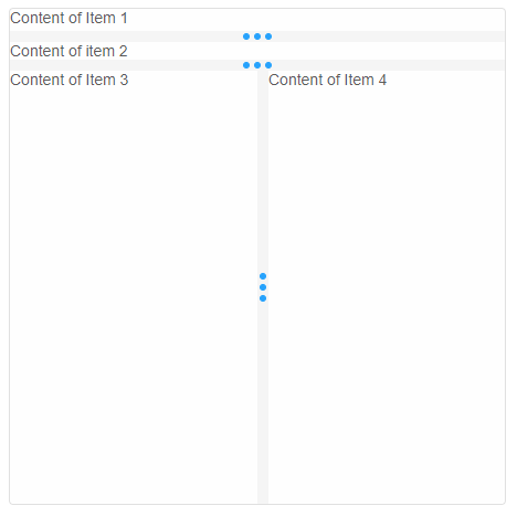
Setting properties before initialization:
<!DOCTYPE html>
<html>
<head>
 <link rel="stylesheet" href="./../../source/styles/smart.default.css" type="text/css" />
 <script type="text/javascript" src="https://cdnjs.cloudflare.com/ajax/libs/webcomponentsjs/1.2.0/webcomponents-lite.js">
 </script>
 <script type="text/javascript" src="../../source/Smart.element.js"></script>
 <script type="text/javascript" src="../../source/Smart.button.js"></script>
 <script type="text/javascript" src="../../source/Smart.Splitter.js"></script>
</head>
<body>
    <smart-splitter orientation="horizontal" resize-mode="end" live-resize>
        <smart-splitter-item min="20"> Content of Item 1 </smart-splitter-item>
        <smart-splitter-item> Content of item 2 </smart-splitter-item>
        <smart-splitter-item>
            <smart-splitter resize-mode="none">
                <smart-splitter-item size="50%"> Content of Item 3 </smart-splitter-item>
                <smart-splitter-item> Content of Item 4  </smart-splitter-item>
            </smart-splitter>
       </smart-splitter-item>
    </smart-splitter>
</body>
</html>
Demo
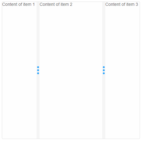
Setting properties after intialiation:
<!DOCTYPE html>
<html>
<head>
 <link rel="stylesheet" href="./../../source/styles/smart.default.css" type="text/css" />
 <script type="text/javascript" src="https://cdnjs.cloudflare.com/ajax/libs/webcomponentsjs/1.2.0/webcomponents-lite.js">
 </script>
 <script type="text/javascript" src="../../source/Smart.element.js"></script>
 <script type="text/javascript" src="../../source/Smart.button.js"></script>
 <script type="text/javascript" src="../../source/Smart.Splitter.js"></script>
<script>
    window.onload = function() {
        const splitter = document.querySelector('smart-splitter');
        splitter.resizeMode = 'proportional';
        splitter.orientaiton = 'horizontal';
        splitter.resizeStep = 1; //Defualt is 5
    }
</script>
</head>
<body>
    <smart-splitter>
       <smart-splitter-item size="25%"> Content of item 1 </smart-splitter-item>
       <smart-splitter-item> Content of item 2 </smart-splitter-item>
       <smart-splitter-item size="25%"> Content of item 3 </smart-splitter-item>
    </smart-splitter>
</body>
</html>
Demo
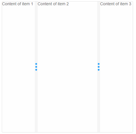
The size of the splitter items can be set via CSS or the size property.
<!DOCTYPE html>
<html>
<head>
 <link rel="stylesheet" href="./../../source/styles/smart.default.css" type="text/css" />
 <script type="text/javascript" src="https://cdnjs.cloudflare.com/ajax/libs/webcomponentsjs/1.2.0/webcomponents-lite.js">
 </script>
 <script type="text/javascript" src="../../source/Smart.element.js"></script>
 <script type="text/javascript" src="../../source/Smart.button.js"></script>
 <script type="text/javascript" src="../../source/Smart.Splitter.js"></script>
<style>
    #mySplitter smart-splitter-item:nth-of-type(1),
    #mySplitter smart-splitter-item:nth-of-type(3) {
        width: 25%;
    }
</style>
</head>
<body>
    <smart-splitter id="mySplitter">
       <smart-splitter-item> Content of item 1 </smart-splitter-item>
       <smart-splitter-item> Content of item 2 </smart-splitter-item>
       <smart-splitter-item> Content of item 3 </smart-splitter-item>
    </smart-splitter>
</body>
</html>
Demo
Keyboard Support
Smart.Splitter implements the following key actions:
| Key | Action |
|---|---|
| Arrow Up / Arrow Down | Resizes the items on the two sides of the focused splitter bar. Used when the orientation of the Splitter is set to 'horizontal'. |
| Arrow Left / Arrow Right | Resizes the items on the two sides of the focused splitter bar. Used when the orientation of the Splitter is set to 'vertical'. |
| Enter | If liveResize is set to 'false' which is the case by default, the key is used to finish an ongoing resizing operation. |
| Escape | Cancels an ongoing resizing operation. |
Append to the DOM:
const container = document.getElementById('splitter-container');
container.appendChild(splitter);
Remove from the DOM:
splitter.remove();
Set a property:
splitter.disabled = true;
splitter.theme = 'dark';
Get a property value:
const isDisabled = splitter.disabled;
const currentTheme = splitter.theme;
Invoke a method:
splitter.refresh();
splitter.focus();
Add event listener:
splitter.addEventListener('collapse', (event) => {
    console.log('collapse triggered:', event.detail);
});
Remove event listener:
const handleSplitterEvent = (event) => {
    console.log('collapse triggered:', event.detail);
};

splitter.addEventListener('collapse', handleSplitterEvent);
splitter.removeEventListener('collapse', handleSplitterEvent);
Common Use Cases
-
Set panel sizes
Configure initial panel dimensions
splitter.dataSource = [ { size: '30%', content: 'Left Panel' }, { size: '70%', content: 'Right Panel' } ]; -
Handle resize
Respond to panel size changes
splitter.addEventListener('resize', (e) => {
  console.log('New sizes:', e.detail);
});
Troubleshooting
- How do I make panels collapsible?
- Add collapsible: true to the panel configuration in dataSource.
- How do I set minimum panel sizes?
- Use min property in panel config: { size: '200px', min: '100px', content: '...' }.
Accessibility
The Splitter component follows WAI-ARIA best practices:
- Keyboard navigation - Tab, Arrow keys, Enter, and Escape are supported
- ARIA roles - Appropriate roles and labels are applied automatically
- Focus management - Visible focus indicators for keyboard users
- Screen readers - State changes are announced to assistive technology
- High contrast - Supports Windows High Contrast Mode and forced colors
For custom labeling, set aria-label or aria-labelledby attributes on the component.
Supported stacks: Smart UI targets Angular 17+, React 18+, Vue 3+, Node 18 LTS, and evergreen browsers; pin exact package versions to your org policy.