Custom Editors
Smart.Grid allows you to customize or completely replace the default cell editors.
Most of the editor's properties are set using the Column.Editor property.
Built-in Editors
The Grid has available the following list of built-in editors depending on the type of data contained in the column:
'input', 'autoComplete', 'comboBox', 'dropDownList', 'image', 'numberInput',
'checkBox', 'multiInput', 'multiComboInput', 'checkInput', 'slider',
'dateTimePicker', 'timeInput', 'dateInput', 'dateRangeInput', 'maskedTextBox', 'textArea'
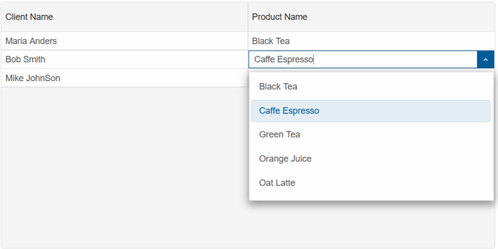
The code below creates a Grid of two colums. The first column is set to the 'multiComboInput' editor, while the second to 'multiComboInput'
<Grid DataSource="@Clients" Editing="editing">
    <Columns>
        <Column DataField="Name" Label="Client Name" Editor="nameEditor"></Column>
        <Column DataField="Product" Label="Product Name" Editor="productEditor"></Column>
    </Columns>
</Grid>


@code {
    class Client
    {
        public string Name { get; set; }
        public string Product { get; set; }

        public Client(string name, string product)
        {
            Name = name;
            Product = product;
        }
    }
    Client[] Clients = new Client[]
      {
            new Client("Maria Anders", "Black Tea"),
            new Client("Bob Smith", "Caffe Espresso"),
            new Client("Mike JohnSon", "Green Tea"),
      };

    string nameEditor = "autoComplete";
    string productEditor = "multiComboInput";

    GridEditing editing = new GridEditing()
        {
            Enabled = true,
            Mode = GridEditingMode.Cell
        };
}
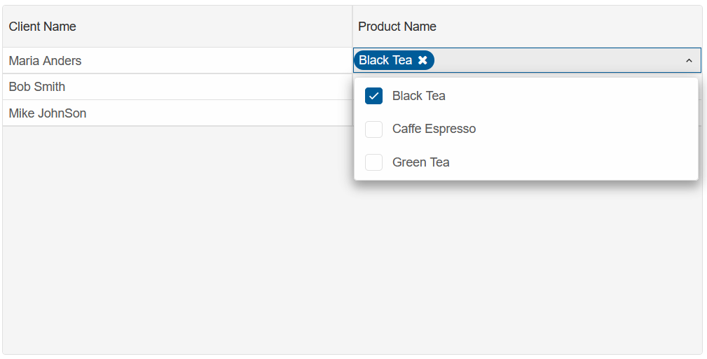
Customize Editor
The Cell Editors can be customized by setting Column.Editor to an object, which must contain a "template" property.
The "seetings" property allows us to change some of the editors' default properties and behavior.
The code below modifies the default "multiComboInput" by allowing only a single item to be selected:
GridEditor productEditor = new GridEditor()
{
    Template = "multiComboInput",
    Settings = new Dictionary<string, object>()
    {
        {"singleSelect", true}
    }
};
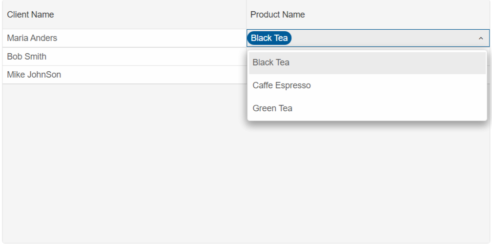
Custom Editor Template
The Column Editor Template can also be set to other Smart component or an entirely editor.
In the example below, the "Product" Column Editor is set to a Smart.ComboBox element with a custom list of items:
Dictionary<string, object> productEditor = new Dictionary<string, object>()
  {
          {"template", "<smart-combo-box/>" },
          {"settings", new Dictionary<string, object>()
              {
                  {"dropDownAppendTo", "body"},
                  {"dataSource", new string[]{"Black Tea", "Caffe Espresso", "Green Tea", "Orange Juice", "Oat Latte"} },
              }
          }
  };