Blazor - Get Started with Smart.CardView
Setup The Project
Follow the Getting Started guide to set up your Blazor Application with Smart UI.
Setup Basic Card View
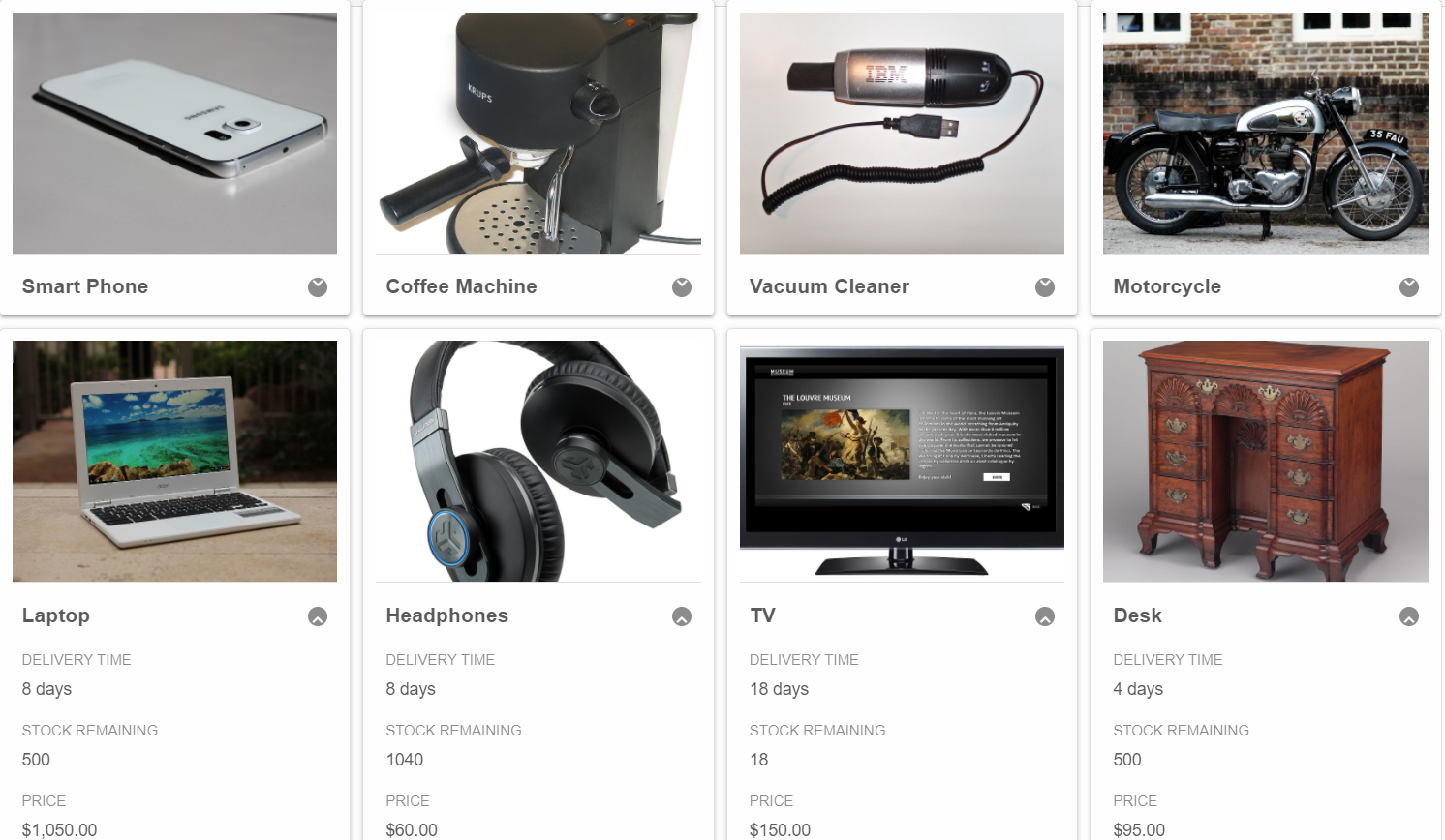
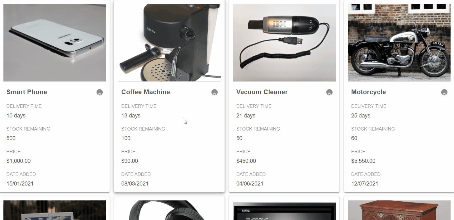
Smart.CardView represnts data source records in the form of Cards. Each Card contains content and actions about a single subject.
- Add the CardView component to the Pages/Index.razor file
<CardView></CardView>
- Inside the
@codeblock, declare the Card Columns and set them as properties of the CardView component.List<CardViewColumn> columns = new List<CardViewColumn>() { new CardViewColumn() { DataField = "ProductName", Label = "Product Name", DataType = CardViewColumnDataType.String, }, new CardViewColumn() { DataField = "DeliveryTime", Label = "Delivery Time", DataType = CardViewColumnDataType.Number }, new CardViewColumn() { DataField = "StockRemaining", Label = "Stock Remaining", DataType = CardViewColumnDataType.Number }, new CardViewColumn() { DataField = "Price", Label = "Price", DataType = CardViewColumnDataType.Number }, new CardViewColumn() { DataField = "DateAdded", Label = "Date Added", DataType = CardViewColumnDataType.Date }, new CardViewColumn() { DataField = "Attachments", Label = "Attachments", DataType = CardViewColumnDataType.String, Image = true } }; -
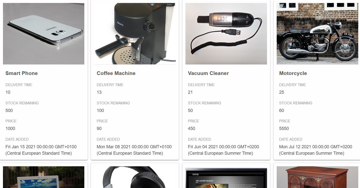
Create an example Product data and bind it to the CardView using the Datasource property.
Then select the field to be used asTitleField.
In order to display cover images, set the Attachments DataField asCoverField<CardView Columns="columns" DataSource="products" TitleField="ProductName" CoverField="Attachments"></CardView> @code{ .... class Product { public string ProductName { get; set; } public int DeliveryTime { get; set; } public int StockRemaining { get; set; } public double Price { get; set; } public DateTime DateAdded {get; set; } public string Attachments {get; set; } public Product(string productName, int deliveryTime, int stockRemaining, double price, DateTime dateAdded, string attachments){ ProductName = productName; DeliveryTime = deliveryTime; StockRemaining = stockRemaining; Price = price; DateAdded = dateAdded; Attachments = attachments; } } Product[] products = new Product[] { new Product("Smart Phone", 10, 500, 1000, new DateTime(2021, 1, 15), "https://upload.wikimedia.org/wikipedia/commons/9/91/Samsung_Galaxy_S6_edge_%2817448278539%29.jpg"), new Product("Coffee Machine", 13, 100, 90, new DateTime(2021, 3, 8), "https://upload.wikimedia.org/wikipedia/commons/thumb/2/21/Krups_Vivo_F880_home_espresso_maker.jpg/800px-Krups_Vivo_F880_home_espresso_maker.jpg"), new Product("Vacuum Cleaner", 21, 50, 450, new DateTime(2021, 6, 4), "https://upload.wikimedia.org/wikipedia/commons/thumb/7/77/USBVacuumCleaner.jpg/1280px-USBVacuumCleaner.jpg"), new Product("Motorcycle", 25, 60, 5550, new DateTime(2021, 7, 12), "https://upload.wikimedia.org/wikipedia/commons/thumb/2/2e/Norton_Motorcycle.jpg/1280px-Norton_Motorcycle.jpg"), new Product("Laptop", 8, 500, 1050, new DateTime(2021, 10, 24), "https://upload.wikimedia.org/wikipedia/commons/thumb/6/6c/Acer_Chromebook_11_%2824394834161%29.jpg/1280px-Acer_Chromebook_11_%2824394834161%29.jpg"), new Product("Headphones", 8, 1040, 60, new DateTime(2021, 12, 19), "https://upload.wikimedia.org/wikipedia/commons/thumb/f/ff/OMNI_image4.png/800px-OMNI_image4.png"), new Product("TV", 18, 18, 150, new DateTime(2021, 5, 2), "https://upload.wikimedia.org/wikipedia/commons/thumb/e/e2/LG_smart_TV.jpg/1280px-LG_smart_TV.jpg"), new Product("Desk", 4, 500, 95, new DateTime(2021, 1, 12), "https://upload.wikimedia.org/wikipedia/commons/thumb/1/12/Bureau_table_MET_DP108643.jpg/1024px-Bureau_table_MET_DP108643.jpg") }; }
Format Data
Using the FormatSettings property it is possible to format numbers as well as dates.
FormatFunction can apply custom formatting settings to the data.
Modify the DeliveryTime, Price and DateAdded Columns:
....
new CardViewColumn()
{
    DataField = "DeliveryTime",
    Label = "Delivery Time",
    DataType = CardViewColumnDataType.Number,
    FormatFunction = (object settings) =>
    {
        Dictionary<string, object> formatSettings = settings as Dictionary<string, object>;
        formatSettings["template"] = formatSettings["value"] + " days";
    }
},
new CardViewColumn()
{
    DataField = "StockRemaining",
    Label = "Stock Remaining",
    DataType = CardViewColumnDataType.Number
},
new CardViewColumn()
{
    DataField = "Price",
    Label = "Price",
    DataType = CardViewColumnDataType.Number,
    FormatSettings =
        new {
            formatString = "c2"
        }
},
new CardViewColumn()
{
    DataField = "DateAdded",
    Label = "Date Added",
    DataType = CardViewColumnDataType.Date,
    FormatSettings =
        new {
            formatString = "dd/MM/yyyy"
        }
},
....
Collapsible Cards
Smart.Cards can be collapsed by setting the Collapsible property of the CardView component.
<CardView Columns="columns" DataSource="products" TitleField="ProductName" CoverField="Attachments" Collapsible="true"></CardView>
Drag & Drop Cards
Setting the allowDrag property allows you to Drag & Drop cards to change their position.
<CardView Columns="columns" DataSource="products" TitleField="ProductName" CoverField="Attachments"
  Collapsible="true" AllowDrag="true">
</CardView>
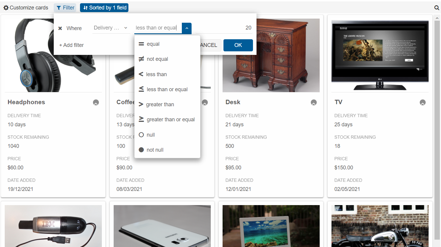
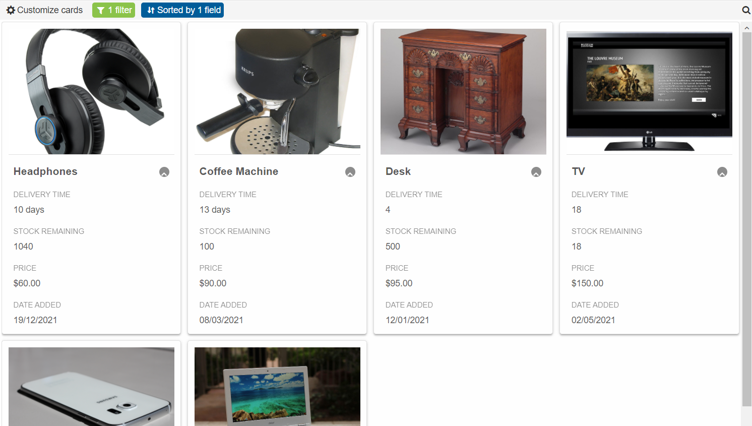
Customize, Filter & Sort
Smart.CardView's built-in header allows you to set the Sorting, Filtering rules as well as to customize the Cards without the need to write any code.
Set the HeaderPosition proper to Top.
<CardView Columns="columns" DataSource="products" TitleField="ProductName" CoverField="Attachments"
  Collapsible="true" AllowDrag="true" HeaderPosition="CardViewHeaderPosition.Top">
</CardView>