Build your web apps using Smart Custom Elements
Smart.Scheduler - Current Time Indicators
Current Time Indicators
Smart.Scheduler can display the exact current time by miliseconds inside the timeline. For the purpose it uses a number of indicators both in the view header and the view cells.
The element can also show the time that has passed. This means that when applied the Smart.Scheduler will apply a shader to the cells and events that have passed according to the current date and time.
The styles of the indicators and shaders inside the Smart.Scheduler can be customized via CSS variables. Check the Scheduler API for additional information.
For example the --smart-scheduler-shader-background CSS variable determines the background color of the shader while the --smart-scheduler-current-time-indicator-background determines the background color of the current time indicator.
Here's how to change the color of the current time indicator:
.smart-scheduler {
    --smart-scheduler-current-time-indicator-background: #D48439;
}
As a result the current time indicator will be colored in the new color.
Current Time Indicator
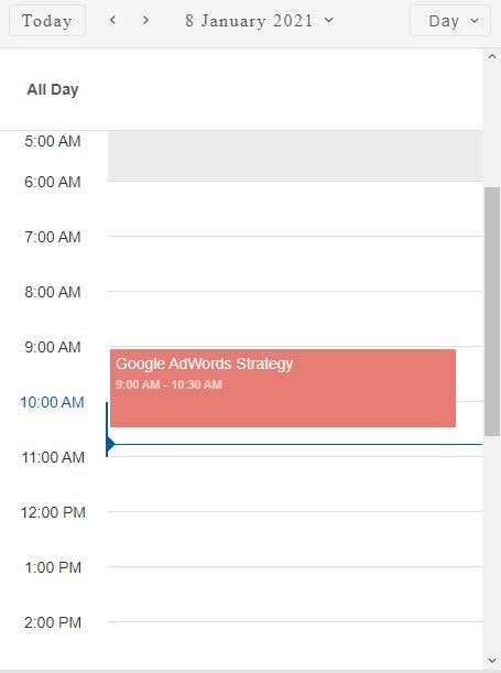
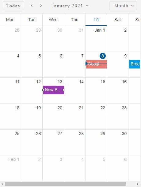
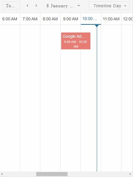
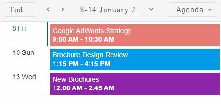
The currentTimeIndicator boolean property determines whether the current time indicator is shown or not. When set, an indicator inside the view header and cell that contain the current time is shown.
Here's how to enable the property:
const today = new Date(),
    todayDate = today.getDate(),
    currentYear = today.getFullYear(),
    currentMonth = today.getMonth(),
    data = [
        {
            label: 'Google AdWords Strategy',
            dateStart: new Date(currentYear, currentMonth, todayDate, 9, 0),
            dateEnd: new Date(currentYear, currentMonth, todayDate, 10, 30),
            backgroundColor: '#E67C73'
        }, {
            label: 'New Brochures',
            dateStart: new Date(currentYear, currentMonth, todayDate - 1, 11, 30),
            dateEnd: new Date(currentYear, currentMonth, todayDate - 1, 14, 15),
            backgroundColor: '#8E24AA'
        }, {
            label: 'Brochure Design Review',
            dateStart: new Date(currentYear, currentMonth, todayDate + 2, 13, 15),
            dateEnd: new Date(currentYear, currentMonth, todayDate + 2, 16, 15),
            backgroundColor: '#039BE5'
        }
    ];

window.Smart('#scheduler', class {
    get properties() {
        return {
            dataSource: data,
            currentTimeIndicator: true,
            view: 'day',
            views: ['day', 'week', 'month', 'timelineDay', 'timelineWeek', 'timelineMonth']
        };
    }
});
Depending on the view the indicator is positioned differently.
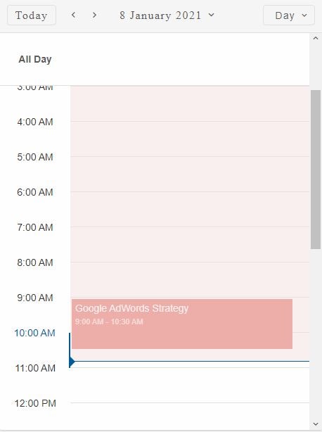
Here is the current time indicator for 'day' view:
Demo
Here is the current time indicator for 'month' view:
Demo
Here is the current time indicator for 'timelineDay' view:
Demo
Here is the current time indicator for 'agenda' view:
Demo
The current time indicator is updated every second by default. However the update interval can be configured via the currentTimeIndicatorInterval. This property accepts a number which indicates the time interval between updates in seconds.
Here's how to set the currentTimeIndicatorInterval:
const scheduler = document.querySelector('smart-scheduler');

scheduler.currentTimeIndicatorInterval = 10;
By making this change the current time indicator will be updated every 10 seconds.
When grouping is applied the current time indicator is displayed on every view cell that corresponds to the current date and time
Shade Until Current Time
Smart.Scheduler uses a shader to indicate cells that correspond to past time. The shader masks the cells and events that have passed.
The shader can be enabled/disabled via the shadeUntilCurrentTime property.
scheduler.shadeUntilCurrentTime = true;
Here's an example of a combination between the currentTimeIndicator and shadeUntilCurrentTime properties.
Demo
The shade serves only a visual purpose. Scheduler events that are covered by the shader can still be dragged and modified and the cells are still selectable.
The currentTimeIndicatorInterval also determines the update interval of the shader.
Time Ruler Ticks
By default in the 'day' and 'week' view the horizontal ruler lines indicate time. They fit in the container that is designed for the cells. However it is possible to show additional tick marks that will extend the time ruler lines a bit further. This is possible thanks to the timeRulerTicks boolean property.
Here's how to enable the time ruler tick marks:
scheduler.timeRulerTicks = true;
Demo
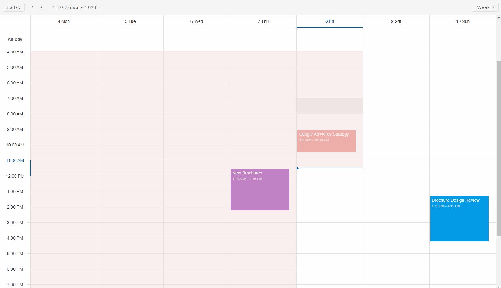
The image displays a Smart.Scheduler in 'week' view with current time indicator, shader and time ruler ticks applied.
For AI tooling
Developer Quick Reference
Topic: scheduler-current-time-indicators Component: Scheduler Framework: JavaScript
Main methods: (none detected)
Common config keys: dataSource, views
Implementation Notes
Compatibility: Modern browsers / Web Components API access pattern: const component = document.querySelector(...) + component.method()
Lifecycle guidance: Initialize configuration first, then invoke imperative API when element is available in DOM.
Common pitfalls:
- Calling methods before element initialization.
- Reassigning large configuration partially without understanding merge behavior.
- Missing required module script import for component type.
Validation checklist:
- Ensure module scripts and CSS are loaded once.
- Keep data schema aligned with columns/series definitions.
- Verify method calls target initialized component instance.