Build your web apps using Smart UI
Smart.DockingLayout - panels manipulation
Overview
The following tutorial will teach how add closed window panels back to the DockingLayout.
Setup
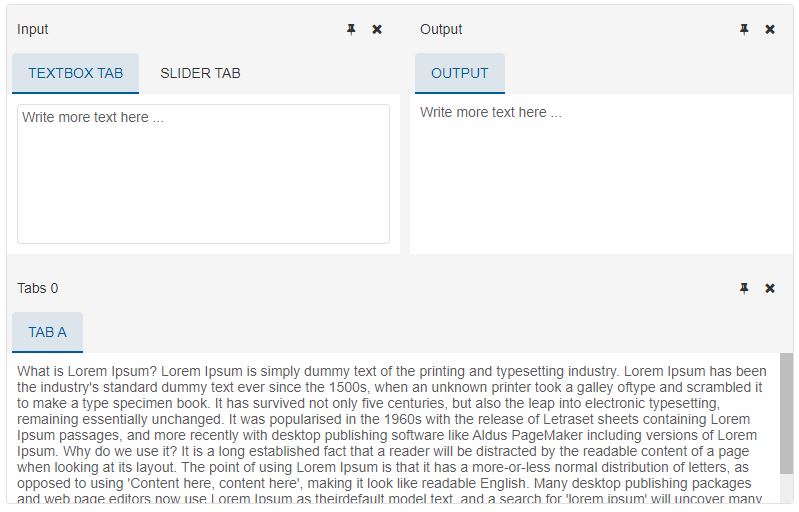
DockingLayout panels are not created by default. They are defined by the layout property. For the purpose of the demo we are going to create three panels:
window.onload = function () {
    const dockingLayout = document.querySelector('smart-docking-layout');

    dockingLayout.layout = [
        {
            type: 'LayoutGroup',
            orientation: 'horizontal',
            items: [
                {
                    type: 'LayoutGroup',
                    items: [
                        {
                            type: 'LayoutPanel',
                            id: 'tabPanel',
                            label: 'Input',
                            items: [{
                                    label: 'TextBox Tab',
                                    content: '<smart-multiline-text-box id="multiLine">Write more text here ...</smart-multiline-text-box>'
                                },
                                {
                                    label: 'Slider Tab',
                                    content: '<smart-slider id="slider"></smart-slider>'
                                }]
                        },
                        {
                            type: 'LayoutPanel',
                            label: 'Output',
                            items: [
                                {
                                    id: 'outputTab',
                                    label: 'Output',
                                    headerPosition: 'none',
                                    content: 'Write more text here ...'
                                }
                            ]
                        }
                    ],
                    orientation: 'vertical'
                },
                {
                    id: 'item0',
                    label: 'Tabs 0',
                    items: [{
                            label: 'Tab A',
                            selected: true,
                            content: 'What is Lorem Ipsum?\n' +
                                'Lorem Ipsum is simply dummy text of the printing and typesetting industry. Lorem Ipsum has been the industry\'s standard dummy text ever since the 1500s, when an unknown printer took a galley of' + 'type and scrambled it to make a type specimen book. It has survived not only five centuries, but also the leap into electronic typesetting, remaining essentially unchanged. It was popularised in ' + 'the 1960s with the release of Letraset sheets containing Lorem Ipsum passages, and more recently with desktop publishing software like Aldus PageMaker including versions of Lorem Ipsum.\n' +
                                'Why do we use it?\n' +
                                'It is a long established fact that a reader will be distracted by the readable content of a page when looking at its layout. The point of using Lorem Ipsum is that it has a more-or-less normal ' + 'distribution of letters, as opposed to using \'Content here, content here\', making it look like readable English. Many desktop publishing packages and web page editors now use Lorem Ipsum as their' + 'default model text, and a search for \'lorem ipsum\' will uncover many web sites still in their infancy. Various versions have evolved over the years, sometimes by accident, sometimes on ' + 'purpose (injected humour and the like).'
                        }]
                }
            ]
        }
    ];

};
These panels will be used in the next steps. The result from the loaded layout:
Adding closed panels back to the DockingLayout
DockingLayout panels are stored in a collection of type Array and can be retrieved via the items getter like so:
const panels = dockingLayout.items;
Important Note:
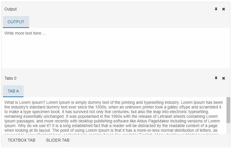
The items getter returns only the opened panels. This means that if some of the panels have been closed, they will not be part of the items collections.
The closed panels are not lost. The DockingLayout can retrieve them via the closedItems getter. closedItems is also a collection of type Array which holds all closed panels that belong to the DockingLayout. The collection can be retrieved like so:
const panels = dockingLayout.items;

panels[0].close(); //closes the first item

const closedPanels = dockingLayout.closedItems; // returns the closed panel
Once a panel is closed it is removed from the DOM and from the layout of the component. After the user has obtained it's instance, he can choose to bring it back to the DockingLayout or simply add it to the DOM.
Adding the closed panel to the DockingLayout is like adding a new TabsWindow panel to the element. This can achieved via one of the following methods:
- dock - adds a new panel to the DockingLayout as last position.
- appendChild - adds a new panel to the DockingLayout as last position.
- insertBefore - adds a new panel to the DockingLayout before another panel as it's sibling.
- autoHideTop - adds a new panel to the DockingLayout and makes it a 'autoHidden' to the bottom.
- autoHideBottom - adds a new panel to the DockingLayout and makes it a 'autoHidden' to the top.
- autoHideLeft - adds a new panel to the DockingLayout and makes it a 'autoHidden' to the left.
- autoHideRight - adds a new panel to the DockingLayout and makes it a 'autoHidden' to the right.
- insertBeforeItem - adds a new panel to the DockingLayout before another.
- insertAfterItem - adds a new panel to the DockingLayout after another.
- insertIntoLeft - adds a new panel to the DockingLayout into another by splitting it in two and placing the new panel to the left.
- insertIntoRight - adds a new panel to the DockingLayout into another by splitting it in two and placing the new panel to the right.
- insertIntoTop - adds a new panel to the DockingLayout into another by splitting it in two and placing the new panel to the top.
- insertIntoBottom - adds a new panel to the DockingLayout into another by splitting it in two and placing the new panel to the bottom.
- insertLayoutTop - adds a new panel to the DockingLayout at top level position by placing it at the top.
- insertLayoutBottom - adds a new panel to the DockingLayout at top level position by placing it at the bottom.
- insertLayoutLeft - adds a new panel to the DockingLayout at top level position by placing it at the left.
- insertLayoutRight - adds a new panel to the DockingLayout at top level position by placing it at the right.
- insertOutsideTargetGroupTop - adds a new panel to the DockingLayout outside the target panel group by placing the new panel at the top.
- insertOutsideTargetGroupBottom - adds a new panel to the DockingLayout outside the target panel group by placing the new panel at the bottom.
- insertOutsideTargetGroupLeft - adds a new panel to the DockingLayout outside the target panel group by placing the new panel at the left.
- insertOutsideTargetGroupRight - adds a new panel to the DockingLayout outside the target panel group by placing the new panel at the right.
For example:
const closedPanels = dockingLayout.closedItems;

dockingLayout.autoHideBottom(closedPanels[0]);
You can read more about these methods in the API of the element on The Offcial Smart Elements Webpage
For AI tooling
Developer Quick Reference
Topic: docking-layout-panels Component: DockingLayout Framework: JavaScript
Main methods: autoHideBottom()
Common config keys: (none detected)
Implementation Notes
Compatibility: Modern browsers / Web Components API access pattern: const component = document.querySelector(...) + component.method()
Lifecycle guidance: Initialize configuration first, then invoke imperative API when element is available in DOM.
Common pitfalls:
- Calling methods before element initialization.
- Reassigning large configuration partially without understanding merge behavior.
- Missing required module script import for component type.
Validation checklist:
- Ensure module scripts and CSS are loaded once.
- Keep data schema aligned with columns/series definitions.
- Verify method calls target initialized component instance.