Build your web apps using Smart Custom Elements
Smart.Scheduler - Menus
Menus
Smart.Scheduler contains many clickable elements some of which can trigger a popup menu to appear. Depending on the click target the popup can be for date selection, view selection, event editing/creation or a context menu.
A Smart.Tooltip component is used for the menus of the Smart.Scheduler. It has the abbility to reposition itself in order to always be inside the visible area.
Here is a list of the Smart.Scheduler menus:
Date Menu
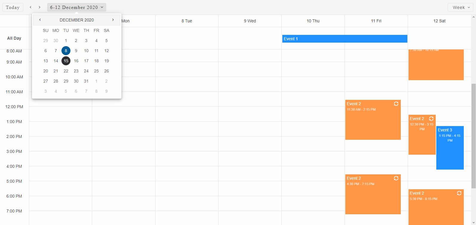
The Scheduler always shows a date or a range of dates depending on the view. For example, when the view is set to 'day' only one date can be visible. The currently visible date is determined by the dateCurrent property of the Smart.Scheduler. It can be changed via the Date Menu which can be triggered from the date selection control that is located in the header.
When the date selector is clicked the Date Menu appears under it by displaying a Smart.Calendar that allows to pick the view date.
There are two events related to the Date Menu in the Smart.Scheduler:
- dateMenuOpen - fired when the Date Menu is opened.
- dateMenuClose - fired when the Date Menu is closed.
Here's how to bind to the events:
document.querySelector('smart-scheduler').addEventListener('dateMenuOpen', function(event) {
    const target = event.detail.target;
    //...
});
The Date Menu can be disabled by setting the disableDateMenu property of the Smart.Scheduler.
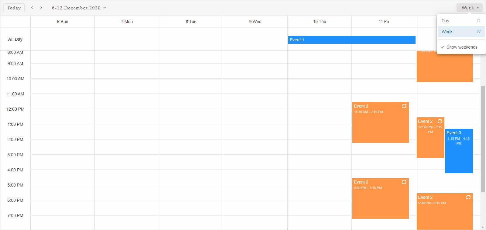
View Menu
The View Menu is the default choice for view selection. In order to change the current view simply click on the view selector control which is positioned inside the header of the Smart.Scheduler component and the View Menu will open.
However the usage of the View Menu depends on the viewSelectorType property. This property determines whether the view items are positioned inside a menu or as tabs. A third option is also available called 'auto' that allows the Scheduler to automatically determine when to use a menu or tabs control for view selection. The decision is based on the space available inside the header for the views. When the view selector type is set to 'tabs', two additional navigation buttons appear in the view selection area that allow to scroll through the items when necessary.
When the View selector button is clicked the View Menu will appear:
The View Menu items depend on the views property. The views defined in the views property will appear as view items in the View Menu. Custom views can be defined as objects. These views can have custom labels and custom shortcut keys as well.
At the bottom of the View menu there's an additional checkbox item that allows to show/hide the weekends. This property depends on the current view settings. It also depends on the hideWeekend Smart.Scheduler property which hides the weekends for all views. However this property can be applied to specific views as well.
Another cool feature of the View Menu is the view items shortcuts. By default each view item has a shortcut key or key combination that when executed the Smart.Sheduler will switch to the corresponding view. The View seletor button should be focused in order for the shortcuts to work. By default the buttons is focused while the View Menu is opened. These shortcuts can also be modifed in the custom view object definition via the views property. Here's an example of a custom view:
window.Smart('#scheduler', class {
    get properties() {
        return {
            //Properties
            view: 'month',
            nonworkingDays: [0, 3],
            views: [
                {
                    type: 'month',
                    label: 'Custom Month',
                    hideNonworkingWeekdays: true,
                    shortcutKey: 'X'
                },
                {
                    type: 'week',
                    label: 'Custom Week',
                    shortcutKey: 'C+W'
                },
                {
                    type: 'agenda',
                    label: 'Custom Agenda',
                    hideWeekend: true,
                    shortcutKey: 'C+A'
                },
            ]
        };
    }
});
There are two events related to the View Menu in the Smart.Scheduler:
- viewMenuOpen - fired when the View Menu is opened.
- viewMenuClose - fired when the View Menu is closed.
Here's how to bind to the events:
document.querySelector('smart-scheduler').addEventListener('viewMenuOpen', function(event) {
    const target = event.detail.target;
    //...
});
The View Menu can be disabled by setting the disableViewMenu property of the Smart.Scheduler.
Context Menu
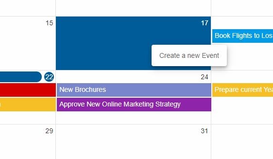
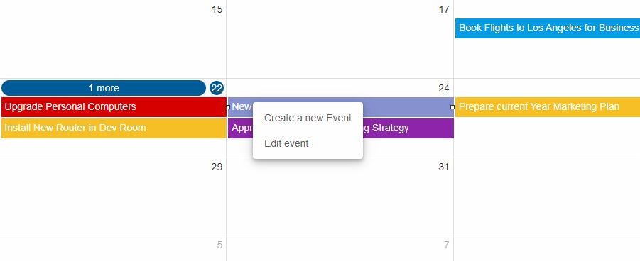
Smart.Scheduler has a build in Context Menu that appears on mouse right click (or touch hold for mobile) over a view cell or an event element. The Context Menu contains menu items. Each item has a label and a value. The label is used as the name of the item wihle value represents the action. Smart.Scheduler has two build-in context menu actions: 'createEvent' and 'editEvent'. The items are determined based on the click target. For example 'editEvent' action is only showed when the user opens the Context Menu on events, not on cells. The view cell Context Menu is only used to create new events.
The Context Menu can be customized to contain completely different items that execute other user actions thanks to the contextMenuDataSource property. It accepts an Array of objects with label-value pairs where the label is again used to name the item and value for the action. The Smart.Scheduler will only create the custom context menu items while the custom action handling is left to the user.
Here's how the Context Menu for a view cell appears when opened:
and here's how the Context Menu for an event element appears when opened:
Clicking on one of the items in the default Context Menu will trigger the Scheduler Window to create/edit an event.
The following events are triggered by the Context Menu:
- contextMenuOpen - fired when the Context Menu is opened.
- itemClick - fired when a Context Menu Item was clicked. This event contains details regarding the item that is clicked.
- contextMenuClose - fired when the Context Menu is closed.
Here's how to bind to the events:
document.querySelector('smart-scheduler').addEventListener('contextMenuOpen', function(event) {
    const target = event.detail.target;
    //...
});
The Context Menu can be disabled by setting the disableContextMenu property to the Smart.Scheduler.
An additional contextMenuClipboardActions boolean property is available that if enabled displays the 'Copy/Cut/Paste' clipboard shortut items as part of the default context menu.
Event Menu
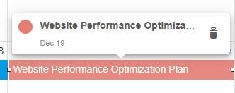
Events inside the Smart.Scheduler timeline can trigger a menu that shows additional information for the target event.
The event information is shown as a Event Menu item. These items actually represent the event objects that correspond to the clicked target but have an additional button that allows to directly delete the event without going through the Scheduler Window.
If an Event Menu item is clicked then the Smart.Scheduler Window will appear allowing to modify the target event.
Here's what the Event Menu looks like for Scheduler timeline events when clicked:
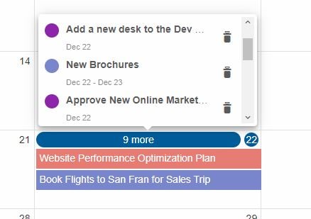
When the click target is an event collector then the Event Menu contains a list of events that are collected. The Event Menu represent a Smart.ScrollViewer and if the events overflow a scrollbar will appear allowing to scroll through them:
The following events are triggered by the Event Menu:
- eventMenuOpen - fired when the Event Menu is opened.
- itemClick - fired when a Event Menu Item is clicked. This event contains details regarding the item that was clicked.
- eventMenuClose - fired when the Event Menu is closed.
Here's how to bind to the events:
document.querySelector('smart-scheduler').addEventListener('eventMenuOpen', function(event) {
    const target = event.detail.target;
    //...
});
Event Menu for specific events can be triggered via the Smart.Scheduler API as well thanks to the following methods:
- openEventTooltip - opens the Event Menu for specific event if possible. The method takes
one argument
- a Scheduler event object:
openEventTooltip(eventObj:EventObj)
- closeEventTooltip - closes the Event Menu if opened.
closeEventTooltip()
The Event Menu can be disabled by setting the disableEventMenu property to the Smart.Scheduler.
Smart.Scheduler menus can be styled via CSS variables. Check the Smart.Scheduler API for more details on CSS styling.
For AI tooling
Developer Quick Reference
Topic: scheduler-menus Component: Scheduler Framework: JavaScript
Main methods: (none detected)
Common config keys: views
Implementation Notes
Compatibility: Modern browsers / Web Components API access pattern: const component = document.querySelector(...) + component.method()
Lifecycle guidance: Initialize configuration first, then invoke imperative API when element is available in DOM.
Common pitfalls:
- Calling methods before element initialization.
- Reassigning large configuration partially without understanding merge behavior.
- Missing required module script import for component type.
Validation checklist:
- Ensure module scripts and CSS are loaded once.
- Keep data schema aligned with columns/series definitions.
- Verify method calls target initialized component instance.