Blazor - Get Started with Smart.Button
Setup The Project
Follow the Getting Started guide to set up your Blazor Application with Smart UI.
Setup Basic Button
Smart.Button is a highly customizable button element with additional features, styling options and event
that can help you further expand the component's functionality
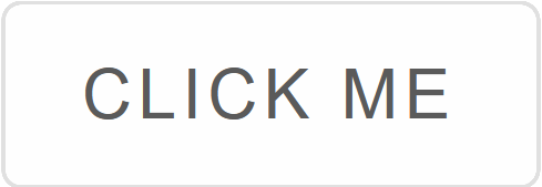
Add the Button component to the Pages/Index.razor file
<Button></Button>
Button Types
Smart.Button has four distinct button types that can be used depending on the type of action performed by the button:
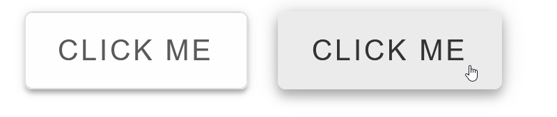
- Raised - The raised button looks as if it is lifted above the other elements. It can be used to emphasize important actions
<Button Class="raised"></Button>
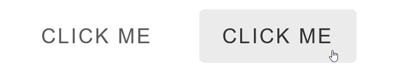
- Flat - The flat button minimizes distraction from other content. It can be used for actions, which are not critical for the application
<Button Class="flat"></Button>
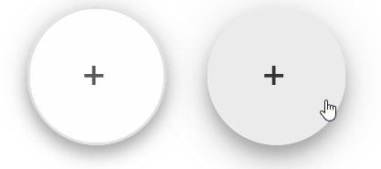
- Floating - The floating button has a small circular shape filled with color. It is best used for actions that need to be avaible at any time to the user
<Button Class="floating"></Button>
- Outlined - The otlined button is less emphasized than the default or raised button types. It can be used for secondary actions
<Button Class="outlined"></Button>
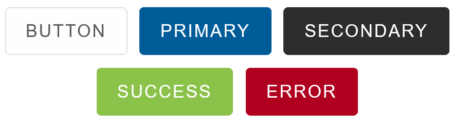
Button Customization
The role of the button element can also be shown by using some of the built-in color options:
<Button Class="">Default</Button>
<Button Class="primary">Primary</Button>
<Button Class="secondary">Secondary</Button>
<Button Class="success">Success</Button>
<Button Class="error">Error</Button>
Shape and size can also be customized using the Class property:
<Button Class="icon squared primary"><span class="material-icons">alarm</span> Timer</Button>

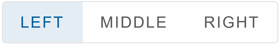
Button Groups
Button Group is a series of buttons placed on the same line. The buttons should execute similar action
        <ButtonGroup DataSource="@options">
        </ButtonGroup>

        @code{
            string[] options = new string[]{"Left", "Middle", "Right"};
        }
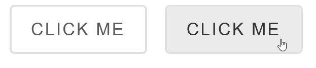
Click Event
The button's action is specified in the OnClick Event:
<Button Class="primary" OnClick="OnClick">Click Me</Button>
<h5>@message</h5>

@code{
    string message = "";
    private void OnClick(){
        message="The button was clicked";
    }

}