Build your web apps using Smart UI Library
Smart.Editor - Toolbars
Editor Toolbar
Smart.Editor has a Toolbar that contains items which when clicked execute an action. Actions can insert/delete content or apply styles to the current text selection.
There are two types ot Toolbars inside the Editor:
- Toolbar - the main toolbar of the Editor. Always visible and positioned right above the content
section.

- Inline Toolbar - an additional toolbar that appears when text is selected or a specific text or
node is clicked, for example: text, link, image, table. The inline toolbar mian purpose for
Images
and Tables where it offers additional actions to be applied to the selection target.

Documentation content sections:
Editor Toolbar Items
The toolbarItems property determines the items inside the toolbar.The property can be used to modify the items and/or add additional custom items.
The default toolbar items types are buttons, drop downs, color inputs or delimiters. Toolbar items can be defined as strings which represent the valid name of an item. Here's the full list of all built-in toolbar item names:
| Name | Type | Descriptions |
|---|---|---|
| SourceCode | Toggle Button | Toggles Source Code/Preview Mode. Changes the view to HTML content editor. |
| SplitMode | Toggle Button | Toggles Split Mode. Split mode allows to view both HTML/Markdown and Code/HTML and makes changes live. |
| FullScreen | Toggle Button | Toggles Full Screen Mode. When full screen mode is on the Editor fills the whole screen. |
| Alignment | Drop Down | Opens a drop down with alignment options. |
| FontName | Drop Down | Opens a drop down with font family options. |
| FontSize | Drop Down | Opens a drop down with font size options. |
| Formats | Drop Down | Opens a drop down with formating options. |
| TableRows | Drop Down | Opens a drop down with table row options. Available only for Inline toolbar and applicable only to Tables inside the Editor. |
| TableColumns | Drop Down | Opens a drop down with table column options. Available only for Inline toolbar and applicable only to Tables inside the Editor. |
| TableVAlign | Drop Down | Opens a drop down with table vertical alignment options. Available only for Inline toolbar and applicable only to Tables inside the Editor. |
| TableStyle | Drop Down | Opens a drop down with additional table styling options. Available only for Inline toolbar and applicable only to Tables inside the Editor. |
| BackgroundColor | Color Input | Opens a color input in order to select a background color for the current selection. |
| FontColor | Color Input | Opens a color input in order to select a font color for the current selection. |
| Bold | Button | Applies bold formatting to the currently selected text. |
| Italic | Button | Applies Italic formatting to the currently selected text. |
| Underline | Button | Applies Underline formatting to the currently selected text. |
| Striketrough | Button | Applies Striketrough formatting to the currently selected text. |
| Delete | Button | Deletes the current selection. |
| Redo | Button | Redo the previous operation. |
| Undo | Button | Undo the previous operation. |
| Indent | Button | Applies indentation to the current selection. |
| Outdent | Button | Applies outdentation to the current selection. |
| OpenLink | Button | Opens the url of the currently selected link. Applicable only when a link element is selected. |
| EditLink | Button | Opens a Dialog Window for advanced link editing. |
| CreateLink/Hyperlink | Button | Opens a Dialog Window for advanced link creation or editing. |
| RemoveLink | Button | Removes the hyperlink from the selected text. |
| Cut | Button | Cuts the currently selected text to the Clipboard. |
| Copy | Button | Copies the currently selected text to the Clipboard. |
| Paste | Button/Drop Down | Pastes the contents of the Clipboard at the current cursor location. By default it's a button unless the advanced attribute is set to 'true' in a custom defition of the toolbar item. |
| Image | Button | Opens a Dialog Window for advanced image inserting/editing. |
| Table | Button | Opens a Dialog Window for advanced table inserting/editing. |
| Lowercase | Button | Applies lower case to the currently selected text. |
| Uppercase | Button | Applies upper case to the currently selected text. |
| Button | Opens the borwser's Print Preview in order to pring the current content of the Editor. | |
| Caption | Button | Insert/Remove a caption to the currently selected image. Available only to the Inline Toolbar and applicable only to Image elements. |
| ClearFormat | Button | Clears the formatting of the current selection. |
| TableHeader | Button | Insert/Remove a header to the currently selected table. Available only to the Inline Toolbar and applicable only to Table elements. |
| OrderedList | Button | Inserts an ordered list item at the current selection location. |
| UnorderedList | Button | Inserts an unordered list item at the current selection location. |
| Subscript | Button | Applies subscript formatting to the current text selection. |
| Superscript | Button | Applies superscript formatting to the current text selection. |
| Other | Delimiter | All other items defined as strings are treated as delimiters. Delimiters are non clickable. |
Here's an example on how to modfy the toolbar items using the item names:
document.querySelector('smart-editor').toolbarItems = [
    'bold', 'italic', 'Underline', 'StrikeThrough', 'hyperlink', 'removeLink',
    'copy', 'cut', 'paste', 'alignment', 'table', 'image', 'sourcecode', 'formats',
    'splitmode', 'undo', 'redo', 'OrderedList', 'UnorderedList', 'superscript', 'subscript'
    ];
Toolbar items can also be defined as objects. This way it is also possible to create custom toolbar items. An item object should contain the following attributes:
| Name | Type | Description | Optional |
|---|---|---|---|
| name | String | Represents the name of the toolbar item. The name can be one of the default names described above which will allow to customize the built-in toolbar item or a custom name for a new custom item. | No |
| disabled | Boolean | Determines whether the item is disabled or not. | Yes |
| width | String | Number | Determines the width of the item. | Yes |
| template | String | Function | Determines template of the toolbar item. It can be a string which represents the HTML for the item or a Function which has two arguments: (element: HTMLElement, item: object), where element is the item container and the item is the toolbar item object definition. | Yes |
| editor | Object | Allows to preset most of the inputs for items that use a Dialog Window. For example:
{
    name: 'hyperlink',
    editor: {
        address: 'http://www.',
        target: '_blank'
    }
}
|
Yes |
| dataSource | String[] | Object[] | Allows to modify the dataSource for the drop down and color input toolbar items. Usefull
when the user wants custom colors or custom options for a toolbar item. For example:
{
    name: 'FontSize',
    dataSource: ['10', '20', '30', '40']
}
|
Yes |
| inlineToolbarItems | Object | Determines the inline toolbar items for specific targets. Applicable only to the
following items: 'Hyperlink' and 'CreateLink' for hyperlinks, 'Cut', 'Copy', 'Paste' for
Text selection, 'Image' for images and 'Table' for tables. This property allows to
modify the inline toolbar items for the previously mentioned elements. The property has
the same definition as toolbarItems property.
Here's how to customize the inline toolbar items for Tables:
 {
    name: 'table',
    inlineToolbarItems: [
    'BackgroundColor', 'FontSize',
    {
        name: 'customButtonGrpup',
        width: 200,
        template: (element, item) => {
                if (!element.customElement) {
                     const buttonGroup = document.createElement('smart-button-group');
                     buttonGroup.dataSource = ['A', 'B', 'C'];
                     //Cache it on the ToolbarItem to avoid re-creation of the element
                     element.customElement = buttonGroup;
                    //Add an event listener if needed
                }
                if (!element.contains(element.customElement)) {
                    element.appendChild(element.customElement);
                    }
                }
        }]
    }
Demo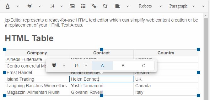
|
Yes |
Here's a complete example on how to predefine the toolbar items to contain custom toolbar item definitions of an Editor on initialization:
window.Smart('#editor', class {
    get properties() {
        return {
            //Properties
            toolbarItems: [
                {
                    name: 'BackgroundColor',
                    disabled: true
                },
                {
                    name: 'FontSize',
                    dataSource: ['10', '20', '30', '40']
                },
                {
                    name: 'ddl',
                    value: '2',
                    width: 100,
                    template: (element, item) => {
                        if (item.name === 'ddl') {
                            const dropDownList = document.createElement('smart-drop-down-list');

                            dropDownList.dataSource = ['1', '2', '3'];
                            dropDownList.dropDownAppendTo = 'body';
                            dropDownList.placeholder = 'Enter...';
                            dropDownList.classList.add('custom-drop-down-toolbar-item');

                            element.appendChild(dropDownList);
                        }
                    }
                },
                {
                    name: 'customButton',
                    width: 100,
                    template: '<smart-button>Button</smart-button>'
                }, {
                    name: 'hyperlink',
                    inlineToolbarItems: [{
                            width: 100,
                            template: '<smart-button>Button</smart-button>'
                        }],
                    editor: {
                        address: 'http://www.',
                        target: 'ala'
                    }
                }, 'removeLink'
            ]
        };
    }
});
Demo

Editor Toolbar View Mode
Editor's Toolbar can display the items as a drop down, a scrollable container or on multiple levels. This is determined by the toolbarViewMode property. By default the toolbar's view mode is toggle.
However there are other options to choose from:
| Mode | Description |
|---|---|
| toggle | The Toolbar can be toggled in order to display the additional items. |
| multiRow | The Toolbar items are positioned on multiple levels depending on the space available. |
| scroll | The Toolbar represent a scrollable contain and the user can scroll through the items via a scroll bar. |
Here's how to set the property to a 'multiRow' for example:
document.querySelector('smart-editor').toolbarViewMode = 'multiRow';
Demo
Editor Toolbar Sticky
When the height of the editor is bigger than the page viewport size the toolbar might not be visible when the user has scrolled to the bottom. The toolbarSticky property allows to make the Toolbar stick to the top of the page regardless of the scroll top position. That way the toolbar items are easy to reach at any time.
Here's how to set the Toolbar to stick to the top of the page:
document.querySelector('smart-editor').toolbarSticky = true;
Demo
Editor Inline Toolbar
The Editor's Inline Toolbar is available only when editMode="html" and it appears only when a specific content nodes are selected, such as text, image, table, hyperlink. The Inline toolbar contains quick actions which are easier to reach.
Let's take a close look at the individual inline toolbar items:
-
Table Inline Toolbar
The Inline toolbar appears when a Table cell has been selected. It offers the following quick actions:
- Table - advanced editing of the selected Table via a Dialog Window.
- TableHeader - allows to create/remove the header of the currently selected table.
- TableRows - allows to delete the currently selected row or insert a new row before of after the current.
- TableColumns - allows to delete the currently selected column or insert a new column before of after the current.
- BackgroundColor - allows to change the background color of the currently selected cell.
- Delete - deletes the Table.
- Alignment - allows to change the cell horizontal alignment.
- TableVAlign - allows to change the cell vertical alignment.
- TableStyle - allows to add/remove additional Table styles, such as 'alternation' or 'dashed borders'.
Demo
-
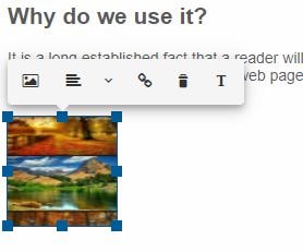
Image Inline Toolbar
The Inline toolbar appears when a Image has been selected. It offers the following quick actions:
- Image - advanced editing of the selected Image via a Dialog Window.
- Alignment - allows to change the alignment of the Image.
- CreateLink - allows to add a hyperlink to the image. When clicked a Dialog Window is opened allowing to create the hyperlink.
- Delete - deletes the Image.
- Caption - allows to add/remove the caption for the Image.
Demo
-
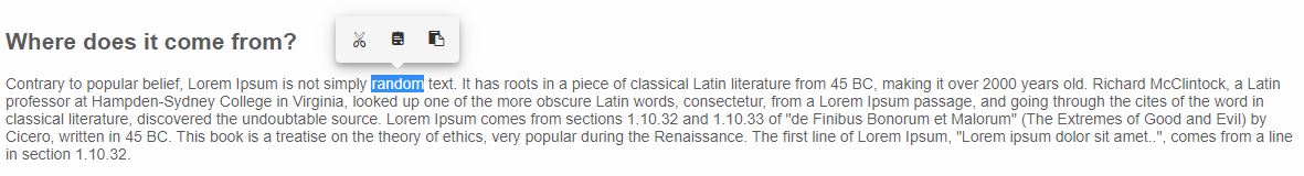
Text Inline Toolbar
The Inline toolbar appears when a Text node is selected. It offers the following quick actions:
- Cut - allows to cut the selected text to the Clipboard.
- Copy - allows to copy the selected text to the Clipboard.
- Paste - allows to paste the Clipboard contents by replacing the current selection.
Demo
-
Hyperlink Inline Toolbar
The Inline toolbar appears when a Text node is selected. It offers the following quick actions:
- OpenLink - allows to open the url of the link.
- EditLink - allows to edit the selected hyperlink by opening a Dialog Window.
- RemoveLink - allows to remove the hyperlink from the currently selected text.
Demo
For AI tooling
Developer Quick Reference
Topic: editor-toolbar Component: Editor Framework: JavaScript
Main methods: (none detected)
Common config keys: dataSource
Implementation Notes
Compatibility: Modern browsers / Web Components API access pattern: const component = document.querySelector(...) + component.method()
Lifecycle guidance: Initialize configuration first, then invoke imperative API when element is available in DOM.
Common pitfalls:
- Calling methods before element initialization.
- Reassigning large configuration partially without understanding merge behavior.
- Missing required module script import for component type.
Validation checklist:
- Ensure module scripts and CSS are loaded once.
- Keep data schema aligned with columns/series definitions.
- Verify method calls target initialized component instance.