Blazor - Get Started with Smart.DateTimePicker
Setup The Project
Follow the Getting Started guide to set up your Blazor Application with Smart UI.
Setup Basic DateTime Picker
Smart.DateTimePicker allows users to easily select Date, Time or DateTime value
- Add the DateTimePicker component to the Pages/Index.razor file
<DateTimePicker></DateTimePicker>
- Set the DropDownPosition and enable the CalendarButton of the component:
<DateTimePicker DropDownPosition="DropDownPosition.Bottom" CalendarButton="true"></DateTimePicker>
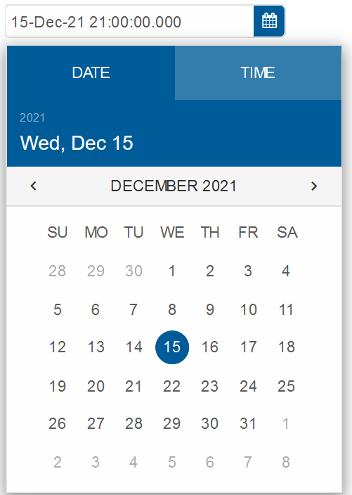
- Default value of the input is the current time. It can be changed using the Value property:
<DateTimePicker DropDownPosition="DropDownPosition.Bottom" CalendarButton="true"  Value="defaultValue"></DateTimePicker>

@code{
  string defaultValue = "2021-12-15T21:00";
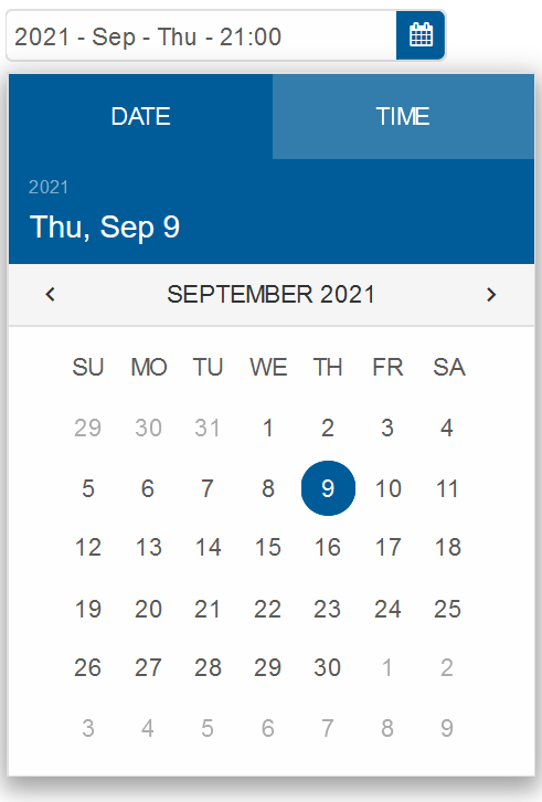
Date Formatting
The date displayed in the input field can be formatted using the FormatString property.
<DateTimePicker DropDownPosition="DropDownPosition.Bottom" CalendarButton="true"
        FormatString="yyyy - MMM - ddd - HH:mm" Value="defaultValue"></DateTimePicker>
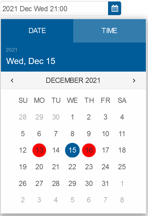
Important Dates
Smart.DateTimePicker allows you to highlight important dates by applying custom templates to selected dates.
First, create an array of the important dates and set them as value of ImportantDates.
Then, create a template and set its id as value of ImportantDatesTemplate
<template id="someTemplate"><div style="background-color:red">{{value}}</div></template>
<DateTimePicker DropDownPosition="DropDownPosition.Bottom" CalendarButton="true"
FormatString="yyyy MMM ddd HH:mm" Value="defaultValue" ImportantDates="importantDates" ImportantDatesTemplate="template"></DateTimePicker>

@code{
  string defaultValue = "2021-12-15T21:00";
  string template = "someTemplate";
  string[] importantDates = new string[]{"2021-12-13", "2021-12-16"};
}
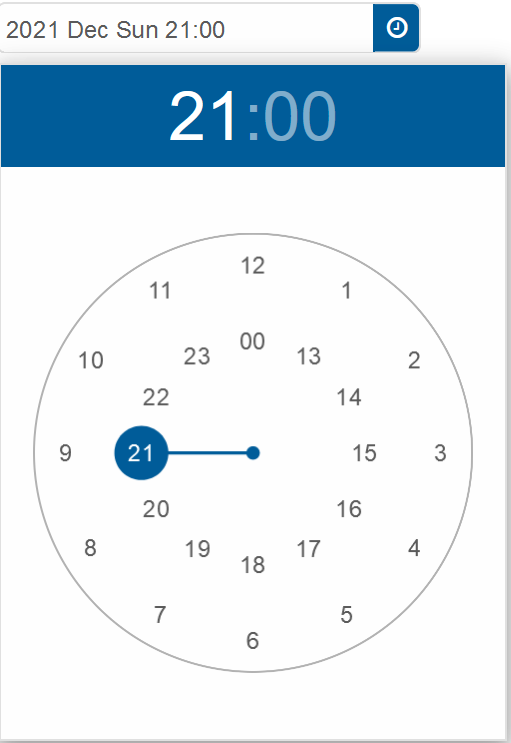
Display Mode
The pop-up display of the component can be customized using the DropDownDisplayMode property.
Setting it to DateTimePickerDropDownDisplayMode.TimePicker will create a time-only picker display
<DateTimePicker DropDownPosition="DropDownPosition.Bottom" CalendarButton="true"
        FormatString="yyyy MMM ddd HH:mm" Value="defaultValue" DropDownDisplayMode="DateTimePickerDropDownDisplayMode.TimePicker"></MultiComboInput>
DateTimePicker Events
Smart.DateTimePicker provides an OnChange Event that can help you expand the component's
functionality.
The event object can have unique event.detail parameters.
OnChange- triggered when the value is changed.
Event Details: dynamic oldValue, dynamic valueOnClose- triggered when the calendar pop-up is closed.
Event Details: N/AOnClosing- triggered when the calendar pop-up is about to be closed.
Event Details: N/AOnOpen- triggered when the calendar pop-up is opened.
Event Details: N/AOnOpening- triggered when the calendar pop-up is about to be opened.
Event Details: N/A