Getting Started with Form Web Component
Smart UI Web Components work with current evergreen browsers and Node 18+ for local tooling; pin package versions to match your project policy.
Smart UI is distributed as the smart-webcomponents NPM package. You can also use the full download from the Download page.
Quick start
- Install the package:
npm install smart-webcomponents
- Load the Form module (ES module script):
<script type="module" src="node_modules/smart-webcomponents/source/modules/smart.form.js"></script>
- Add the default stylesheet (prefer angular.json / bundler entry in app codebases; for plain HTML use a link):
<link rel="stylesheet" type="text/css" href="node_modules/smart-webcomponents/source/styles/smart.default.css" />
- Add markup in one of two ways - semantic custom element (the component tag is in your HTML) or a host
div(you mount programmatically with appendTo):
Semantic element (id matches the selector in Smart()):
<smart-form id="form"></smart-form>
Host container (id matches appendTo on Smart.Form):
<div id="formContainer"></div>
- Initialize after the module loads: define a const formOptions object, then either bind with Smart('#form', ...) on the semantic tag or use new Smart.Form({ ...formOptions, appendTo: '#formContainer' }) on the host
div:
<script type="module">
	import 'node_modules/smart-webcomponents/source/modules/smart.form.js';

	const formOptions = {};

	// Option A - semantic <smart-form> with id="form"
	Smart('#form', class {
		get properties() {
			return formOptions;
		}
	});

	// Option B - host div id="formContainer"
	// const formInstance = new Smart.Form({
	// 	...formOptions,
	// 	appendTo: '#formContainer'
	// });

	// Option C - constructor(selector, options), then append the returned element yourself
	// const myForm = new Smart.Form('#form', formOptions);
	// document.body.appendChild(myForm);
</script>
Uncomment Option B when you use the host
div; use Option A when you use the semantic element. The Runtime cookbook also documents new Smart.Form('#form', formOptions) with appendChild, and document.createElement('smart-form') with .props or Object.assign (all are valid patterns; do not combine overlapping patterns for the same instance unless you intend multiple components). - Serve the folder over HTTP (or use your bundler dev server) and open the page.
Runtime cookbook
Alternative creation patterns and imperative APIs. These are all valid ways to create Smart UI components: semantic markup + Smart(); new Smart.Form({ ...options, appendTo: '#...' }); new Smart.Form('#form', formOptions) plus appendChild on the returned element; and document.createElement('smart-form') then assigning options via .props or Object.assign on the element.
Constructor with a selector string and options, then append the returned element (for example const myForm = new Smart.Form('#form', formOptions)):
	const formOptions = {};
	const myForm = new Smart.Form('#form', formOptions);
	document.body.appendChild(myForm);
Create with document.createElement('smart-form'), assign properties (same as any custom element), then append:
	const formOptions = {};
	const form = document.createElement('smart-form');
	Object.assign(form, formOptions);
	document.body.appendChild(form);
Host on a div with appendTo (import the module, then instantiate when the document is ready; the container id must match appendTo):
	import "../../source/modules/smart.form.js";

	document.readyState === 'complete' ? init() : window.addEventListener('load', init);

	function init() {
		const formOptions = {};
		const form = new Smart.Form({
			...formOptions,
			appendTo: '#formContainer'
		});
	}
The Smart.Form control has two types of members: Smart.FormControl and Smart.FormGroup.
Smart.FormControl manages the value and validity status of an individual form control. It corresponds to an HTML form control such as 'input' or 'select'.
Smart.FormGroup manages the value and validity state of a group of Smart.FormControl instances. The group's properties include its child controls. The top-level form in your component is Smart.FormGroup.
Smart.FormControl and Smart.FormGroup have the following state properties:
- untouched - The field has not been touched yet
- touched - The field has been touched
- pristine - The field has not been modified yet
- dirty - The field has been modified
- invalid - The field content is not valid
- valid - The field content is valid
Smart.Form has an addition submitted field, which determines whether the form is submitted. All of the above properties are either true or false.
Our Form automatically mirrors many control properties onto the form control element as CSS classes. You can use these classes to style form control elements according to the state of the form.
The following classes are currently supported.
.smart-valid.smart-invalid.smart-pristine.smart-dirty.smart-untouched.smart-touched
Create a Form from HTML Template
Creating a Reactive form with that approach is very easy and it is appropriate, when you migrate an existing Form to a Smart.Form
HTML
<form id="profileForm">
	<div class="smart-form-row">
		<label>
			First Name:
		</label>
		<smart-input class="underlined" form-control-name="firstName"></smart-input>
	</div>

	<div class="smart-form-row">
		<label>
			Last Name:
		</label>
		<smart-input class="underlined" form-control-name="lastName"></smart-input>
	</div>

	<div class="smart-form-row" form-group-name="address">
		<h3>Address</h3>

		<div class="smart-form-row">
			<label>
				Street:
			</label>
			<smart-input class="underlined" form-control-name="street"></smart-input>
		</div>

		<div class="smart-form-row">
			<label>
				City:
			</label>
			<smart-input class="underlined" form-control-name="city"></smart-input>
		</div>

		<div class="smart-form-row">
			<label>
				State:
			</label>
			<smart-input class="underlined" form-control-name="state"></smart-input>
		</div>

		<div class="smart-form-row">
			<label>
				Zip Code:
			</label>
			<smart-input class="underlined" form-control-name="zip"></smart-input>
		</div>
	</div>
	<div class="smart-form-row submit">
		<smart-button class="success" form-control-name="submit" type="submit">Submit</smart-button>
	</div>
</form>
Javascript
const form = new Smart.Form('#profileForm', {
	firstName: ['', {
		validationRules: [
		   { type: 'required', message: 'First Name is required' },
		   { type: 'stringLength', min: 2, message: 'First Name requires minimum 2 characters' }
		]
	}],
	lastName: ['', {
	  validationRules: [{ type: 'required', message: 'Last Name is required' }]
	}
	],
	address: new Smart.FormGroup({
	  street: ['', {
		validationRules: [
			{ type: 'required', message: 'Street is required' }
		]
	  }
	  ],
	  city: [''],
	  state: [''],
	  zip: ['']
	})
});
Output
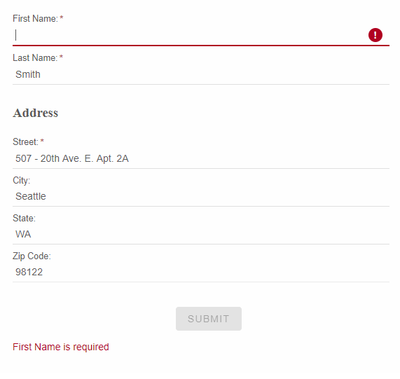
The above code upgrades an existing Form control to Smart.Form. That adds more API options, features and capabilities of your Form and also easily adds user input validation.
Once the Form is initialized, you can access each FormControl or FormGroup by its name.
form.firstName.value = "Peter";
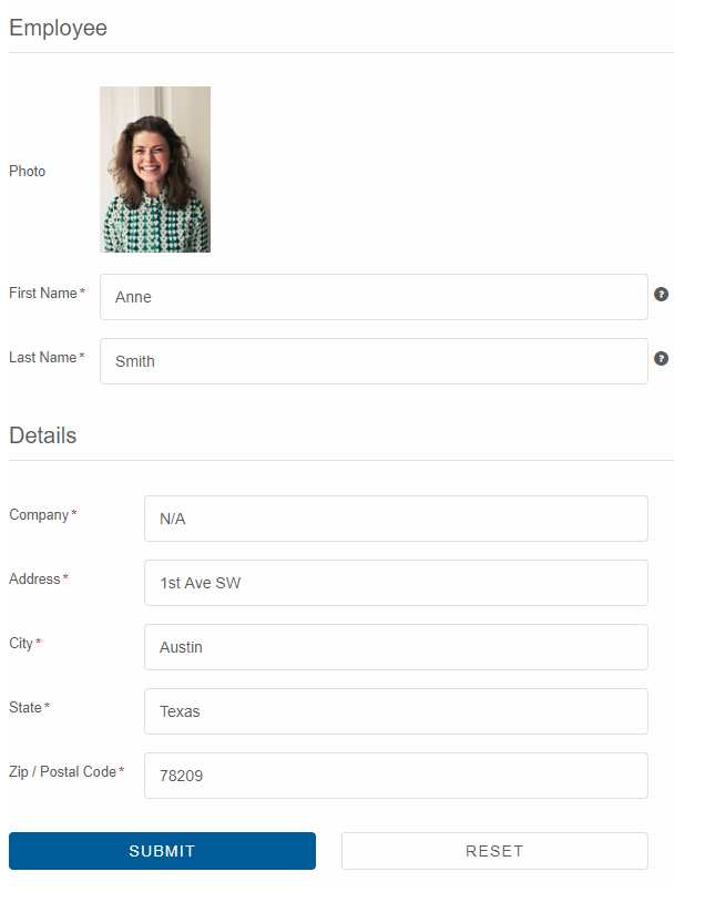
Create a Form using Component tags
Smart.Form can be created from a special tag, called smart-form. The other supported custom elements are smart-form-group and smart-form-control.
All properties of Smart.FormGroup and Smart.FormControl can be set as attributes of the custom elements, if you choose to use that initialization approach.
When you create a Form from Tag, the Form instance is automatically created once the HTML is rendered on your web page. You do not need to create a Smart.Form, Smart.FormGroup and Smart.FormControl instances as
these are created by the custom elements.
HTML
<smart-form id="profileForm"> <smart-form-group id="employee" label="Employee" data-field="employee"> <smart-form-group data-field="name"> <smart-form-control column-span="2" label="Photo" control-type="template"> <div style="overflow: hidden;"><img width="100" src="../../images/people/anne.png"/></div> </smart-form-control> <smart-form-control info="Enter First Name" required placeholder="First Name" control-type="input" data-field="firstName" label="First Name" class="outlined"></smart-form-control> <smart-form-control info="Enter Last Name" required placeholder="Last Name" control-type="input" data-field="lastName" label="Last Name" class="outlined"></smart-form-control> </smart-form-group> <smart-form-group label="Details" data-field="details"> <smart-form-control placeholder="Company Name" required control-type="input" data-field="company" label="Company" class="outlined"></smart-form-control> <smart-form-control placeholder="Address" required control-type="input" data-field="address" label="Address" class="outlined"></smart-form-control> <smart-form-control placeholder="City" required control-type="input" data-field="city" label="City" class="outlined"></smart-form-control> <smart-form-control placeholder="State" required control-type="input" data-field="state" label="State" class="outlined"></smart-form-control> <smart-form-control placeholder="Zip / Postal Code" required control-type="input" data-field="zip" label="Zip / Postal Code" class="outlined"></smart-form-control> </smart-form-group> <smart-form-group columns="2"> <smart-form-control align="right" control-type="submit" label="Submit" class="primary"></smart-form-control> <smart-form-control align="left" action="reset" control-type="button" label="Reset"></smart-form-control> </smart-form-group> </smart-form-group> </smart-form>
Javascriptwindow.onload = function() { const form = document.getElementById('profileForm'); form.value = { employee: { name: { firstName: 'Anne', lastName: 'Smith', }, details: { address: '1st Ave SW', company: 'N/A', city: 'Austin', state: 'Texas', zip: '78209' } } } document.getElementById('log').innerHTML = JSON.stringify(form.value); form.onValueChanges = function(value) { document.getElementById('log').innerHTML = JSON.stringify(value); } }
Output
Using the React Form, FormGroup and FormControl
Setup React Environment
The easiest way to start with React is to use create-react-app. To scaffold your project structure, follow the installation instructions.
npm install -g create-react-app create-react-app my-app cd my-app npm startPreparation
Open src/App.js andsrc/App.css
- Remove everything inside the App div tag in src/App.js:
<div className="App"> </div>- Remove the logo.svg import
- Remove the contents of src/App.css
- Remove src/logo.svg
Setup the Form
Smart UI for React is distributed as smart-webcomponents-react NPM package
- Download and install the package.
Once installed, import the React Form Component and CSS files in your application and render it app.js
npm install smart-webcomponents-react
import React from "react"; import ReactDOM from "react-dom"; import { Form, FormGroup, FormControl } from 'smart-webcomponents-react/form'; import 'smart-webcomponents-react/source/modules/smart.form'; import 'smart-webcomponents-react/source/modules/smart.datetimepicker'; import 'smart-webcomponents-react/source/modules/smart.dropdownlist'; import 'smart-webcomponents-react/source/modules/smart.input'; import 'smart-webcomponents-react/source/modules/smart.maskedtextbox'; import 'smart-webcomponents-react/source/modules/smart.numerictextbox'; class App extends React.Component { constructor(props) { super(props); this.state = {log: ""}; this.form = React.createRef(); } onValueChanges(value) { this.setState({ log: JSON.stringify(value) }); } componentDidMount() { const form = this.form.current; form.value = { employee: { name: { firstName: 'Anne', lastName: 'Smith', }, details: { address: '1st Ave SW', company: 'N/A', city: 'Austin', state: 'Texas', zip: '78209' } } } form.onValueChanges = this.onValueChanges.bind(this); } render() { return ( <div> <div className="demo-description">Reactive Form with Validation created from HTML</div> <Form ref={this.form} id="profileForm"> <FormGroup id="employee" label="Employee" dataField="employee"> <FormGroup dataField="name"> <FormControl label="Photo" controlType="template"> <div><img width="100" src="../../images/people/anne.png"/></div> </FormControl> <FormControl info="Enter First Name" required placeholder="First Name" controlType="input" dataField="firstName" label="First Name" class="outlined"></FormControl> <FormControl info="Enter Last Name" required placeholder="Last Name" controlType="input" dataField="lastName" label="Last Name" class="outlined"></FormControl> </FormGroup> <FormGroup label="Details" dataField="details"> <FormControl placeholder="Company Name" required controlType="input" dataField="company" label="Company" class="outlined"></FormControl> <FormControl placeholder="Address" required controlType="input" dataField="address" label="Address" class="outlined"></FormControl> <FormControl placeholder="City" required controlType="input" dataField="city" label="City" class="outlined"></FormControl> <FormControl placeholder="State" required controlType="input" dataField="state" label="State" class="outlined"></FormControl> <FormControl placeholder="Zip / Postal Code" required controlType="input" dataField="zip" label="Zip / Postal Code" class="outlined"></FormControl> </FormGroup> <FormGroup columns={2}> <FormControl align="right" controlType="submit" label="Submit" class="primary"></FormControl> <FormControl align="left" action="reset" controlType="button" label="Reset"></FormControl> </FormGroup> </FormGroup> </Form> <h3>Form Value:</h3> <div>{this.state.log}</div> </div> ); } } ReactDOM.render(<App />, document.querySelector("#root")); export default App;
Running the React application
Start the app withnpm startand open localhost:3000 in your favorite web browser to see the output below:Read more about using Smart UI for React: https://www.htmlelements.com/docs/react/.
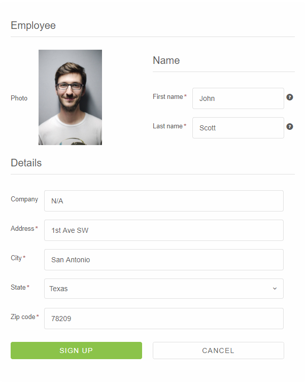
Create a Form from JSON
Smart.Form can be fully initialized from JSON object. From the Form API docs, you can learn about each member of the JSON structure. In general, the Form has controls array. Each member in that array has "controlType" which determines the form control's type. When the "controlType" is "group", you can define "constrols" property with nested form controls. In the JSON initialization you can set up FormControl or FormGroup labels, dataFields, validation rules, info-icon, addons, etc. Javascriptconst form = new Smart.Form('#profileForm', { controls: [{ controlType: 'group', columns: 2, label: 'Employee', dataField: 'employee', labelPosition: 'left', controls: [ { label: 'Photo', template: '<div style=" overflow: hidden;"><img width="125" src="../../images/people/andrew.png"/></div>', controlType: 'template' }, { label: 'Name', dataField: 'name', controlType: 'group', controls: [ { dataField: 'firstName', controlType: 'input', label: 'First name', required: true, info: 'Enter first name', placeholder: 'First name', cssClass: 'outlined', infoPosition: 'right' }, { dataField: 'lastName', controlType: 'input', label: 'Last name', placeholder: 'Last name', required: true, cssClass: 'outlined', info: 'Enter last name' } ] }, { label: 'Details', dataField: 'details', controlType: 'group', columnSpan: 2, controls: [ { dataField: 'company', controlType: 'input', label: 'Company', placeholder: 'Company name', cssClass: 'outlined', required: false }, { dataField: 'address', controlType: 'input', label: 'Address', placeholder: 'Address', required: true, cssClass: 'outlined' }, { dataField: 'city', controlType: 'input', label: 'City', placeholder: 'City', cssClass: 'outlined', required: true }, { dataField: 'state', controlType: 'dropdownlist', label: 'State', required: true, cssClass: 'outlined', controlOptions: { placeholder: 'State', dataSource: ['California', 'New York', 'Oregon', 'Illinois', 'Texas'] } }, { dataField: 'zip', controlType: 'input', placeholder: 'Zip', cssClass: 'outlined', label: 'Zip code', required: true } ] } ] }, { controlType: 'group', columns: 2, controls: [ { controlType: 'button', action: 'submit', label: 'Sign up', cssClass: 'success', align: 'right' }, { controlType: 'button', action: 'reset', label: 'Cancel', align: 'left' } ] } ]} );
Output
Updating parts of the data model
When updating the value for a form group instance that contains multiple controls, you may only want to update parts of the model. This section covers how to update specific parts of a form control data model.
There are two ways to update the model value:
- Use the setValue() method or the value property to set a new value for an individual control. The setValue() method and value property strictly adheres to the structure of the form group and replaces the entire value for the control.
- Use the patchValue() method to replace any properties defined in the object that have changed in the form model.
Use the getValue() method or the value property to get the value of a Smart.Form, Smart.FormGroup or Smart.FormControl.
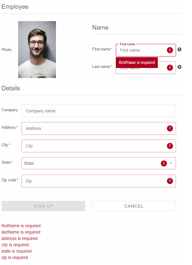
Form Validation
You can improve overall data quality by validating user input for accuracy and completeness. This page shows how to validate user input from the UI and display useful validation messages.
Smart.Form internally uses the Smart.Validator i.e all validation rules supported by the Smart.Validator are supported by the Smart.Form. To define a validation rule or rules of a FormControl, you need to set the FormControl's validationRules property.Example:
{
	dataField: 'Email',
	label: 'Email',
	validationRules: [
		{type: 'email', message: 'Please enter a valid email'}
	],
	placeholder: 'Email',
	cssClass: 'outlined'
}
The list of supported validation rule types:
- "required" - Checks if the input is not empty
- "notNumber" - Checks if the input value is not numeric
- "startWithLetter" - Checks if the input value starts with letter
- "numeric" - Checks if the input value is numeric
- "phone" - Checks the input value for valid phone number /if this format doesn't work for your country, you should try type: 'pattern'/
- "stringLength" - Validates the length of input value. To work properly, you should pass also min and max properties
- "minLength" - Validates the length of input value. The min property should be set
- "maxLength" - Validates the length of input value. The max property should be set
- "pattern" - Checks if the input value matches the pattern from the pattern property
- "compare" - Checks if the input value matches the result of the user defined function, declared in the comparisonTarget property
- "range" - Validates numeric input value. To work properly, you should pass also min and max properties
- "custom" - Custom validation, that executes the user defined function in the validationCallback property.
- "email" - Checks if the input value is valid email
- "zipCode" - Checks if the input value is valid zip code
- "ssn" - Checks if the input value is valid ssn
The Smart.Form has a method called validate. After you call it all FormControls will be validated. Validation Summary information is displayed below the form. The visibility of the summary is controlled by the showSummary property. The Submit buttons are automatically disabled, if there are Validation errors. Validation Error icons and Error borders are displayed, if a field is invalid. The styles of these is defined in the CSS.
We added a shortcut boolean property called required which will create a required validation rule for your Form Control.
Output
Append to the DOM:
const container = document.getElementById('form-container');
container.appendChild(form);
Remove from the DOM:
form.remove();
Set a property:
form.disabled = true;
form.theme = 'dark';
Get a property value:
const isDisabled = form.disabled;
const currentTheme = form.theme;
Invoke a method:
form.refresh();
form.focus();
Add event listener:
form.addEventListener('change', (event) => {
    console.log('Event triggered:', event.detail);
});
Remove event listener:
const handleFormEvent = (event) => {
    console.log('Event triggered:', event.detail);
};

form.addEventListener('change', handleFormEvent);
form.removeEventListener('change', handleFormEvent);
Accessibility
The Form component follows WAI-ARIA best practices:
- Keyboard navigation - Tab, Arrow keys, Enter, and Escape are supported
- ARIA roles - Appropriate roles and labels are applied automatically
- Focus management - Visible focus indicators for keyboard users
- Screen readers - State changes are announced to assistive technology
- High contrast - Supports Windows High Contrast Mode and forced colors
For custom labeling, set aria-label or aria-labelledby attributes on the component.
Supported stacks: Smart UI targets Angular 17+, React 18+, Vue 3+, Node 18 LTS, and evergreen browsers; pin exact package versions to your org policy.