Vue & Web Components
Vue is a framework focused on the view layer, helping the development of applications based on components. This page will show you how to use Smart Web Components with Vue.
Overview
We will walk you through the steps to add Smart Web Components to an existing Vue project, and configure some of the features. Smart web Components contains 40+ Web Components with Material Design. Some of the web components are: Grid, Chart, Gannt Chart, Docking Layout. For the purposes of the demo, we will use the Grid web component. We will show you some of the data grid capabilities (properties, data source). In addition, we will customize the Grid appearance with custom Column Templates.
Table of Contents
Add "smart-grid" to Your Vue Project
Creating projects with vue-cli
Let's install vue-cli
npm install -g @vue/cli
Then we can start creating our Vue.js projects with:
vue create my-project
Install Smart Web Components
Open the "my-project" folder and run:
npm install @smarthtmlelements/smart-elements
Ignored Elements
Make Vue ignore custom elements defined outside of Vue (e.g., using the Web Components APIs). Otherwise, it will throw a warning about an Unknown custom element, assuming that you forgot to register a global component or misspelled a component name.
Open src/main.js in your favorite text editor and change its contents to the following:
import Vue from 'vue'
import App from './App.vue'

Vue.config.productionTip = false
Vue.config.ignoredElements = [
  'smart-grid'
]

new Vue({
  render: h => h(App),
}).$mount('#app')
Open src/App.vue in your favorite text editor and change its contents to the following:
App.vue
 <template>
  <smart-grid id="grid"></smart-grid>
 </template>
 <script>
 import "@smarthtmlelements/smart-elements/source/styles/smart.default.css";
 import '@smarthtmlelements/smart-elements/source/modules/smart.grid.js';
 export default {
  name: "app",
  mounted: function() {
   window.Smart(
    "#grid", class {
     get properties() {
           return {
                columns: [
                     {
                          label: 'First Name', dataField: 'firstName'
                     },
                     { label: 'Last Name', dataField: 'lastName' },
                     { label: 'Product', dataField: 'productName' }
                ],
                dataSource: new window.Smart.DataAdapter(
                {
                     dataSource: [
                          { "firstName": "Beate", "lastName": "Wilson", "productName": "Caramel Latte"},
                          { "firstName": "Ian", "lastName": "Nodier", "productName": "Caramel Latte"},
                          { "firstName": "Petra", "lastName": "Vileid", "productName": "Green Tea"},
                          { "firstName": "Mayumi", "lastName": "Ohno", "productName": "Caramel Latte"},
                          { "firstName": "Mayumi", "lastName": "Saylor", "productName": "Espresso con Panna"},
                          { "firstName": "Regina", "lastName": "Fuller", "productName": "Caffe Americano" },
                          { "firstName": "Regina", "lastName": "Burke", "productName": "Caramel Latte"},
                          { "firstName": "Andrew", "lastName": "Petersen", "productName": "Caffe Americano"},
                          { "firstName": "Martin", "lastName": "Ohno", "productName": "Espresso con Panna"},
                          { "firstName": "Beate", "lastName": "Devling", "productName": "Green Tea"},
                          { "firstName": "Sven", "lastName": "Devling", "productName": "Espresso Truffle"},
                          { "firstName": "Petra", "lastName": "Burke", "productName": "Peppermint Mocha Twist"},
                          { "firstName": "Marco", "lastName": "Johnes", "productName": "Caffe Mocha"}
                     ],
                     dataFields:
                     [
                          'firstName: string',
                          'lastName: string',
                          'productName: string'
                     ]
                })
           }
     }
    }
   );
  }
 };
 </script>
 <style>
  body {
   min-height: 700px;
  }
  smart-grid {
   width: 100%;
   height: auto;
  }
 </style>
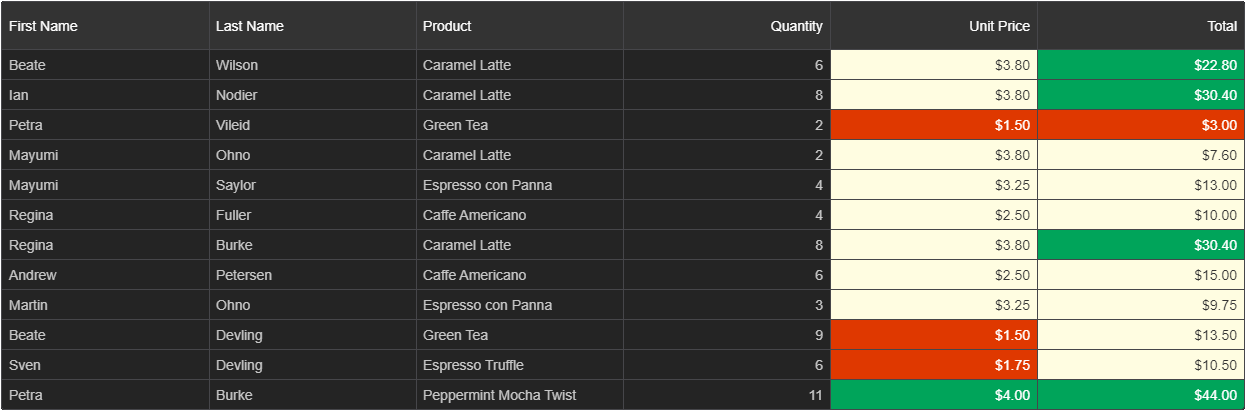
We can now use the smart-grid with Vue. Data binding and event handlers will just work right out of the box.
We have bound the "columns" and "dataSource" properties of the smart-grid to values in our Vue component.
Result:

Add Sorting and Filtering
Sorting and Filtering are essential features in each web application with Grids. To enable the sorting and filtering in our grid, we need to define two objects - sorting and filtering and set the "enabled" boolean property to true. We add the below code to the Smart function defined in the App.vue
 <template>
  <smart-grid id="grid"></smart-grid>
 </template>
 <script>
 import "@smarthtmlelements/smart-elements/source/styles/smart.default.css";
 import '@smarthtmlelements/smart-elements/source/modules/smart.grid.js';
 export default {
  name: "app",
  mounted: function() {
   window.Smart(
    "#grid", class {
     get properties() {
           return {
                columns: [
                     {
                          label: 'First Name', dataField: 'firstName'
                     },
                     { label: 'Last Name', dataField: 'lastName' },
                     { label: 'Product', dataField: 'productName' }
                ],
				sorting: {
					enabled: true
				},
				filtering: {
					enabled: true
				},
                dataSource: new window.Smart.DataAdapter(
                {
                     dataSource: [
                          { "firstName": "Beate", "lastName": "Wilson", "productName": "Caramel Latte"},
                          { "firstName": "Ian", "lastName": "Nodier", "productName": "Caramel Latte"},
                          { "firstName": "Petra", "lastName": "Vileid", "productName": "Green Tea"},
                          { "firstName": "Mayumi", "lastName": "Ohno", "productName": "Caramel Latte"},
                          { "firstName": "Mayumi", "lastName": "Saylor", "productName": "Espresso con Panna"},
                          { "firstName": "Regina", "lastName": "Fuller", "productName": "Caffe Americano" },
                          { "firstName": "Regina", "lastName": "Burke", "productName": "Caramel Latte"},
                          { "firstName": "Andrew", "lastName": "Petersen", "productName": "Caffe Americano"},
                          { "firstName": "Martin", "lastName": "Ohno", "productName": "Espresso con Panna"},
                          { "firstName": "Beate", "lastName": "Devling", "productName": "Green Tea"},
                          { "firstName": "Sven", "lastName": "Devling", "productName": "Espresso Truffle"},
                          { "firstName": "Petra", "lastName": "Burke", "productName": "Peppermint Mocha Twist"},
                          { "firstName": "Marco", "lastName": "Johnes", "productName": "Caffe Mocha"}
                     ],
                     dataFields:
                     [
                          'firstName: string',
                          'lastName: string',
                          'productName: string'
                     ]
                })
           }
     }
    }
   );
  }
 };
 </script>
 <style>
  body {
   min-height: 700px;
  }
  smart-grid {
   width: 100%;
   height: auto;
  }
 </style>

Online Examples: Grid Sorting and Grid Filtering
Enable Selection
The Grid supports selection by cell, row and with checkboxes. We can also choose from selection with single and double-click, selection by one or multiple rows or cells. In the code below, we will enable the Row selection. We add the below code to the Smart funtion App.vue
	selection: {
		enabled: true
	}
Online Selection Example:
Grid Selection.
Add Grouping(Professional)
Grouping is a professional feature and requires a license. The comparison table with features and components included in the Community and Professional versions is here. Similar to Sorting and Filtering, Grouping is enabled by setting the "enabled" property to true
We add the below code to App.vue
	grouping: {
		enabled: true
	}
App.vue
 <template>
  <smart-grid id="grid"></smart-grid>
 </template>
 <script>
 import "@smarthtmlelements/smart-elements/source/styles/smart.default.css";
 import '@smarthtmlelements/smart-elements/source/modules/smart.grid.js';
 export default {
  name: "app",
  mounted: function() {
   window.Smart(
    "#grid", class {
     get properties() {
           return {
                columns: [
                     {
                          label: 'First Name', dataField: 'firstName'
                     },
                     { label: 'Last Name', dataField: 'lastName' },
                     { label: 'Product', dataField: 'productName' }
                ],
				grouping: {
					enabled: true
				},
				sorting: {
					enabled: true
				},
				filtering: {
					enabled: true
				},
                dataSource: new window.Smart.DataAdapter(
                {
                     dataSource: [
                          { "firstName": "Beate", "lastName": "Wilson", "productName": "Caramel Latte"},
                          { "firstName": "Ian", "lastName": "Nodier", "productName": "Caramel Latte"},
                          { "firstName": "Petra", "lastName": "Vileid", "productName": "Green Tea"},
                          { "firstName": "Mayumi", "lastName": "Ohno", "productName": "Caramel Latte"},
                          { "firstName": "Mayumi", "lastName": "Saylor", "productName": "Espresso con Panna"},
                          { "firstName": "Regina", "lastName": "Fuller", "productName": "Caffe Americano" },
                          { "firstName": "Regina", "lastName": "Burke", "productName": "Caramel Latte"},
                          { "firstName": "Andrew", "lastName": "Petersen", "productName": "Caffe Americano"},
                          { "firstName": "Martin", "lastName": "Ohno", "productName": "Espresso con Panna"},
                          { "firstName": "Beate", "lastName": "Devling", "productName": "Green Tea"},
                          { "firstName": "Sven", "lastName": "Devling", "productName": "Espresso Truffle"},
                          { "firstName": "Petra", "lastName": "Burke", "productName": "Peppermint Mocha Twist"},
                          { "firstName": "Marco", "lastName": "Johnes", "productName": "Caffe Mocha"}
                     ],
                     dataFields:
                     [
                          'firstName: string',
                          'lastName: string',
                          'productName: string'
                     ]
                })
           }
     }
    }
   );
  }
 };
 </script>
 <style>
  body {
   min-height: 700px;
  }
  smart-grid {
   width: 100%;
   height: auto;
  }
 </style>

Online Grouping Example: Grid Grouping.
Enable Editing
smart-grid supports editing by cell, editing by row(Professional) and editing with dialog or command column(Professional). In this case, we will use the cell editing. You can enable the editing functionality by setting the "enabled" boolean property to true.
App.vue
	editing: {
		enabled: true
	}
Enable Paging
To enable pagination, set the grid paging and pager properties. The paging.enabled turns on/off pagination, pager.visible shows/hides the top or bottom pagers. The grid's pagination feature can be used to load data on demand. It can be used with all other grid features. There are built-in options to customize the "pageSize", navigate through pages using API, customize the pager's template, configure whether top and bottom pagers are visible all the time or only the top or bottom pager is visible. It is also optional to display a "select" tag to dynamically update the page size or an "input" tag which allows you to type the page index and navigate to the page.
App.vue
 <template>
  <smart-grid id="grid"></smart-grid>
 </template>
 <script>
 import "@smarthtmlelements/smart-elements/source/styles/smart.default.css";
 import '@smarthtmlelements/smart-elements/source/modules/smart.grid.js';
 export default {
  name: "app",
  mounted: function() {
   window.Smart(
    "#grid", class {
     get properties() {
           return {
                columns: [
                     {
                          label: 'First Name', dataField: 'firstName'
                     },
                     { label: 'Last Name', dataField: 'lastName' },
                     { label: 'Product', dataField: 'productName' }
                ],
				grouping: {
					enabled: true
				},
				paging: {
					enabled: true
				},
				pager: {
					visible: true
				},
				selection: {
					enabled: true
				},
				sorting: {
					enabled: true
				},
				filtering: {
					enabled: true
				},
                dataSource: new window.Smart.DataAdapter(
                {
                     dataSource: [
                          { "firstName": "Beate", "lastName": "Wilson", "productName": "Caramel Latte"},
                          { "firstName": "Ian", "lastName": "Nodier", "productName": "Caramel Latte"},
                          { "firstName": "Petra", "lastName": "Vileid", "productName": "Green Tea"},
                          { "firstName": "Mayumi", "lastName": "Ohno", "productName": "Caramel Latte"},
                          { "firstName": "Mayumi", "lastName": "Saylor", "productName": "Espresso con Panna"},
                          { "firstName": "Regina", "lastName": "Fuller", "productName": "Caffe Americano" },
                          { "firstName": "Regina", "lastName": "Burke", "productName": "Caramel Latte"},
                          { "firstName": "Andrew", "lastName": "Petersen", "productName": "Caffe Americano"},
                          { "firstName": "Martin", "lastName": "Ohno", "productName": "Espresso con Panna"},
                          { "firstName": "Beate", "lastName": "Devling", "productName": "Green Tea"},
                          { "firstName": "Sven", "lastName": "Devling", "productName": "Espresso Truffle"},
                          { "firstName": "Petra", "lastName": "Burke", "productName": "Peppermint Mocha Twist"},
                          { "firstName": "Marco", "lastName": "Johnes", "productName": "Caffe Mocha"}
                     ],
                     dataFields:
                     [
                          'firstName: string',
                          'lastName: string',
                          'productName: string'
                     ]
                })
           }
     }
    }
   );
  }
 };
 </script>
 <style>
  body {
   min-height: 700px;
  }
  smart-grid {
   width: 100%;
   height: auto;
  }
 </style>
Set Theme
The Smart Web Components product includes 14 Material Themes - 7 Light and 7 Dark. To set a theme, just include the "smart.[theme].css" file after smart.default.css and set your component's theme attribute to the theme name.

If you would like to customize or build a custom theme, you can use our Online Theme Builder web application.
Summary
You just learned how to setup an Vue project and add a Grid Web Component with Sorting, Filtering, Grouping and Selection. To learn more about the Grid component, visit:
Grid Demos and Documentation.
If you want to learn more: https://www.htmlelements.com/docs/vue/