Getting Started with MaskedTextBox Web Component
Smart UI Web Components work with current evergreen browsers and Node 18+ for local tooling; pin package versions to match your project policy.
Smart UI is distributed as the smart-webcomponents NPM package. You can also use the full download from the Download page.
Quick start
- Install the package:
npm install smart-webcomponents
- Load the MaskedTextBox module (ES module script):
<script type="module" src="node_modules/smart-webcomponents/source/modules/smart.maskedtextbox.js"></script>
- Add the default stylesheet (prefer angular.json / bundler entry in app codebases; for plain HTML use a link):
<link rel="stylesheet" type="text/css" href="node_modules/smart-webcomponents/source/styles/smart.default.css" />
- Add markup in one of two ways - semantic custom element (the component tag is in your HTML) or a host
div(you mount programmatically with appendTo):
Semantic element (id matches the selector in Smart()):
<smart-masked-text-box id="maskedtextbox"></smart-masked-text-box>
Host container (id matches appendTo on Smart.MaskedTextBox):
<div id="maskedtextboxContainer"></div>
- Initialize after the module loads: define a const maskedtextboxOptions object, then either bind with Smart('#maskedtextbox', ...) on the semantic tag or use new Smart.MaskedTextBox({ ...maskedtextboxOptions, appendTo: '#maskedtextboxContainer' }) on the host
div:
<script type="module">
	import 'node_modules/smart-webcomponents/source/modules/smart.maskedtextbox.js';

	const maskedtextboxOptions = { mask: "+1 (###) ### - ####" };

	// Option A - semantic <smart-masked-text-box> with id="maskedtextbox"
	Smart('#maskedtextbox', class {
		get properties() {
			return maskedtextboxOptions;
		}
	});

	// Option B - host div id="maskedtextboxContainer"
	// const maskedtextboxInstance = new Smart.MaskedTextBox({
	// 	...maskedtextboxOptions,
	// 	appendTo: '#maskedtextboxContainer'
	// });

	// Option C - constructor(selector, options), then append the returned element yourself
	// const myMaskedTextBox = new Smart.MaskedTextBox('#maskedtextbox', maskedtextboxOptions);
	// document.body.appendChild(myMaskedTextBox);
</script>
Uncomment Option B when you use the host
div; use Option A when you use the semantic element. The Runtime cookbook also documents new Smart.MaskedTextBox('#maskedtextbox', maskedtextboxOptions) with appendChild, and document.createElement('smart-masked-text-box') with .props or Object.assign (all are valid patterns; do not combine overlapping patterns for the same instance unless you intend multiple components). - Serve the folder over HTTP (or use your bundler dev server) and open the page.
Runtime cookbook
Alternative creation patterns and imperative APIs. These are all valid ways to create Smart UI components: semantic markup + Smart(); new Smart.MaskedTextBox({ ...options, appendTo: '#...' }); new Smart.MaskedTextBox('#maskedtextbox', maskedtextboxOptions) plus appendChild on the returned element; and document.createElement('smart-masked-text-box') then assigning options via .props or Object.assign on the element.
Constructor with a selector string and options, then append the returned element (for example const myMaskedTextBox = new Smart.MaskedTextBox('#maskedtextbox', maskedtextboxOptions)):
	const maskedtextboxOptions = { mask: "+1 (###) ### - ####" };
	const myMaskedTextBox = new Smart.MaskedTextBox('#maskedtextbox', maskedtextboxOptions);
	document.body.appendChild(myMaskedTextBox);
Create with document.createElement('smart-masked-text-box'), assign properties (same as any custom element), then append:
	const maskedtextboxOptions = { mask: "+1 (###) ### - ####" };
	const maskedtextbox = document.createElement('smart-masked-text-box');
	Object.assign(maskedtextbox, maskedtextboxOptions);
	document.body.appendChild(maskedtextbox);
Host on a div with appendTo (import the module, then instantiate when the document is ready; the container id must match appendTo):
	import "../../source/modules/smart.maskedtextbox.js";

	document.readyState === 'complete' ? init() : window.addEventListener('load', init);

	function init() {
		const maskedtextboxOptions = { mask: "+1 (###) ### - ####" };
		const maskedtextbox = new Smart.MaskedTextBox({
			...maskedtextboxOptions,
			appendTo: '#maskedtextboxContainer'
		});
	}
Demo
Appearance
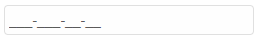
Smart.MaskedTextBox uses promptChar property to point the available user input positions. These position are defined by the mask property.
Mask characters are:
- 0 - Accepts any single digit between 0 and 9.
- 9 - Accepts digit or space.
- # - Digit or space, optional. If this position is blank in the mask, it will be rendered as a space
- L - Letter, required.
- ? - Letter, optional
- & - Character, required
- C - Character, optional
- A - Alphanumeric, required
- a - Alphanumeric, optional
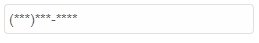
<smart-masked-text-box mask="(###)###-####" prompt-char="*"></smart-masked-text-box>
Demo
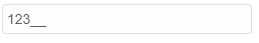
The Masked Text Box could be filled on initialization via the value property
<smart-masked-text-box value="123"></smart-masked-text-box>
Demo
hidePromptOnLeave property is responsible all prompt characters to be hidden when the element loses it's focus. If the element is focused, characters are rendered again in the input-s field. By default prompt characters are rendered
<smart-masked-text-box hide-prompt-on-leave></smart-masked-text-box>
Demo
Behavior
If selectAllOnFocus is true the whole test is selected when the element is focused
<smart-masked-text-box select-all-on-focus></smart-masked-text-box>
Demo
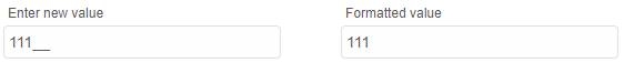
Smart.MaskedTextBox offers few different types of value formatting. The property responsible to this is textMaskFormat. It can be:
- excludePromptAndLiterals - all prompt characters and literals are removed from the value
- includePrompt - all literals characters are removed from the value
- includeLiterals - all prompt characters are removed from the value
- includePromptAndLiterals - the value is equal to the visualized input string.
<smart-masked-text-box text-mask-format="excludePromptAndLiterals"></smart-masked-text-box>
Demo
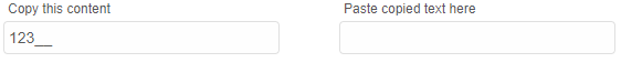
Similar to textMaskFormat is Smart.MaskedTextBox's cutCopyMaskFormat property. It's used to set the value in the clipboard after "cut" and "copy" operations.
<smart-masked-text-box cut-copy-mask-format="excludePromptAndLiterals"></smart-masked-text-box>
Demo
Append to the DOM:
const container = document.getElementById('maskedtextbox-container');
container.appendChild(maskedtextbox);
Remove from the DOM:
maskedtextbox.remove();
Set a property:
maskedtextbox.disabled = true;
maskedtextbox.theme = 'dark';
Get a property value:
const isDisabled = maskedtextbox.disabled;
const currentTheme = maskedtextbox.theme;
Invoke a method:
maskedtextbox.refresh();
maskedtextbox.focus();
Add event listener:
maskedtextbox.addEventListener('change', (event) => {
    console.log('change triggered:', event.detail.oldValue);
});
Remove event listener:
const handleMaskedTextBoxEvent = (event) => {
    console.log('change triggered:', event.detail.oldValue);
};

maskedtextbox.addEventListener('change', handleMaskedTextBoxEvent);
maskedtextbox.removeEventListener('change', handleMaskedTextBoxEvent);
Accessibility
The MaskedTextBox component follows WAI-ARIA best practices:
- Keyboard navigation - Tab, Arrow keys, Enter, and Escape are supported
- ARIA roles - Appropriate roles and labels are applied automatically
- Focus management - Visible focus indicators for keyboard users
- Screen readers - State changes are announced to assistive technology
- High contrast - Supports Windows High Contrast Mode and forced colors
For custom labeling, set aria-label or aria-labelledby attributes on the component.
Supported stacks: Smart UI targets Angular 17+, React 18+, Vue 3+, Node 18 LTS, and evergreen browsers; pin exact package versions to your org policy.