Getting Started with Input Web Component
Smart UI Web Components work with current evergreen browsers and Node 18+ for local tooling; pin package versions to match your project policy.
Smart UI is distributed as the smart-webcomponents NPM package. You can also use the full download from the Download page.
Quick start
- Install the package:
npm install smart-webcomponents
- Load the Input module (ES module script):
<script type="module" src="node_modules/smart-webcomponents/source/modules/smart.input.js"></script>
- Add the default stylesheet (prefer angular.json / bundler entry in app codebases; for plain HTML use a link):
<link rel="stylesheet" type="text/css" href="node_modules/smart-webcomponents/source/styles/smart.default.css" />
- Add markup in one of two ways - semantic custom element (the component tag is in your HTML) or a host
div(you mount programmatically with appendTo):
Semantic element (id matches the selector in Smart()):
<smart-input id="input"></smart-input>
Host container (id matches appendTo on Smart.Input):
<div id="inputContainer"></div>
- Initialize after the module loads: define a const inputOptions object, then either bind with Smart('#input', ...) on the semantic tag or use new Smart.Input({ ...inputOptions, appendTo: '#inputContainer' }) on the host
div:
<script type="module">
	import 'node_modules/smart-webcomponents/source/modules/smart.input.js';

	const inputOptions = { value: 'Peter Brown' };

	// Option A - semantic <smart-input> with id="input"
	Smart('#input', class {
		get properties() {
			return inputOptions;
		}
	});

	// Option B - host div id="inputContainer"
	// const inputInstance = new Smart.Input({
	// 	...inputOptions,
	// 	appendTo: '#inputContainer'
	// });

	// Option C - constructor(selector, options), then append the returned element yourself
	// const myInput = new Smart.Input('#input', inputOptions);
	// document.body.appendChild(myInput);
</script>
Uncomment Option B when you use the host
div; use Option A when you use the semantic element. The Runtime cookbook also documents new Smart.Input('#input', inputOptions) with appendChild, and document.createElement('smart-input') with .props or Object.assign (all are valid patterns; do not combine overlapping patterns for the same instance unless you intend multiple components). - Serve the folder over HTTP (or use your bundler dev server) and open the page.
Runtime cookbook
Alternative creation patterns and imperative APIs. These are all valid ways to create Smart UI components: semantic markup + Smart(); new Smart.Input({ ...options, appendTo: '#...' }); new Smart.Input('#input', inputOptions) plus appendChild on the returned element; and document.createElement('smart-input') then assigning options via .props or Object.assign on the element.
Constructor with a selector string and options, then append the returned element (for example const myInput = new Smart.Input('#input', inputOptions)):
	const inputOptions = { value: 'Peter Brown' };
	const myInput = new Smart.Input('#input', inputOptions);
	document.body.appendChild(myInput);
Create with document.createElement('smart-input'), assign properties (same as any custom element), then append:
	const inputOptions = { value: 'Peter Brown' };
	const input = document.createElement('smart-input');
	Object.assign(input, inputOptions);
	document.body.appendChild(input);
Host on a div with appendTo (import the module, then instantiate when the document is ready; the container id must match appendTo):
	import "../../source/modules/smart.input.js";

	document.readyState === 'complete' ? init() : window.addEventListener('load', init);

	function init() {
		const inputOptions = { value: 'Peter Brown' };
		const input = new Smart.Input({
			...inputOptions,
			appendTo: '#inputContainer'
		});
	}
Demo
DataSource
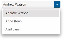
To enable the options list popup the user has to define an Array of objects with label and value attributes and pass it to the dataSource property of the element:
const input = document.querySelector('smart-input');

input.dropDownButtonPosition = 'right';
input.dataSource = [
    { label: "Andrew Watson" },
    { label: "Anne Kean" },
    { label: "Avril Janin" }
];
Demo
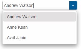
The dropDownButtonPosition Boolean property determines the position of the drop down button.
By default the drop down button is not visible. If no dataSource is provided, clicking on the drop down button will not open the popup.
MultiInput
Smart.MultiInput is a variation of the Input element that allows multiple items to be selected from the drop down. The selected items will be added to the input devided by a separator.
To initialize a Smart.MultiInput element the user has to include the following files to the head of the page:
- smart.default.css - the CSS file containing the styles for the elements.
- smart.element.js - the base element.
- smart.button.js - the Smart Button file definitions needed for the ScrollBars.
- smart.scrollbar.js - this file contains definitions for the Scrollbars inside the input popup.
- smart.input.js - the JS file containing the definitions for the Input element.
- smart.multiinput.js - the JS file containing the definitions for the MultiInput element.
Here's how to initialize a Smart.MultiInput element with dataSource and dropDownButtonPosition:
<smart-multi-input drop-down-button-position="right" placeholder="Please Select" ></smart-multi-input>
window.onload = function() {
    const multiInput = document.querySelector('smart-multi-input');

    multiInput.dataSource = [
        { value: "Austria", label: "Austria" },
        { value: "Belarus", label: "Belarus" },
        { value: "Belgium", label: "Belgium" },
        { value: "Bosnia and Herzegovina", label: "Bosnia and Herzegovina" },
        { value: "Bulgaria", label: "Bulgaria" },
        { value: "Croatia", label: "Croatia" },
    ...
];
}
Demo
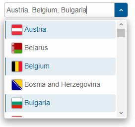
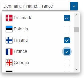
The following demo shows a country list with national flags with three selected items. As a result the selected labels are displayed in the input, separated with a coma. The user can type in a country and the popup will show a match if possible.
Smart.MultiInput is very similar to the Smart.Input but allows multiple item selection.
CheckInput
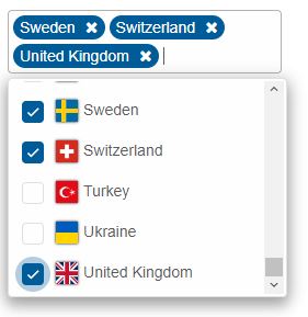
Smart.CheckInput is a variation of the MultiInput element that allows multiple items to be selected from the drop down via checkboxes. The selected items will be added to the input devided by a separator.
To initialize a Smart.CheckInput element the user has to include the following files to the head of the page:
- smart.default.css - the CSS file containing the styles for the elements.
- smart.element.js - the base element.
- smart.button.js - the Smart Button file definitions needed for the ScrollBars.
- smart.scrollbar.js - this file contains definitions for the Scrollbars inside the input popup.
- smart.input.js - the JS file containing the definitions for the Input element.
- smart.multiinput.js - the JS file containing the definitions for the MultiInput element.
- smart.checkinput.js - the JS file containing the definitions for the CheckInput element.
Here's how to initialize a Smart.CheckInput element with dataSource and dropDownButtonPosition:
<smart-check-input drop-down-button-position="right" placeholder="Please Select" ></smart-check-input>
window.onload = function() {
    const checkInput = document.querySelector('smart-check-input');

    checkInput.dataSource = [
        { value: "Austria", label: "Austria" },
        { value: "Belarus", label: "Belarus" },
        { value: "Belgium", label: "Belgium" },
        { value: "Bosnia and Herzegovina", label: "Bosnia and Herzegovina" },
        { value: "Bulgaria", label: "Bulgaria" },
        { value: "Croatia", label: "Croatia" },
    ...
];
}
Demo
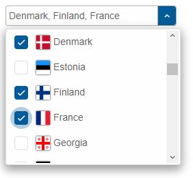
Checkboxes can be selected using the mouse or the Enter key when an item is focused via the keyboard.
Inverted
An additional inverted Boolean property is available which allows to position the checkboxes on the right side instead of the left.
checkInput.inverted = true;
Demo
Smart.CheckInput is similar to the Smart.MultiInput but contains checkboxes.
MultiComboInput
Smart.MultiComboInput is a combination between the CheckInput and MultiInput elements which allows to select multiple items from the drop down via checkboxes. The selected items will be added to the input section ( before the input ) as tags.
To initialize a Smart.MultiComboInput element the user has to include the following files to the head of the page:
- smart.default.css - the CSS file containing the styles for the elements.
- smart.element.js - the base element.
- smart.button.js - the Smart Button file definitions needed for the ScrollBars.
- smart.scrollbar.js - this file contains definitions for the Scrollbars inside the input popup.
- smart.input.js - the JS file containing the definitions for the Input element.
- smart.multiinput.js - the JS file containing the definitions for the MultiInput element.
- smart.checkinput.js - the JS file containing the definitions for the CheckInput element.
- smart.multicomboinput.js - the JS file containing the definitions for the MultiComboInput element.
Here's how to initialize a Smart.MultiComboInput element with a list of countries with flags as a dataSource:
<smart-multi-combo-input></smart-multi-combo-input>
window.onload = function() {
    const multiComboInput = document.querySelector('smart-multi-combo-input');

    multiComboInput.dataSource = [
        { value: "Austria", label: "Austria" },
        { value: "Belarus", label: "Belarus" },
        { value: "Belgium", label: "Belgium" },
        { value: "Bosnia and Herzegovina", label: "Bosnia and Herzegovina" },
        { value: "Bulgaria", label: "Bulgaria" },
        { value: "Croatia", label: "Croatia" },
    ...
];
}
Demo
SelectAll
An additional selectAll property is available in this element that shows a Select All button at the top of the popup, allowing to select/unselect all items.
multiComboInput.selectAll = true;
Demo
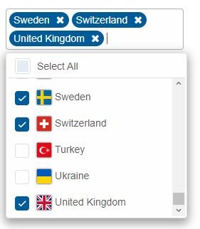
Smart.MutliComboInput is similar to the Smart.CheckInput but creates tags for each selected item in the input section instead of adding them to the input.
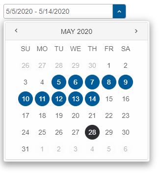
DateRangeInput
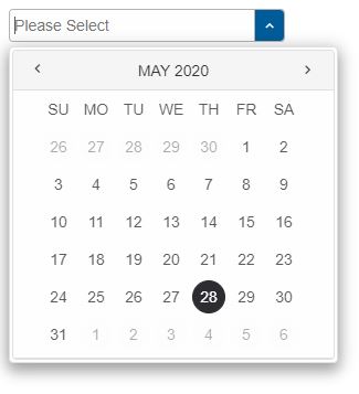
Smart.DateRangeInput is an Input variation that contains a Smart.Calendar in a drop down that is hidden by default. It accepts valid JS Date format strings and allows the user to pick a date from the popup.
A single click on a date marks the beginning of a date range selection. The second click on a date marks the end of the range. Every other selected date after that is treated as a new range selection.
The selected dates in the Calendar are added to the Input as strings according to the locale of the element and the dateFormat and timeFormat properties.
To initialize a Smart.DateRangeInput element the user has to include the following files to the head of the page:
- smart.default.css - the CSS file containing the styles for the elements.
- smart.element.js - the base element.
- smart.button.js - the Smart Button file definitions needed for the ScrollBars.
- smart.scrollbar.js - this file contains definitions for the Scrollbars inside the input popup.
- smart.listbox.js - the Smart Button file definitions needed for the ListBox used by the Calendar.
- smart.dropdownlist.js - the Smart Button file definitions needed for the DropDownList used by the Calendar.
- smart.tooltip.js - the Smart Button file definitions needed for the Tooltip used by the Calendar.
- smart.calendar.js - the Smart Button file definitions needed for the ScrollBars.
- smart.input.js - the JS file containing the definitions for the Input element.
- smart.daterangeinput.js - the JS file containing the definitions for the DateRangeInput element.
Here's how to initialize a Smart.DateRangeInput element with a dropDownButtonPosition property:
<smart-date-range-input placeholder="Please Select" drop-down-button-position="right"></smart-date-range-input>
Demo
The user can open the popup and select a date range from the Calendar or set the value property to a valid JS Date, for exampe:
window.onload = function() {
    const dateRangeInput = document.querySelector('smart-date-range-input');

    dateRangeInput.value = '5/5/2026 - 5/14/2026';
}
Demo
The two dates in the date range are separated by a dash surrounded by a whitespace. This can be configured via the separator property.
Timepicker
Time selection is also available in the Smart.DateRangeInput. It can be enabled via the timepicker Boolean property. Once applied the input accepts time values along with the dates and a Timepicker panel is available inside the popup when a date is selected and the user clicks on the time indicator at the bottom.
dateRangeInput.timepicker = true;
Demo
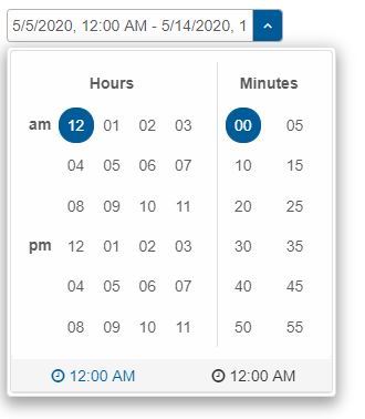
If a date range is selected the time indicators in the popup will be two, one for the start time and another for the end time.
Smart.DateRangeInput is an Input that offers Date selection and acts a lightweight DateTimePicker.
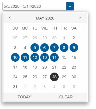
Icons
Another feature of the Smart.DateRangeInput is the icons Boolean property which enables/disables the icon buttons located next to the time indicators inside the drop down. These buttons allow to select the today date or clear the selection.
dateRangeInput.icons = true;
Demo
Since the Smart.DateRangeInput is an Input it returns it's value as a string. However it can be configured to return an Object with two attributes - from and to, which hold the start and end date if selected. This can be configured via the valueFormat property.
Readonly
By default the Input components act as ComboBoxes which means that they allow to enter and modify the text value and open the drop down at any time. Entering a value in the input (applies to all Inputs except the DateRangeInput) will trigger the search alghoritm that will open the popup to display matching items, if any. Setting the readonly property to the element will only display text in the input and the element will behave as a DropDownList:
input.readonly = true;
Demo
Events
Since they are Inputs they fire a change event with details regarding the old and new value:
input.addEventListener('change', function(event) {
    console.log('Input Event details: ' + event.detail);
});
The event.detail object contains the new and old label and value of the element.
Keyboard Support
Smart.Input elements implements the following keys:
| Key | Action |
|---|---|
| Arrow Up/ Arrow Down | Navigate up/down the popup. |
| Alt + Arrow Down | Close the drop down. |
| Alt + Arrow Up | Open the drop down. |
| Escape | Close the drop down. |
| Enter | Submit current input value / Select an item from the popup. |
You can read more about the components in the Docs section on the Official HTMLElements website.
Append to the DOM:
const container = document.getElementById('input-container');
container.appendChild(input);
Remove from the DOM:
input.remove();
Set a property:
input.disabled = true;
input.theme = 'dark';
Get a property value:
const isDisabled = input.disabled;
const currentTheme = input.theme;
Invoke a method:
input.refresh();
input.focus();
Add event listener:
input.addEventListener('change', (event) => {
    console.log('change triggered:', event.detail.label);
});
Remove event listener:
const handleInputEvent = (event) => {
    console.log('change triggered:', event.detail.label);
};

input.addEventListener('change', handleInputEvent);
input.removeEventListener('change', handleInputEvent);
Accessibility
The Input component follows WAI-ARIA best practices:
- Keyboard navigation - Tab, Arrow keys, Enter, and Escape are supported
- ARIA roles - Appropriate roles and labels are applied automatically
- Focus management - Visible focus indicators for keyboard users
- Screen readers - State changes are announced to assistive technology
- High contrast - Supports Windows High Contrast Mode and forced colors
For custom labeling, set aria-label or aria-labelledby attributes on the component.
Supported stacks: Smart UI targets Angular 17+, React 18+, Vue 3+, Node 18 LTS, and evergreen browsers; pin exact package versions to your org policy.